thanks to:
karindalziel @ flickr for the clouds
and kosare for the bees (5 years and 3251 days ago)
Best viewed in Full Screen mode. (F11) (5 years and 3391 days ago)
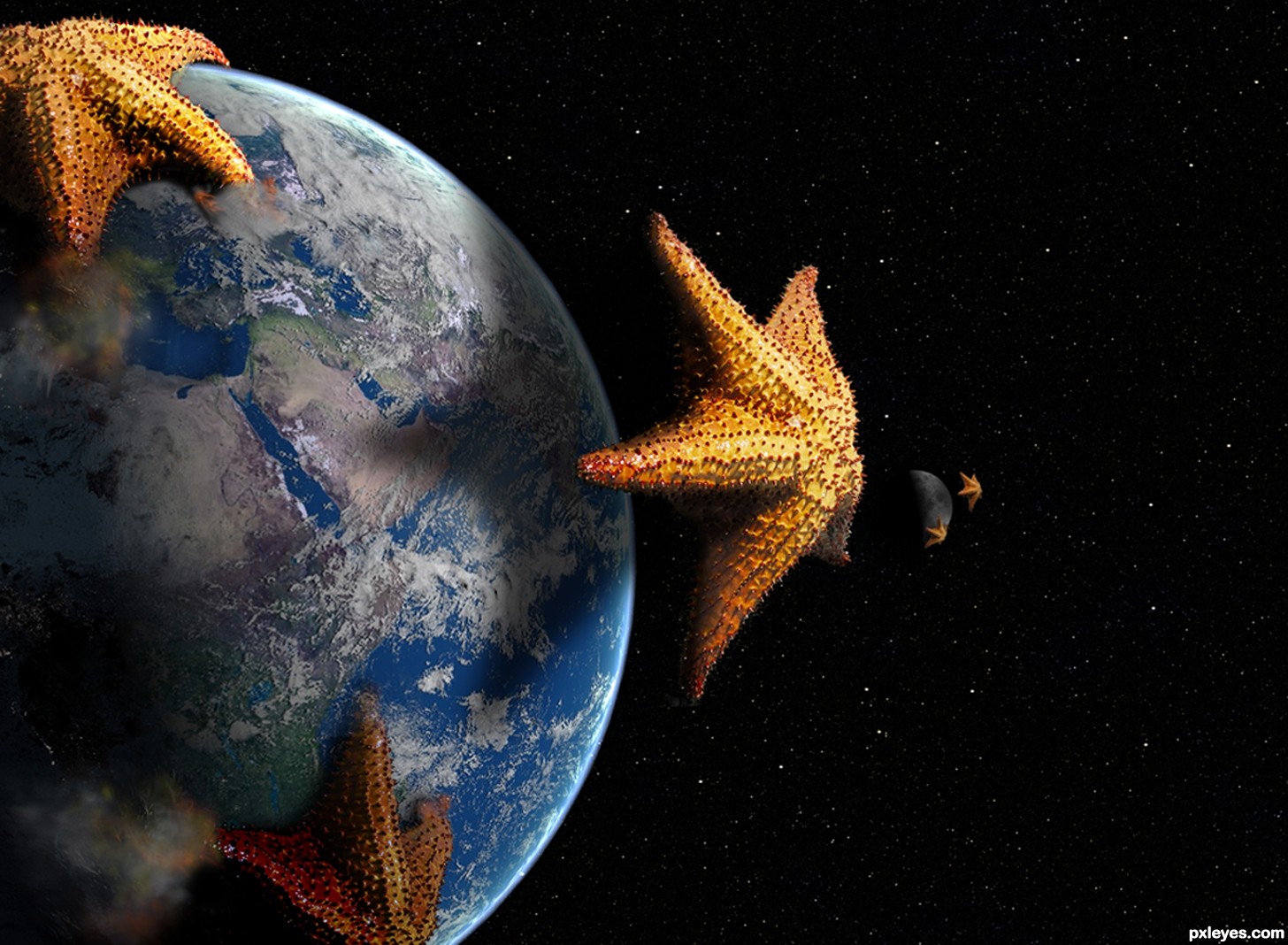
Cool concept. The 3 o'clock earth starfish is maybe a bit too close; a little more distance might be more dramatic/threatening/tell more of a story. The outer edges of the 12 o'clock starfish's arms seem weak because (as revealed in hi-res) the water line bulges instead of remaining flat to the earth's surface.
The moon is hard to discern plus the closer starfish isn't casting any shadow. I think just deleting that closer starfish would be a simplifying improvement.
Nice1..Faved!
nice idea!
A good idea, despite a similar image already being in the contest. I agree with Dan about the uppermost starfish being above the waterline even though it has been clearly warped. Other than that it looks good  Good attention to lights and shadows too.
For the comments about the upper starfish, it is as I want it to be. Yes it has been warped. I am trying to portray the creature as if it is wrapping its upper most arm UP and over the atmosphere and curvature of the Earth. If you notice the other arms are digging into the surface. Ponti and Dan I am not sure what you 2 are getting at. As for having been done as a similar idea...well I started this project as you see it with out seeing the other similar entry. It is not the first time things like this have happened here and probably will not be the last. Thank you for the comments and the favorite.
This is a pretty cool concept, name and execution, author. Quite the mutated starfish, very scifi! 
That one center leg on the bottom starfish looks as if it's really burrowing below the water surface - great work! Dust and fire on the others works, too. Planet looks like a NASA image, nice job on that as well. 
This swarm looks unbeatable
Very cool work author...gl
Wauw amazing :O
should've been third at least ..
Howdie stranger!
If you want to rate this picture or participate in this contest, just:
LOGIN HERE or REGISTER FOR FREE
own collection (5 years and 3670 days ago)
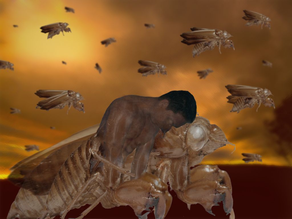
Source for wings?
very chaotic.you need to paste sources..this has some great moods in it..don't let it get pulled on a tech issue
edit.. alrighty then LOL
He made the wings from the source. Am I right?
i made the wings from the body of the exoskeleton
Howdie stranger!
If you want to rate this picture or participate in this contest, just:
LOGIN HERE or REGISTER FOR FREE
(5 years and 3677 days ago)
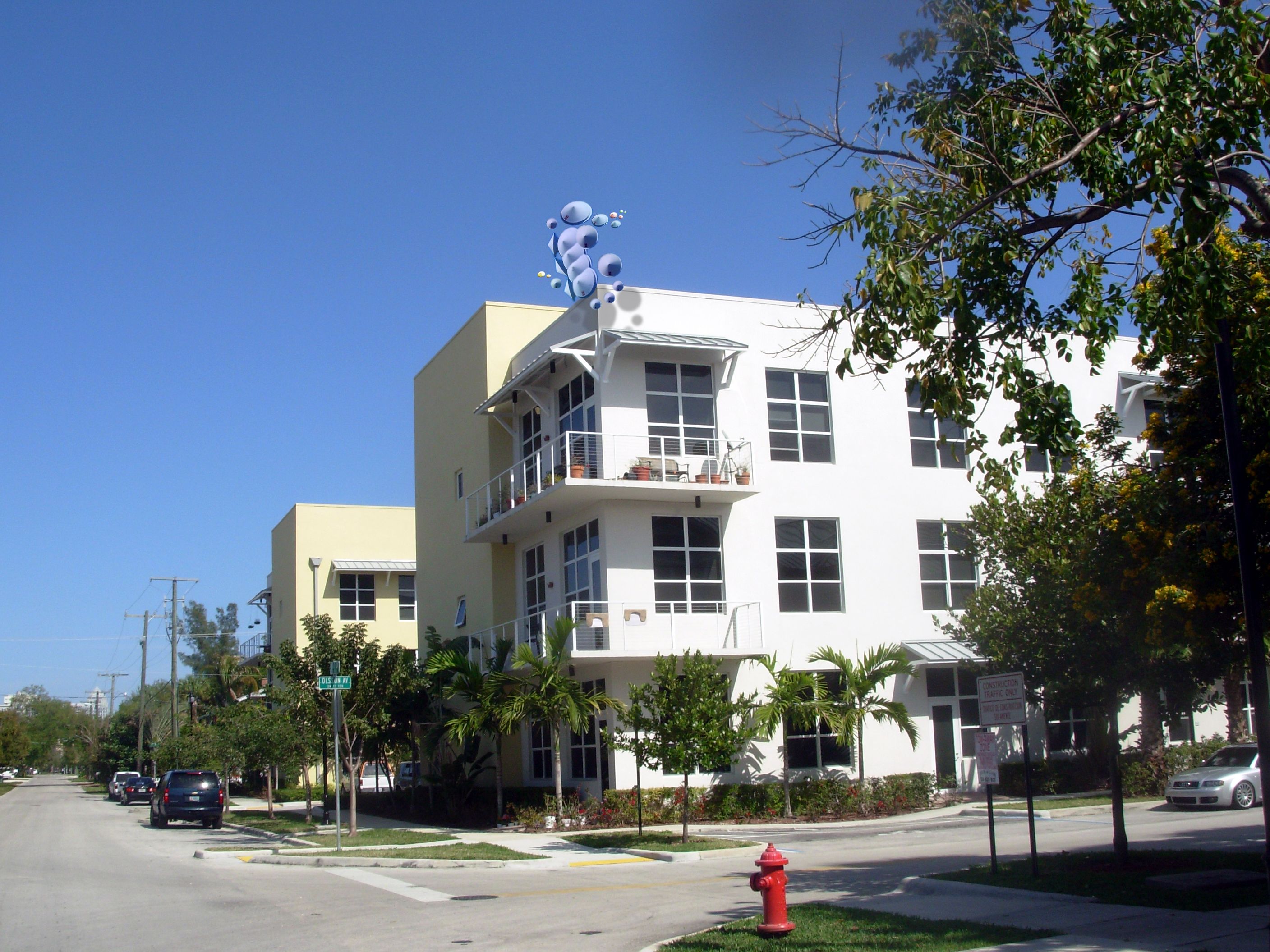
Not bad...just looks a bit cut out. Try blurring the shadows a bit and maybe even some of the smaller crafts.
Very nice,different idea...good luck author
got it game master P, forgot about the shadows completely and added blur
Not bad, but the light on the UFOs is from the opposite direction. Good luck!
Imagine that you suddenly look at your window and... oh gosh! UFOs!!!
Hmm better. Try a bit more blur, if you want. When you zoom out so far, the blur is hard to see. It's only in high-def that it becomes clear. Of course, only if you wish. Good luck, author.
great idea ! awesome work
Waz is right, the shadow are going in the wrong direction.
I like the originality of your craft.

I like the originality of your craft.
Howdie stranger!
If you want to rate this picture or participate in this contest, just:
LOGIN HERE or REGISTER FOR FREE
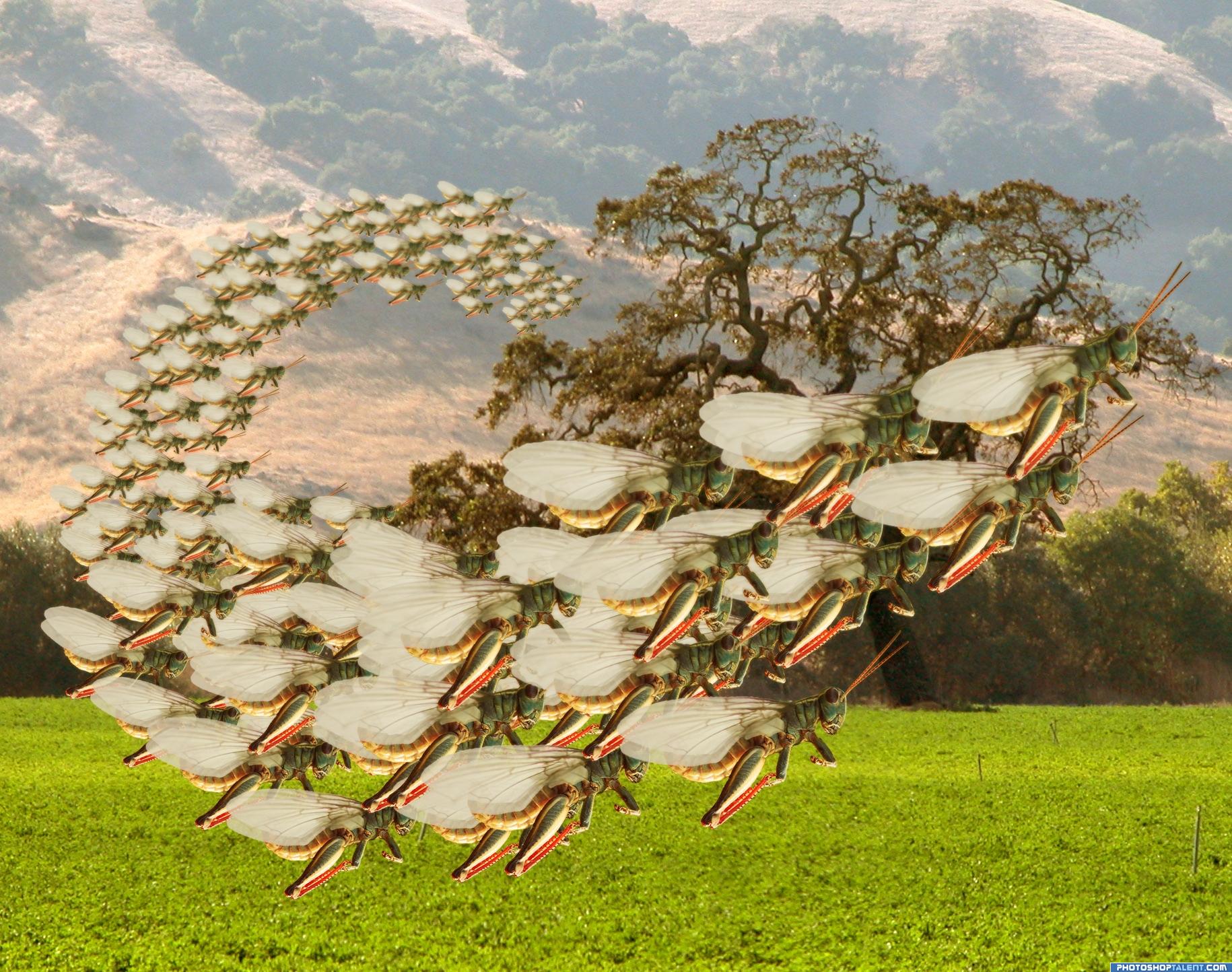
I wanted to try and recreate a kinda locust storm. (5 years and 3955 days ago)
looks good
Which Ride at Disney is this?.. hehehe.. just a suggestion..save your work so you don't lose anything.. but if you duplicated the whole scene..then motion blurred the back layer behind the locust in the right direction..you may set the whole seen in greater motion... DO NOT RUIN THE PIC ...TEST FIRST TO SEE IF IT WORKS.. it's up to you.. .. I really do want to ride them LOL
All from the same school, very Disciplined action
Please fix link #1.
Fixed the link
interesting
NICE...i want it for my room..
Nice but I think it would look better if they were all not in the same position..
nice idea
Howdie stranger!
If you want to rate this picture or participate in this contest, just:
LOGIN HERE or REGISTER FOR FREE
Photography and photoshop contests
We are a community of people with
a passion for photography, graphics and art in general.
Every day new photoshop
and photography contests are posted to compete in. We also have one weekly drawing contest
and one weekly 3D contest!
Participation is 100% free!
Just
register and get
started!
Good luck!
© 2015 Pxleyes.com. All rights reserved.


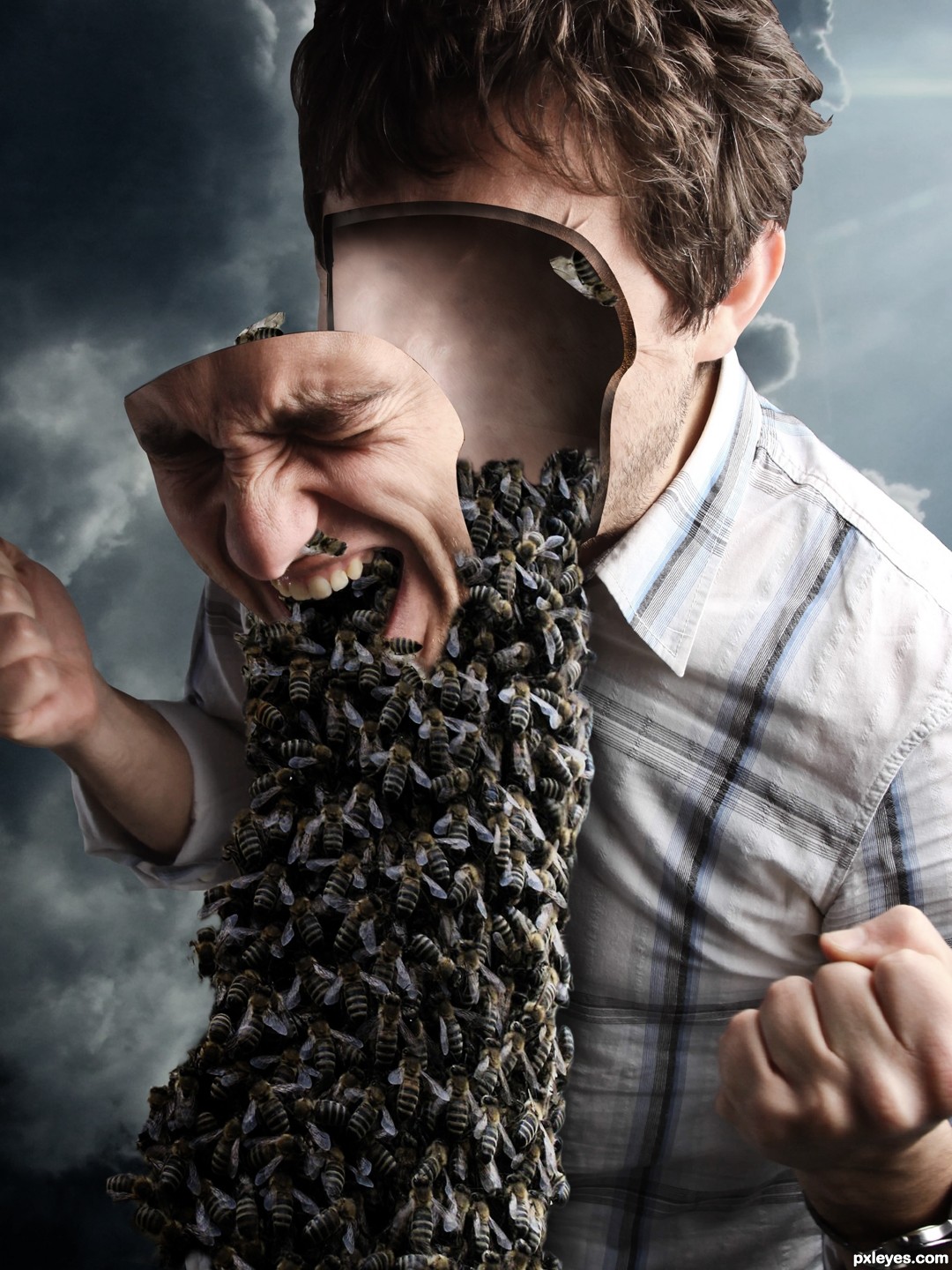
Dig the idea, the perspective on the hard angles of the face are throwing me off.
Really nice idea, author! In my opinion...the face plate is detracting from the cool effect. If you somehow have part of the face showing at the bottom, like it has already fallen...I think that would help focus the creepy part more. Or...if you have him holding his face...that would be good. Nice thinking!
thank you all for the comments! Maybe this updated version is less distracting
Much improved author.. great fix it work!!! it's much more believable now!
Good correction on the perspective!
Creepy! Good work!
Howdie stranger!
If you want to rate this picture or participate in this contest, just:
LOGIN HERE or REGISTER FOR FREE