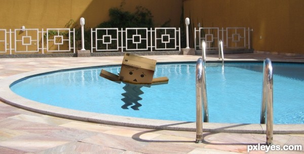
(5 years and 2700 days ago)
- 1: source1
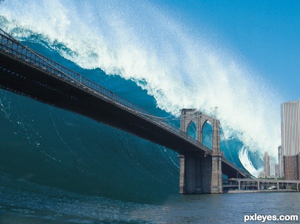
A simple (I only needed 2 images) Matte painting...
1. Image:
Brooklin Bridge:
http://www.morguefile.com/archive/display/87859
2. Image:
Water Wave:
Digital Vision "Waves" Image CD (Royalty free images) (I have some CD's @ work - thank you Boss! ^.^ ) (5 years and 2753 days ago)
Whoa! That is frightening!
Agreed, made me shudder.
Scary indeed, and well done except for the blending of the 2 water images at bottom center. GL author! 
Congrats!!
Howdie stranger!
If you want to rate this picture or participate in this contest, just:
LOGIN HERE or REGISTER FOR FREE
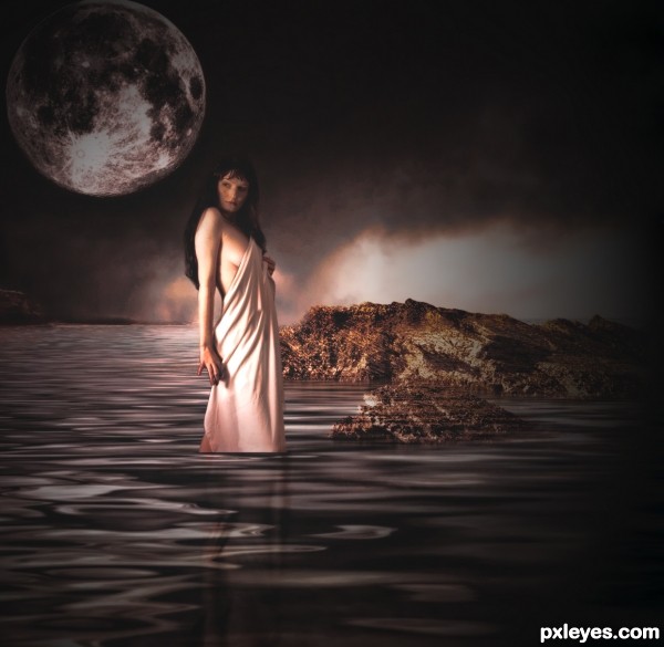
thanks to almudena stock
resurgere,night-fate-stock
please leave comments so i can fix if anything is wrong (5 years and 2925 days ago)
Interesting. I wish the title provided more of a hint as to who this giant goddess is. Her tatoos are not realistic (odd brown outer glow, for example) and overdone IMO. I think the soft black of the foreground trees tones down the drama. The bright blue of the moon seems like a distraction from the mood and color palette of the goddess who should be the focal point; a white moon would fit in better.
hope this is better
hope this is better
love it! i think when u remove some part of the moon or lady i think you forget some part like. some wear on the trees, and i think the lady is some wear in the lake? so she must flout down more! itats my idea! except that, its nice
I like this a lot more as well. The title tells us who she is and her scale seems reasonable. If this weren't meant to be fantastical, her front lighting might seem odd but I'm very willing to get caught up in the moment (although a little more shadow where her towel hits the water might add some faux realism). I wish the light reflections in the water pointed more clearly to the moon as their source. I would crop out the right half of the image for several reasons: The resulting composition would be more compelling. The light source for that cliff is inexplicable. A night scene suggests cool light yet the cliff's light is warm.
hope this is better please let me know
Now is much better!
there is a lot of unfinished lines in the high rez?
Howdie stranger!
If you want to rate this picture or participate in this contest, just:
LOGIN HERE or REGISTER FOR FREE
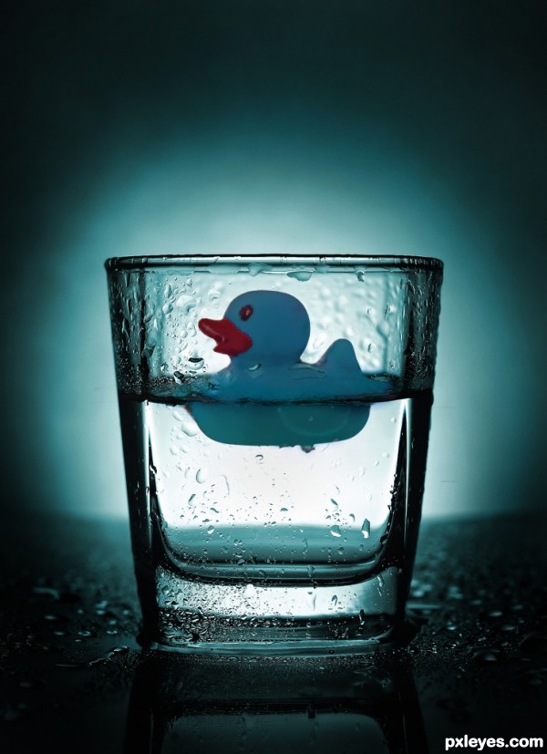
basic brushes, paint, clone stamp, distort, mask, levels, hue and saturations, dodge and burn (5 years and 3039 days ago)
Thanks, I worked hard on this one.
its a great image with a wow effect, excactly what a image makes so powerfull. but without good photoshopwork its still not complete, I think you covered both the skills and wow effect  Good job!!
One minor thing, Id liked to have seen some drops on the glass in front of the duck to give it a lil more depth.
Thanks ... there are some drops in front of the duck on the left side ... ... I'll have a better look at it later ... just checking in right now. Thanks Eladine
Oh and I must have looked through hundreds and hundreds of glass photo's before I found this one ... I almost went with a wine glass
Ok more drops added in front of duck to give it a little more depth ... thanks again Eladine ...
yes very nice 
great idea
gratz  well deserved
congrats!!!
Congratulations!
congrats!
Thanks all ... Happy New Year!
Howdie stranger!
If you want to rate this picture or participate in this contest, just:
LOGIN HERE or REGISTER FOR FREE
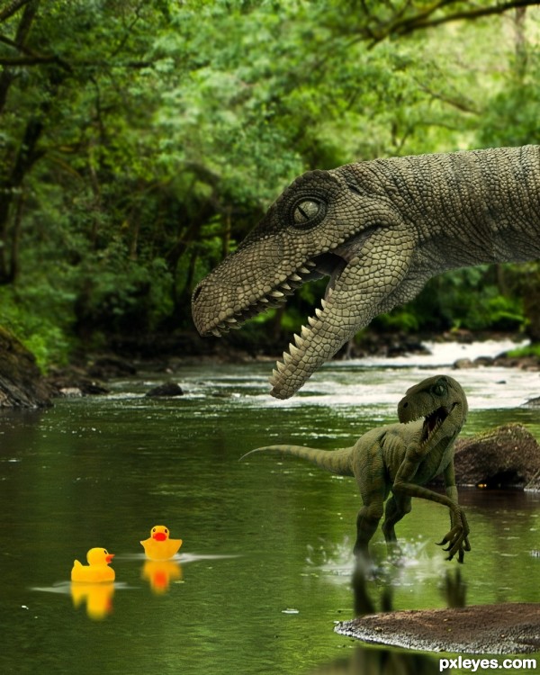
Swimming in the river was fun, until these velociraptors showed up! The fun is over, at least it looks like....
Thanks to mqtrf for the pic of the river, and to grafixar from morguefile for the two pics of the velociraptors. Just a little work, but lots of fun. (5 years and 3157 days ago)
Would have been even funnier if the big raptor was about to eat the small raptor who is intent on eating the ducks, but it's still a good image. GL author. 
Hey Bob, this is fun, isn't it? Yeah, I did not think of that, good idea. Maybe my next! Glad to see you safe from Irene....! 
hehehe!
It looks like the little velociraptor is running away from the duckies. I would have been better if he was behind them (compositionally speaking). He's also a bit too dark in front. But it's a very imaginative idea!
These 2 raptors must be very scared as they never seen rubber ducks in their era. It's very nice artwork composition, where the bigger raptor appears very sharp and close, whilst the smaller one is a little bit blurry to show depth of field. The eyes of the raptors are focusing on the rubber ducks to direct the viewer that the rubber ducks are the main actors in this stage. The colour harmony of yellow and green emphasize the funny scene of rubber ducks that are "lost" in the dinosaur era. Thumbs up
Thank you for comments.....
nice work author like it
looks very realistic
HEY! LEAVE MY DUCKIES ALONE YOU BIG MEANIE MONSTERS!  Great job author!
lol munch munch  Nice chop Author
Good job on those reflections. Real funny picture. Good luck, friend.
Thanks again for all comments. MnMcarta: Thanks for your pic, it was cool working with it!
Cute
the ducky do not seem to be afraid...
what an !dea sir ji.. 
Poor thing, he can't even start swimming until this big dino comes @ it!!!! 
Lovely work author! 
Howdie stranger!
If you want to rate this picture or participate in this contest, just:
LOGIN HERE or REGISTER FOR FREE
Howdie stranger!
If you want to rate this picture or participate in this contest, just:
LOGIN HERE or REGISTER FOR FREE