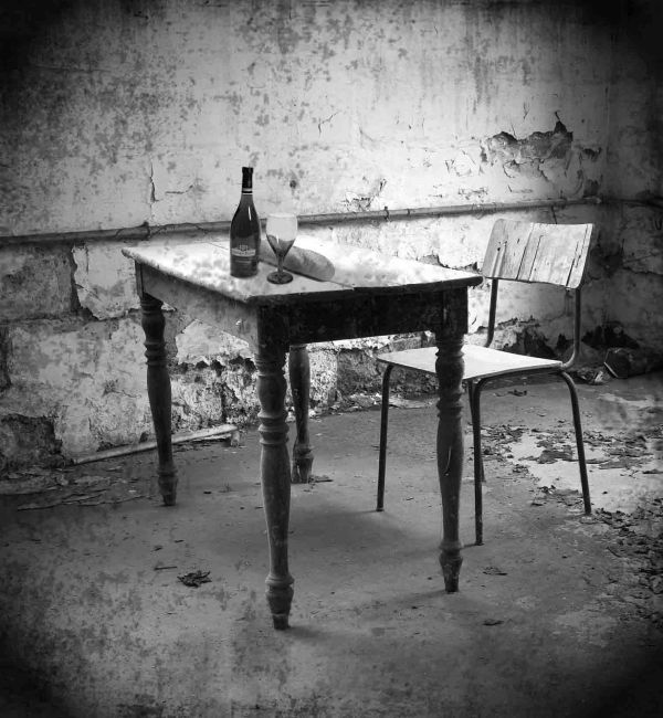
(5 years and 3690 days ago)
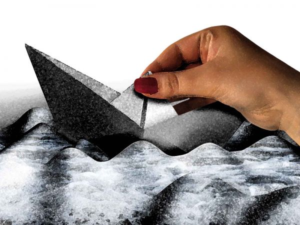
(5 years and 3691 days ago)
I couldn't imagine what to do with this image, but you've done a very nice job with it.
Good. I agree with pearlie, this is not a easy source
it was a bit hard but i was enjoying working on it 
it was a bit hard but i was enjoying working on it 
... WELL DONE  !!
!!
Nice 1!
Howdie stranger!
If you want to rate this picture or participate in this contest, just:
LOGIN HERE or REGISTER FOR FREE
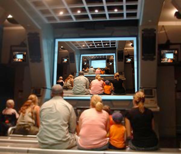
special thanks to creations. (5 years and 3692 days ago)
author.. please supply your sources (even if it is your own picture you have to put a copy of it into your step by step) very on theme image.. hate to see it pulled on a silly technicality
(just go to my stuff, my contests and click the add SBS thingy on the bottom) and up load the original pic and/or source
IT's a shame you couldn't get a more in focus picture. Yeah as Drivenslush said, just stick the pic in your SBS and you will be fine. You have to make an SBS anyways so the mods won't remove it.
nice idea 
Howdie stranger!
If you want to rate this picture or participate in this contest, just:
LOGIN HERE or REGISTER FOR FREE
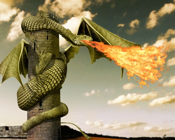
view Highres before voting. (5 years and 3704 days ago)
very nice , voted against myself here..... lovely work! good luck
killer image, great work! 
you could make the flames a little more hehehe, kidding, it's perfect
Nice work with the shading, I like the claws too. The lowest part of the tail on the left side can do with a bit more masking and the turn around the tower looks like the dragon has a knack there. If you make the turn from the tail shorter, it will look more natural curved. But well done for the rest! Good luck!
Edit: tail is fixed, including the masking 
Great job 
thanks for the tips wazowski. i believe i fixed the turning problem of the tail (you was absolutely right), but i'm sorry, i can't tell where is the masking problem.. anyways i hope it's better now.
it seems like your dragon is burning its wing, at least that's what i see. otherwise, i like the idea, good luck to you 
Wow... \o/!...
Fantastic work...Few minor observation...fire is just a bit strong and unnatural...and i think that the wings are to low...They have to start in the line of front legs...Beside that...fantastic thing...good luck author
not an awesome entry................ But Its an extra ordinary... Fantastic one......!!!! claps for you...!!
Flame could be better blended in Multiply mode...
My Favorite....!!
niceeeeeeeeeeeeeeeeeeee
i tried different blending modes and different settings for the fire, i was most satisfied with this one.
better without the fire
Really nice chop Author! Well done 
thank you.
aaarrggghghh, I've set fire to my bloody wing !!! lol Nice well done
nope. the wings are behind the flames...
nice!
In the top 2 for sure, congratulation in advance 
nice!!! 
Congrats for your second place, Inanis!
congrats for 2nd place...
congrats !!
thank you all for your high votes, favs and comments.
Congrats!! 
Congrats!!
Congratz to 2nd
Congratz to 2nd
Congratz to 2nd
Howdie stranger!
If you want to rate this picture or participate in this contest, just:
LOGIN HERE or REGISTER FOR FREE
Nothing to saY:P (5 years and 3761 days ago)
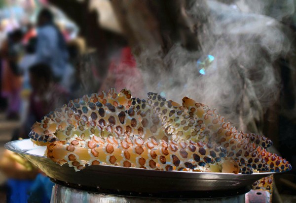
there is blue sky in the horsetail. the "steam" is coming from behind it. you didnt cover a piece of corn on the left.
I cant understain you . what u want to say , i think that the smoke is ok.
it doesnt look like it tastes good 
There is blue scky from the original source image. Color replacement would have helped.
nice job 
thank you all.
Howdie stranger!
If you want to rate this picture or participate in this contest, just:
LOGIN HERE or REGISTER FOR FREE
not bad
Good effort....
no shadows, and can't see the pipe through the glass, nice though
nice work
Good Job. GL
Howdie stranger!
If you want to rate this picture or participate in this contest, just:
LOGIN HERE or REGISTER FOR FREE