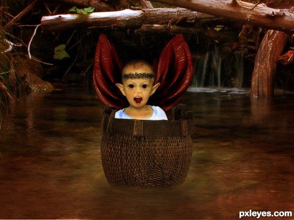
ears r made with the liguify tool
source 7 removed the kid only used the basket (5 years and 3049 days ago)

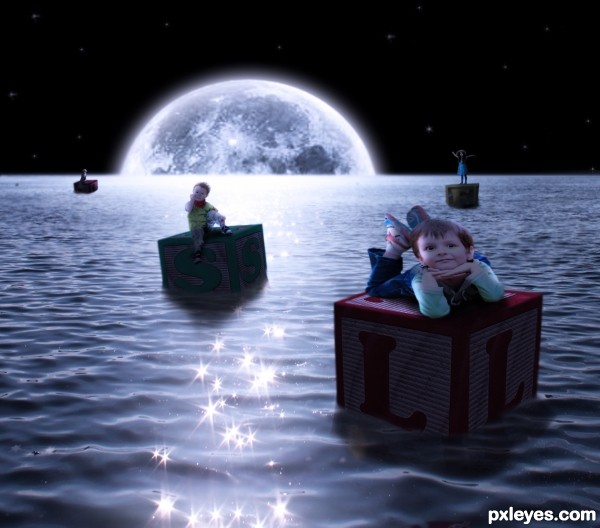
To the moon apparently! (5 years and 3065 days ago)
The boy floating on the right hand block is very deformed, leaning too far to the left. If you use Edit>Transform>Warp, and bring his head a bit to the right and round it out a bit, he will look much more natural.
Link for source 5 doesn't work. Re: foreground boy. Holding down the shift key when resizing (scaling) will avoid distortion. GL author. 
Oh lord, thanks CMY! Theres always at least ONE source that is a pain in my behind 
I really like how you darkened the blocks...being in front of the main light. Excellent touch.
Howdie stranger!
If you want to rate this picture or participate in this contest, just:
LOGIN HERE or REGISTER FOR FREE

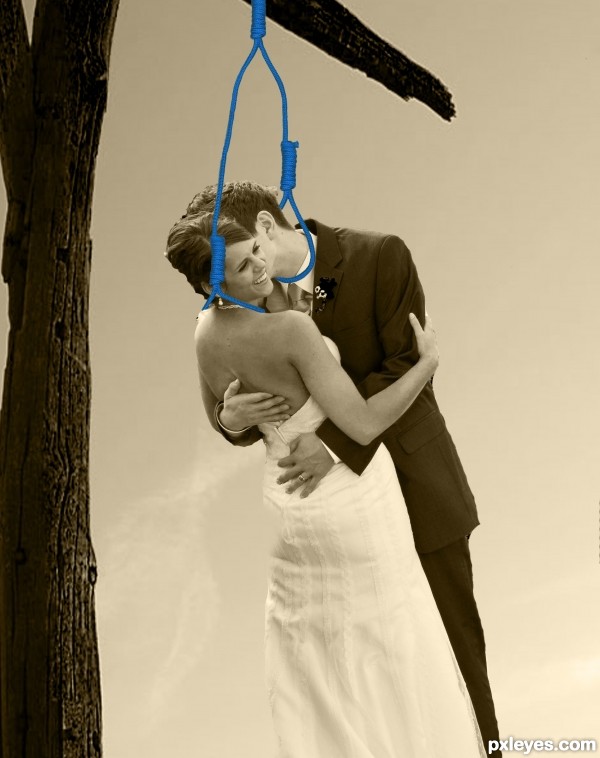
Picture is meant to capture the happy couple just before they take the plunge. (5 years and 3136 days ago)
LOL!
suicide  lol..
lol..
she looks happy
LOL...there's no way the rope on the nooses would look like that...it'd be pulled straight down. IMO this isn't even funny.
To:CMYK46
True love can be Twisted.......They are happy to die together.
OK, I admit it.......I'm Twisted!! LOL
comment about the nooses being loose... I think it's because the flower girl hasn't pulled the lever yet,silly.
I`d hope this image is supposed to be quirky rather than realistic, lol
To: Geexman
That and i just started learning Photoshop.
Mayby you should remove all colors instead of just have the ropes colored
my comment wasnt meant to be offensive author, some of the best artists can do drastic chops to be quirky, its just hard to judge sometimes. Still a great concept 
To Geexman
Thank You
Wow..... it is like a love story.... Romeo and Juliet.... Marc Anthony and Cleopatra.... etc....now the newly weds..... Good job....good luck.
Jordy!
Thanks for the Favorite i need that!!
George55
Thanks, Im glad you like it.
Howdie stranger!
If you want to rate this picture or participate in this contest, just:
LOGIN HERE or REGISTER FOR FREE

Spec Thanks to vitalyzator for use of this picture found on Flickr photo sharing.com (5 years and 3142 days ago)
Perspective on front of train is off. Look at the different vanishing points to correct.

Thanks all 
Howdie stranger!
If you want to rate this picture or participate in this contest, just:
LOGIN HERE or REGISTER FOR FREE

(5 years and 3150 days ago)
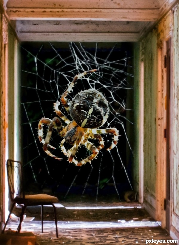
It's creepy, but too sharp in focus compared to the rest of the hallway around it and the chair in front of it. Maybe soften the outside edges of it very slightly to give it better continuity...
Very effective image indeed! GL author! 
I have worked on entry as you suggested Mossy. Hope you like it..
Howdie stranger!
If you want to rate this picture or participate in this contest, just:
LOGIN HERE or REGISTER FOR FREE
EEEEKKKK..hit him with a shoe!!! very fun entry!!!
Take him home .... he is so cute!
I take that back sorry .... he's not as cute anymore LOL ... it's too bad our orig were pulled I'm still bumming about mine.
you can always suggest a contest where it is alowed I think hes still a lil funny creature
i know he is not as cute as they other, still bumming bout that also weatherspc, in the spare time i had i changed it
Howdie stranger!
If you want to rate this picture or participate in this contest, just:
LOGIN HERE or REGISTER FOR FREE