thanks to deathbycanon-stock
longstock,flaviacabral,phantompanther,urbannature,xstockx
ThePropagation3,BrokenFeline-Stock
(5 years and 2906 days ago)
9 Sources:
(5 years and 2933 days ago)
Howdie stranger!
If you want to rate this picture or participate in this contest, just:
LOGIN HERE or REGISTER FOR FREE
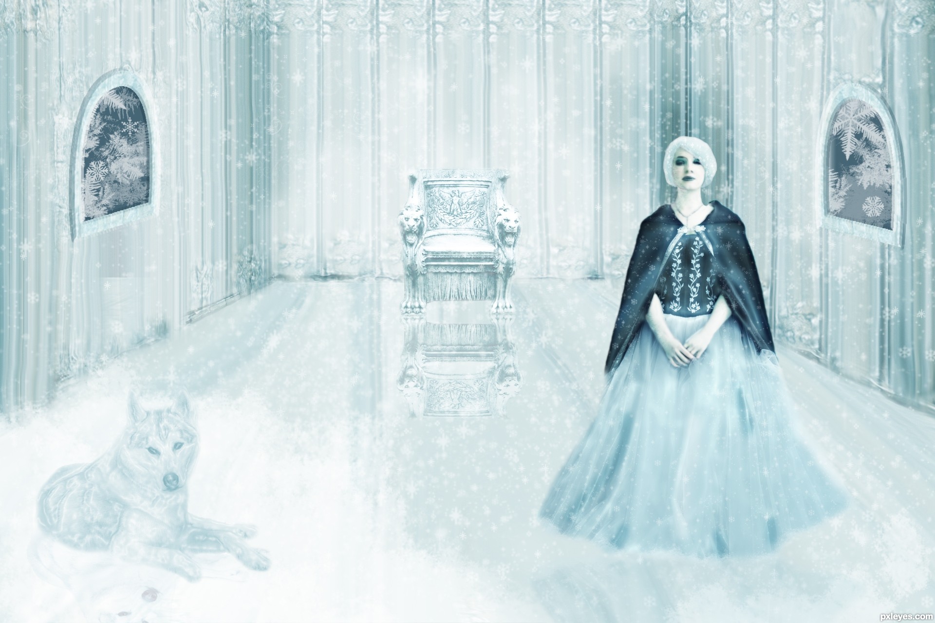
Thanks to tigg-stock for ice queen photo, to TOTGStock for throne photo, to obsidiandawn for glitter brushes and also thanks to echiax for husky photo (5 years and 2967 days ago)
Howdie stranger!
If you want to rate this picture or participate in this contest, just:
LOGIN HERE or REGISTER FOR FREE
(5 years and 2986 days ago)
Howdie stranger!
If you want to rate this picture or participate in this contest, just:
LOGIN HERE or REGISTER FOR FREE
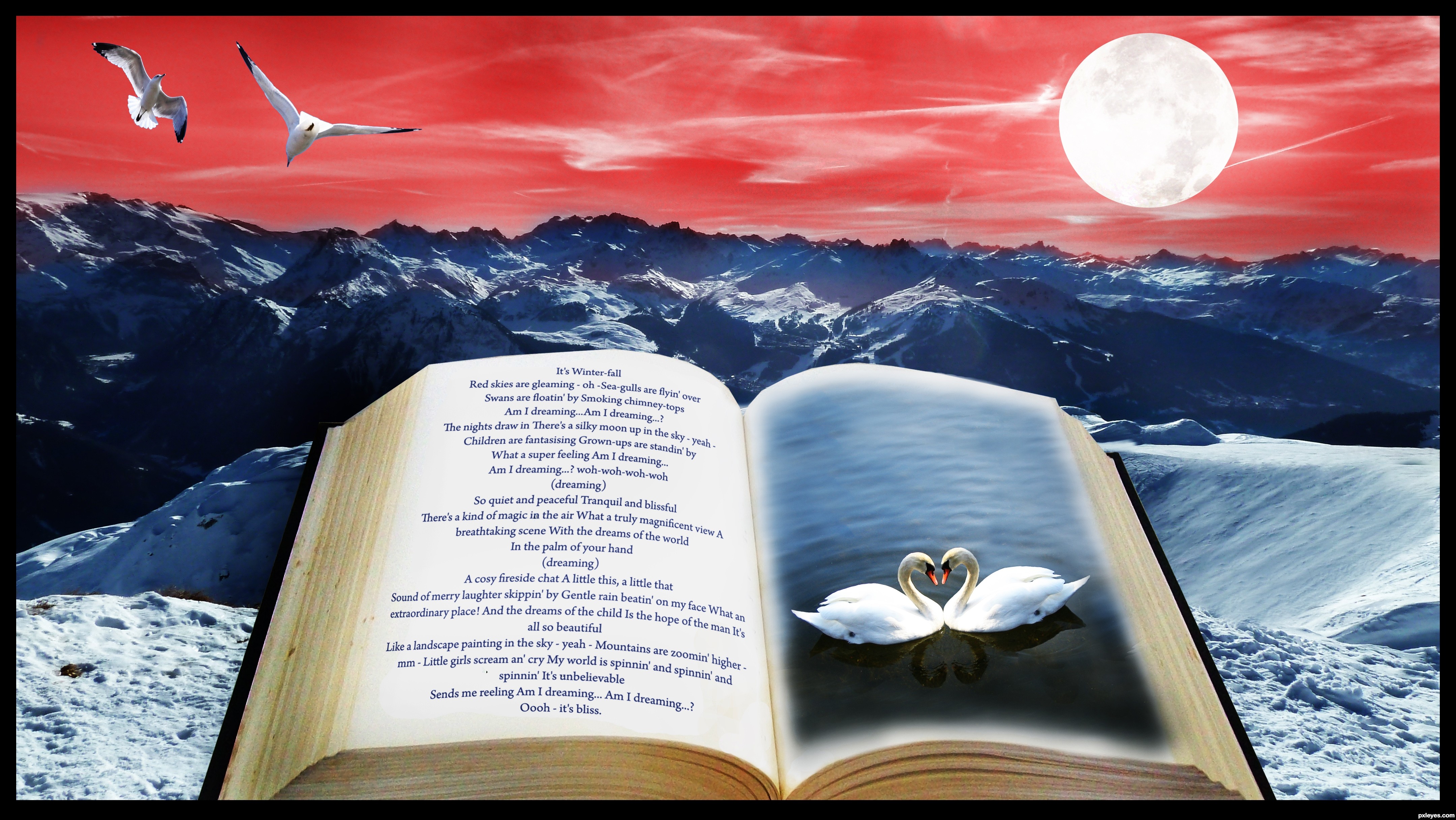
A Winter's Tale - Made in Heaven 1995
Mask, blending, cloning, painting, distortions, adjustment layers
Swans Credit http://agutrot-stock.deviantart.com/
Book Credit http://luna-8-stock.deviantart.com/
Mountains Credit http://senzostock.deviantart.com/
(5 years and 3033 days ago)
Howdie stranger!
If you want to rate this picture or participate in this contest, just:
LOGIN HERE or REGISTER FOR FREE
Photography and photoshop contests
We are a community of people with
a passion for photography, graphics and art in general.
Every day new photoshop
and photography contests are posted to compete in. We also have one weekly drawing contest
and one weekly 3D contest!
Participation is 100% free!
Just
register and get
started!
Good luck!
© 2015 Pxleyes.com. All rights reserved.


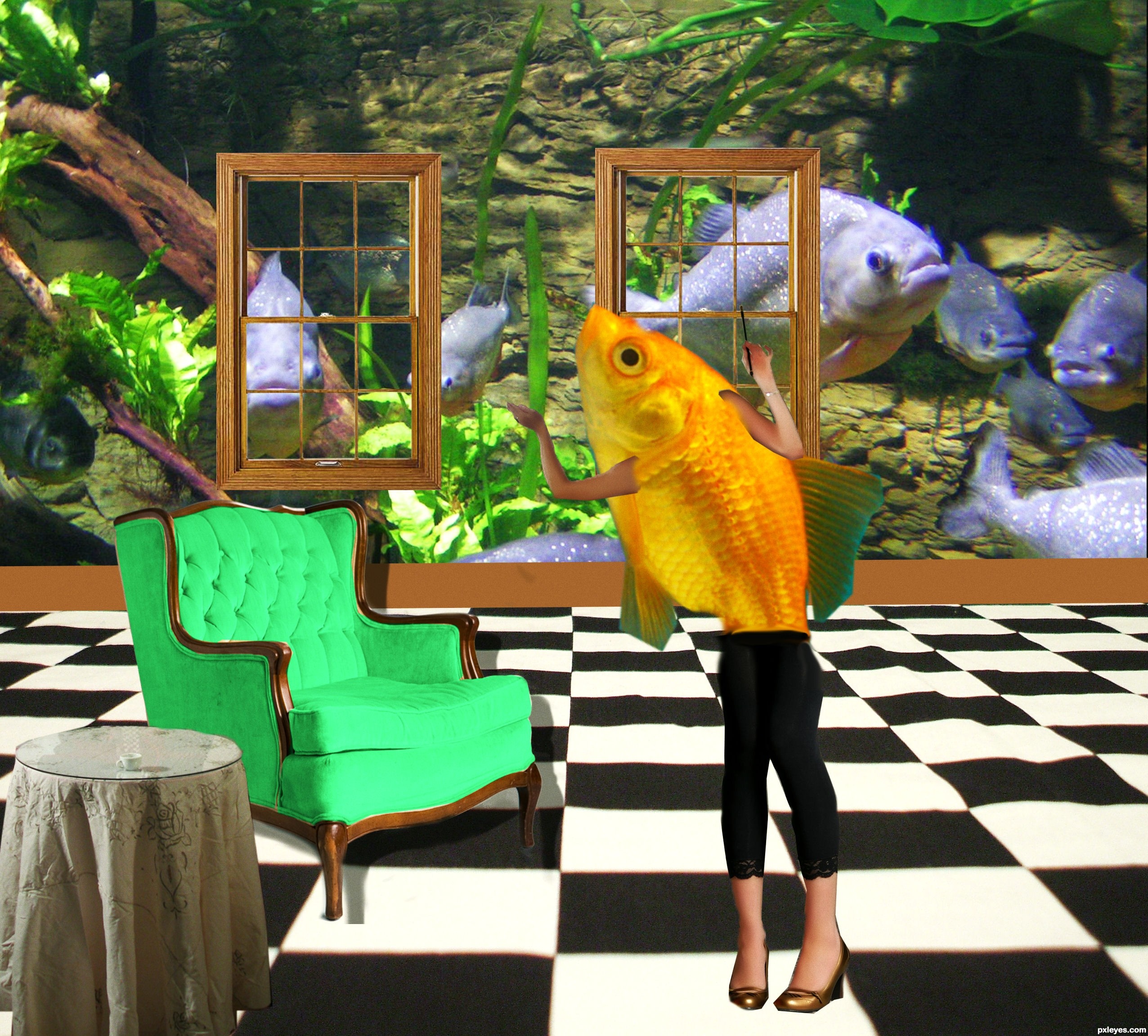
Surrealism is a good approach for this theme. I'm not sure what tale the fish is telling, however. IMO eliminating the distracting wallpaper so the windows and baseboard are just suspended in space would be more surrealistic and would give a lot more attention to your dramatic background photo (which has erroneous lightning reflections in the water but those should not be visible here). I think the fish that is supposed to be the focus would then stand out a lot more. Even if the window pair were centered, I would consider deleting the right one and moving the left one so it's centered on the Rule of Thirds' left vertical line. The table and chair have different perspectives than the floor. The scale of the chair is odd given that it's in front (not way behind) the table. Nothing seems to be casting shadows. [Surrealistic does not mean totally unrealistic.]
let me know if this is better
I agree with DanLundberg on the wallpaper. The color/pattern of the wallpaper is taking the focus away from the fish. Its completely up to you if you wanna keep it as it is.
let me know if this is better
This is much better than the previous one.
This is much better IMO. I like how the cool green/blue/neutral palette of all the background elements makes the warm orange/yellow fish stand out more. I also think the title revision with the new exterior view that's under water creates a more coherent story (or tale, if you will ).
).
thank you much
Howdie stranger!
If you want to rate this picture or participate in this contest, just:
LOGIN HERE or REGISTER FOR FREE