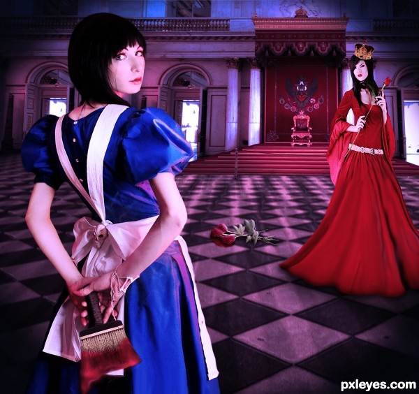
Alice was nothing but a trouble maker. (5 years and 3069 days ago)
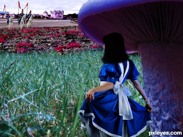
"http://www.morguefile.com/archive/display/745306" Used but didn't make the final pic. (5 years and 3069 days ago)
Nice idea. I think the perspective is too distorted. The castle has unreal height. The roses seem flat ( are stretched a little to much). This is only an oppinion. Good luck!
smooth brush it's bad don't use smooth brush while deleting backgrounds.
The hair looks too plain, you should increase the detail. Good luck.
this one had potential, but what was said before I'd only be repeating...
Howdie stranger!
If you want to rate this picture or participate in this contest, just:
LOGIN HERE or REGISTER FOR FREE

One of my fav and epic movies of all time. (5 years and 3209 days ago)
Howdie stranger!
If you want to rate this picture or participate in this contest, just:
LOGIN HERE or REGISTER FOR FREE
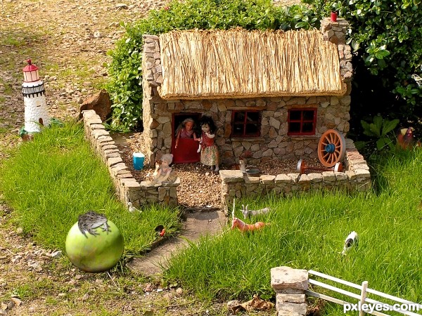
(5 years and 3227 days ago)
shadow on the 'vegetable'...(isn't it?) is wrong... g l 
how do you mean hereisanoop?
the light source is coming from the right upper side' you can see it on the wall of the house
the light source on the veg is from the other side and that`s wrong.
The easiest way to solve your shadow and light problem, author, is to flip the "marble" horizontally. I see you are trying to change the light and dark with other manipulations - that is much harder and usually doesn't work too well. If you still have your original image in separate layers (a good thing to do until contests are over, by the way), just flip the marble and you will see a huge difference, and the light and shadows will match. Good luck!
Thank you elemare, I made the change, hope it is better now
You're welcome! So glad you liked my tip. I find that matching and/or creating shadows and light are probably the most common challenge when adding outside elements to scenes.
Very cute...nice job!! best of luck!!
Howdie stranger!
If you want to rate this picture or participate in this contest, just:
LOGIN HERE or REGISTER FOR FREE
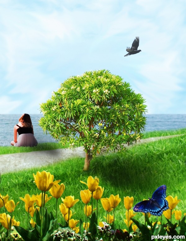
(5 years and 3262 days ago)
That's a huge woman!
No it's a little tree 

Nice idea..but some things needed to fix..
1. Women is too huge as compare to whole composition.
2.Increase slightly tree and the tree shadow's width.
3.Decrease the size of bird and the butterfly.
And the most important thing, mood is missing here. It's necessary to boost your entry. You can do it by using Gradient Map, Solid color with different color, opacity and blending modes. Just try and see the difference. If you need any help just send me a PM.
Thank you 
Congrats for 3rd
Thank you
Congrats!
Thank you
Howdie stranger!
If you want to rate this picture or participate in this contest, just:
LOGIN HERE or REGISTER FOR FREE
i don't like roses on the ground because of shading and paint on brush is to blurry, but overall is nice work
Nice image, but the skin tones are too magenta. A warming filter, or a selective color adjustment to the reds, adding more yellow should help this a lot.
Great composition..
That she was, although her intentions were generally good. Nice take on the story, well executed.
Howdie stranger!
If you want to rate this picture or participate in this contest, just:
LOGIN HERE or REGISTER FOR FREE