(5 years and 3430 days ago)
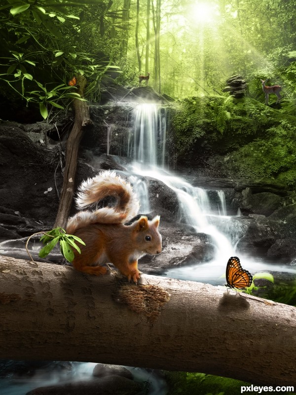
The squirrel's tail was made with the hair. See SBS. (5 years and 3633 days ago)
Nice looking image. Maybe just try to color match the tail a bit better. 
I agree on the color, but very cute scenery here.
Very natural, beautiful image! 
Good idea..... nice image!
Thanks for your comments all. CMYK, I was struggling with the same thought when I created it. On the one hand, I wanted to keep the hair intact as much as I could. But on the other hand, I wanted to make the squirrel as realistic as possible... I am going to give it another try 
incredible work!
Indeed a nice looking image. There is a lot of light in the scene. Would expect the squirrels shadow to be darker, considering how much light is hitting the tail, also the fawn in the B.G. by the pile of rock is a tad to sharp to be believable.
great great great work ! i like it . good luck
beautiful entry ......... 
beautiful entry ......... 
Amazing scene author,light effects are perfect...best of luck
cute little pooter 
Made a few changes, including the tail's colour and shadows. Thanks for the comments all.
Well done.
Beautiful scene and composition.  In high resolution 2 deers look sharp. Making them a bit blurry will match with background. Good luck
Thanks Nasir for checking the high res with your keen eye, changed it!
This one made me smile.
This is so beautiful! Creative use of the source. Great job, author!
Well done and Good luck Author.
Gefeliciteerd met je 2e plaats.
congrats for the second
Congrats Ressiv. Now that's easy to recognize your entries: clean, clear, with vibrating colors. Keep it up buddy!!
Congrats! for 2nd place 
Congrats!!! 
Howdie stranger!
If you want to rate this picture or participate in this contest, just:
LOGIN HERE or REGISTER FOR FREE
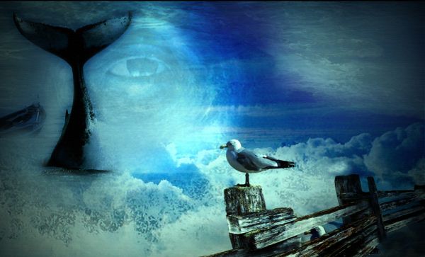
Blending modes,Dry brush (5 years and 3811 days ago)
I really like this.
Links are not good,lead to download page...and u cannot use some other's manipulation...Link of the sea is premade picture,so its not valid....
Good idea...fix link 5, and supply links for eye & boat.
erathion if you see that where the link opens, and trce it back to the main site, it sayd free stock....maybe he just needs to credit that person...I dono
Sweet scene, well done author.
Lovely........
All the sources were downloaded from http://amygdela.com, which is a free stock photos.The link for the eye is in the step guide
Very imaginative.. great job!
Edit: What software did you use for this? It looks very artistic if it's Photoshop... good job!!
to ponti55.-Thanks for the comment.I always use photoshop
Links are from stock base,and all except first one are valid.Image of the sea is some others manipulation and u cannot use some others work for your project.Only photos are allowed. I am sorry because i am pointing to this.Your work is great composition and i like it so much,but we all have to be guide by some rules....
Source 1 is an 'all rights reserved' photo. It isn't a stock photo so you can't use it unless you have permission in writting from the original photographer.
the source was deleted!
this is my favorite
great job 
Howdie stranger!
If you want to rate this picture or participate in this contest, just:
LOGIN HERE or REGISTER FOR FREE
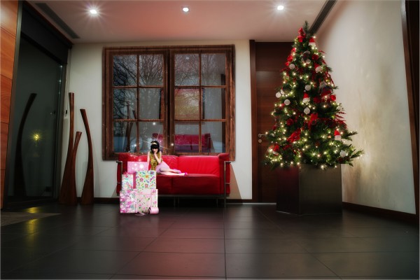
Credit model: Janjayne http://janejayne.deviantart.com/art/they-do-not-believe-146151407
Credit presents: Premier Packaging http://www.flickr.com/photos/retail-packaging/3523017534/
Credit Winter Dusk photo: GermanGirl http://www.sxc.hu/photo/1147288 (5 years and 3862 days ago)
Am I not getting this? Why is the figure so small?
 It's a fairy.... That's the reason why the title is "Wrong tale"...
The Incredible Shrinking Woman? Not exactly a fairy tale but that was what first came to mind. Feel free to tell me if I'm wrong.
Well, Jawshoewhah, she's a fairy, pixie or something like that... Small people, though I think she looks huge there. And she has nothing to do with the Christmas scene and she knows to judge by her look  .. I made the manipulation for fun...
Alrighty then. Good enough for me.
LOL. I used to hate faries, thanks for bringing me back around
Howdie stranger!
If you want to rate this picture or participate in this contest, just:
LOGIN HERE or REGISTER FOR FREE
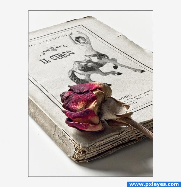
EDIT: the permission for the book source is in the SBS.
Thanks to David Resenes (http://www.flickr.com/photos/dreneses/) for the beautiful book.
*
I made a young centaur melting a little dancer and the horse, to create a creature who reminded me the fantasy tale's atmosphere of the circus.
*
I tried to give the centaur the look of an old illustration using different patterns, and used the Circus decoration like a publishing house logo. Then i completed the word Circo using a C like base for the last O.
The dancer and the book are Flickr images. (5 years and 3962 days ago)
i love those romantic stories behind a circus... by the way.. i visit this particulair circus every year.. but i never had seen this lil cart so I took a picture because it was such a nice lil car that it tickled my fantasy. I had expected a lot of colorfull works.. but yours dont have that many colors at all and is still very pretty.. i like it
beautiful work! High marks 
Simple yet outstanding love this... 
Wow!
I love old books. This is really nice. Especially the flower.
this is awesome! The only little thing is the "IL CIRCO" is not centered under the design above it--I would move it over to the right just a tad. Love this.
Madrid? 1,50 pesetas? this book is Italian or Spanish?  , cute image, BTW
It's a Spanish book about an Italian circus. Maybe. (n_n)
Terrific... beautifully composed... everything just fits... awesome job!!
beautiful, nice idea 
Nice work. Looks convincing, but please add the other source link too.
You did a wonderful job!  It's such a lovely and natural looking image. Good luck
gratz!
Congrats, deserved!
Congratulations for your first place! 
Congratulations for 1st
congratulations for your first, this is so very deserved!
Congrats, really nice work 
Congrats, angeluzend!
Congrats!
Congrats for 1st 
Congrats!!!!!!!
Congrats!
Congrats!
Howdie stranger!
If you want to rate this picture or participate in this contest, just:
LOGIN HERE or REGISTER FOR FREE
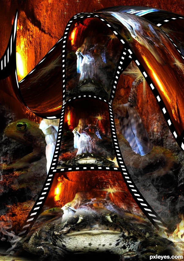
very interesting creation...its a bit confusing but the idea is very unique...gl
very nice chaotic oic
I like your thinking and idea here. Perhaps if you give the top area of film where it curls some lightness...brighter. If you gradually make the inside of the curl darker it'll give the image some depth...which I think is why for some it may seem chaotic. Nice work, author!
Points for concept for sure ... very unusual take on the source.
thanks arca...pixelkid...enblanco....erathion..i will work on lights ,,thanks for the comments
nice entry
Howdie stranger!
If you want to rate this picture or participate in this contest, just:
LOGIN HERE or REGISTER FOR FREE