Just source (5 years and 3368 days ago)

Ok....I have only one word to say about this....looooots of work...and lots of sources!
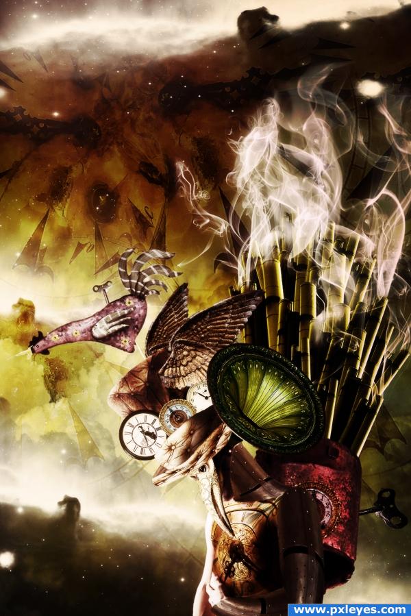
I have dreamed to create a steampunk image for a long time now...and I'm happy I got the chance to do it!
Hope you find it interesting for a first try!
First of all million thanks to Becky Stock on deviantart for the great man image, at http://b-e-c-k-y-stock.deviantart.com/.
Then credits to:
- "csnyder" at http://csnyder.deviantart.com/ for beautiful clouds images;
- "cepolina.com" for a great mask image at: http://www.cepolina.com/freephoto/;
- "strwberrystk" for the little key at: http://strwberrystk.deviantart.com/;
- "sunira"for a great great galaxies free brush at: http://sunira.deviantart.com/.
Please see also extra sources:
1. http://www.sxc.hu/photo/1137812 - Clock for backround
2. http://www.sxc.hu/photo/1067358 - Clock 1 on hat
3. http://www.sxc.hu/photo/1111976 - Clock 2 on hat
4. http://www.sxc.hu/photo/1080261 - Clock 3 on hat
5. http://www.sxc.hu/photo/1044042 - Rooster
6. http://www.morguefile.com/archive/display/5202 - black hat
7. http://www.sxc.hu/photo/452382 - wings on hat
8. http://www.sxc.hu/photo/950983 - Furnace
9. http://qbrushes.com/photoshop-abstract-brushes/smoke-brushes/ - smoke brush
10. http://sunira.deviantart.com/art/Nebulae-Brushes-18959502 - Galaxies Brush
Please see high resolution and also be kind and wait for SBS, will be posting it tomorrow as it has been a long day on photoshop for me...!
Hope you like it! (5 years and 3918 days ago)
wow awesome image author
quite the storm... so much going on.. but I'm guessing this is great Steam Punk  (this is going to be quite the contest woo HOO) (this would have gone great in my old office..hehehe)
Wow! Great source search and great result! 
Very, very nice.
cool!!
FANTASTIC!!!
Ouch, super art, fantastic work here. Excellent.
it looks really magical! a beautiful thing to look at 
I'm speechless... 

It's interesting, I just can't tell what I'm looking at...
This is amazing! However ,I had to look through your tutorial to see the metal thing on the bottom was a guy. Perhaps warping the metal around the body to better fit a muscle would help, and straightening some things.
I'm with CMYK46: it's hard to know what to make of this. I think the mish-mash of the hat is particularly to blame. The three clock faces make this look like a collage as they cast no shadows on each other, face flat on to the viewer despite the three-quarter pose of the hat wearer, and are not constrained by the hatband's left edge. The far wing is too far back to match the three-quarter pose. The upholstered hat itself is flat and doesn't match the three-quarter pose either. I see from the SBS that the rooster is part of the hat, but then it, too, is heading off in the wrong direction.
Bottom line: I would simplify by ditching the hat but keeping a free-flying mechanical rooster. The gramophone horn is cool but may seem weird without some sort of horn coming out of his other ear.
Its interesting to see when people comment so see what imangation they have on work like this~~For me i think its a wonderful work what i see is a bird which is half human and tin he has smokin bagpipes playing out the loudspeaker and he has to tame the time with music before his key runs out~~I think its a stunning piece of work i wouldnt change a thing colours are great. Well done author
i am amazed by this... Great Job...
Amazing blending and manipulation here, perfect work author.
Congrats Cornelia! 

congrats
con grats on 3rd place..
Congrats!! No surprise here
congrats!
congrats!!
Congrats!!
Most obliged to everyone for the Congrats!
Brilliant work!
Congratulations for 3rd
felicitari!
Howdie stranger!
If you want to rate this picture or participate in this contest, just:
LOGIN HERE or REGISTER FOR FREE
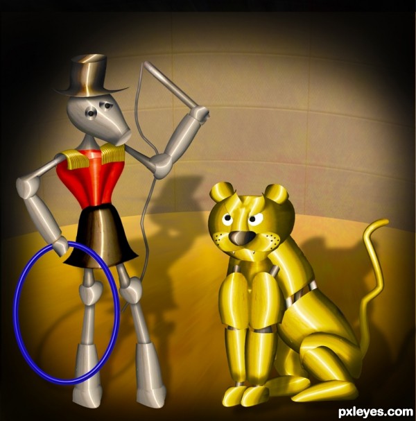
Love the lion's expression! GL author.
Nice job, author! I like all the various transformations of parts. One small suggestion...maybe if you soften your edges a bit, it will blend a bit better. Like the use of the image as your background as well...nice source usage here.
Great construction author...Lion looked so pissed...LOL...best of luck
Congrats for 1st
Congrats!!
Congrats again Geex , love the expressions
Congratulations on first place!
congrats on first...
Howdie stranger!
If you want to rate this picture or participate in this contest, just:
LOGIN HERE or REGISTER FOR FREE