(5 years and 2584 days ago)
- 1: source1
(5 years and 2613 days ago)
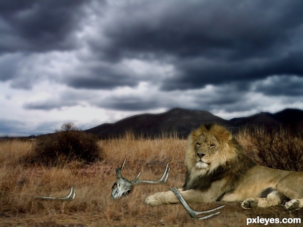
Nice image, just a few ideas  Instead of blurring that part of the mountain maybe use some low lying clouds or even try get hold of another image with mountains in the background, you could then keep the foreground of this image. When doing hair its hard, we all go through it but if you use the lasso tool etc you can adjust the feathering
  Took me a long time to catch on to that one. Lastly is the skull in question, it still looks like its floating on the background, it might be because of the bluring in the rest of the image, makes the different textures stand out. But hey, you have a week to play with it. Goodluck
Nice idea. The smudge tool is your friend!
Howdie stranger!
If you want to rate this picture or participate in this contest, just:
LOGIN HERE or REGISTER FOR FREE
(5 years and 2655 days ago)
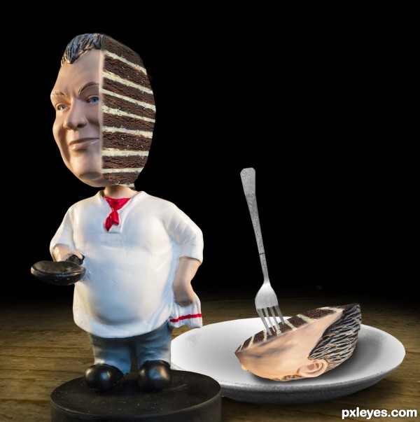
good idea -- the shape of the slice on the plate would not be the shape you are showing -- it should slope down from the forward edge -- using one of the transforming tools in photo shop or what ever you are using will correct this perspetive issue
yeah I was havin a hard time making it look right, but that seems to help a lot thanks for the input
Howdie stranger!
If you want to rate this picture or participate in this contest, just:
LOGIN HERE or REGISTER FOR FREE
(5 years and 3472 days ago)
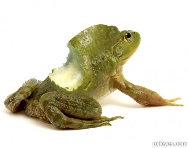
That's Funnny... add some tomato sauce over there....  Good luck
YEEEEEEP (hehe) now make it really gory LOL (Great Idea.. and great job)
Thanks for the comments
hahaha so cool. XD
good and funny one
what an idea ............. great job ............... 
Splendid job.. both the idea and work.
THIS IS GREAT!!!!!
Very good and cute :]...gl
*oooouch which hungry princess has bitten this frog-king? haha I like that idea and also the work.
NOOOOOO!!! Your supposed to LICK the frog!!!!!
great job author
Great mix of distgusting and tasty.....and now I`m hungry!, great job 
French people love Frogs legs, with some garlic and butter hummmmmmmm!!!!
hahahaha....so cool work author...gl
Well done - congrats!
congrats!!
Congrats!!
Howdie stranger!
If you want to rate this picture or participate in this contest, just:
LOGIN HERE or REGISTER FOR FREE
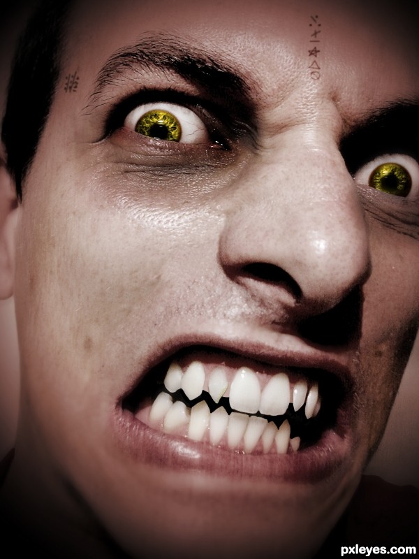
The writings on his skin are not images but just done with a brush.
Thanks you Ale_Paiva for the Person! (5 years and 3551 days ago)
Interesting chop. Maybe desaturate the skin a little to make it appear paler ? Good luck ! 
He's spooky, Cherish is right about the skin tone.
Thx I made it more pale.. 
Looks better. Just a suggestion though, Vampires don't have wrinkles and some skin imperfections, they just have the perfect type of skin, I would suggest removing all little imperfections with the clone tool, but that's just IMO. 
Eyes and teeth are good and i like the Imperfections but that is more personally preference. The writing on the skin looks to be floating just above it, maybe try a simple overlay and then duplicate the layer to improve contrast, also adjust the orientation a very small amount mainly the writing on the forehead.
Thanks for the advice  I'm working on it...
i really like the eye color
Very threatening. The skin tone could be a more ashen (less red). The tiny tatoos don't add anything IMO.
The eyes are about the only thing that make this a vamp..The teeth are just in bad need of a dentist more than anything. Although the in your face" effect you've created can be frightening and of a resemblance to a vamp, it just doesn't quite make it for me, IMO.
Howdie stranger!
If you want to rate this picture or participate in this contest, just:
LOGIN HERE or REGISTER FOR FREE
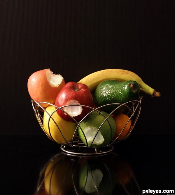
You have naughty kids in your house, taking a bite of the fruit and putting it back in the bowl. Well done
Yes, I can't keep track on them! Thank you, Madame
Reminds me of the scene from Coal Miner's Daughter, when little Ernie takes one bite out of every apple in a big bushel of the fruit and Loretta Lynn (Sissy Spacek) has to make a bazillion jars of apple butter all day. hehehe
Really fun Chop ... good luck
This explains why some author turned these fruits to vine in another entry =)
I like a lot your association, thanks!
great one!
Thank you, did my best there
Nicely done.
Oh thanks. I was afraid that you will find some perspective issues there!
Convincing result, well done with masking the basket. Good luck!
Thank you, much appreciated!
Very realistic!!! Wow!
Thank you a lot, Janna =)
Congrats Great work!!
Thank you
Congrats
Congrats , nice work
Congrats!
Thank you all, I'm so happy right now!
Congrats!!
Congrats for the nice composition!
Howdie stranger!
If you want to rate this picture or participate in this contest, just:
LOGIN HERE or REGISTER FOR FREE