(5 years and 4046 days ago)
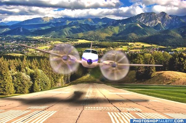
- 1: runway
- 2: background
- 3: A/C windscreen

shadow fixed.
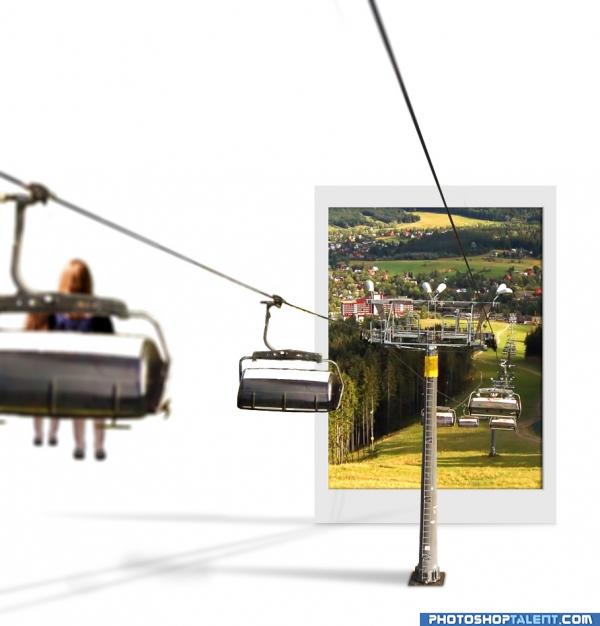
Add woman and her children on another glider.
Add depth of field by give it a lens blur.
your comment please! (5 years and 4054 days ago)
Photograph's shadow seems awkward to me, but nice job overall 
window to europe! 
@kid: any idea why? The shadow for pole looks like that.
very good oob work 
that's a good example of thinking outside the box:P
what about the shadow for the cable's and the seats
This image just scares me. Like a dream I once had. 
The photo is so thin, it wouldn't have much of a shadow at all....
This concept is a good one, but I think it would be more effective visually if the car going into the photo was brought outside into the "white space" a bit. the partial in and partial out of the frame is distracting from the idea.
except for a couple of blurry spots on the photograph, this one looks visually brilliant.. do get rid of those blurry spots.. gl 
I LIKE IT... really is good work AUTHOR.. in my humble opinion.. this would be magnificent in a billboard with an ad in the white space.. "leave your white dimension behind.. etc.. etc.. brilliant.. the tech stuff will happen but the composition an Idea are out of the park.. good job
Nice change of pace. I like the depth too. Great job! The white space area can have all it's own properties...shadows, color etc....since it's separate from Tatra. Very good.
Now you've got two light sources: one for the shadow of the pole and one for the cables...pick one.
good
love the idea, gl author
seems like the images should be blury farther away not close up?
AWESOME ! I LOVE IT!
very good concept! 
Good work author!!!!
original 
Good work, they would enter the tatra realm, but where are they coming from? My mind is aching!! 
good work but if there is no camera blur it will be perfect
nice idea, very creative, good luck!
like the white background and shadows. very cool. maybe the woman+chair is too blurry?-you could just blur the second chair a bit if you cant make the woman clearer. good job!
nice job 
Very Nice! 
Brilliant idea very well executed!
Nice entry! If I were doing this pic I would hide the base of the pillar. GL!
you did very well, keep going.
Howdie stranger!
If you want to rate this picture or participate in this contest, just:
LOGIN HERE or REGISTER FOR FREE
Nice blend...if he's landing, I think he forgot something.

Edit: Oops, sorry for the assumption! On second look, nice reconstruction of the plane.
No he's not landing he's making a low approach/pass with the gear up at 250 knots
wow.. that's a zoomer.. excellent .. need and SBS if possible.. would love to see the process
nice work ...keep it up
looks great,I love it.
I think yor perspective, lines on the tarmac, and shadows are right on. Great job on a good idea. Good luck! (p.s. I hope he has landing gear and this is not a crash approach!)
woo hoo.. I LOVE how you made the propellers..that was why I wanted to see the sbs.. never thought to spin and blend etc.. I thought you used radial.. SUPER COOL TECHNIQUE.. knew it would be..heheh.. good luck on this one.. it's AWESOME
good work
nice work...uh, they might want to put down the landing gear...soon!!!
Thanks everyone for the nice comments. I purposely made the aircraft with the wheels up. In the world of aviation this is a common practice a "low approach" it is done for practice and proficiency.
I can almost hear him wroom above my head . It's just my opinion, maybe it was meant to be like that but the plane looks a bit too magenta.
@pthree, thanks you were right, I was thinking that myself. I made an edit to the color at bottom of airplane...I think it looks better
Very nice work, well done, I dont think the rotor blades need that blue/purple on them...
that is awesome!!!!!!!!!!!!!!!!!!!!!!
Great work author, love the propellers.
Get that landing gear down or we're going to ...........Nice idea author.
Nice work
nice job , , but i think that the shadow of the wing that closer to the ground ,,, should be darker than the other..
bbunni1404 , You were exactly right. Thank you very much for that call
WHOAH that shadow is awesome
INCREDIBLE
Nice job! Good effects! Particularly smooth work on the propellers and shadowing!
very nice work, BARNEY THE BIG PURPLE PLANE
great!!
Congratulations for 3rd
congrats for 3rd
CONGRATULATIONS!
congrats
Great work...!! congrats!!!
congrats Chappy!!
Howdie stranger!
If you want to rate this picture or participate in this contest, just:
LOGIN HERE or REGISTER FOR FREE