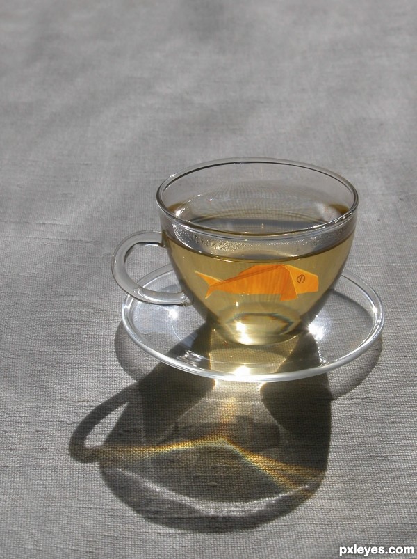
Goldfish origami in a teacup (5 years and 3228 days ago)
- 1: source1
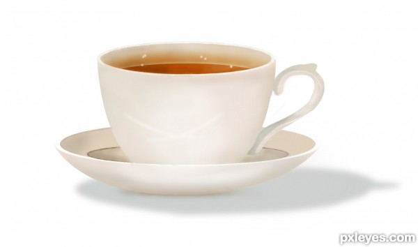
Thanx to hereisanoop (5 years and 3335 days ago)
Very clean work, looks quite realistic. Well done!
Excellent job! The tutorial may not instruct this, but if you put a smaller and slightly darker shadow directly under the saucer it will really help the realism. Nice work. 
Very well done. Excellent following of the tut and super finished image.
woooowwww .. that's my cup of tea.... well done author... 
Fantastic reproduction of great tutorial...well done author and well done Anoop for creating this priceless tutorial...GL
Howdie stranger!
If you want to rate this picture or participate in this contest, just:
LOGIN HERE or REGISTER FOR FREE
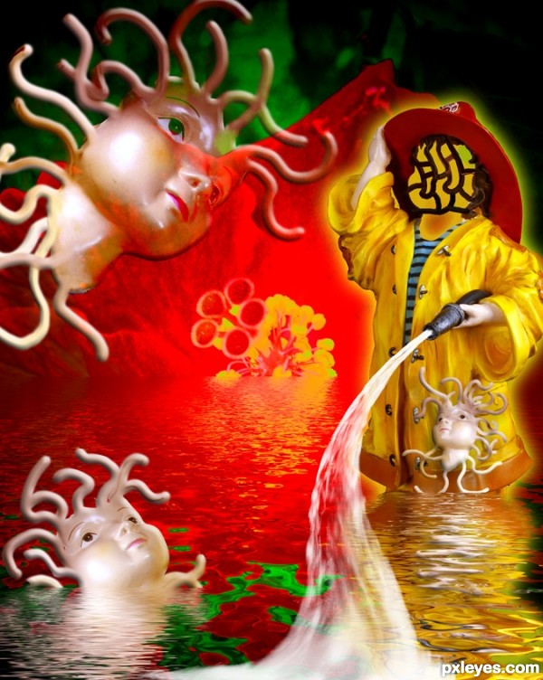
source and my photo (5 years and 3352 days ago)
Brainfreeze composition- i might not totally get it, but i like that you paid attention to the reflections so they look realistic.
I agree. I tried to make the water once and was not successful at all! Nicely done here IMO 
Have u had some of those tablets from the sixties...LOL. Good work
Fantastic,psychedelic,weird and super cool...great job author...very well done
what a weird and wonderful mind ;p
I don't really get it, but its different to look at, got my attention 
@Kelly22 and Greyval, well the heads represents teabags, the tentacles seepage, the head/face a strainer, the hibiscus the tea, and the water is the surface of the teacup, and the fireman the stirrer...
or it could be the oversuffed Raviolios I had for dinner.. you be the judge (I shouldn't have had it with the chocolate milk and cheesecake)
I liked the red, yellow and complementing green combination. Also liked the reflection details.
"or it could be the oversuffed" (Magic Mushrooms in the) "Raviolios I had for dinner.."
Yeah man, I'm pretty sure that's it ! 
Wild! GL! 
Sooooooooo weird, are you sure you don't add some special weeds to the Hibiscus he-he-he 
Howdie stranger!
If you want to rate this picture or participate in this contest, just:
LOGIN HERE or REGISTER FOR FREE
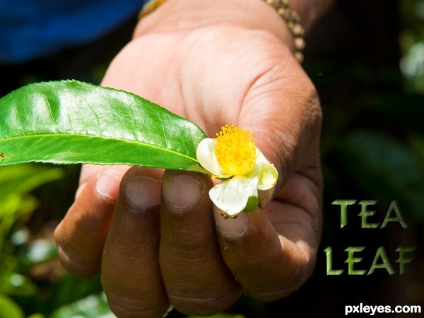
Thanks for the image of leaf and hand by minglespy. (5 years and 3489 days ago)
Very CBR.
Oh dear, sorry you think that Lamantine, quite a bit of work went into it, and I've seen a LOT worse!  (See SBS)
I have to agree with Lamantine!
You only used the source in the text? 
...and a 9 step sbs to show it.
i think you could have made the source more relevant to the piece. such as making a background for the hand to be over instead of the original sources background. would have brought more attention to the source image of the contest.
No CMYK46, I also used it for the leaf in the persons hand and used overlay and a few other things - it's all in the sbs. I think jadedink has viewed them, if so - thanks!
Ah jadedink, I used the whole of the background image because it was a tea plantation and that was the whole point of my pic - making the single leaf into a tea leaf. I really don't want to say this: but tea comes from leaves...... THAT'S the point I was making.
my point still is, you can't really SEE the source being used. i mean, i HAD to look at the 9 step sbs just to see if you'd tried to use the source in any other way.
Don't take all of this the wrong way, its just, there are SOOOO many entries in different contests in which the source is minimal, or...barely seen at all. I was just trying to be helpful in suggesting using it in a way which people could see without having to look through 9 steps on how to make a leafy text.
I don't get it...except for being lighter, the leaf is the same as in the source pic.
CKYM46, that's a compliment really although I appreciate that you didn' mean it to be. Well - the leaf is taken from the source image as shown in step 6 of sbs and then I used overlay. So in all the source image is used roughtly nine times in all to create this picture. That's 8 times to make the text and once for the leaf. Now I'm leaving the building!
like the font. good luck Author
It's hard to deny the author's observation that "I've seen a LOT worse!" Nevertheless, this still seems rather slight. Making the text a lot more prominent, and perhaps more of an advertising message instead of just a label, might help.
Seriously, not much use of the source here. I don't need to go to your SBS to see where you used it.
This isn't CBR'd. It's minimal use and you COULD have used more of the source.
Yes, seriously jawshoewhah, you're right! 
Howdie stranger!
If you want to rate this picture or participate in this contest, just:
LOGIN HERE or REGISTER FOR FREE
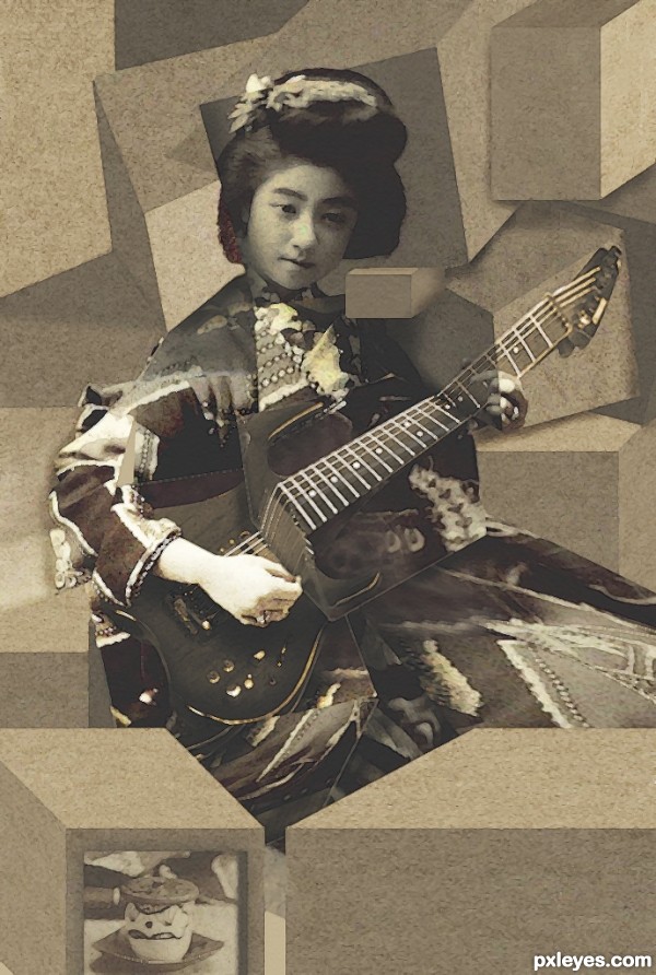
Not traditional cubism I know, more of a literal take on it (5 years and 3523 days ago)
nice job
very nice work,good luck
I think there's no limit for art! Nice entry. 
just like you three guys said....nice....!
Nice idea with the actual3D cubes. The guitar part looks awesome, dunno about leaving the whole head part intact. I wonder if giving some shadows and shading for the boxes would take it out of cubism, not so familiar with the style myself? Good image anyways, quite creative viewpoint.
very awesome i can tell a quality image when i see one
I really think this is interesting using the 3d cubes. I agree that doing something with the head may add another element to it. Nice job!
very nice work...gl
Nice retro look 
Howdie stranger!
If you want to rate this picture or participate in this contest, just:
LOGIN HERE or REGISTER FOR FREE
I like the choice of an origami fish as oppose to a real one (I know we are going to get a naked human sooner or later
Thanks!
Howdie stranger!
If you want to rate this picture or participate in this contest, just:
LOGIN HERE or REGISTER FOR FREE