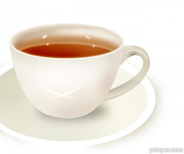
tutorial by hereisanoop
a tutorail i wanted to do ! (5 years and 3636 days ago)
- 1: source1
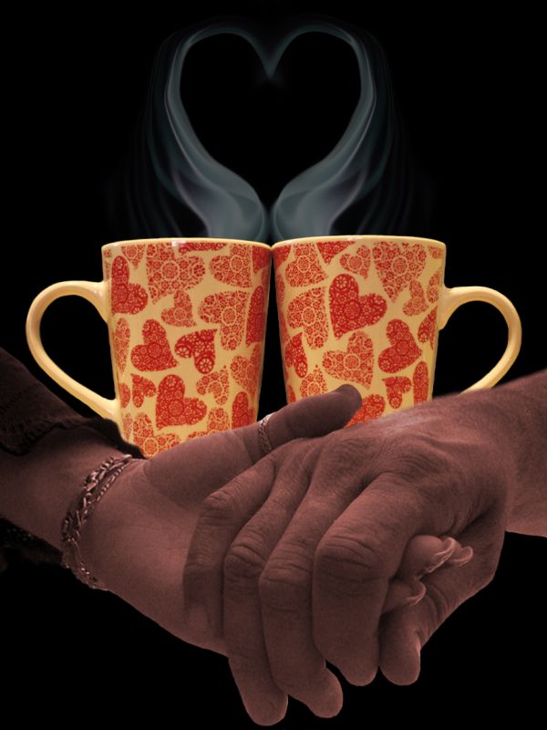
A real love goes through the years... (5 years and 3650 days ago)
nice one...gl
Howdie stranger!
If you want to rate this picture or participate in this contest, just:
LOGIN HERE or REGISTER FOR FREE
(5 years and 3656 days ago)
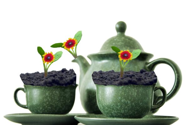
And who put flowers in your tea..?
Hehe cute one  I think you could fix the dirt a bit more, unless you like it like that but it's a simple fix you can just use the warp perspective on the dirt and put the 2 top ends down to match the cup curve. If I make any sense lol. It's just to sharp to look piled up.
Could use a bit of work to clean the masking of the flowers and the rear most flower should be blurred to match the teapot
the dirt actually looks like an oasis ( a piece of foam soaked in water used in floral arrangements and bouquets and fake flower arrangements) are they fake flowers??
I agree with Jello...
dirt chop a bit rough ... different idea though, well done
Howdie stranger!
If you want to rate this picture or participate in this contest, just:
LOGIN HERE or REGISTER FOR FREE
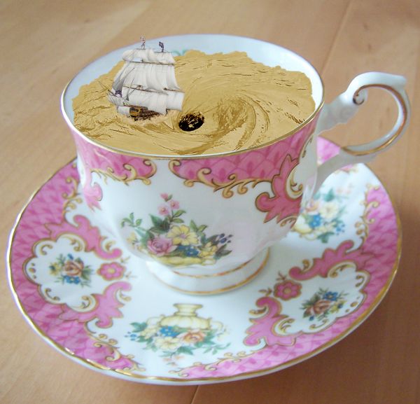
Thanks to arrsistablestock, angelmoon17 and obliteratedstock of deviantart.com for the use of their images. (5 years and 3656 days ago)
nice idea -- the edges of the water (tea) are too smooth the waves and ripples should disrupt the edge -- the colour of the tea seem a bit off (Maybe because it don't take cream) IMHO it would be a better effect if the colour was more tea like
great 
Nice  agree with alan about the color, it could use some contrast. Cool so far good luck author.
Thanks for your comments and tips guys. Much appreciated. Hope this looks better.
edges are good improvement colour of the tea is still a bit odd. I found playing with this image that using comibination of Curves & Hue and saturation layer set to a hard light mode I was able to get a more tea like appearnce to the water
Or change it into a hot chocolate cup! 
Well, thanks again Alan. I really appreciate you taking the time and effort to help me out on this one. I played around with the light modes and this is about as close as I can get it. I think it looks more like the correct colour now.
P.s lol at erikuri. That would have probably been easier 
Unique idea! GL!
Howdie stranger!
If you want to rate this picture or participate in this contest, just:
LOGIN HERE or REGISTER FOR FREE
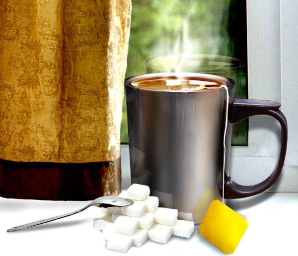
sbs soon.. (5 years and 3729 days ago)
Very nice, you didn't overdo it, i think the reflections are great. Good luck!
Perspective of sugar cubes is different than cup, shadow of yellow tab is opposite that of cup handle, but still a nice job...
Nice job! But how many sugar do you use in youre tea? 
Congrats for your second place, Kitty!
Congrats
Howdie stranger!
If you want to rate this picture or participate in this contest, just:
LOGIN HERE or REGISTER FOR FREE
Thanks for choosing my tut... its amazingly well done... the only thing I want to say is... right upper of the handle need not to be that much darker.... other wise better than me.......
seems that my screen setting been changed while i was cleaning it =p
VERY WELL DONE!!!!! Excellent
Very Welldone, this is the second time I am favoring this teacup!!!!!
you have done it, best of the contest. now I am confused that which one is better. The author's or hereisanoop's. Good Luck and high marks.!!
very good work, Good luck to both authors
Very nicely done. GL
Perfect again!
this is ultra realistic
all thanks to hereisanoop , his tutorial was Very well explained and was easy to follow on each step
well done
congrats.......
Howdie stranger!
If you want to rate this picture or participate in this contest, just:
LOGIN HERE or REGISTER FOR FREE