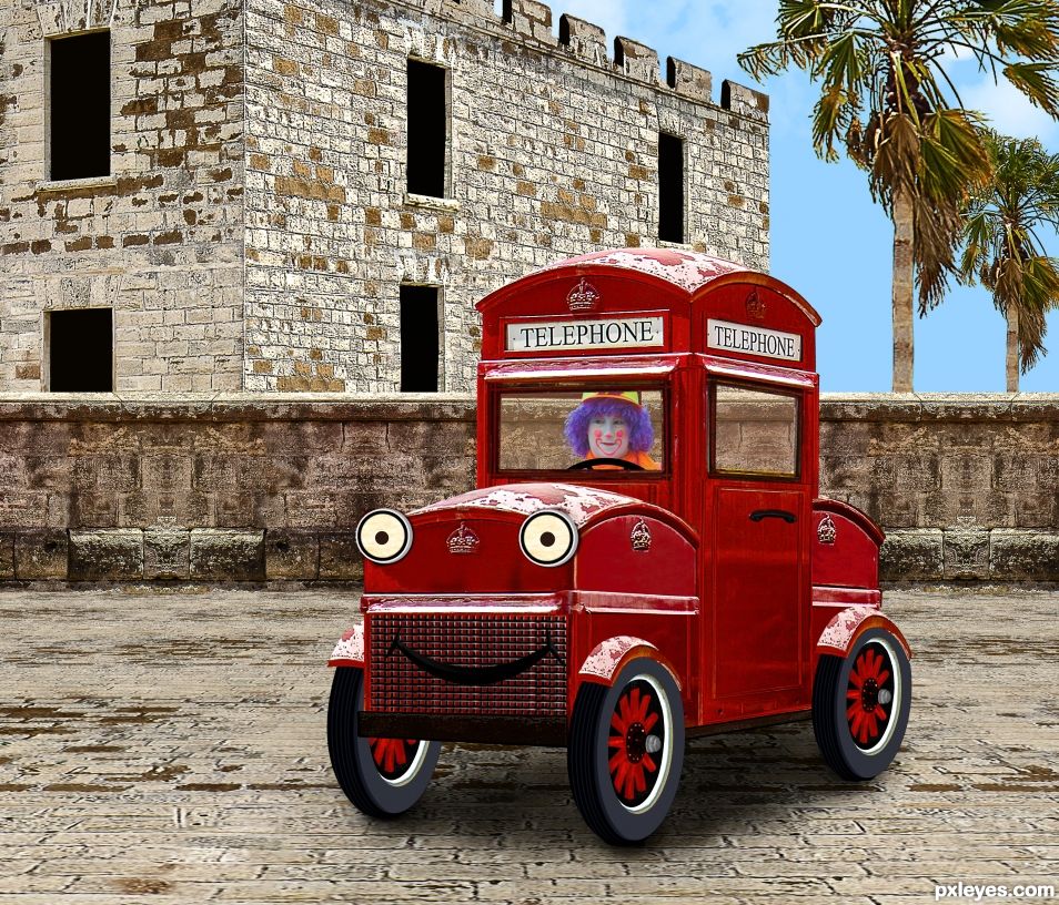
All source, except clown. (5 years and 1058 days ago)
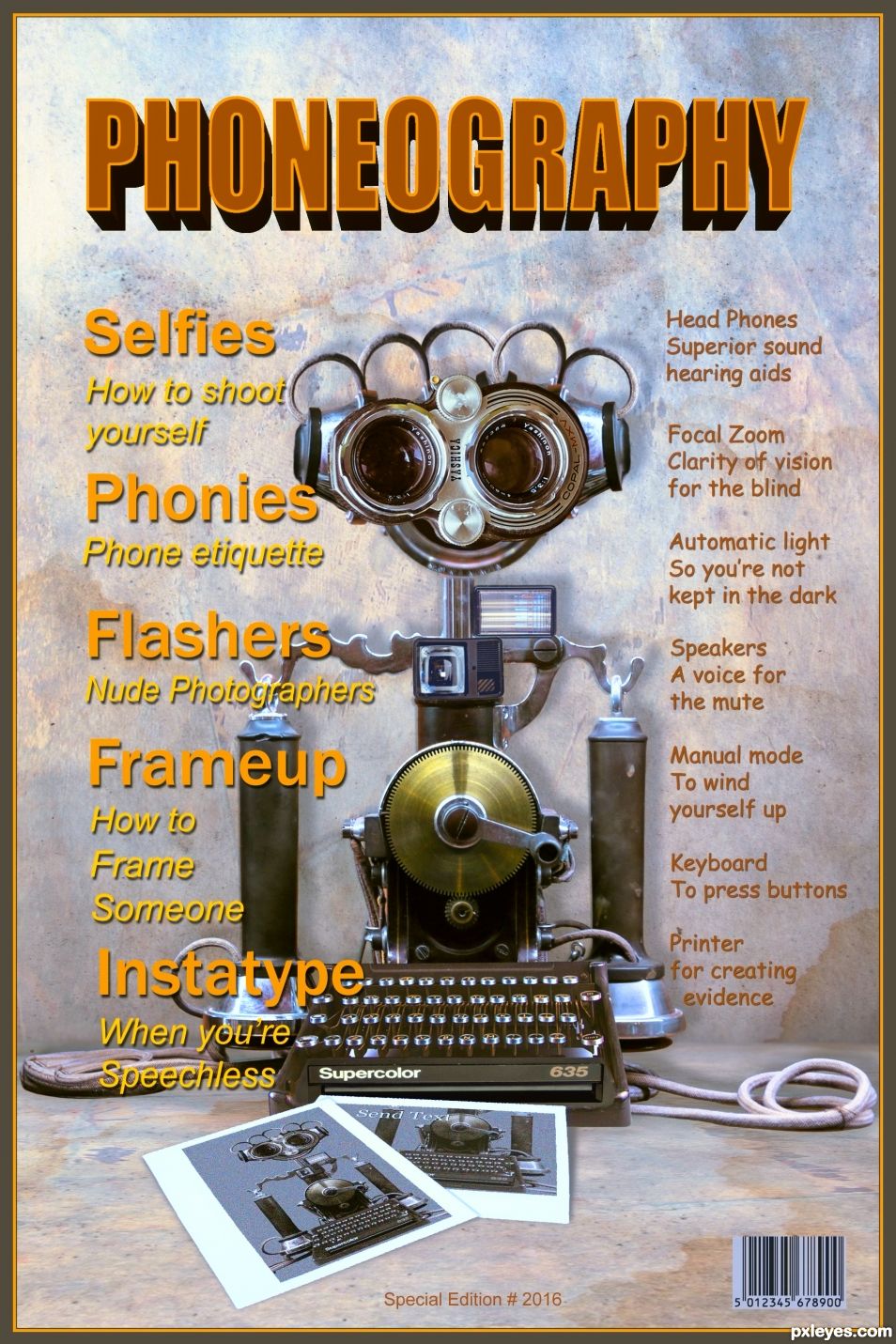
A rare vintage magazine cover. The communication device on the cover was the latest technology of the time. It could do anything you imagined.
The fonts used are.. Ariel, Impact, Comic Sans, Franklin Gothic which are all standard Photoshop fonts. (5 years and 1244 days ago)
Congratulations again...
Thanks George
Congrats on top 2 
Congrats, so funny and well done!
Congrats yet again!!
Thank you everyone
Howdie stranger!
If you want to rate this picture or participate in this contest, just:
LOGIN HERE or REGISTER FOR FREE
(5 years and 1384 days ago)
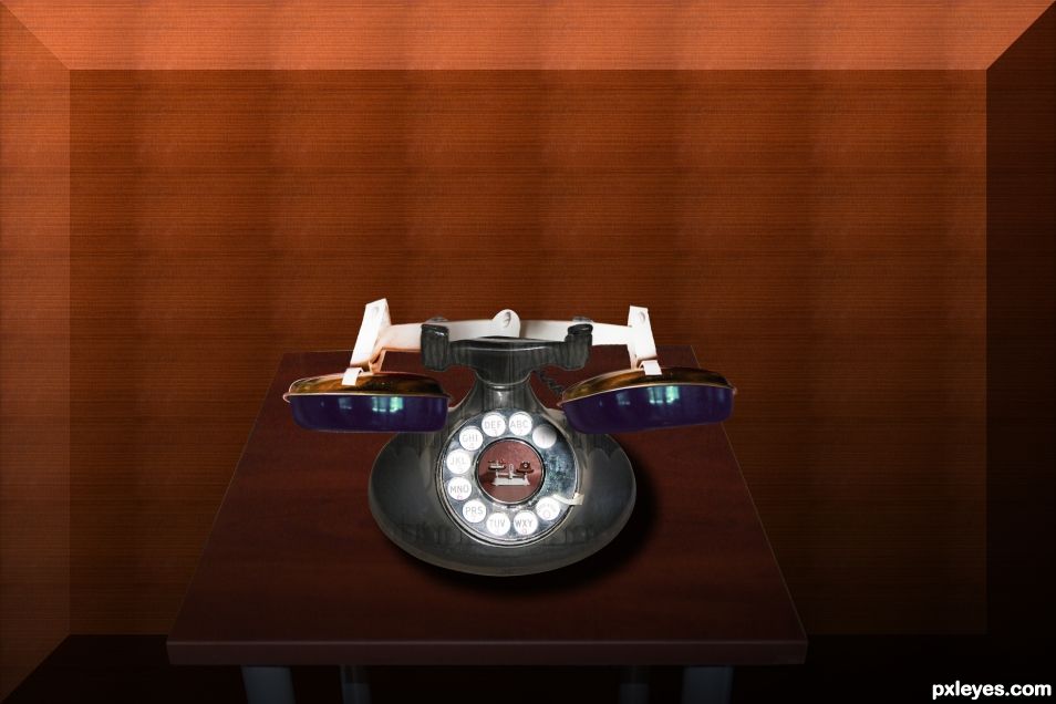
Good idea. Try to give it a surface to sit on instead of just a gradient background.
hehehe, good thinking, some one is going to get a whooping in the design department for non color matching LOL Good luck author 
I fixes the gradient as well as color combination i hope its better.. Thanks for feedback
Looks much better! 
agree, love the changes -looks much better.. creative .
Howdie stranger!
If you want to rate this picture or participate in this contest, just:
LOGIN HERE or REGISTER FOR FREE
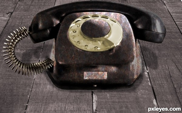
A metalic old phone (5 years and 2991 days ago)
It was a very good idea to use the milkfrotter source as a phonecord. It fits perfect for that.
Now dont take this personal but as a learning possibility please, the cutout of the phone is really badly done, this is because, im guessing you have used the magic wand, since it has a white background, but you have cut the shadow that the author of your phone source had on his picture also, and that shadow just doesnt fit with your adjustions.I suggest you go back to your phone source and cut it out again using the pentool this time and leaving out the shadows this time. Then you can apply all the other stuff you have done. And be aware of the light reflections, they should not be as bright on rusty old metal as on plastic, as Im guessing its plastic and not the real old material the phones used to be made of back in the days.
The shadowing that you have added yourself look ok to me. but you do need to tone down the lightreflections because they dont work compared to the softer shading and the old metal.
I like it, very nice chop for me 
Great idea!..
Howdie stranger!
If you want to rate this picture or participate in this contest, just:
LOGIN HERE or REGISTER FOR FREE
Resources + Images-http://euphoricdesire-stock.deviantart.com/
My hero has real wings.-http://wingsofahero.deviantart.com/
Youri-http://meandmymachine.deviantart.com/
Nicolas Raymond-http://www.sxc.hu/profile/somadjinn
Michal Zacharzewski-http://www.sxc.hu/profile/mzacha
Jose-http://zeta32-stock.deviantart.com/
Lavica-http://lavica-photoshop.deviantart.com/
Mila Vasileva-http://milavasileva.deviantart.com/
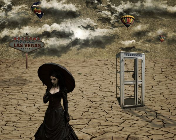
Thanks guys for the fantastic resources... (5 years and 3716 days ago)
Pretty ....
nice concept...n awesome colors composition...........
Shadows?
shadows would add depth.
Sorry about the shadow guys...i just add some...thanks for the suggestion i was forget for that...thanks again.
shadows fall two different directions... great image though! GL!
bjaockx sun is between 2 objects,so shadow will go in opposite directions.And something else,this is surreal contest...here the natural order is not in line... ...still thanks for your comment.
Nice image.
Shadows are in different directions but a nice image....Nice work...
Now I'm new here but what I don't understand is why usually everyone yells when there isn't a step by step how I did it. Then other times not a peep from the same people who usually toot the horn loudly??? Newbie wondering??
Shadows are fine. The light radiates from an obvious central object. And @ Martrex: read the FAQ. An entry doesn't need to have a SBS unless it is created solely from the PXL source with no outside sources. An entry with a decent SBS will usually get better votes, though...
Howdie stranger!
If you want to rate this picture or participate in this contest, just:
LOGIN HERE or REGISTER FOR FREE
Congrats, very well done and a terrific sbs
Thanks madamemonty. I feel so lonely with just one comment. But we got you, me, and the clown in the car, which sounds like a damned good party.
Congrats BWR!
Congrats BWR!!
Howdie stranger!
If you want to rate this picture or participate in this contest, just:
LOGIN HERE or REGISTER FOR FREE