Would love your comments on this one. Thanks in advance.
Updated. Thanks for the help. (5 years and 3555 days ago)

Used picture I took of friend and one other source (5 years and 3870 days ago)
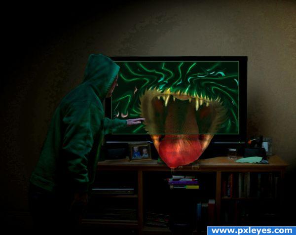
very funny picture.. but you might want to get rid of the green static going over the cat's mouth so it looks more like its coming out of the picture.. but it is your vision author... good luck (lots of fun!!!)
(the white spooky eyes in the kid picture is a great touch LOL)
Thanks for the tip Golem>>>fixed the green static
update....a little more touch up.
Very cool! But, I still see a green static on the TV. Are you sure you deleted that? Or maybe you can just delete the static part where the mouth is. GL 
or make the part thats coming uit of the tv green static too 
love this concept. now if only we could reverse it for chocolate ads.
Howdie stranger!
If you want to rate this picture or participate in this contest, just:
LOGIN HERE or REGISTER FOR FREE

This work was accomplished in CS3 with the help of the following tutorials:
http://www.pxleyes.com/tutorial/photoshop/1123/Make-a-Realistic-LCD-HDTV-from-Scratch.html THANKS BCS
http://www.pxleyes.com/tutorial/photoshop/1083/Make-A-Broken-Glass-Shard-From-Scratch.html THANKS ZAPHODQB
http://www.eyesondesign.net/pshop/speaker1/speaker1.htm
Fonts are from here:
http://www.dafont.com/ds-digital.font
The original source is on the TV screen...thanks!
(5 years and 3917 days ago)
You should add a step y step guide for this one so people recognise faster where have you used the source pic. You worked hard for this one, very nice, gl!
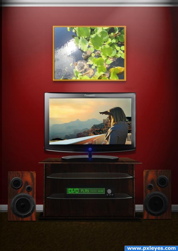
It looks nice, but i think that you should drop everything else, except for what's showing on the TV.. that looks fantastc! Unfortunatley i think you need to change the television's name to something like Panafonic so so that there aren't any copyright issues. Good luck!!
Perspective on speaker tops is off. Everything else looks good.
very good, but seeing that the light source is directly above the objects in the room, they shouldn't cast shadows to the right, only below them 
elficho and cmyk46 thanks for the callouts, I made changes per yor suggestions 
i totally disagree with ponti! the image is cool i just love those speakers and the stand is done very well indeed the speakers perspective is awesome on them too the tv also, is very well done! the lighting in the picture in the tv is awesome...very dramatic! the perspective on the scene is tip top also!
Looks verry good and I'm glad when, from time to time, i can recognize the original source, good luck.
Cool work - looks familiar!
Howdie stranger!
If you want to rate this picture or participate in this contest, just:
LOGIN HERE or REGISTER FOR FREE
cool idea
good 1, bt the television is looking a bit tilted IMO, good luck
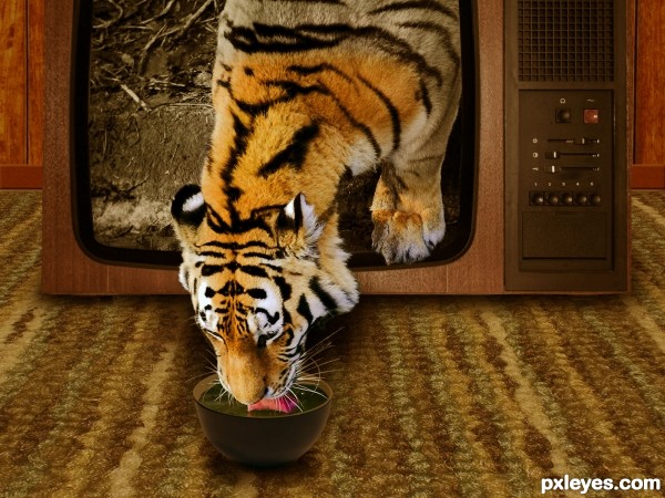
Great idea and very nice work author...My advice is to create 2 color adjustment layers to achieve better blending...brown color layer and golden soft light layer could work...best of luck
Very cool!
Thanks everyone! I updated my entry.
Chromathoughts, I fixed the tv shadow so it wouldn't look tilted, hope this is better.
Erathion, thanks for the tip. I couldn't quite figure out the best color to use for blending. Think this works?
yup, looks much better now, gud luck !
Howdie stranger!
If you want to rate this picture or participate in this contest, just:
LOGIN HERE or REGISTER FOR FREE