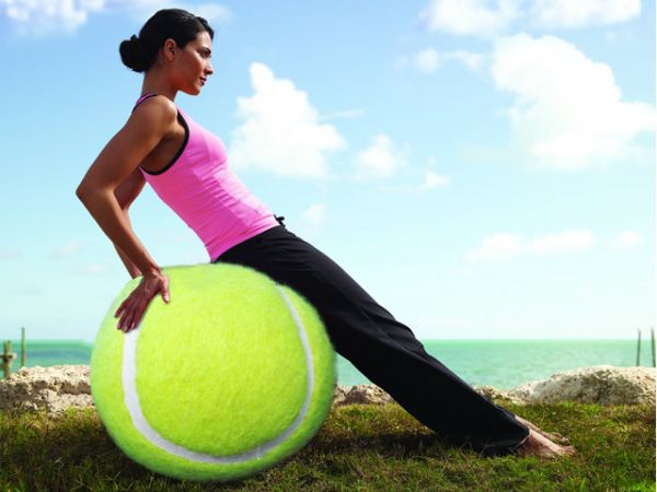
Hi Frndz.....
I'm using Yoga woman on exercise ball.
(5 years and 3671 days ago)
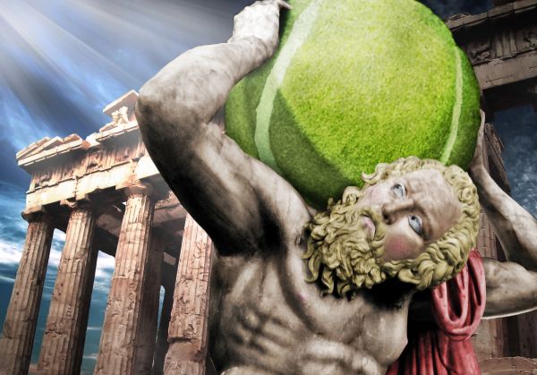
A forgotten piece of Greek mythology...
Thanks to Wikipedia for the stature image. Thanks to this tutorial for some techniques for making photos more dramatic: http://psd.tutsplus.com/tutorials/photo-effects-tutorials/how-to-turn-humdrum-photos-into-cinematic-portraits/
SBS will be added soon. (5 years and 3672 days ago)
wouldn't the light be on the other side of the ball??
The light is on the top-left of the ball...the light is coming from the top-left. Think I should emphasise the light more?
no, quite the opposite, you should emphasise the shadows more... shadows and lighting are key, but shadows need work on the bottom right of the ball.. just make it darker so its not all the same lightness
Very impressive! Are the eyes just drawn? They're almost perfect...
nice work.. GL
This is very very nice work,but Atlas image is not usable...
From Wikipedia: "I grant anyone the right to use this work for any purpose, without any conditions, unless such conditions are required by law." I've seen pictures used here with the same Wikipedia liscense. What would make it not usable? Is there some hidden copyright that I don't know about? O.o I'll fix the shadows more, thanks, bdesign, as soon as I make sure my picture is okay...
looks very good
awesome work ! the atlas image is NOT copyrighted and it can be used 
Thanks, Lamantine. I looked around on the site more and found a few places where entries used Wikipedia pictures with the same copyright. So, yes, should be alright. I'll go ahead with the SBS and extra shading.
To me, the light rays are distracting, but over all I think this is a great image...good luck!
nice
Howdie stranger!
If you want to rate this picture or participate in this contest, just:
LOGIN HERE or REGISTER FOR FREE
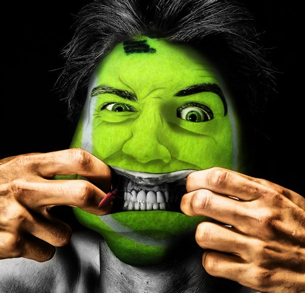
thanks to flickr & sxc.hu (5 years and 3672 days ago)
great idea ! 
Before i get stunned by this amazing piece, could u pls upload the sbs..thanks
awesome.. but... the corner of left eye (near the side of nose) need more blending... and one more line under the left bottom eye lid ( like the right eye) and it will be more good if the expression lines that on the left side of man's fore head follows to center , that wil change the facial expression more good... still I like this very much.. Fantastic and Gl... Author...
about the eyes, agrees with hereisanoop and this is a top blend excellent photoshopping Goodluck and high marks
fantastic masking
Oh man...awesome work. That face is priceless.
Yes, Nator. Flesh color would make a great finishing touch.
Great work...i agree's with Nator about skin color,but mouth are perfect in grayscale...good luck author
Jesus, I think I don't sleep tonight... 
lol.. cool ... hang on ... what's that .... EEEeewwww it's a BIG BUG!!!!
I think you should have made the hands green to match.
No need to desaturate the body, it's too tricky and just distracting.
I love the power of the visual..you have created something quite deadly.. good luck..do hope you win.. 
good luck author, this is totaly scarrry..
will be in the top3
Howdie stranger!
If you want to rate this picture or participate in this contest, just:
LOGIN HERE or REGISTER FOR FREE
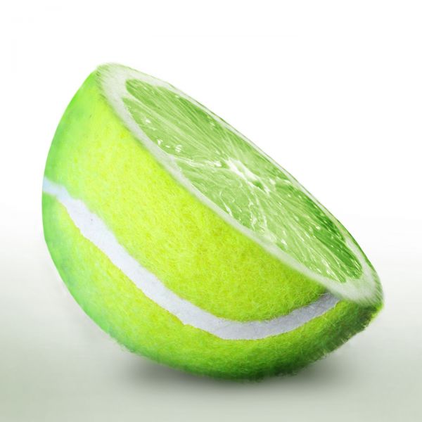
thanks to sxc.hu (5 years and 3673 days ago)
Nice and neat..... But looks not a good cut over the tennis ball
I too was thinking about that, but i thougt leave it as some furry. But you are right. Thanks for pointing out. Hope its better now.
good blending and a good output
awesome ! 
top blending, top colour, top impression. I feel the need to lick it up if I stare at this picture
nice work awsome blending !!
Nice work...looks very good.In high resolution if u look to left part of the ball/fruit u can see some to much smudged parts...tru to fix that author using ball texture and instead dodge and burn u could create new layer with some dark green color and low opacity and overlay blend mode maybe...Good luck
It looks sour, but nice! 
haha nice!
nice idea, but using some of the 'original' fur would've got higher marks rather than wind or zoom blurs
Nice idea, kicking myself i didnt think of it. Smudged at parts, isnt it actually a lime ? good luck 
Thank you very much Erathion... That was a new trick I didnt used it before... but I fell sorry that i am out of station and i cant edit anymore, but that will be very useful for me in the future!!
simple but very welldone...
edges needed to be furry. .. otherwise welldone
Very believable... right side is a little blurry but great work overall. good job!
Howdie stranger!
If you want to rate this picture or participate in this contest, just:
LOGIN HERE or REGISTER FOR FREE
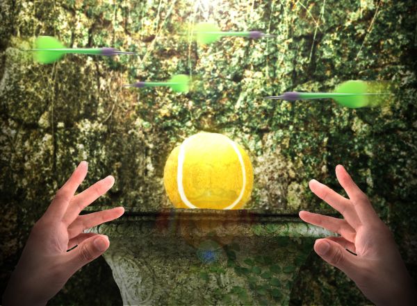
The fabled...the lost...the one and only...Golden Tennis Ball!!!! (5 years and 3673 days ago)
Shouldn't it be "Raiders" of the lost tennis ball? Or do you quest alone?
Heh...tried that.  No space for the 's.' Had to sacrifice a letter lol.
EDIT: Title changed. Better now?
Pretty cool chop!
Are the darts some kind of protection against... thieves?
Yup. Seen Raiders of the Lost Ark?
nice peice, shame the ball is hairless
It's golden. Does gold have hair? 
Oh yeah, forgot about that. Yeah it's cool! GL
Howdie stranger!
If you want to rate this picture or participate in this contest, just:
LOGIN HERE or REGISTER FOR FREE
Well done!
She have a very nice small ass and would not made that big pressure on a ball....lol...good job author,i like it very much
lol
Howdie stranger!
If you want to rate this picture or participate in this contest, just:
LOGIN HERE or REGISTER FOR FREE