From the web site @:
http://www.uebersetzung.at/twister/en.htm
Tongue Twister #20 (5 years and 3712 days ago)
- 1: textures

burn dodge warp texture.....
(5 years and 3724 days ago)
For an entry like this to be appreciated, you really need to post a SBS...
Thank you so much CMYK I am in this site almost a week. I am working so hard.. Your word is very important for me. I have something in PSD format but for psp maybe is not going to work. But I am really happy what you've said.
What CMYK ment was that you need to post a step by step (sbs) guide on how you created the image. Good luck author.
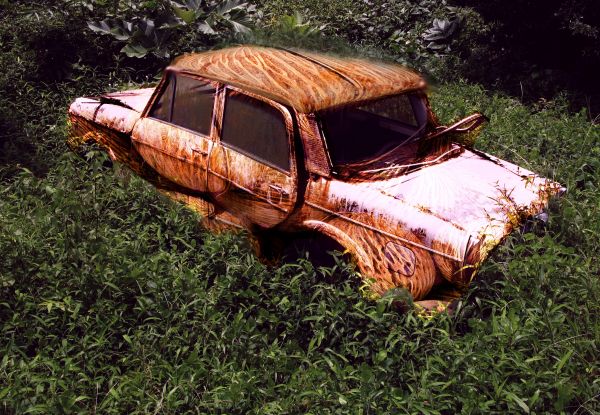
it was a nice idea to give it a rusty look but y r u showin coconuts in the look..its making no sense at all
It look nice this way... Not a rusty way , coconut way 
everything is making sense dat a car is mashed and broken and rusted and with your coconut look also its giving good signal but showing exact coconut at the back of your car has made it meaningless..i mean if u wanted to show a coconut you could have used a normal car to design it.as it is the coconut texture is visible all over if you only could have edited the back portion of the car...newaz if ur satisfied its kool..
thanks for advice..
Good for a starting piece, I am sure your work will improve as you progress in the group. Good luck with this though, we all had to start somewhere.
i like it... i'd bet money that gillagan would have liked too
Thank you to every one... 
Howdie stranger!
If you want to rate this picture or participate in this contest, just:
LOGIN HERE or REGISTER FOR FREE

This is my first time entering so I hope I do this right :)
Steps I took:
-unsharpen mask
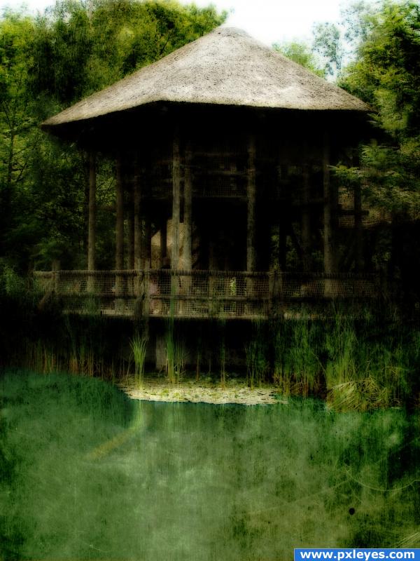
-cleaned up the water and changed it to a blueish/green
-messed with hue/saturation on entire pic
-added a texture
-added gaussian blur to entire pic (5 years and 3888 days ago)
errmm.. if you have the gaussian blur on it's own seperate layer, lower the opacity. and/or try "soft light" on that layer. i'm interested in how that would turn out 
the image really doesnt make sence to me!
Maybe you didnt do a lot with the image, but the effect is not bad..
Howdie stranger!
If you want to rate this picture or participate in this contest, just:
LOGIN HERE or REGISTER FOR FREE

See the step-by-step! :) (5 years and 3914 days ago)
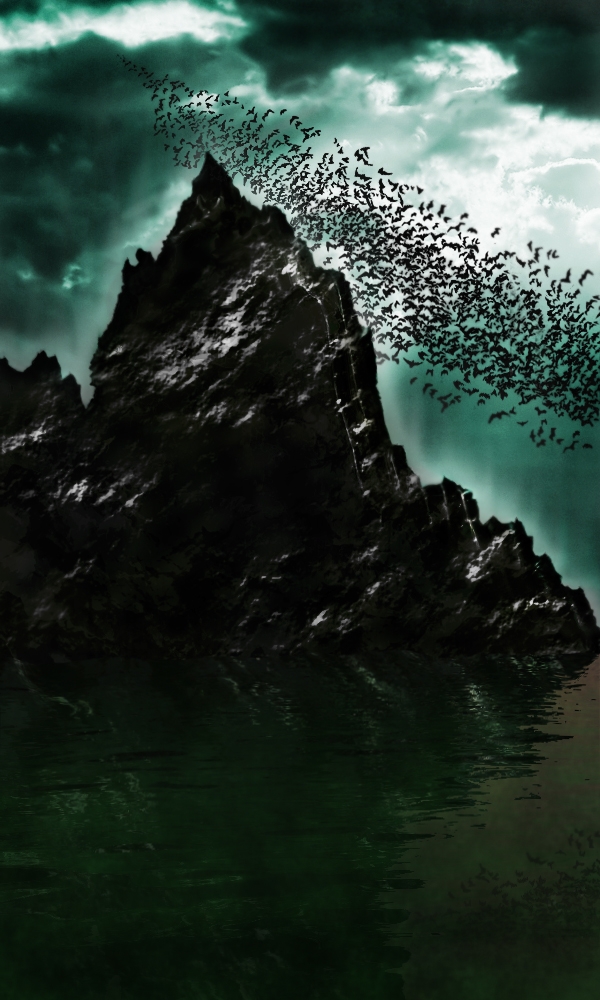
Very batty  ...nicely done indeed...good luck.
whoah cool
Great atmosphere nice work!
Thanks a lot CMYK46, Tuckinator & Warlock! 
very nice feel
gud work + imagination.......bt mountain's top area luks bit flat.....
cool
reminds me of the bats movie lol great mood
Thank you. How should i make the mountain look more realistic? (not flat) =)
really nice idea & job author ... GL
hey nice work
cool
Thanks to all of you! 
very nice balance of shape and form author.. the two merging triangles are a risk as they could easily throw you up and out of the picture but the complex base really retrieves you back into the focus of the whole composition.. quite nice.. even though it is very dark.. but that's just me and my eyes  (I'm a tad bit addicted to color
  IMHO
IMHO
take off, or reduce the outer glow on the mountain.. will make it look more realistic, and if your going to put a blur on any of the bats, put it on all of them. it actually doesnt look bad with a minor blur. maybe make a copy of a flattened layer (select the top layer and press command+option+shit+E, this will duplicate all your layers and flatten them into one) after that, do a bit of a diffuse glow (if that helps with the brightness) or add a medium gaussian blur, and set the blending mode to overlay, and bring down the opacity to around 20. this'll help give it a smooth, yet sharp effect.
great feeling! 
Excellent idea.. nice work author ! good luck!!
So unique and creative, realyl nice work!
WoW Thanks everybody. Thanks for all your fantastic comments! ^^
Congratulations for 1st
Congrats! Well done!
Omg.. I won? :O Thanks for everything guys  !
!
Congrats 
Congrats, well done 
Congrats...good job! 
Congrats!
Congrats for 1st 
Congratulations!!!!
Congratulations!!!! 
yesss, you deserve this first, very well work, congrats.
Thanks to all of you!!! 
Howdie stranger!
If you want to rate this picture or participate in this contest, just:
LOGIN HERE or REGISTER FOR FREE
Link doesn't work. Paste your source URLs into the boxes when you upload!
KY if you are talking about the url provided in the description it is really not a source per say, it was just a place with various tongue twisters, the link that I have inserted for the sources I used to create this work is indeed working, correctly...thank you very much
The link should lead to the actual page your tongue twister is on...
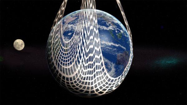
Well Bob if you copy and paste the link to your browser address bar it will take you to English Tongue Twisters... once you get to the page it is a simple matter of scrolling down to the # (number) 20 tongue twister... c'mon man lighten up, jeez. In an effort to help you CMYK46 I have posted a screen shot of the inspirational source in question. Please see my SBS.
giggle snort
Good thinking !
I love it!
LOL you showed him. Nice work
Edit: ~Thas said, "world wide web" is not a tongue twister.
Howdie stranger!
If you want to rate this picture or participate in this contest, just:
LOGIN HERE or REGISTER FOR FREE