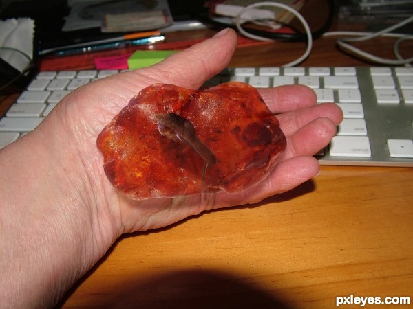
my hand holding a snail in Amber. Did you ever. I thought soft tissue didn't survive this process, well there is always a first time. (5 years and 3445 days ago)

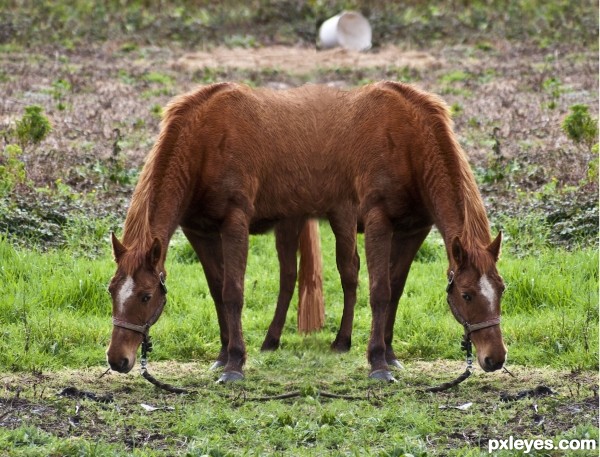
Spec Thanks to mqtrf for use of horse picture found in member stock on pxleyes.com mqtrf is a member of pxleyes (5 years and 3515 days ago)
A bit too obvious of mirroring the image...
You should adjust more things with the clone tool, or add more object too the scene..
Gl author 
Thanks Nickk It's one of those thing's your like ????
Siamese horses! You could have made it only with the head, as said in title.
Sorry?
I think you meant "two", not "to"
Hey Thanks I looked at what you were talking about and I'm like how did I miss that. It don't pay to rush....
Howdie stranger!
If you want to rate this picture or participate in this contest, just:
LOGIN HERE or REGISTER FOR FREE

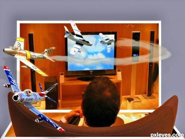
Thanks fi_chince, Paul Maritz, mashleymorgan, and kotofoto. Basically this is an exercise in cut and paste, free transform (skew) and some shadow work. (5 years and 3534 days ago)
It's twice OOB! Very nice... I suggest you that plane next the screen has a part (wing, for example) inside the TV. 
very cool author
Nicely done!! Maybe a plane buzzing his ear  Best of Luck
very nice idea and great work author...gl
Very nice work author 
Howdie stranger!
If you want to rate this picture or participate in this contest, just:
LOGIN HERE or REGISTER FOR FREE

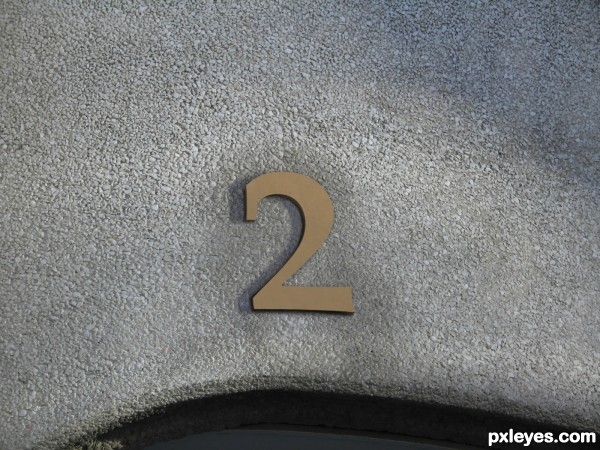
It looks simple but it took me a while to match the shadows and color the best i could.
All original image.
Typed a "2" that looked like it matched the "1"; used the clone tool to cover the "2" with the "1" texture; duplicated the "2", offset it and darkened it for the 3D effect; clone tool to fill the surroundings over the "1"; duplicated the "2", stretched it left, lowered opacity for shadow; paint black with gaussian blur around the edge to create a darker shadow. (5 years and 3578 days ago)
Actually, even though it looks simple, it's very effective and believable and a nice chop. Very convincing and a good blend. GL!
Oh but you do have to make an SBS. I imagine you're new so check out the guidelines when you get a chance.
It's perfect, it seems no. 2 really exists! 
Nice job! Simple, but tells the story! GL
As you say: matching colours and shadows and - not to forget - doing the "2" so it matches typed "1" is not a easy match. So I am impressed by the "simpleness" outcome of this effort. GL 
very nice...gl
How do I change the description for this entry or add an SBS?
My Stuff / my contests 
I should have known that... Thanks!
One is the loneliest number that you'll ever do
Two can be as bad as one
Hehe love the idea 
Very nicely done, gl
Congrats for your second place!
Congrats! 
Howdie stranger!
If you want to rate this picture or participate in this contest, just:
LOGIN HERE or REGISTER FOR FREE

(5 years and 3596 days ago)
sources to follow
I think the Castro figure should be in front of the tank shadow and maybe a tad bit more downstage... good luck.. interesting conglom
And you didn't just link the sources when you uploaded your entry because????????
It's action speaks louder than WORDS, with an S
yeah i no jawshoewhah but for some reason would nt let me put the s in
shadow on the board is not off tank its of the man himself he is crouched over
You couldn't put an S in your title because it's too long; it already happened to me once... Very "catastrophic" mood; cool entry! 
good luck
Howdie stranger!
If you want to rate this picture or participate in this contest, just:
LOGIN HERE or REGISTER FOR FREE
Idea has potential ** snail looks more on the amber than in -- try some additional layers of the amber at varying blending modes and opacities or fill levels You should be able to find one that "sinks" the snail into the amber
Hi Alan thanks for the suggestion - I was trying to keep the transparency going so the hand still shows through but you know what I did forget - the snail should have a shadow.

done
You can alway try puttting a layer of the hand over the top, masking out parts that you don't like with a layer mask, then reducing the opacity ... that can sometime give the appearance of seeing something "through" when you are losing it ...hope that makes sense???
Nice idea ... very interesting work and concept.
Howdie stranger!
If you want to rate this picture or participate in this contest, just:
LOGIN HERE or REGISTER FOR FREE