(5 years and 3517 days ago)
- 1: source1
(5 years and 3524 days ago)
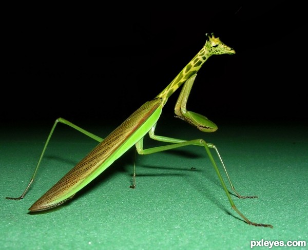
There is a clear line between where the insect stops and the giraffe neck starts which makes it less convincing, they don't quite match in size or colour either.
LOL!
I know the giraffe's neck was short, but don't stretch it cause the spots look weird. Either copy paste and blend a part of the neck to continue either make a blend between the mantis neck and the giraffe.
You'll have to blend the fore members too.
cool idea author, u could create some curves on giraffe's neck...
Howdie stranger!
If you want to rate this picture or participate in this contest, just:
LOGIN HERE or REGISTER FOR FREE
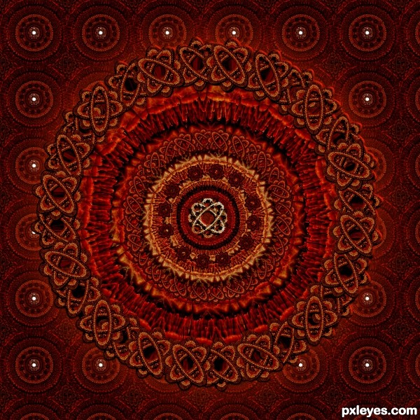
I've made this mandala only with a hand. (5 years and 3532 days ago)
very nice -- like the stitched effect
great work. it is very creative how you used the hand to come up with this cool image, I love it 
Very pretty! 
I like how this one pops, there is a real perception of depth in this work , nice high res.
Very clever use of the hands as a texture, and agree with Lchappell regarding the depth. Looks also like a tapestry. 
Beautiful, like a Persian carpet 
good thing author...gl
Congrats for your third place, Lolu!
Congrats on third place!
congrats , great entry 
Congrats!!
Congrats Lolu...
Howdie stranger!
If you want to rate this picture or participate in this contest, just:
LOGIN HERE or REGISTER FOR FREE
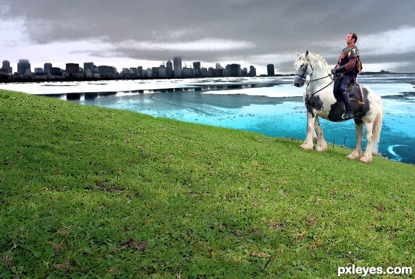
Thanks to shelley Cunningham for the horse image... (5 years and 3534 days ago)
The filter effect on the foreground looks very inconsistent with the background. You should either make it all filtered or none.
Ya i re-edited ..,its new one ..,thank you..,
You just used the grass?
ya its grass..,but i gave some filter effect to the grass..,thank u.,
nice one..
thank u sivakbio..,
Howdie stranger!
If you want to rate this picture or participate in this contest, just:
LOGIN HERE or REGISTER FOR FREE
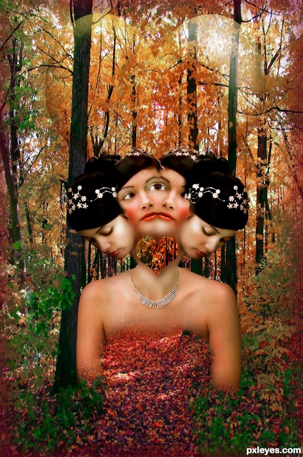
(5 years and 3545 days ago)
The heart cutout is too large, it makes the heads look almost totally disconnected from the body.
Love the concept!
Thanks arca
idea is good....but can be improved
Howdie stranger!
If you want to rate this picture or participate in this contest, just:
LOGIN HERE or REGISTER FOR FREE
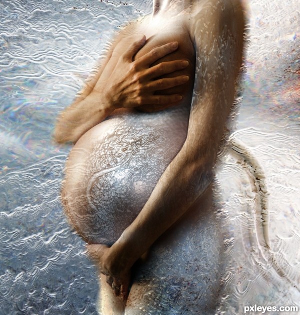
A bit too much filter.
It's the effect i wanted sorry you don't like it CMYK46
Well done! Filters are not a sin, I think you used them judiciously.
I do think the hands are a bit too big and too bright, though. The right hand looks like it comes from a man...
Cool job!!! Never would have thought of this!
I find this has an alien quality to it ... almost like something from "Species". I don't know if that is what you where going for but either way it is a fascinating image!
I agree with arca and MossyB, it does look alien, and especially looks like she has a tail, and the hand is a bit too big. But I do like this picture very much, great idea. I too do not have a problem with the filters, I think it gives it a cool (literally) effect.
I should say that the hand is the real hand of this pretty pregnant woman so i cannot make it smaller sorry. Thanks to all for your comments !
Well done!
WOW what a great creation...well done author
Fantastic image author Good luck.
Thanks to all for your comments !
Wow really? She has a HUGE hand! lol. Well in that case, nevermind. GL, author!
Congrats Lolu...
Thanks Erathion
Howdie stranger!
If you want to rate this picture or participate in this contest, just:
LOGIN HERE or REGISTER FOR FREE