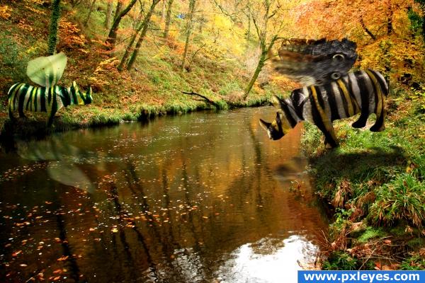
Gary is obviously having a problem crossing this river... credits to Marlong-Sveres-Backey and Alitaylor for the source images (5 years and 3865 days ago)
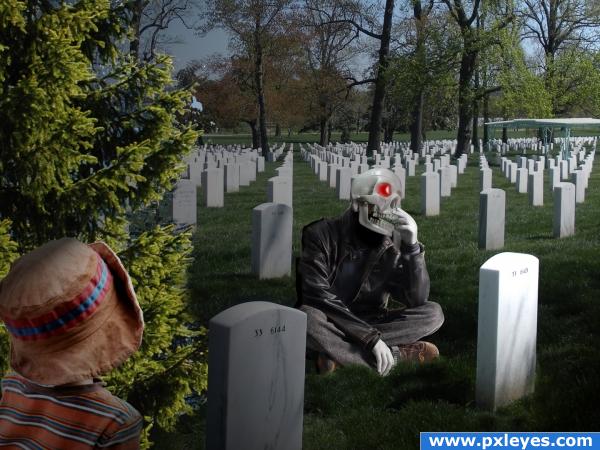
Thanks and credits to cohdraboy and bigevil600 (5 years and 3889 days ago)
Nice idea, mostly good, but the grass under 'death' looks too green and it doesn;t really match up with the rest of the grass, but it's a nice idea, soo good luck!
There's a square area around the lower right tombstone that needs blending, and you should do something to the skull so it doesn't look like plastic.
the image is ok
If I was that kid, I'd be miles away by now! Scary! Lol!
The tree is really bad cut o.o the grass on the skull guys feet is too bright!
a few different light sources there... good idea though, i would be sitting next to him lmao
Reminds me of Ghoustrider... Or something like that... lol
Howdie stranger!
If you want to rate this picture or participate in this contest, just:
LOGIN HERE or REGISTER FOR FREE
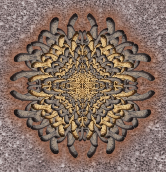
This is an example of making fractals using copy and pasted images. Only source image used. (5 years and 3889 days ago)
cool image wow...
thank you
I LOVE THE WAY YOU USES THE SORCE IMAGE...WHAT A COOL PIC!!!
Absolutely wonderful
Love it!
Howdie stranger!
If you want to rate this picture or participate in this contest, just:
LOGIN HERE or REGISTER FOR FREE
(5 years and 3889 days ago)
i feel the same way about the bell tower they built in the middle of our city lol
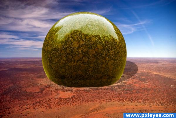
Needs a shadow...
great, maybe a little ground shadow around the base of the stone?
very cool image! nice feel! agree with cmyk
Maybe you could try softening up the shadow a little by blurring it. Good luck!
Since you don't know where it came from, I got the feeling that it was dropped there. I was looking for an impact dent in the sand. But my vision of course isn't yours, but I think that that would have been cool. Nice job, the shadow needs softening like someone else said.
Stone the crows this is good
gl
Meka & Medina... that is called the place where the muslimans assemble to celebrate the great stone that has fallen from sky into the dessert... that was in my mind when i looked at this... nice...
Howdie stranger!
If you want to rate this picture or participate in this contest, just:
LOGIN HERE or REGISTER FOR FREE
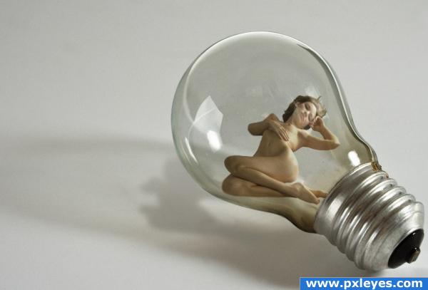
God had some great ideas, but that had to be one of his all time greats
Thanks to Marcus J Ranum for the girl stock
see www.ranum.com (5 years and 3893 days ago)
interesting though, i think the female's shadow should be stretched a bit more like the lamp is, but i like the image! Good luck!
ye bro good idea for shore nice work good luck
ah and source for girl is not working 
hahaha someones a nauty guy! lol i like the image
Howdie stranger!
If you want to rate this picture or participate in this contest, just:
LOGIN HERE or REGISTER FOR FREE
The blending is very good! I think you should choose a less noisy background to give more attention to the animals.
Good idea, i agree with Isolflow though.
very smugly cheers!
reminds me of that short lived SITCOM Titus.. when the father throws the little brother in the water off the pier and says.. "Don't be a Wussy" then has to throw the older brother in and say.. "go save your brother LOLOLOL.. very cute and funny... (the wings need a little more definition to carry better) but very humorous
Idea great...rhino skins great...wings bad...
Howdie stranger!
If you want to rate this picture or participate in this contest, just:
LOGIN HERE or REGISTER FOR FREE