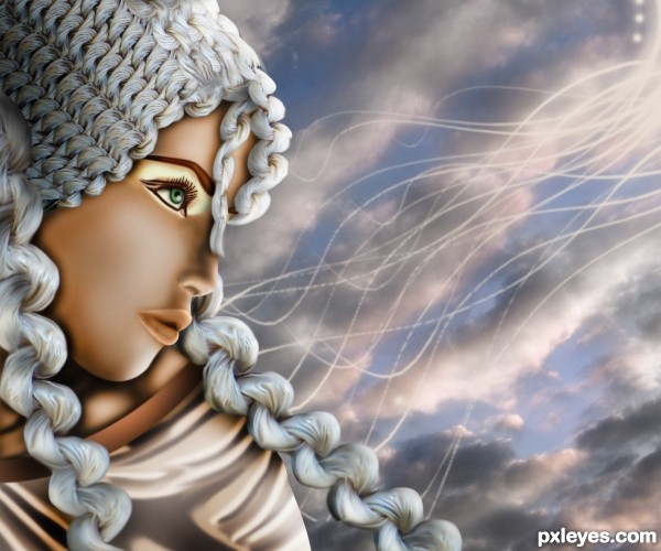
(5 years and 3064 days ago)
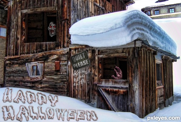
(5 years and 3101 days ago)
Howdie stranger!
If you want to rate this picture or participate in this contest, just:
LOGIN HERE or REGISTER FOR FREE
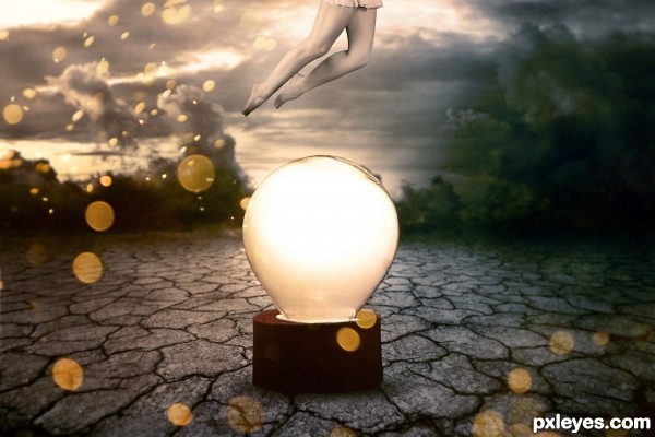
Thanks to Cloaks, Koko-Stock, Night-Fate-Stock and freestockswirls from DeviantArt (5 years and 3140 days ago)
The dark area on the right does not match in tone to the rest of the image, it looks too blue and does not add anything to the mood or composition. You'd be better off cropping the sides and reducing the fireworks' bokeh effect to squeeze it back into the image.
There's a shadow on the legs where there should be a highlight, since they're lit by the bulb.
Howdie stranger!
If you want to rate this picture or participate in this contest, just:
LOGIN HERE or REGISTER FOR FREE
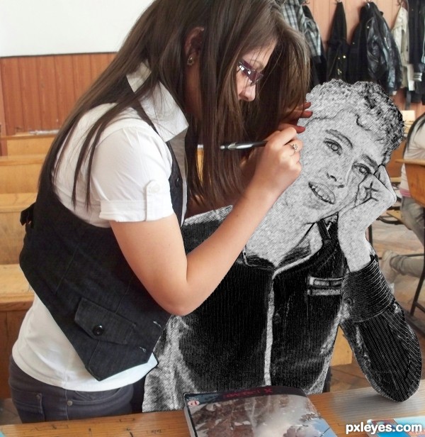
(5 years and 3146 days ago)
Just lighten the edge where the girl's arm is in front of the boy. Fun image!
Thanks for suggestion, it's better now?
ggrreeeaaattt idea
Try a small soft round eraser brush or a soft brush to mask along the edges of her hands where they rest on the sketch part. Cool idea a little tweak on the masking will do it right.
Good fix, great concept!
Thanks for the tip @lchappell, i will try.
very nice take on this contest -- well done like the effect.
This is very creative, author, and you got a perfect photo to use. 
Thank you Pearlie
!
Author I see a major difference. Looking better, glad I had something useful to say for you. Welcome to PXL BTW. 
Thank you Ichappell, is nice to be here, around nice and talented peoples. I'm sure i have many great things to learn!
Splendid my good boy .
Splendid my good boy .
Howdie stranger!
If you want to rate this picture or participate in this contest, just:
LOGIN HERE or REGISTER FOR FREE
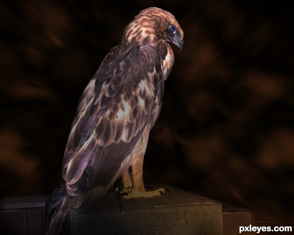
(5 years and 3147 days ago)
Just a wee bit too dark behind his legs - It looks like there is a square shadow being cast onto the tail area. The feet are also a bit odd colored. Perhaps a light application of the Dodge Tool to bring up their contrast a bit?
It's great you could get this photo, but step 7 is better. 
Initially I thought after looking at step 7 that the area under the foot of the eagle is too bright.so i decided to make it darker, but apparently it makes everything look a mess. Thank you so much Mossy, for your input, I'm very happy to get any input from all friends , and I'll learn a lot from here.
CMYK46,what you say is true, if I stop at step 7 of course the result is definitely better than this.thank you for always giving me comment and input.about the eagle, finally someone came to take it from our home.i thought it was better because I am scared of the eagle.my hands bleed when I tried to touch his feathers
Oh, it's not wise to try to touch wild birds, especially babies, the mother will abandon them if they smell humans. You did get a fantastic shot, tho - he posed for you! Not a mess at all, step 7 lighting fine, but final image works, too. 
Howdie stranger!
If you want to rate this picture or participate in this contest, just:
LOGIN HERE or REGISTER FOR FREE
Where's MY COCOA? (Swiss Miss) hehehe.. great JOB!!!
Very nice job in unraveling the source to look like hair
Looks great! Well compsed,nice use of the source.
Beautiful colors. Very nice.
AMAZING.....
Amazing, first having the idea of what to create and then creating it. So well done.
Lov it..and fav!
Beautiful!
Just beautiful..... good luck and good marks for your good work.
WOW!!! What a beauty!
Beautiful work, author, and great idea for the source!
congratulaaaaationssssssss !!!!!!!!!!!!!!!!!!!!!!!
Congrats!!
Howdie stranger!
If you want to rate this picture or participate in this contest, just:
LOGIN HERE or REGISTER FOR FREE