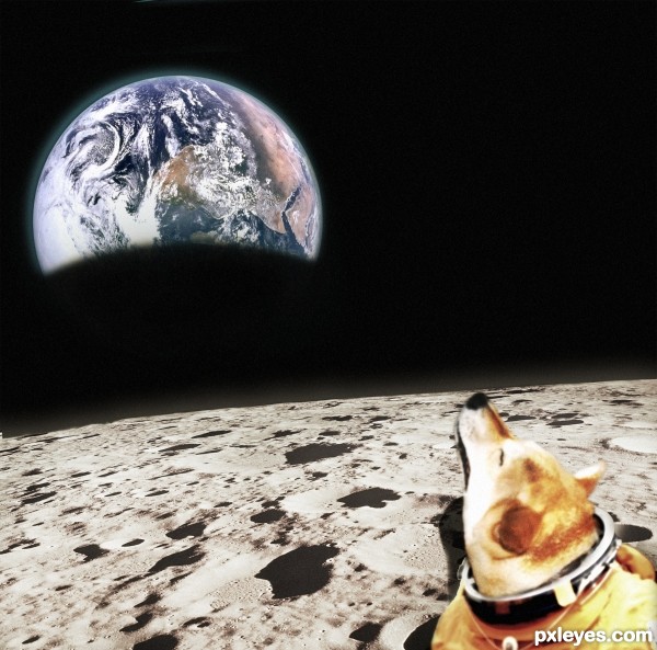
blaine2nd: "How many dogs howling at the moon will we see?"
Decided to try the other way around :) (5 years and 3056 days ago)
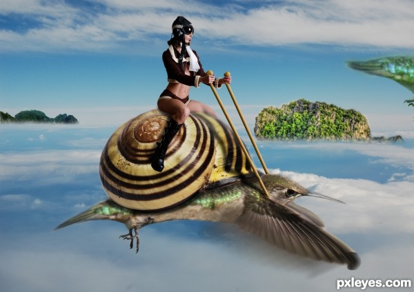
(5 years and 3057 days ago)
Cool concept. But there are some shadow issues: shell on bird body, steering poles on shell and bird body.
Also, the rope is not in her left hand... It is behind it. Mask that hand below the fingers to have the rope thside her hand at the bottom.
ok thanks hope its ok now
Would be more believable if the shell were a lot smaller, like saddle sized. Otherwise it's a fun image. 
looks much better now... and i just noticed the tail end of another bird you placed to the left of the image... i liek the idea of a squadron of these, why not group some together in the distance behind her? great stuff!
i was thinking to do so but can't get models i dont want to use the same model
Howdie stranger!
If you want to rate this picture or participate in this contest, just:
LOGIN HERE or REGISTER FOR FREE
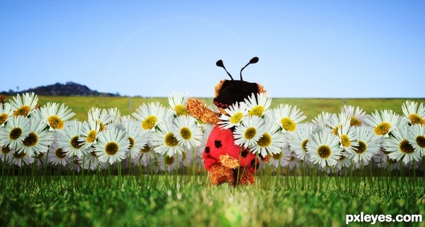
Please if you have seen this image before and think you know who the author is, do not vote for it. I appreciate any feedback you wish to give, but please do not vote for this image if you think you know who the author is. I know a few folks have seen this, but not nearly as many as what normally votes in the contests.
Thank you!
*NOTE*
Some changes have been made per the received suggestions. Thank you for Viewing!
Thanks to the great contributors to SXC for use of their images... image and author mentioned in the source links.
flowers are form the Daisy contest that recently passed.
(5 years and 3058 days ago)
The lens flare bothers me a little, and I'm not sure why the vignette disappeared, I liked it better because it helps focus on the bear. Otherwise, a cute idea 
thanks kid! i'll make a few adjustments!
The image is intending to be photo-realistic. I placed the lense flare in the position it is in as it is similar to how an actual lense flare would be in this scene. I understand that it will distract your eyes slightly from the image, but that is kind of the purpose of it. I have greatly reduced it's intensity from what it was to begin with. Thank you for your time and input on my image!
Howdie stranger!
If you want to rate this picture or participate in this contest, just:
LOGIN HERE or REGISTER FOR FREE
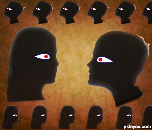
I used my photos of shadows. Selected them and copied and pasted onto the background file(which I had previously manipulated using hue and sat. tool.)
Made eye - pen tool - and then resized and duplicated images as needed.
finally I used the difference maker over the whole image at a lower opacity. (5 years and 3058 days ago)
good idea but what is the white on back of head. just wondering
Thanks for the comment. It arrived due to a lousy selection round tuft of hair - I have not mastered the smart radius etc in CS5, but I quite liked it and as I was short on time I left it!
Howdie stranger!
If you want to rate this picture or participate in this contest, just:
LOGIN HERE or REGISTER FOR FREE
(5 years and 3059 days ago)
excellent work
It's a good collage, but you could have used dirt from anywhere to create this.
great job on the depth
Howdie stranger!
If you want to rate this picture or participate in this contest, just:
LOGIN HERE or REGISTER FOR FREE
This is a good study in proportioning. I'm kind liking it.
The light source is from the right, so the Earth should be flipped accordingly.
I know the Earth looks way too big and the craters way too small but it was not meant to be realistic. More of a, Dog in a space suit standing in front of a wallpaper, thing. But as CMYK46 mentioned, I messed up the lighting and positioning a bit

Thank you for the comments! I'll try and fix it ASAP
if we can see the curvature of the moon then we should see the same shadow on the earth (easy fix)
good luck
Howdie stranger!
If you want to rate this picture or participate in this contest, just:
LOGIN HERE or REGISTER FOR FREE