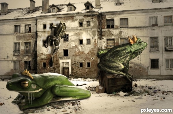
(5 years and 2994 days ago)
- 1: houses
- 2: frog1
- 3: frog2
- 4: frog3
- 5: water drop
- 6: belt
- 7: crown1
- 8: crown2, thanks allexxx13

(5 years and 2994 days ago)
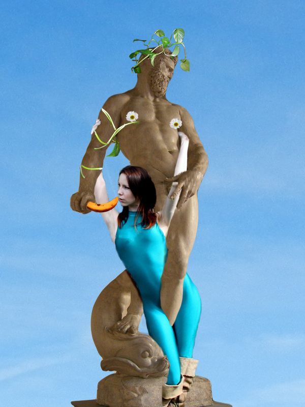
(5 years and 2995 days ago)


what they said..
try adding some shadows on the girls body
hahaha :P
I added some shadow to the girl, i hope it helps.
WTF! was my first reaction...., but in a good way. It made me laugh alot.
So thanks for the laugh. 
Good job and good luck.
the statue should cast a shadow on her leg and body.
I don't know why this was removed the first time, but I'm sorry to see it return. There are just too many technical flaws to go into because the basic concept isn't worth it. I hate to pick on this particular entry, but it's an example of the downward trend of images on this site in general.
ma cmyk46 am crezut caci u are my romanian brother from another mother. Mai insultat foarte mult. Dar am sa incerc mai bine next time. ce trebuie sa fac ca sa fie mai bine?
author the chosen sources dont work really well with eachother I think that's one of the big problems with this work.
Author I don't think most of us understand your comment. I ran it through Babylon translate:" I cmyk46 have thought because U has my Romanian Brother from another mother. More insulting very much. But I will try better next truth: what to do that to be better?" I guess that's close to what you meant to say. You can find language help from members in the help menu at the top of the page. CMYK46 is known to speak his mind and I think he's only being honest though you may find it harsh he doesn't seem to be alone in his opinion.
As for your comment Bob with so many newbies just learning we will see beginner level work, best to try and help with comments and by example.
i would like to have seen you try to make the woman and the other additions to the statue more stone like in look. otherwise this is not working for me. good luck!
Haha very funny idea, extra point for the funny composition.
Howdie stranger!
If you want to rate this picture or participate in this contest, just:
LOGIN HERE or REGISTER FOR FREE
(5 years and 2996 days ago)
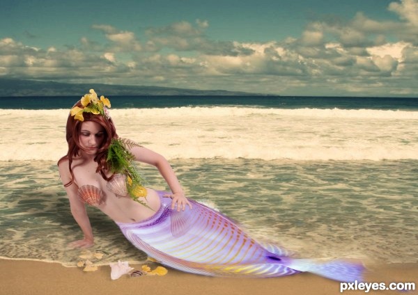
Objects need shadows.
ohh thanks
Making the tail bigger might ground her more, but hell.. it's a fantasy image so what ever you see in your minds eye is okay with me.. (I just see the tail bigger and more powerful to move her body torso) GREAT JOB AND GOOD LUCK .... IMHO
its done driven hope its ok like this
Nice work author. The mermaid part feels a bit lacking in shape. 
Howdie stranger!
If you want to rate this picture or participate in this contest, just:
LOGIN HERE or REGISTER FOR FREE
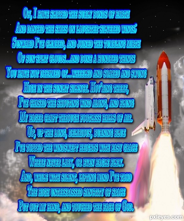
High Flight, John Gillespie Magee Jr.
Oh, I have slipped the surly bonds of earth
And danced the skies on laughter-silvered wings;
Sunward I've climbed, and joined the tumbling mirth
Of sun-split clouds...and done a hundred things
You have not dreamed of...wheeled and soared and swung
High in the sunlit silence. Hov'ring there,
I've chased the shouting wind along, and flung
My eager craft through footless halls of air.
Up, up the long, delirious, burning blue
I've topped the windswept heights with easy grace
Where never lark, or even eagle flew.
And, while with silent, lifting mind I've trod
The high untrespassed sanctity of space
Put out my hand, and touched the face of God. (5 years and 2997 days ago)
Good choice of poem. Can't say the same about the font.
EDIT: Font looks much better now. GL author. 
Glad ya like it, the new font is Century.
Very nice tribute to a horrible tragedy.
Howdie stranger!
If you want to rate this picture or participate in this contest, just:
LOGIN HERE or REGISTER FOR FREE
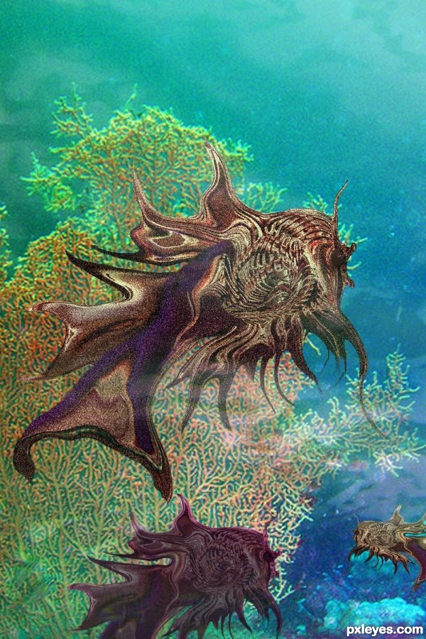
Thanks to Nemo's greatuncle at flickr.com for the background undersea source (5 years and 2999 days ago)
http://www.flickr.com/photos/maynard/255534402/sizes/l/
Source for background scene by Nemo's great uncle at flckr.com
So sorry, but contest shut down before I was able to post my SBS. To explain briefly, the fish is created from source using first the liquify warp tool to create fins, bloat tool for mouth and eye. Smudge tool smoothed shapes together. Noise and scratches filters were used for textures, and clone tool further shaped the upper body of the fish. Soft brush tool created soft swirls and shapes toward bottom of the scene.
Howdie stranger!
If you want to rate this picture or participate in this contest, just:
LOGIN HERE or REGISTER FOR FREE
Nice image! The shadow of the frog on the wall is wrong. You have the light source coming from lower right, which is impossible. The light on the foreground frog is from upper right, just the opposite. Make the adjustment and this will be a great image. GL author.
The shadow is changed. Thanks Bob!
A lot of great entries..this is one of them!!
FAV!!..the frog in the back reminds me of RAMBO..
Cool Chop! GL author.
Howdie stranger!
If you want to rate this picture or participate in this contest, just:
LOGIN HERE or REGISTER FOR FREE