(5 years and 3024 days ago)
(5 years and 3024 days ago)
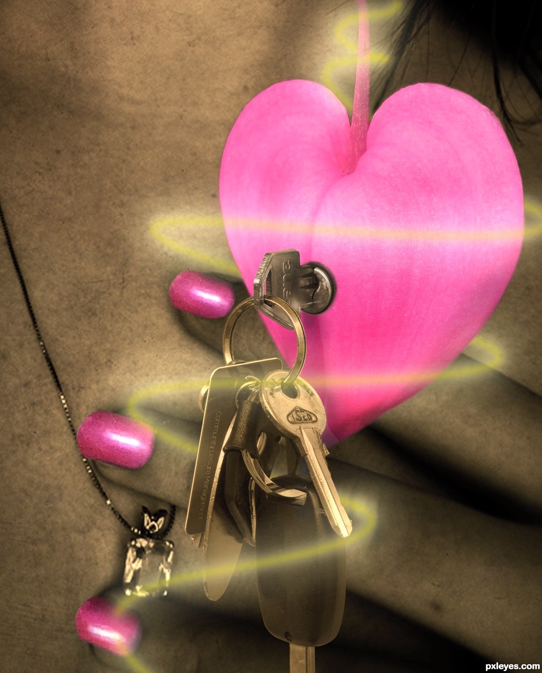
BWHAA HAAA HAAAA... LOL.. the key to your heart comes with a car ignition key and a discount Key Chain UPC card from your local Pharmacy?
Great chop author, a very DaDa idea (Now does he pick her up for a hot date in a UPS Truck?)
WEEEEEEEEEEEEEEEEEEEEEEEEEE!!! super fun image (love the swirly gig around the keys.. nice play  )
)
Good Luck!
Thank you @Drivenslush, that's the point, sometimes love don't open the heart but a nice car and a discount key does it. LOL
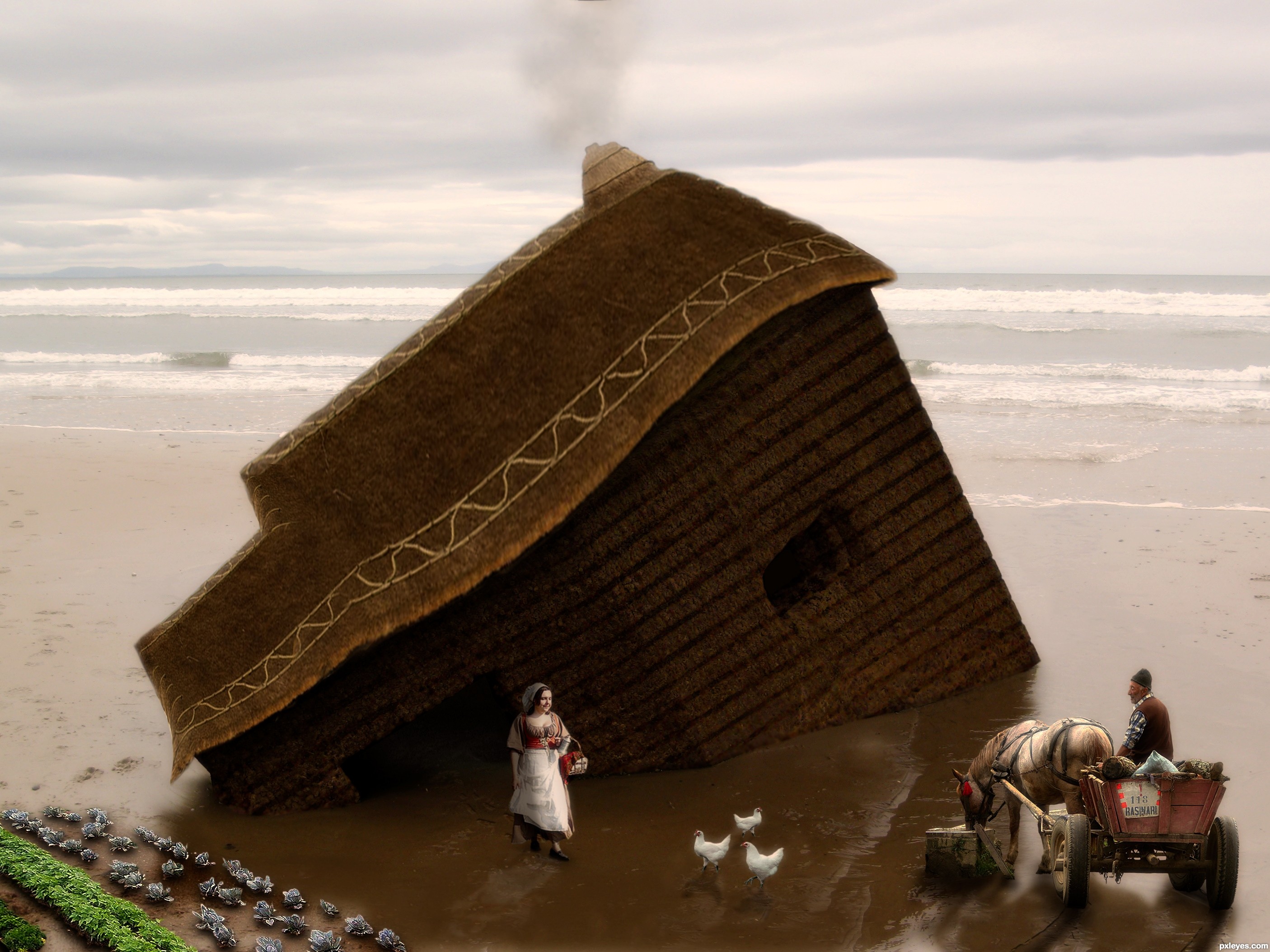
source 2 isnt working your chop looks good though, the nails stand out maybe a lil too much and have lil white edge. nice job on attaching the keylock. the nail shape is a lil bit off too i noticed i dont know if you will be able to correct that. I will hold off my vote for now
Thank you @Eladine, I've corrected it 
very nice entry
Howdie stranger!
If you want to rate this picture or participate in this contest, just:
LOGIN HERE or REGISTER FOR FREE
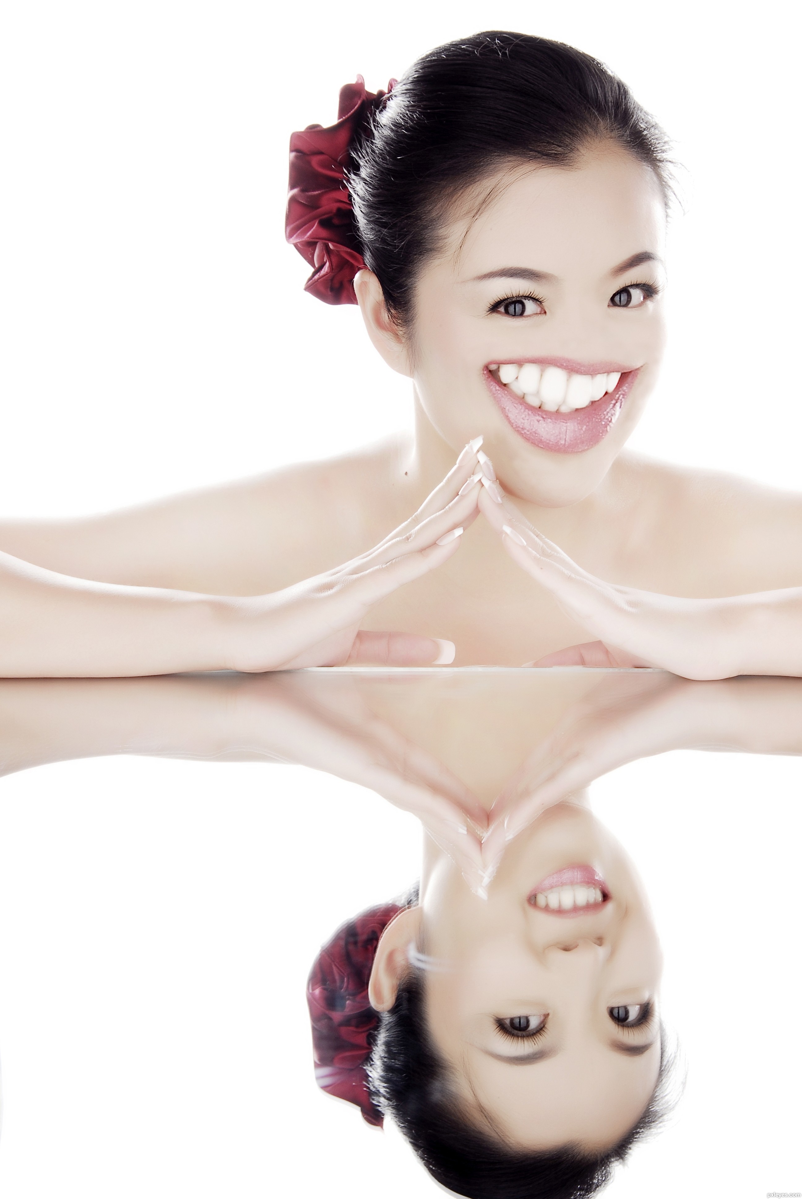
This particular reflection makes one look so much more...original. (5 years and 3027 days ago)
its a very nice picture that you choose to work with in your entry, its too bad that her nose disapears for me that makes the face unbelievable, perhaps you can place her smile lower like her bottom lip is dropping and place her nose back on where it belongs, you can always try it, if you dont like it just keep it this way
I agree with Eladine, I think adding the nose would help the image a lot. Good idea author. Good luck!
I respect your opinions on this and adding the noes back into the image would make it look more believable but the unbelievable is what is ugly to me. She was beautiful before i picked up my Wacom tablet, now she is ugly. Sorry im gonna keep the noes off. Thanks for your opinions tho.
Howdie stranger!
If you want to rate this picture or participate in this contest, just:
LOGIN HERE or REGISTER FOR FREE
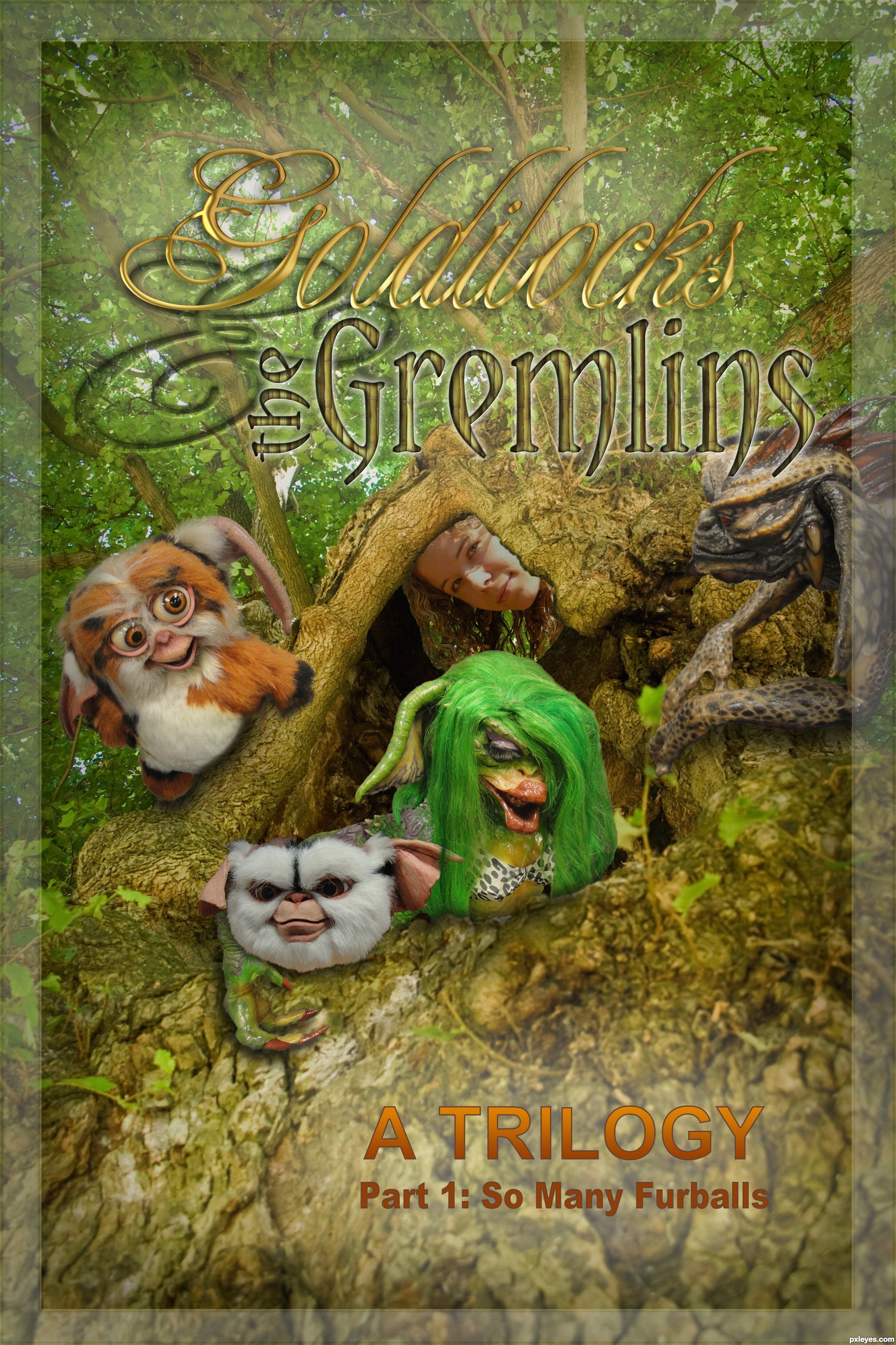
I chose one of the more difficult images just for the challenge. Only the not-so obvious steps are in the sbs, the rest is just painting, masking, basic ps techniques. The leaves that are behind the girl in this final image are the ones from the background image. After the girl's hair was extracted, I did a little retouching on her face as well. (5 years and 3027 days ago)
That's one sexy green haired Gremlin, should have been Part 1: So Many Hairballs. This looks great love the choice of colors.
BWHAAA HAAAA HAAAA HAAA.. very well done
I don't see much of a masking challenge here...you cropped out most of the girl's hair in the source pic.
i agree with CMYK..the hair wasn't masked out at all
I disagree with you RickLaMesa, the SBS shows the extraction clearly and then the author incorporated it into the Poster design (Part of the problem with the contest is that image you MASK has to be combined with 5 other sources) and the author did a swell job IMHO
I have to disagree with both KY's and lemesa's comments. Too start with it looks like what was originally there of the girls hair/head is indeed still very visible in this picture. The high resolution and step 1 of the sbs clearly shows the hair has been masked well.
I don't vote on SBS steps, I vote on the final image, and in the final image, none of that work shows, which is what the contest is supposed to be about.
lol could have called it a trology :P
good job, good luck
Congrats!
Howdie stranger!
If you want to rate this picture or participate in this contest, just:
LOGIN HERE or REGISTER FOR FREE
(5 years and 3028 days ago)
I like your reflections.
Howdie stranger!
If you want to rate this picture or participate in this contest, just:
LOGIN HERE or REGISTER FOR FREE
Photography and photoshop contests
We are a community of people with
a passion for photography, graphics and art in general.
Every day new photoshop
and photography contests are posted to compete in. We also have one weekly drawing contest
and one weekly 3D contest!
Participation is 100% free!
Just
register and get
started!
Good luck!
© 2015 Pxleyes.com. All rights reserved.


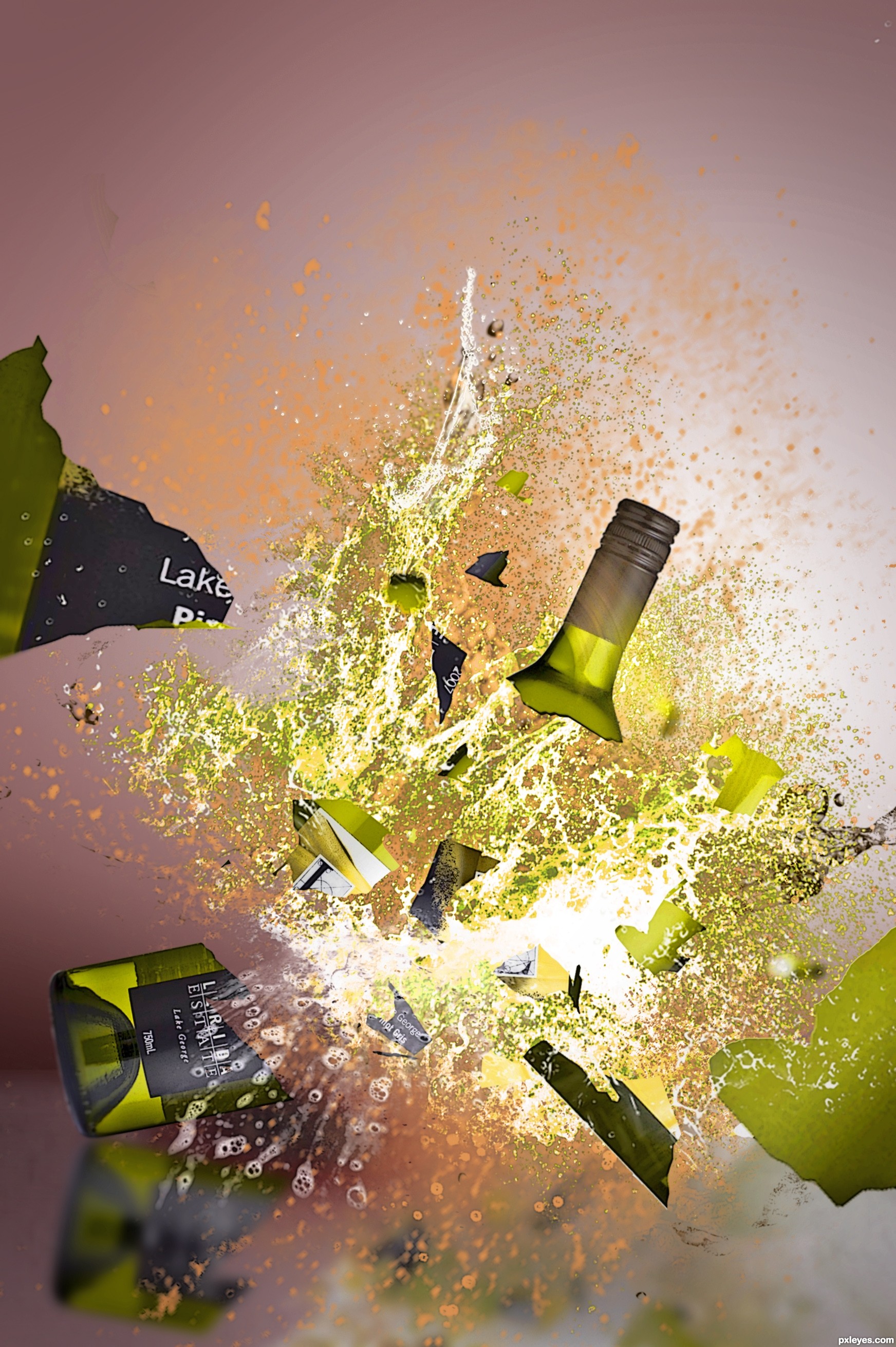
very well done, the olive color palette is quite neat.. good luck
very nice entry, the only thing i would change somewhat is the angle of the glass pieces. I would try to emboss it a little bit to give it a little bit more debt and variation of the arround flying pieces.. the neck of the bottle looks great done but the other pieces still look somewhat flat. This image is however a great idea and the fluids youdone well too.
I really like this entry! it has a very "artsy" look to it. I'd hang this on my wall!
awsmm wrk Author!!
I can almost hear the glass breaking (I love that sound)!! Good work author!
Thanks for the words peeps.
Too much debris from just one bottle, but otherwise nicely done.
Actually I only used cut outs from theo original bottle.... no more no less. Any less and I would have half a bottle.
Howdie stranger!
If you want to rate this picture or participate in this contest, just:
LOGIN HERE or REGISTER FOR FREE