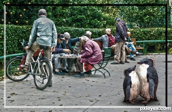
Used Puppet warp and size to make the second penguin (5 years and 3017 days ago)
- 1: source1
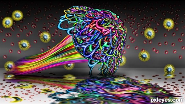
(5 years and 3018 days ago)
Wow!..love the reflection!
Lot of work here, good job!
Surrealist your idea, good luck
Love the colors, very clever use, especially step 10. 
Magic plant 
Howdie stranger!
If you want to rate this picture or participate in this contest, just:
LOGIN HERE or REGISTER FOR FREE
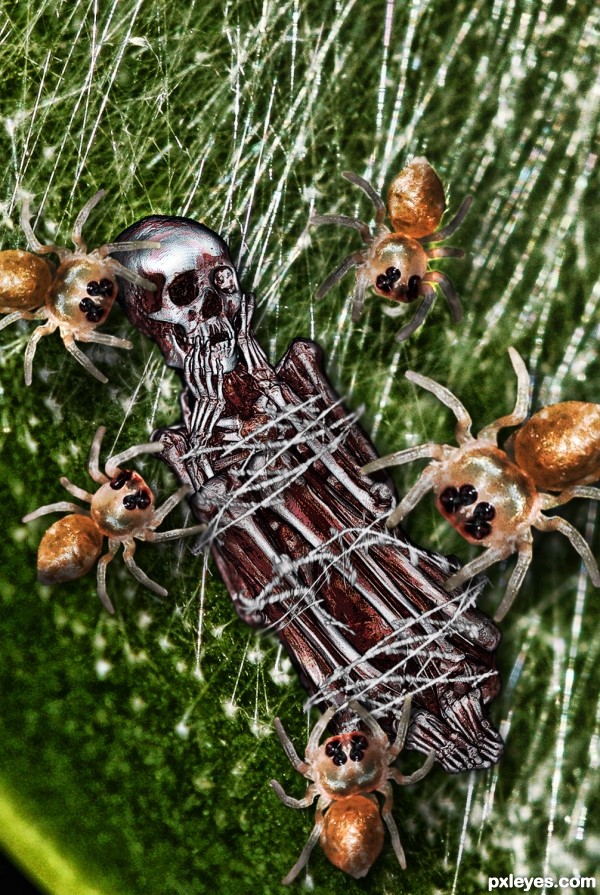
(5 years and 3019 days ago)
disturbingly good
Wow....forget "marabunta" these spiders are small killers! The guy did not have a chance....! Nice chop, good luck!
Howdie stranger!
If you want to rate this picture or participate in this contest, just:
LOGIN HERE or REGISTER FOR FREE
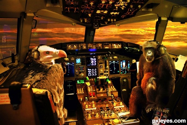
credit to Aaron Landry, Bill Liao, Fly For Fun, MattHurst and Dhammika Heenpella / Images of Sri Lanka for the use of your pictures. (5 years and 3020 days ago)
hah great! love the pilot!
lots of fun
Nice job on the reflections of the cabin. LOL, shouldn't the 1st Officer have his seatbelt on? 
Lol Pearlie that's why he's only a 1st officer he's always ignoring the rules and besides he's thinking about a trip to the head. 
Bringing the warm colors of the sky into the cockpit kills depth, but the image still works.
Howdie stranger!
If you want to rate this picture or participate in this contest, just:
LOGIN HERE or REGISTER FOR FREE
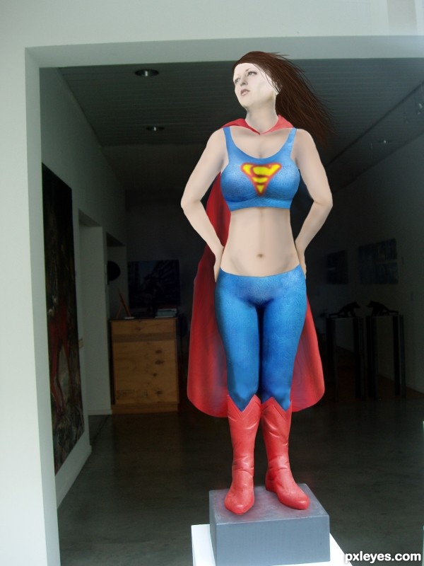
After some time in the gym, a good diet, and some therapy Super Woman got back on the pedestal. (5 years and 3020 days ago)
What's the source for the "S" on the chest, and why is the yellow area green? The red area should be the same red as on the costume, too.
Pretty easy symbol, no source. green is coming from the layer being multiplied with the blue below it. Same with the red, its the same color but just tinged due to multiplied layer.
No source? Then please show how you made it. And you could easily adjust the color to match the costume.
Adjusted colors. I'll add the symbol creation into the sbs in a few minutes.
Considering that the 'S' is a Specialized font, I too would like to see its creation in the SBS...
SBS now includes how the symbol was created.
Well now, that wasn't so hard, was it? 
The SBS clearly states you did not draw the 'S', and it is not a common font, so where did you obtain it from?
Hi Mossy,
The SBS does clearly illustrate how i created the logo. No matter how many times you say it, or accuse me of "obtaining" it, its not going to make it true. It was drawn...plain and simple. I am having a hard time understanding why that is so hard to see. As a matter of fact, it seems like it would be easier to go find a free stock image of this symbol and use it instead of creating one myself, as I did. I don't have video capture capability on this computer or i would do it that way, the best thing i can do is show you the process in the steps provided.
The Superman symbol is a copyrighted logo so really should not be used. The "S" is not a type font at all it is a hand lettered graphic incorporated in a triangular border. A type "font" is the term for the entire alphabet, numbers and symbols based on a particular design. There are "Superman" fonts in existence now based on the logo and also those based on the 3 dimensional comic book titles.
Your right it is a copyrighted image. I figured if it was drawn it wouldn't be an issue for this contest. With all the flack I'm getting for it I don't know if its worth it keeping in the image Your avatar says mod, so if you need me to take it off her I will. Just say the words.
Used the smudge tool to make the logo unrecognizable in relation to the copyrighted one.
Howdie stranger!
If you want to rate this picture or participate in this contest, just:
LOGIN HERE or REGISTER FOR FREE
I think this piece could be stronger without the border. That's just my opinion though. Good luck!
Howdie stranger!
If you want to rate this picture or participate in this contest, just:
LOGIN HERE or REGISTER FOR FREE