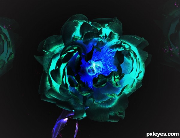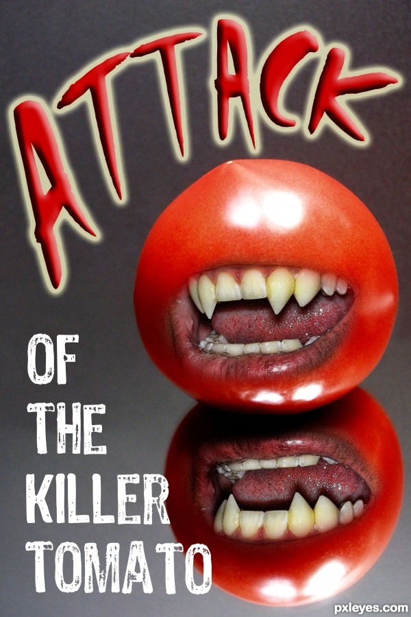
Hi there i used the original flower and flipped the layers around and added a divide layer and used my brush to fill in the stem and sparkles. i hope you enjoy! (5 years and 2594 days ago)

A kite's journey across the world. (5 years and 2595 days ago)
Howdie stranger!
If you want to rate this picture or participate in this contest, just:
LOGIN HERE or REGISTER FOR FREE

(5 years and 2597 days ago)
scary tomatoes 
i wont go for this movie
very nice  keep it up
is that the reflection of tomato? then you should decrease the opacity
I matched the original photo
Hello author. The reflection is off a bit. It actually is different than the original tomato all together. I will try to help you out to the best of my abilities. I would duplicate your tomato and all the elements that make up the tomato (such as the mouth glares, etc...) then I would merge all the duplicated layers together. After this flip the merged layer and move it straight down to the base of the original tomato. Reduce the opacity to about 50% and then cover with a reveal all mask. Now use a black to white gradient on the mask to reveal the tomato so that it gradually fades to nothing at the bottom. I hope this helps. There is probably a better way to explain this. Good luck author.
EDIT: Sorry author i didn't even look at the source picture before I commented. The reflection is fine. I think something with the mouth is off a bit though. I cant quite put my finger on it. I think the top lip in the reflection is too dark. if you look at the lips on the "original tomato" the upper lip is not even there. if you look at the reflection the upper lip is very dark. Otherwise, Good work and good luck.
hehehe, thank you so very much for all the help, I really thought the original reflection was strong, but that was why I used it 
THANK YOU VERY MUCH
Howdie stranger!
If you want to rate this picture or participate in this contest, just:
LOGIN HERE or REGISTER FOR FREE

(5 years and 2598 days ago)
This is the story of my life!!! It made me cry... 
Good luck author  !
!
Howdie stranger!
If you want to rate this picture or participate in this contest, just:
LOGIN HERE or REGISTER FOR FREE

this is my second entry as first will most probably be remove.All lightings are made with ps (5 years and 2599 days ago)
Nice! 
It's a very nice image but you shouldn't be so negative there's nothing wrong with the sources you have used. The only problem you have is with source 3 which the author states "Standard restrictions apply and FlorinN must be notified and credited when using the photo for any public work." That means you have to give a line of credit for the author, all you need to do is write " Thanks to FlorinN for the use of Source 3." and put that in your description or in the anchor text for source 3. If you don't you will be sent a warning to do so. It's a good idea to always give credit to the source authors, it's good manners and you'll never miss a required credit line.
Nicely put together but please be a bit more carefull with selecting/masking the images. In Hires the house looks very cut out like you only used the polygonal lasso tool and that's it. The mood is ok, but details like a good masking are very important. Good luck!
Howdie stranger!
If you want to rate this picture or participate in this contest, just:
LOGIN HERE or REGISTER FOR FREE
Howdie stranger!
If you want to rate this picture or participate in this contest, just:
LOGIN HERE or REGISTER FOR FREE