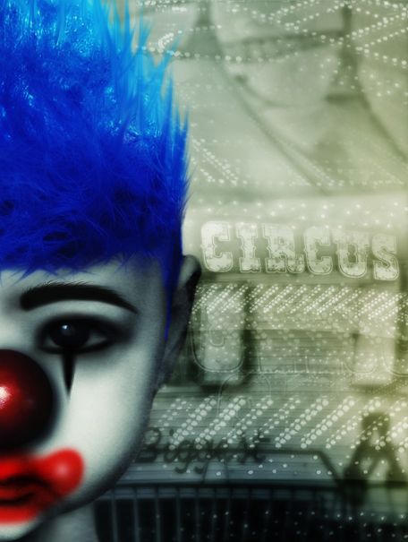
For the eye liner,eye shadowing, and eyebrow..I used simple black brush,for the mouth some red brush with blending mode..for the eyebrow and hair I used some brush,warp,and smudge tool. (5 years and 3055 days ago)
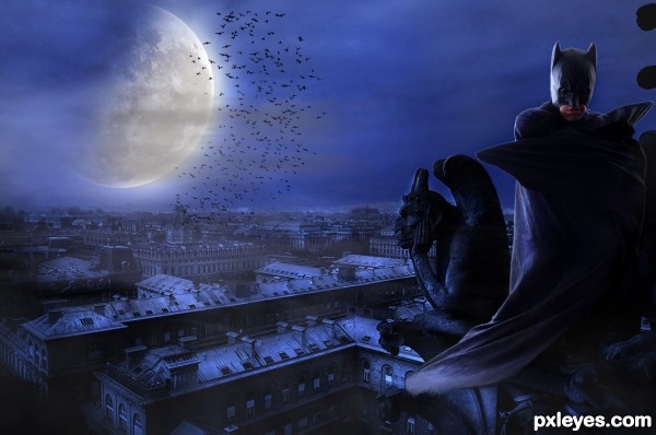
credit:
http://stormxstorm.deviantart.com/art/Street-and-City-Stock-17-167645166
http://browse.deviantart.com/resources/?q=batman&order=9&offset=48#/d3h49en
http://mrhighsky.deviantart.com/art/Moon-and-Light-Brushes-119466660?q=boost%3Apopular%20in%3Aresources%20moon&qo=556
http://www.flickr.com/photos/amynkassam/3793627911/in/photostream/
(5 years and 3056 days ago)
Nice mood. Might be better to flip the moon, since the light on the figure is from the left...should be that way on the moon too.
thank you CMYK for your suggestions..
The sun is reflecting onto the moon and then reflecting onto the scene, so flipping the moon isn't really necessary. Flipping the moon would indicate that both moon and scene are being lit by the sun.
Just my opinion, no offense meant CMYK.
Plus if you flip it, the Northeast Oceanus Procellarum would be backwards and the phase would be all wrong....hahaha just kidding, no idea what I'm talking about there.
Good luck.
Hey, just my opinion...you might wanna clear up some of the white edges on the foreground figures, though...
Great scene! I would personaly have made look batman to the city 
very neat image.. good luck author 
The statue looks too plain compared tot he character, it should have some light edges as the batman figure. Otherwise it's really good, great work.
Awesome 
thank you all for your suggestions,comms and favs !!
Howdie stranger!
If you want to rate this picture or participate in this contest, just:
LOGIN HERE or REGISTER FOR FREE
photomanipulation (5 years and 3057 days ago)
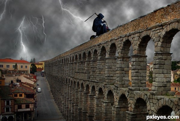
whats the sky/lightning source?
@Eladine ; the sky was rendered in Photoshop while the lightning was done using normal brushes with added effects like "outer glow" .
By the way , thanks for commenting : )
Nice mood, but the Reaper is out of proportion for the image - He would be almost as tall as the arch if he stood up off that tricycle...
@ MossyB ; the Reaper was meant to be bigger than typical human beings (it is the Reaper after all) ... Anyway , thanks for commenting : )
Nice idea. I think it will look better if you desaturated the other buildings (to mach with the dark clouds).
Reaper on a tricycle...LOL...pretty darn goofy. 
Author has added credit: "Thanks to Marcus Ranum at DeviantArt for the use of his image."
Howdie stranger!
If you want to rate this picture or participate in this contest, just:
LOGIN HERE or REGISTER FOR FREE
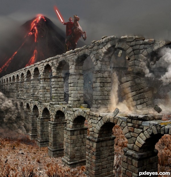
While i was working on this, i was also reading about Snurtr with the flaming sword and the battle of Ragnarok. The result was that image became very different from what i had initially in my mind. (5 years and 3057 days ago)
good hard work 
Vegetation on ground is out of scale with the rest.
good work done in destroying bricks........but the volcano is not fitting very well.....play with the colour of volcano to get a better result.....good luck
Thanks for the comments. Don't have the time to fix it now, so it will stay this way.
Congratulations on second place, good work.
congrats 
Howdie stranger!
If you want to rate this picture or participate in this contest, just:
LOGIN HERE or REGISTER FOR FREE
(5 years and 3058 days ago)
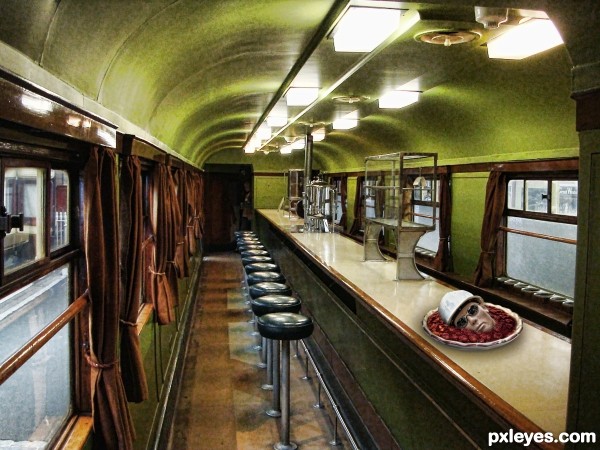
Gross! HAHA. Good luck author!
Howdie stranger!
If you want to rate this picture or participate in this contest, just:
LOGIN HERE or REGISTER FOR FREE
Very Cute Clown, Love what you did with the hair .... Good Luck
Thanks a lot weatherspc!..
Nice composition The hair looks fashion lol
LOL!! Akassa u are right!..pretty fashion.
Thank u very much Nator!..
Congratulations.
Howdie stranger!
If you want to rate this picture or participate in this contest, just:
LOGIN HERE or REGISTER FOR FREE