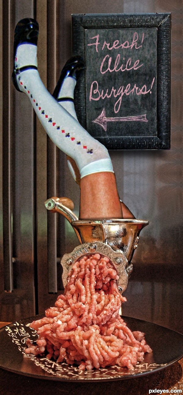
(5 years and 3057 days ago)
- 1: Chalk Board
- 2: Meat Grinder
- 3: alice
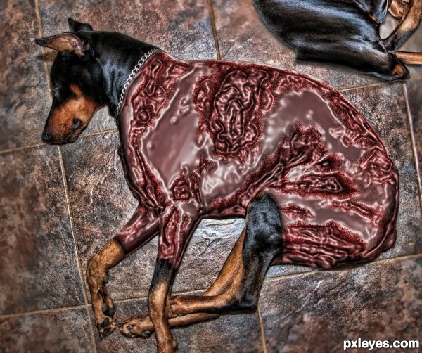
(5 years and 3059 days ago)
I think we were supposed to "undress" them not "rip off their freakin' flesh". Lol.
Good job nonetheless 
I know what you mean nbaztec, I got it all pink and nudie and then said, oh to hell with it and I saturated and plastic wrapped the heck out of it, though no blood spill 
A visually powerful entry nonetheless. Not to mention gross. 
to much plastic, it's not realistic.
Very nice and disgusting at the same time lol, good luck!
Howdie stranger!
If you want to rate this picture or participate in this contest, just:
LOGIN HERE or REGISTER FOR FREE
http://www.pxleyes.com/forum/viewtopic.php?f=6&t=1755&start=60
Section of the Forum (5 years and 3062 days ago)
Congrats!!
congratulations for the third place, well done 
Congrats
Howdie stranger!
If you want to rate this picture or participate in this contest, just:
LOGIN HERE or REGISTER FOR FREE
(5 years and 3062 days ago)
Try using the pen tool or lasso tool to avoid jagged edges on a selection.
Fixed up to some extent, thanks. 
Congrats!!
Howdie stranger!
If you want to rate this picture or participate in this contest, just:
LOGIN HERE or REGISTER FOR FREE
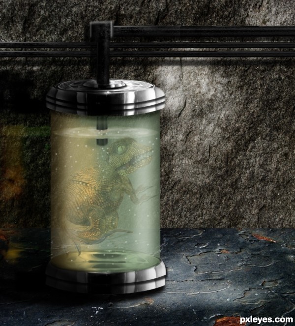
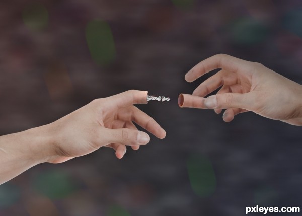
Thanks to mqtrf from pxleyes, for the pic of the wall, to grafixar from morguefile for the pic of the dino eye, and to ppdigital also from morguefile for the pic of the texture for the foreground. The rest is the result of using the image source. (5 years and 3062 days ago)
Great work!
Thanks Ichappell........
The rendering is very nice but there is a little problem with the perspective of the cylinder. The ellipses should be a little flatter at the top and get more rounded as you go further below eye level. You can find several links with google to help, this one will show you the basic perspective: http://www.artyfactory.com/perspective_drawing/perspective_7.htm
As I said the rendering is good, if you could tweak the perspective IMO it would make it even better.
This entry is very nice, original and well done.
You can improove it by adding a better ( more dark and long) shadow at the base of the cylinder.
Nicely done!!
Wonderful execution, but there's something about it that I can't get to believe it's "inside" the container. Might be the perspective or the non-blurriness of the creature behind water. Good luck 
Thank you for comments. Spaceranger: I worked on the perspective of the top ellipses. Tempora: worked on the shadow, and nbaztec: I think the creature looks it is "inside" the water. Thanks anyway.
Excellent tweaking author! Perspective looks much better and the darkening of the shadow adds more drama! The creature looks fine to me, definitely looks inside the container. 
Don't get me wrong author, the creature looks well inside, but not like a solid object inside water, I still can't figure out why? The container looks stunningly superb! Excellent job on the container & the SBS.
Above all just ignore me & enjoy a job well done. 
@Spaceranger: Thank you for your tips and all your help!!!!
@nbaztec: Hey, my friend. I had the same problem when I did the filters and the blending for the creature. Nothing wrong with your comment, I really appreciate your time looking at my work.
very cool and fun author.. very good look  lizards in jars.. IT'S THE MATRIX! giggle snort
Very creative work, author, good construction of the lizard creature especially! 
Thanks Driven, pearlie..... comments appreciated.
Congrats George nicely done!!
Thanks Spaceranger..... (Also, thanks for suggestions)
Congrats George 
Congrats, George! 
Howdie stranger!
If you want to rate this picture or participate in this contest, just:
LOGIN HERE or REGISTER FOR FREE
holy cow!..jeje lov this twisted pic!...
Thinking outside the obvious or proverbial box! Deserves a high vote from me. Yikes!
OMG! this is insane, fantastic concept about wonderland, very creative, good luck!
Very creative and so totally twisted. Well done and good luck!
Howdie stranger!
If you want to rate this picture or participate in this contest, just:
LOGIN HERE or REGISTER FOR FREE