Photoshop Pictures: The (page 133)


results 661 - 665 of 2863

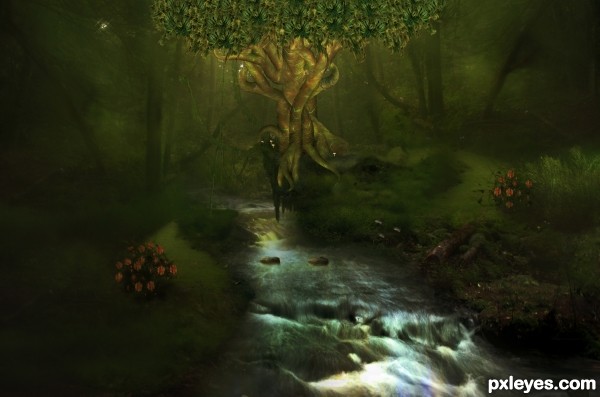
The Tree - created by TwilightMuse


The Tree
Favs: 0SBS: 21Hi-resRank: 6/12Score: 60.8% (0)8133 views

Tried to redo it to include more of the source image. Made a gnarled tree to replace the sword. Tree used two carrot selections and the carrot leaves. IMO, I liked the original better and considered it some of my best work but since it mainly got criticisms for source use I wanted to change it up to something which might be more acceptable. I'll update the SbS soon. (5 years and 2924 days ago)

avatar CMYK46
CMYK46 says:

You need to post links to all sources used, or post your own uncut photos in the SBS.
And BTW, I have no idea how the carrot source or stylus were used in your image, despite the SBS.

author says:

Oops sorry I didn't main to publish it yet, not sure how that happened. I'm working on the SBS right now but it might take a bit, its lengthy.

author says:

All done!

avatar erathion
erathion says:

I still don't see where u used provided contest source image author...If u are new on PXL please read rules and guidelines...http://www.pxleyes.com/guidelines/

author says:

Mushrooms around sword, stepping stones in creek, mushrooms on bank next to creek.

author says:

Oh and the "lashes" around dragon eyes. Steps 20 and 21 show this.

no avatar
pshoudini says:

its a nice composition, but i cant really tell where you used the original source provided for the contest.

avatar MossyB
MossyB says:

The use of the carrot leaves in the background is almost negligible, since you can't make out what they are. This is a lovely image, but the use of the contest source photo is very, very hard to discern within it. Submitting it to the stylus contest would be more logical, since you can somewhat make out that contest source image...Still, an excellent effort, combining many disparate images into a cohesive picture.

author says:

You can't tell what things are because carrots and radishes wouldn't make sense in an image like this. I blended and changed colors. The stepping stones are quite clear and those were the tops of the radishes. The mushrooms are also clear, carrot bottoms and radish tops. Everything was blurred slightly to keep with the feel of the whole image. I can't enter the stylus contest because I'm not a level 15. I've seen many images with the source image hidden so well that looking at it without an SBS ones lost on how it was used.

avatar Eladine
Eladine says:

I love the image but as much where it comes to use of source image i cant really give a high score

Howdie stranger!
If you want to rate this picture or participate in this contest, just:

LOGIN HERE or REGISTER FOR FREE


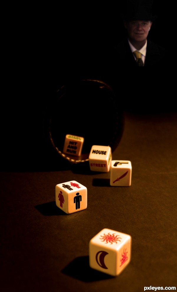
Planning the murder - created by JimLemon


Planning the murder
Favs: 3SBS: 6Hi-resRank: 2/12Score: 68.7% (34)15618 views

I hope you get what each die means ;) (5 years and 2925 days ago)

2 Sources:

avatar enblanco
enblanco says:

great entry, good luck!

avatar riady
riady says:

Wow, nice concept and seamlessly blended with the overall image. Well done

avatar Akassa
Akassa says:

Very creative, would be a real psycho ~~

author says:

Thanks for your comments!! They're really appreciated

avatar erathion
erathion says:

Great entry author...One of the favorite for sure...GL

author says:

Thank you two! And yes... I hope so

avatar Drivenslush

well done

avatar spaceranger

Congrats!!

avatar sigi
sigi says:

congrats!

Howdie stranger!
If you want to rate this picture or participate in this contest, just:

LOGIN HERE or REGISTER FOR FREE


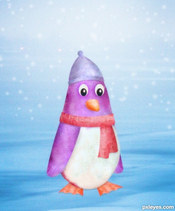
Just me and the snow... - created by JimLemon


Just me and the snow...
Favs: 1SBS: 9Hi-resRank: 8/12Score: 60.5% (0)6719 views

(5 years and 2925 days ago)

1 Source:

no avatar
pshoudini says:

cute little buddy

avatar lilybean2011

Aww! thats adorable! :3

Howdie stranger!
If you want to rate this picture or participate in this contest, just:

LOGIN HERE or REGISTER FOR FREE


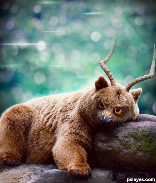
The Forest Guardian - created by langstrum


The Forest Guardian
Favs: 10SBS: 9Hi-resRank: 3/12Score: 68.6% (29)14553 views

This image was made for the four animals contest but I didn't finish it on time.
The Forest Guardian was made from a bear, an owl, a falcon, and a deer (5 years and 2926 days ago)

6 Sources:

avatar Drivenslush

he is very floofy! (I want to stick my finger in his belly to make him giggle like the Pillsbury Dough Boy )

author says:

Just be careful, he might be hungry now

avatar orientallad

amazing blending, i'm impressed, just one tiny suggestion, why not giving it's fur something like tiger stripes, by that could get even more combined animals, great job and good luck

avatar MossyB
MossyB says:

Exceptional blending on the face. Very well done entry!

author says:

Thank you all for your comments. @orientallad: I actually planned to do that but the 4 animals contest restricted the number of creature to 4. Now I'm free from the rule so I might give it a try, thank you for your suggestion.

avatar loopyluv
loopyluv says:

Great work, just love him!!!!!

avatar Akassa
Akassa says:

Very good blending, a like the new specie result.

avatar Athanaric
Athanaric says:

Ah, I know it! It's Ursus aquiliatus ibexii or The Goatly Hawk-bear.

avatar rodrigo73
rodrigo73 says:

Great work... the blend is perfect!! good luck!!

avatar Clinge
Clinge says:

Very nice GL

avatar nbaztec
nbaztec says:

This things is absolutely furry and cute. Too bad you didn't get a chance to upload it in time.

avatar dekwid
dekwid says:

no wonder it is so perfect,...it is yours and it is my fav for sure.....!

avatar erathion
erathion says:

Fantastic image and amazing creature...Best of luck author, u still made perfect entry's...

avatar rsguetre
rsguetre says:

I second all the comments so far -- just a suggestion for a small improvement: the horn on the right is touching the border - an easy fix - excellent otherwise

avatar nikita1972

Maybe not the wisest thing to say but you should have won.
Because I see a artist and this is something I would hang on my wall (something I would never do with most of the entries)
And thats all I wanted to say


avatar spaceranger

Congrats!!

author says:

Thanks everyone for voting, comment, and faving my entry, I appreciate your supports ^^

avatar nishagandhi

wow this is amazing! great blending! congrats

avatar 6tann
6tann says:

nice composition

Howdie stranger!
If you want to rate this picture or participate in this contest, just:

LOGIN HERE or REGISTER FOR FREE


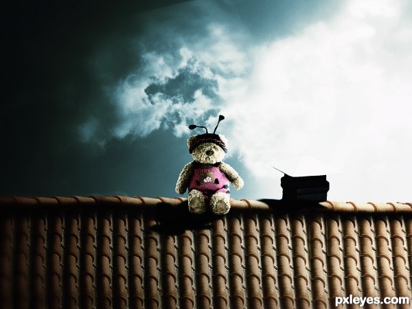
poo on the roof - created by itsdesign


poo on the roof
Favs: 0SBS: 4Hi-resRank: 4/12Score: 66.7% (42)10499 views

(5 years and 2927 days ago)

2 Sources:

avatar CMYK46
CMYK46 says:

The top of the chimney vent disappears against the background.

author says:

What do you suggest for it to be fixed?

avatar DanielaOwergoor

Beautiful art, lovely. Love the color tones...
... But I agree with CMYK in the same point...

avatar DanielaOwergoor

I know you did'n ask to me, but the suggestion that at least around the chimney the light is reduced.
You're pro, you'll not be hard to get!

avatar CMYK46
CMYK46 says:

Darken one or the other.

avatar dustfinger

Nice job on the blending and the colors. A small addendum to the remarks of CMYK and Daniela: The light is coming from behind, so the visible part of the chimney top should be shaded.

no avatar
pshoudini says:

awww.its adorable....i love to see more of the chimney though...but other than that its a great chop...(i'd probably add some gray smoke coming from out of the chimney so ppl could recocgnize it more)

avatar TemporaNigra

Nice colors!

Howdie stranger!
If you want to rate this picture or participate in this contest, just:

LOGIN HERE or REGISTER FOR FREE