(5 years and 3158 days ago)
(5 years and 3158 days ago)
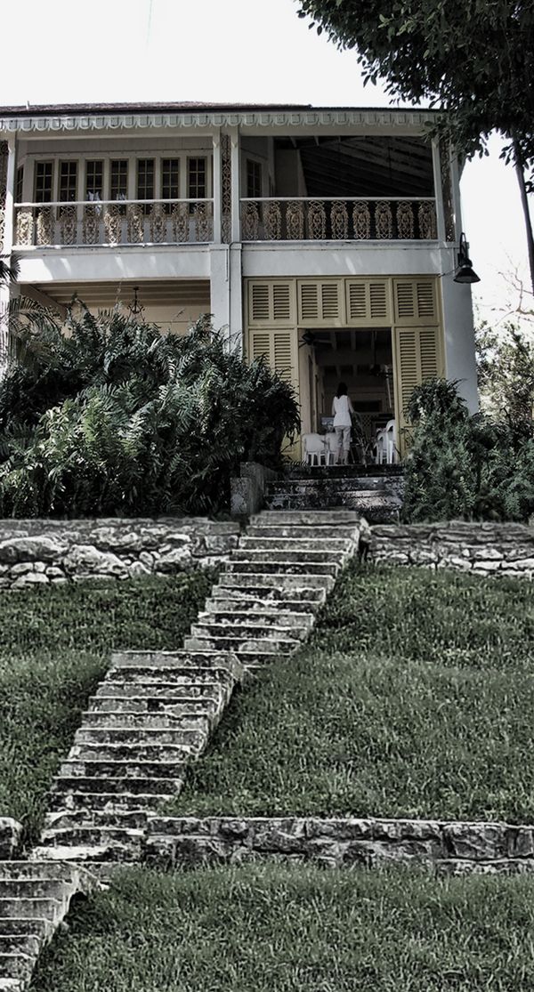
Stairs are a bit blurry and it's like ZIG ZAG - going up then down - ...................... stairs are only Zig Or Zag
blending is nice
good luck
Howdie stranger!
If you want to rate this picture or participate in this contest, just:
LOGIN HERE or REGISTER FOR FREE
(5 years and 3158 days ago)
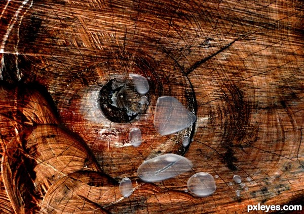
I don't see tears, I see blurry blobs.
The eye doesn't really look like part of the tree, it looks too cut and paste. Perhaps a different layer mode would help.
nice idea but u need darker wood so we can see all effects ............... I THINK ?
Good Luck
thanx designed
I changed it ...... really is better
thanx designed
beautiful work author
nice thought good luck
Howdie stranger!
If you want to rate this picture or participate in this contest, just:
LOGIN HERE or REGISTER FOR FREE

Spec Thanks to perpetualplum for use of his world map picture found on Flickr photo sharing.com (5 years and 3158 days ago)
The double space between 'World' and 'Wide' is distractring, made more so when they should really be a hyphenated adjective. The double PXL logos on the sides come across as secondary when a single big logo in the center could be compelling.
The fingernails are shaded funny, they look almost dirty.
DanLundberg Thanks for the comment I too care of it.
MossyB Thank you also The hands were done with a mask ok I redid by ding a solid hand and pasting over it but you lose the detale in hands and nail swhat I mean in # 10 in sbs. I put the redo #9 up. Yea maybe I could have had someone take picture of my hands But only one home with me is my dog..lol But thanks
really looks like a Tshirt logo.. good luck author
good work author good luck
Thanks guys.
Howdie stranger!
If you want to rate this picture or participate in this contest, just:
LOGIN HERE or REGISTER FOR FREE

(5 years and 3158 days ago)
Nice painting. 
very realistic work author like it
reaaly looks like painting man
brilliant
Howdie stranger!
If you want to rate this picture or participate in this contest, just:
LOGIN HERE or REGISTER FOR FREE
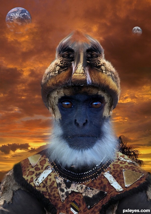
The light reflection in the eyes is a bit distracting, and is inconsistent with the back lighting of the background.
this is great work author good luck
like ur work
Awesome chieftain, what a pity, he doesn't look friendly enough
Howdie stranger!
If you want to rate this picture or participate in this contest, just:
LOGIN HERE or REGISTER FOR FREE