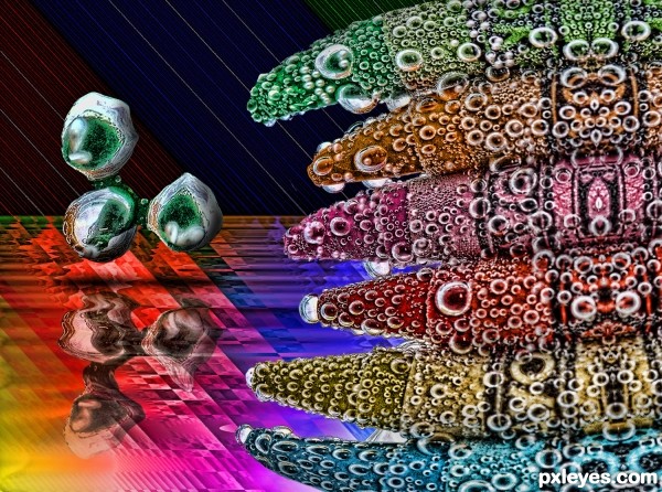
mother protecting her eggs (5 years and 3139 days ago)

the back could be the other side of the earth and people could mark their approx. location (5 years and 3139 days ago)
Really nice concept. Good manipulation!
Really great concept but you are missing a part of the description 'PXL ON TOUR' should be mentioned in the design 
I like your idea of adding a print on the back. 

Cool!
I am so inpressed with so many wonderful entries here and this is definitely one of the best!
Very good potential for a white T-shirt. I do feel more contrast (shadows?) between "PXL ON TOUR" and the background would be more striking when printed on the T-shirt.
The logos on the compass points seem repetitious and boring. Would it be too trite to dress them in parkas, sombreros, grass skirts, kimonos, etc. to add some variety? Or perhaps they could be deleted altogether for a simple, less-is-more approach.
lovely entry.. good context and usage of images for the shirt.
I like This, nice work !
I like your idea, but if you just make the words, "ON TOUR" a little bigger and separated from eachother, in this way they will be more readable. You have enough space between the edges of the world to make the change. This is just my opinion, the design is yours. Good luck.
I always received some great ideas and comments thank you all. The quandary I have is when to apply them? In this case I agree the letter could be larger and since this is a focus of the T shirt I have revised it.
..
ty you all for the kind and informative comments
great work...
lovely
One of the best..
Good work! congrats
Nice Congrats
Congrats..
Howdie stranger!
If you want to rate this picture or participate in this contest, just:
LOGIN HERE or REGISTER FOR FREE

(5 years and 3140 days ago)
like it author..
The hand is very well done but that pill needs work A real looking pill with out the dark lines would have gotten a much better score here.

Wow! Cool!
Howdie stranger!
If you want to rate this picture or participate in this contest, just:
LOGIN HERE or REGISTER FOR FREE

(5 years and 3140 days ago)
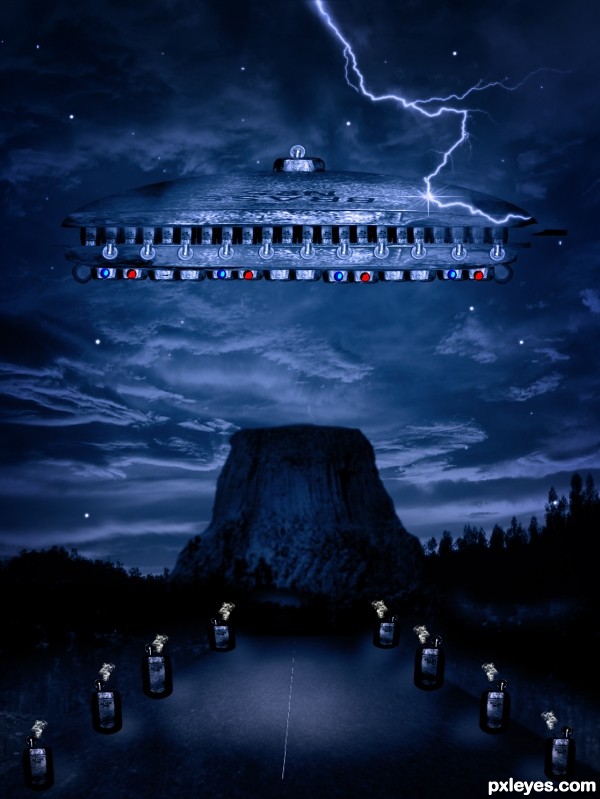
The lighting of the UFO is odd, since the light source is behind it and beneath it, and the lightning is striking it on one side. Try to adjust it to be more consistent with the rest of your image and it will look better.
agree with MossyB but it is a wonderful entry author
best luck
Best of luck author!
Howdie stranger!
If you want to rate this picture or participate in this contest, just:
LOGIN HERE or REGISTER FOR FREE

just tried.. (5 years and 3140 days ago)
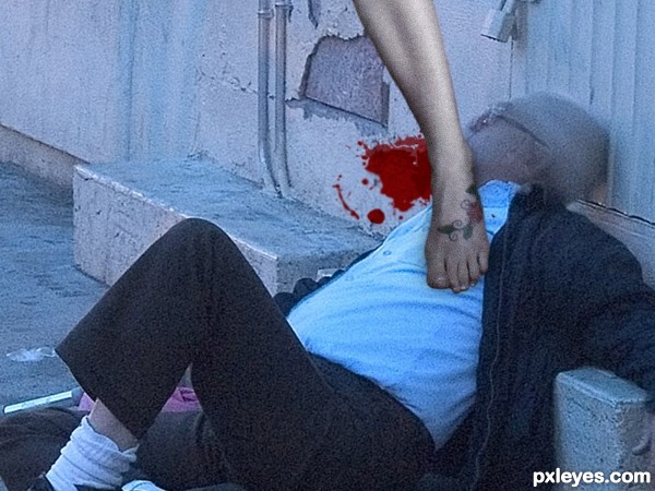
The background image has much more noise than the contest source - You should add additional noise to the leg so that it is more consistent with the background. Good color match, though.
and maybe you should add a high heel shoe on the foot so that it looks like some crazy dancer shoved her stilhetto into some perverts neck! lol
Thank u MossyB i added noise to the leg..
Better, now maybe just lighten the shadow on the left side of the leg - the body shows a light source from that direction.
WOW!!! A disembodied zombie leg that hops after its victims, stomps them, and kills them! Just wondering how it manages to eat their brains, though...
Hi Moderator,
I modified my entry. Now i used Blood Brush Please find that.
Thank you.
Thanx to all who comment on my picture..
very funny author gl
Author, this is really hilarious. I'd love to know what you were thinking. 
Oh no!!! Beat of luck author! 
Sorry * Best
Howdie stranger!
If you want to rate this picture or participate in this contest, just:
LOGIN HERE or REGISTER FOR FREE
Interesting idea, great mood.
Creatively done. Love the mood.
Good Idea Author.. Very Nice Image..
Great job! great mood!
Good work..nicely done
good work...
Such a wild and wonderful imagination you have, love your concept and chop.
Howdie stranger!
If you want to rate this picture or participate in this contest, just:
LOGIN HERE or REGISTER FOR FREE