Photoshop Pictures: The (page 163)


results 811 - 815 of 2863

The Demon - created by rizazte


The Demon
Favs: 1SBS: 2Hi-resRank: 8/15Score: 62.7% (0)8284 views

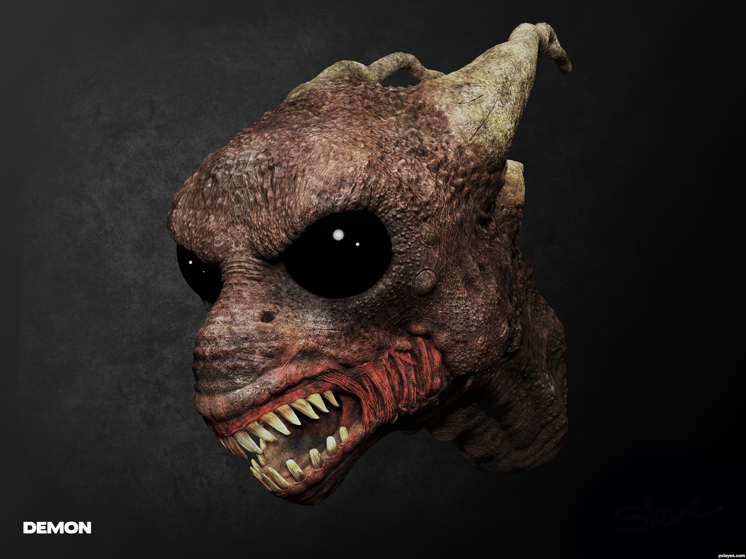
I created a creature head a while back, I used Zbrush to sculpt the model, detail was also sculpt using Zbrush. The base colour was painted into Zbrush then touched up and composition applied in Photoshop CS4.

I hope you enjoy. (5 years and 2947 days ago)

avatar MossyB
MossyB says:

Very scary! Nice job!

author says:

Thanks very much

avatar CMYK46
CMYK46 says:

Might be good to know how this image was made. GL author.

author says:

It was sculpt from a sphere using Zbrush.
- It is an older piece of work, and only have a couple of stages captured... sorry about that, and thanks

Howdie stranger!
If you want to rate this picture or participate in this contest, just:

LOGIN HERE or REGISTER FOR FREE


The light is dimming - created by adelia


The light is dimming
Favs: 0SBS: 6Hi-resRank: 10/15Score: 59.8% (0)6839 views

(5 years and 2948 days ago)

avatar MossyB
MossyB says:

Nice mood! I'd maybe add some stars to the sky, but I like this!

author says:

thank you Mossy 
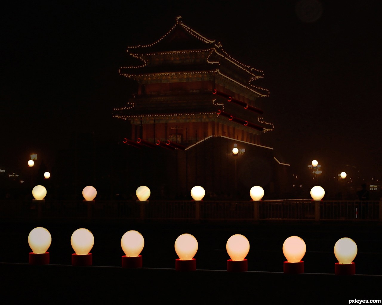
sometimes I love the darkness of the night,It reminded me of a place that I miss always,at my village,no electricity other than lighting of the lamp with kerosene fuel,I live in the village until I was 9 years old...you're right,add some star will definitely look more beautiful..

avatar Deki
Deki says:

is that a moon on the top right? gl

author says:

yes deki..that`s a moon.

Howdie stranger!
If you want to rate this picture or participate in this contest, just:

LOGIN HERE or REGISTER FOR FREE


The First Weaver - created by IDt8r


The First Weaver
Favs: 6SBS: 5Hi-resRank: 2/15Score: 74.3% (75)11410 views

(5 years and 2948 days ago)

1 Source:

avatar Alan2641
Alan2641 says:

nice build of the spider and lighting -- just wondering if the web would not have just a hint of shadow seeing as the spider has one

avatar Drivenslush

Woo HOO and a Ham sandwich

avatar MossyB
MossyB says:

Very clean work and quite imaginative!

avatar CMYK46
CMYK46 says:

Good lookin' spider! Might have been better to use a real web as reference, though.

avatar George55
George55 says:

Good looking spider....and a good job! Good luck author.

avatar aheman
aheman says:

horizontal pair of legs seem too short

suggest:
1) add abit more shading to the spider
2) add little suggestion of web on the shadow as well (no need to have full web, just a bit here n there)
3) saturate the whole image (personal perference)

avatar hereisanoop

superb entry

avatar yoguy108
yoguy108 says:

really like the spider, great work
wish you had put a little more effort in making the web and background as amazing as the spider

avatar yoguy108
yoguy108 says:

really like the spider, great work
wish you had put a little more effort in making the web and background as amazing as the spider
still... my vote with you

avatar itsdesign
itsdesign says:

Awesome entry

avatar Derivatix
Derivatix says:

great work, very creative and well done. The net is a bit small for a spider this size, but I love this, nevertheless.

avatar nilknarfsoive

very beautiful... this deserves a place...

avatar Glockman
Glockman says:

nice work

avatar JoeCacia
JoeCacia says:

Even thought I am not to die for spiders I must say this is an amazing work of art!!! Best of luck author, very well done!

avatar CMYK46
CMYK46 says:

@ Aheman: maybe you should spend a little time looking at the source pics before commenting.

author says:

And thank you again! Wow. Thanks!

avatar George55
George55 says:

Beautiful work....congratulations for 2nd!!!!

Howdie stranger!
If you want to rate this picture or participate in this contest, just:

LOGIN HERE or REGISTER FOR FREE


cat in the glow of the light - created by scratzilla1


cat in the glow of the light
Favs: 10SBS: 1Hi-resRank: 1/15Score: 68.2% (39)15104 views

thanks to the following for stock:
http://hanratty-stock.deviantart.com
http://constantstock.deviantart.com
http://eirian-stock.deviantart.com
(5 years and 2948 days ago)

3 Sources:

avatar Drivenslush

sooOOoOOooOOOOoOOooooo COOL!!! great job! and upload a hi res..

EDIT: YEAH! Whisker fix great job author

author says:

Hi Res just for you Driven slush....

avatar MossyB
MossyB says:

This is utterly delightful!

avatar CMYK46
CMYK46 says:

Excellent work!

avatar pearlie
pearlie says:

Hilarious, love it!

avatar robvdn
robvdn says:

Great entry!

But IMHO there's room for improvement... the stripes on the cat can be blended nicer (edges are to harsh) and a lack of a decent background which can be solved by a very blurred forest source or something like that. In short... I really really do like the head (don't even try to touch it anymore, it is perfect the way it is now. If you do: I have my ways to find you author ) but you can give the rest of the image some more attention.
Sorry if I sound harsh, that's not the way I intended it, trying to offer critique to improve this entry.

author says:

robvdn: HARSH! NO! great feedback that i find very helpful... THANKS> you have covered everything that i struggled with.... Did not think of a forest background.

Critique for improvement... THANKS AND HIUGS for the help.

Thanks to everyone for the great feedback and comments.

made some changes.. love to hear what you think..

author says:

Homer
Photos of Homer
You MUST credit me in your artist description. Copy and paste → :devhanratty-stock: is okay for me!

My stock is unrestricted and free to use. This includes
→ dA prints
→ offsite use - with credit if possible
→ commercial use
→ school/college work

It is NOT to be used to make stock from

http://hanratty-stock.deviantart.com/art/Homer-80174960
http://hanratty-stock.deviantart.com/gallery/9075258
http://hanratty-stock.deviantart.com/gallery/9075258#/d1bqfe8 link to cat

all credit and links have been provided.

thanks

avatar MossyB
MossyB says:

Ummm...now you've lost all major reference to the tilted bulb contest source...Just having it as the bright spots on the flowers is a minimal use at best, making this a nice CBR, but a bit of a topic stretch...But it'll probably still win, because too many voters couldn't care less about the amount of contest source when compared to the "wow" factor.

author says:

thanks MOssdy B. Took a stance with a happy medium.. I put back the source background , keeping in theme MORE.

Fixed blending probs with the stripes.

avatar neo2011
neo2011 says:

great work!!

avatar bcabilan
bcabilan says:

What should i say...Instant fav here...

avatar gchiou2008

Very good work, author, congratulations!

avatar CorneliaMladenova

Wow! Fabulous

avatar Drivenslush

CONGRATS!

author says:

Thanks to everyone for your support , comments and FAVS.

avatar madamemonty

Congrats fabulous work

avatar CorneliaMladenova

Congratulations, my friend! Great work

Howdie stranger!
If you want to rate this picture or participate in this contest, just:

LOGIN HERE or REGISTER FOR FREE


That's What the Water Gave Me - created by ponti55


Thats What the Water Gave Me
Favs: 0SBS: n/aHi-resRank: 4/15Score: 63.1% (20)13311 views

Thanks to Cloaks, Koko-Stock, Night-Fate-Stock and freestockswirls from DeviantArt (5 years and 2949 days ago)

5 Sources:

avatar MossyB
MossyB says:

The dark area on the right does not match in tone to the rest of the image, it looks too blue and does not add anything to the mood or composition. You'd be better off cropping the sides and reducing the fireworks' bokeh effect to squeeze it back into the image.

avatar CMYK46
CMYK46 says:

There's a shadow on the legs where there should be a highlight, since they're lit by the bulb.

Howdie stranger!
If you want to rate this picture or participate in this contest, just:

LOGIN HERE or REGISTER FOR FREE