thankyou for the brush to env1ro and
Lisajen-stock for the pic of her (5 years and 3174 days ago)
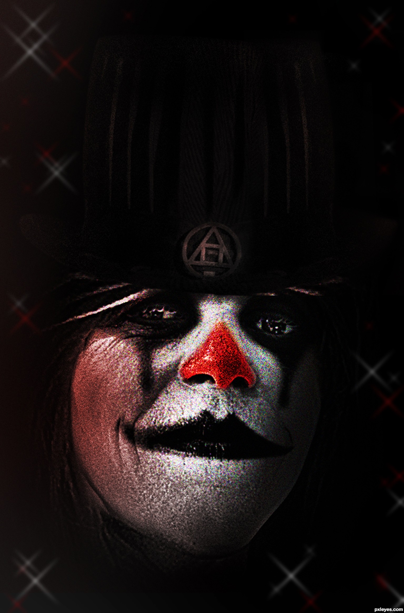
revisited, and redone
sbs may not happen as I was piecing this together and not saving.
thanks violentz
thanks jadis (5 years and 3174 days ago)
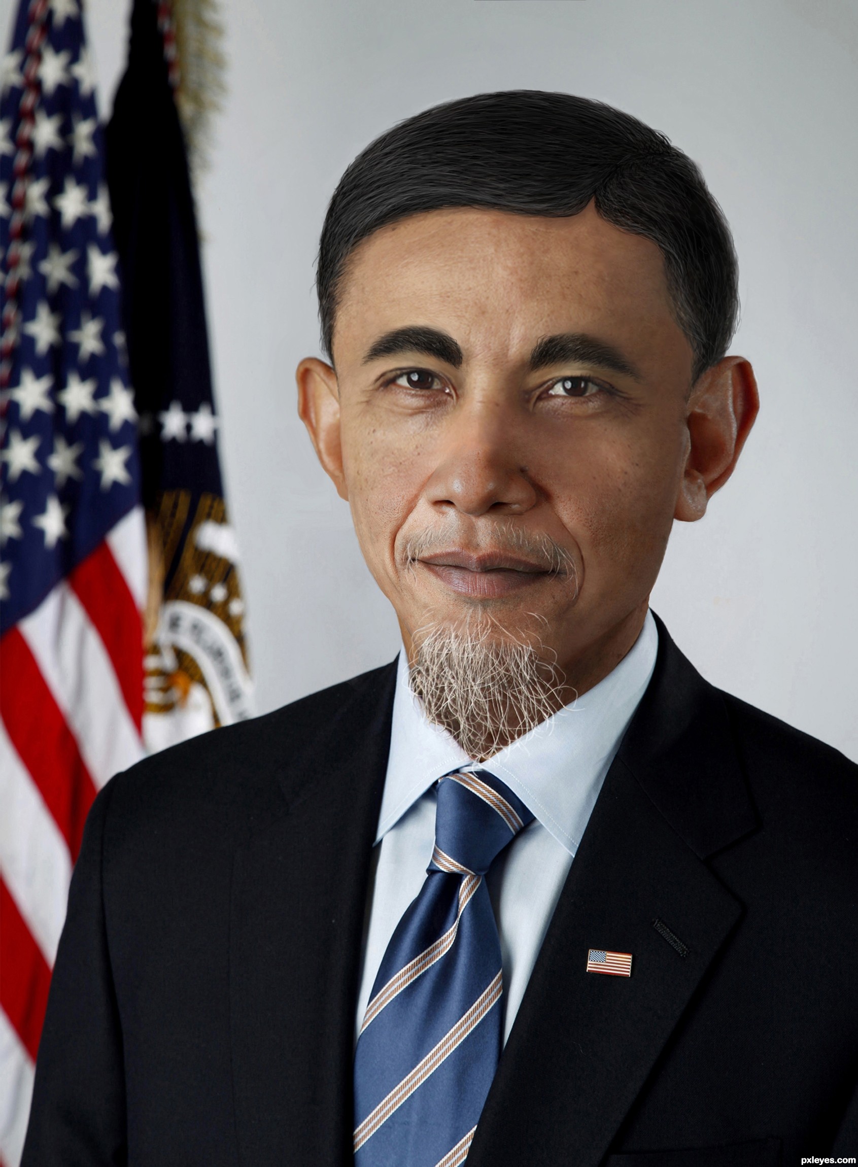
i think the face is too smooth around the eyes and the skin tone difference on the forehead is distracting...great take on the theme though author! i'll hold my vote
very well author like it
The skin tones are all over the place, and the eyes are a bit too dark in contrast, like he's wearing very heavy eyeliner.
Yes Mossy as usual he is.
The hair unfortunately was all hand drawn as there doesn't seem to be many salt and pepper Chinese men
And for MossyB this is all Obama's skin, check his photo in hi res, he has a rather bad complexion
Sorry author, but no. You've made some color adjustments to Obama's skin, resulting in a weird pinkish patch on the side of his nose and his cheek, and have lost some of the cyan tones on the face, while keeping them on his ears..."Bad complexion" is one thing, inconsistent coloring is another.
As for the hand drawn hair, it looks it. There is no skin visible at all beneath the eyebrows - Even the thickest hair shows small bits of the face along the edges - and the color of the hair on the head (as well as the eyebrows) shows far too little gray to correspond with the basically white beard...
Good attempt author, the idea is great but the blending needs a little more work!
Best of luck!
Where does the hairline come from? Seems like a SBS is needed here...
Great entry, I think the blending is fine....and I believe the hair is drawn (drawn well too) only nitpick would be that I would have prefered the hair to be more grey. Best of luck author & well done 
Howdie stranger!
If you want to rate this picture or participate in this contest, just:
LOGIN HERE or REGISTER FOR FREE
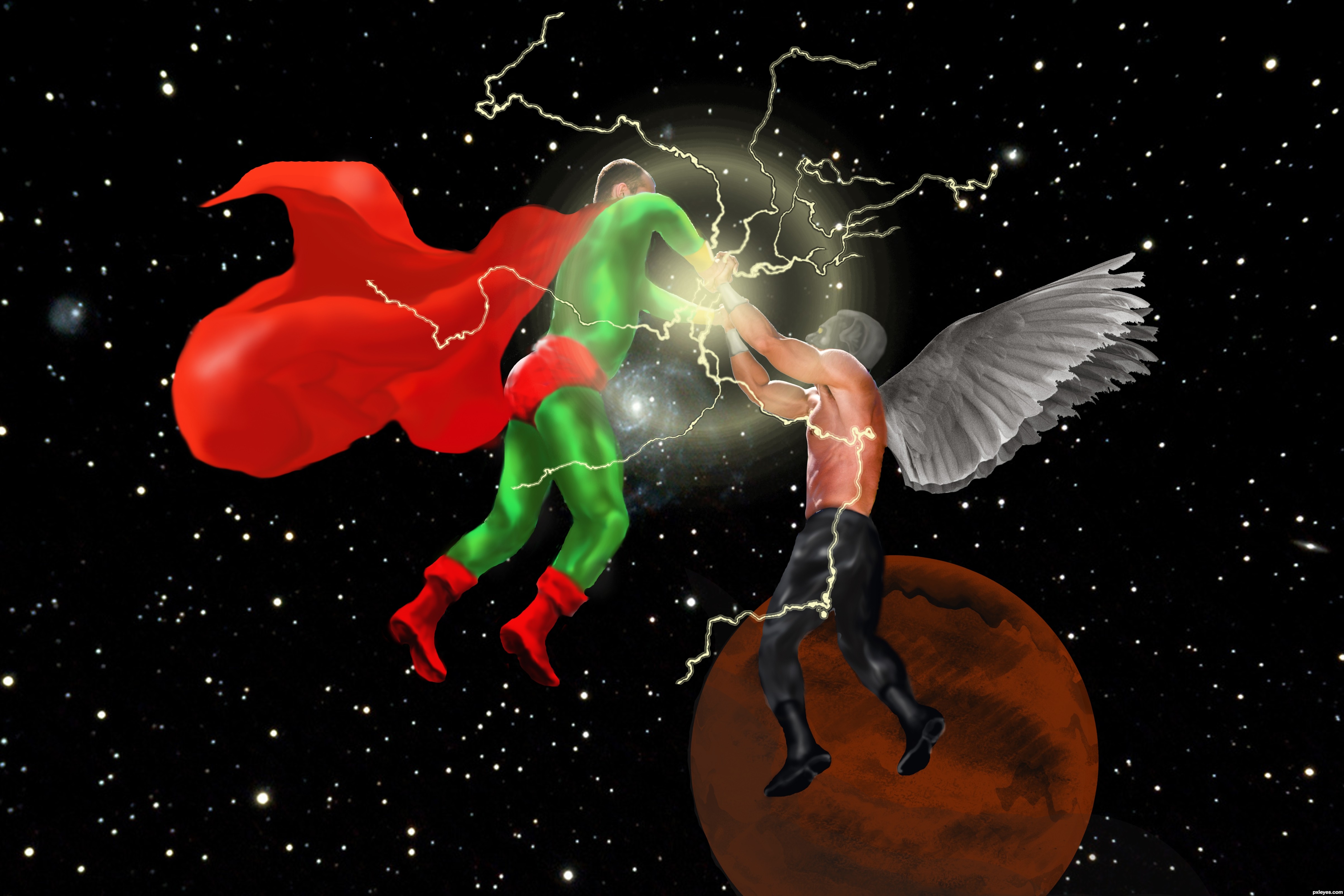
Images, paintbrushes, blur tool, eraser tool, eyedropper (5 years and 3174 days ago)
Good idea, but try to smooth your edges.
Thanks for the advice, my friend! I used only the mouse, I am without pentablet where the result would be much better!
You can use the blur tool with your mouse.
you can either use "Eraser" tool to slowly erase along the edges or use "selection" tool
then add a feather (low amount) ,then delete to have soft edge.
move the planet further from his legs.. add shading to the planet to make it look like a sphere
Thank you all !
pretty cool author
Great idea, but I'd reposition the red planet in the background, making it much larger and higher in position. As is, it takes away from the battle, by looking like the one fighter is standing on it.
Thank you very much, Kushpatel and MossyB !
Lovely work author! What an amazing idea! very well done.
Thanks, JoeCacia !
Howdie stranger!
If you want to rate this picture or participate in this contest, just:
LOGIN HERE or REGISTER FOR FREE
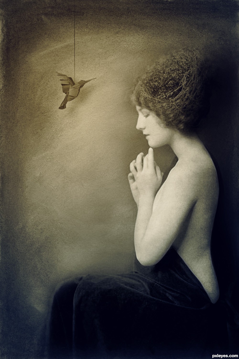
Thanks to Goblin-Stock, Step-In-Time-Stock and Geek-Stock. (5 years and 3175 days ago)
blending is superb author..
I love the tones you used...the blending is well done, and the mood is just right.
I LOVE that you used a vintage model. She's perfet!
wow nice work author..
Simplicity at it's best.
great image author, but you didn't really do anything to the source image..i think you played it a little too safe, i like the over all tones and vintage feel
No, i usually like to keep the source image intact and i don't really consider it playing it safe, but thank you all the same. And thank you for all the comments and the favourites (h)
This is a very good manipulation. "Simple" can be just as effective as CBR (chopped beyond recognition), sometimes even better.
I agree that the vintage feel is very well done. Nice image!
why the string on the bird... such a perfect image...
Cool!..like it a lot.
I think its a beautiful image. I love that you didn't chop the hell out of the bird
Nice one author, well done 
What a lovely creation...Nice job author! GL!
Congrats Matteo lovely work
Thank you very much for the comments and favourites!
Howdie stranger!
If you want to rate this picture or participate in this contest, just:
LOGIN HERE or REGISTER FOR FREE
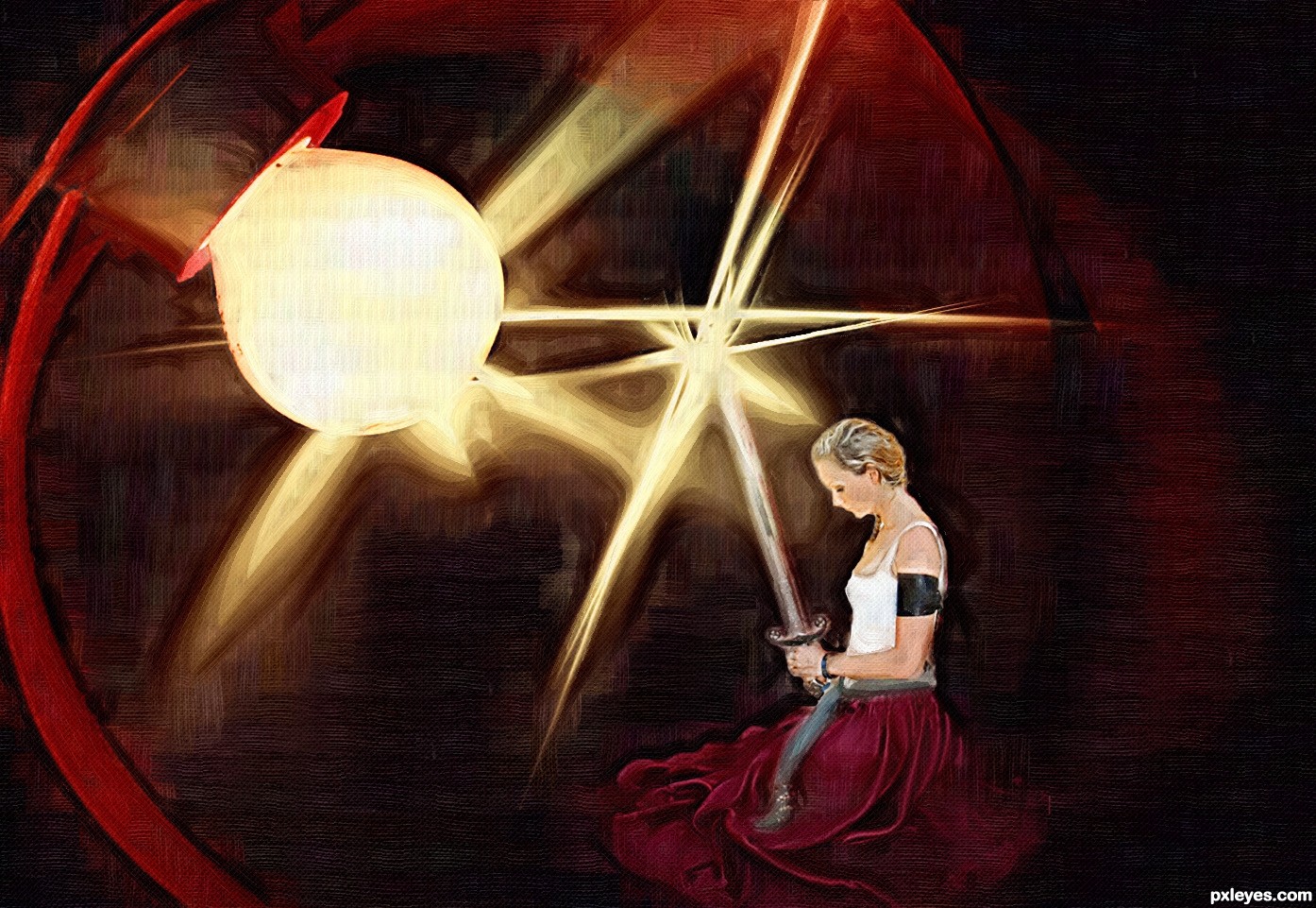
(5 years and 3176 days ago)
Wow, very nice!!!
I think you could crop some of all the dead space from the top for a more dynamic image, but good effect, none the less!
Just a tad more light on that stovepipe hat will make up the difference in what looks like waaaaaaaaaay too much dead space on top.
Agree with Elemare. This could be a much more powerful image.
EDIT: Now it's overkill.
Thanks to all for your usefull advices
agree with the others 
The lensflare is distracting. It became the focal point.
i like it...
I've followed your good advice MossyB, hope it's better now !
Better to have "dead space" at the top, rather than a "stab your eye" bright spot commanding you to focus on it... 
Howdie stranger!
If you want to rate this picture or participate in this contest, just:
LOGIN HERE or REGISTER FOR FREE
Photography and photoshop contests
We are a community of people with
a passion for photography, graphics and art in general.
Every day new photoshop
and photography contests are posted to compete in. We also have one weekly drawing contest
and one weekly 3D contest!
Participation is 100% free!
Just
register and get
started!
Good luck!
© 2015 Pxleyes.com. All rights reserved.


looks good author..
looks good author..
nice author..gl
The woman is too well lit on her back, considering the strong light source in front of her.
love the Environment you created author.. much like a painting
thank you for all your comments
Lovely
Howdie stranger!
If you want to rate this picture or participate in this contest, just:
LOGIN HERE or REGISTER FOR FREE