Photoshop Pictures: The (page 17)


results 81 - 85 of 2863

Drifting out the Frame - created by x1xJAZZYx1x


Drifting out the Frame
Favs: 1SBS: n/aHi-resRank: 4/5Score: 63.9% (0)13629 views

Used Photoshop to build up the image. Using layers, selection tool, eraser, free transform, and drop shadow filters.

UPDATE changed the perspective of the water, and added pebbles so they don't look like they're floating :) (5 years and 2498 days ago)

5 Sources:

avatar JamesD
JamesD says:

I think some perspective to the water inside the frame would help make it more believable; would like to see a high res image too!!

no avatar
Keiley22 says:

Maybe a few extra rocks to the sides so that they dont look like they are floating bring them close to the edge of image.

Keiley22 says:

much better author

(5 years and 2496 days ago)


no avatar
margaret says:

What I like : its so easy made, just put some pebbles here and some leaves there, and it's
done, nice!

no avatar
margaret says:

What I like : its so easy made, just put some pebbles here and some leaves there, and it's
done, nice!

no avatar
margaret says:

What I like : its so easy made, just put some pebbles here and some leaves there, and it's
done, nice!

Howdie stranger!
If you want to rate this picture or participate in this contest, just:

LOGIN HERE or REGISTER FOR FREE


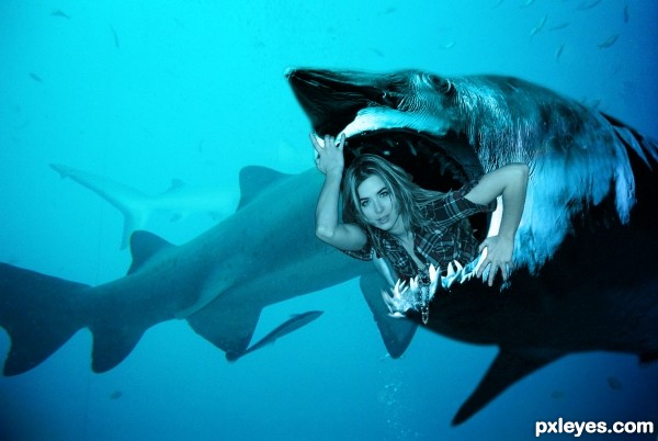
The POWER Girl - created by chinmay


The POWER Girl
Favs: 0SBS: n/aHi-resRank: 5/5Score: 60.5% (0)6279 views

The POWER Girl is back (5 years and 2498 days ago)

3 Sources:

no avatar
Keiley22 says:

she just looks like she is chopped and pasted. Try blending her in with the background so she too looks like she is under the water.

Keiley22 says:

looking better

(5 years and 2498 days ago)


avatar wazowski
wazowski says:

Result is pretty ok, imo. Perhaps some suggestions: add more shading to the girl, mostly on her body around the mouth of the shark. This way it will look less flat. Same for the back of her hair, experiment with light and shade. You might want to blur here and there her hair too, gives the idea it has more underwater movement and it's a bit further away (to create some depth of field). Lastly you could try to add a color adjustment layer to make her a bit more blue, that's up to you. Good luck!

no avatar
rajivram says:

LOL

Howdie stranger!
If you want to rate this picture or participate in this contest, just:

LOGIN HERE or REGISTER FOR FREE


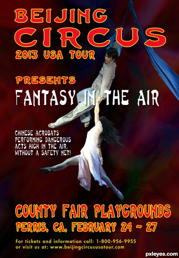
High In The Air - created by George55


High In The Air
Favs: 0SBS: 3Hi-resRank: 4/5Score: 66.4% (2)11112 views

Thanks to eviltomthai from flickr, for the pic of the Chinese acrobats and D Griebeling also from flickr, for the pic of the Chinese background.
Typography are fonts from PS.
UPDATE: I really appreciate your comments and your suggestions. I just wasn't sure about the Chinese background. I thought at the end that it was so busy, and I decided to use a simple colorful background that goes with the text colors and image. No more changes will be made. (5 years and 2499 days ago)

1 Source:

avatar CMYK46
CMYK46 says:

Good poster author, but shouldn't it be "Beijing"...or is that how they spell it where you live? GL!

author says:

See, I told you Bob, my spelling is bad!!!! (C-), but thanks to you, I will know how to spell it right..I think, I am the only one who spells Beijing wrong here where we live.....!

(5 years and 2499 days ago)


avatar robvdn
robvdn says:

The description mentions that photo manipulation as well as the typography is important, I see your attempt at typography but no photo manipulation at all. Maybe have a second chance on this and do something with the source?

Sorry if I sound harsh author, but I know you are talented and can make awesome stuff.

author says:

You're right Rob...will try to manipulate the image I have now...You do not sound harsh...This is the only way I will learn. Thanks for suggestion.

(5 years and 2499 days ago)


avatar wazowski
wazowski says:

Certainly not bad, but a few things about the typography. You used blue text on blue background. Although the text has a lighter blue you stil may want to give it a more contrasting color (or maybe white). Other thing, since it's about a Chinese circus (or only acrobats?), is it an idea to give the whole poster a more asian atmosphere/typography (but of course keep it readable) instead of the typical western-american font? Good luck!

author says:

Thanks Waz. I am working in a photomanipulation as you mention on the rules. Will redo the text too...probably tomorrow, kind of late here now. Comment appreciated.
UPDATE: Made some changes to the original entry. Cropped the original source, and placed over a new background. I used a Chinese font ( Last Ninja ) for the Typography. Hope it fills the contest suggestions.

(5 years and 2499 days ago)


avatar CMYK46
CMYK46 says:

If this were my image I'd desaturate the background a lot...right now all the colors are competing for my attention.

author says:

Thanks again Bob. Background desaturated and motion blurred it a little more. The font is (Last Ninja). The bottom is Futura HV

(5 years and 2498 days ago)


avatar wazowski
wazowski says:

Heyhey, quite a make over, author! Only thing left is that I might lower the block of text from county fair till the web address. Not too low, but imo it't covering the photo a bit too much. Good luck!
author says:

Thanks again Waz....made some changes to text.

(5 years and 2498 days ago)


avatar robvdn
robvdn says:

Much better author, I like your make over

author says:

Thanks again Rob.

(5 years and 2498 days ago)


no avatar
Guiltss says:

I feel that the blur is overdone because i cant see the beautiful picture from the stock

author says:

Thanks for comment Guiltss, for me the background is blurred because it gives the feel of movement..You can imagine the speed the acrobats are moving...?

(5 years and 2498 days ago)


Guiltss says:

I understand what you try to achieve here is motion blur. As a photographer that have shot many moving things (including this kind of act in a circus) theres no need to have a drastic motion blur because the performers doesnt move as fast as racing cars, what you need is motion blur in some part of the body to make it looks more realistic

(5 years and 2497 days ago)


author says:

Thanks again Guiltss...You are right, I brought the background back, and blurred it just a little. I also blurred the right side of the acrobats.... suggestion appreciated.

no avatar
Guiltss says:

It is so much better Author nicely done

avatar CMYK46
CMYK46 says:

Now I can't see anything against the background. It's all white on white, black on black. You had it right earlier.

author says:

Thanks Bob. I am following your (Yours and others)suggestions...what can I do now? Blur more? Desaturate more? etc...Tell me, I will do it...I am here to learn.

(5 years and 2494 days ago)


CMYK46 says:

Just think color contrast.

(5 years and 2494 days ago)


avatar tnaylor21286

Much improved from your original! Everything pops more. Good luck author!

author says:

Thanks Tnaylor.

(5 years and 2493 days ago)


Howdie stranger!
If you want to rate this picture or participate in this contest, just:

LOGIN HERE or REGISTER FOR FREE


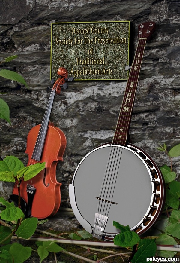
Waiting For the Show - created by lchappell


Waiting For the Show
Favs: 0SBS: 10Hi-resRank: 5/5Score: 63.8% (0)12796 views

(5 years and 2500 days ago)

No comments yet... Be the first!Waiting, For, the, Show

Howdie stranger!
If you want to rate this picture or participate in this contest, just:

LOGIN HERE or REGISTER FOR FREE


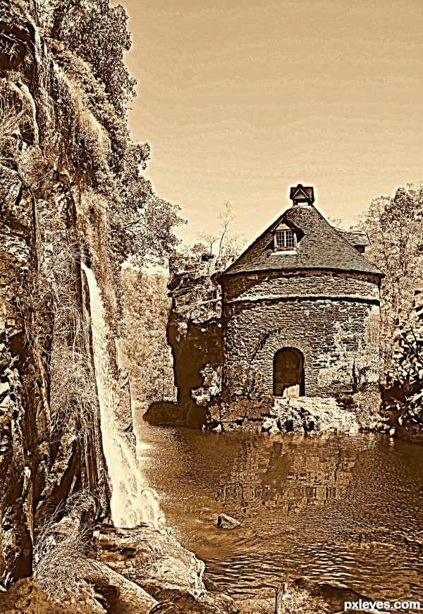
In the old days! - created by Chrys Rizzo


In the old days!
Favs: 1SBS: 1Hi-resRank: 4/5Score: 61.9% (0)9152 views

(5 years and 2501 days ago)

avatar CMYK46
CMYK46 says:

Too much HDR, but good color.

author says:

Tks for comment and giving me a support.

(5 years and 2500 days ago)


avatar oziipop
oziipop says:

I like the color, and the whole composition.
Hate all that noise!!!
If this was done to hide hard edges it is defo not working. IMO
Its too bad because it has a nice flow...your next entry, will no doubt be much better.
You have a good eye but lack the knowledge of the tools. keep at it and don't give up.
Cheers!

Howdie stranger!
If you want to rate this picture or participate in this contest, just:

LOGIN HERE or REGISTER FOR FREE