Images, Magic wand, eraser tool, filters, adjusts (5 years and 3259 days ago)
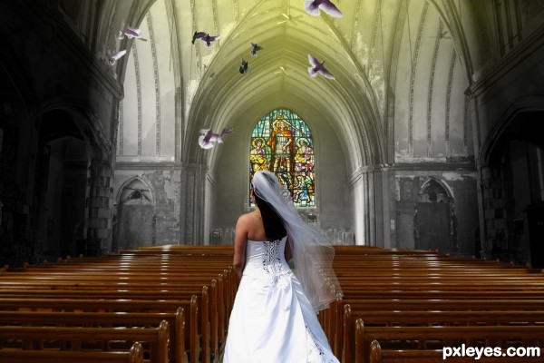
- 1: Pigeon flying
- 2: Church
- 3: Vitral
- 4: Bride

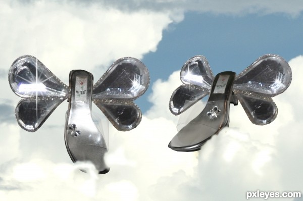
...because when I'm walking with you, I feel like I am dancing in the clouds.......... (5 years and 3260 days ago)
A nice idea -- a bit of softing on the edges of the wings and some work on the masking betwwen the wing and shoe on the left would improve this IMHO

Howdie stranger!
If you want to rate this picture or participate in this contest, just:
LOGIN HERE or REGISTER FOR FREE

i used only one source image..
&
i hope all pxleyes members like this image. (5 years and 3260 days ago)
AWWWWWEEEEEEEEEEEEEEEEE!! very sweet
Thank u Drivenslush..
Sunsets are my favourites,nice creation 
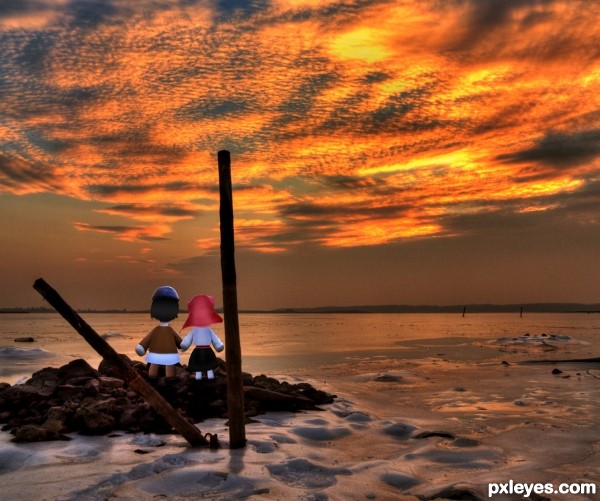
The shirts are a bit too bright, bluish-white, but a very interesting take on the contest source!
I always a sucker for lovey-dovey scene... nice...
suggest crop away the right side (boat, etc)... distracts the focus 
Very interesting image author...IMHO would be better without man at the right side, cause create distraction and it cool to watch this image as doll's world...best of luck

Thanx 2 all
Cool and apocalyptic 
Howdie stranger!
If you want to rate this picture or participate in this contest, just:
LOGIN HERE or REGISTER FOR FREE

Thanks to Greg Martin for the star field tutorial.
Except for the tut, everything is made from scratch. (5 years and 3260 days ago)
You did a good job on the planet and spaceship. Good luck....like your idea!
Cool spaceship.
Really great spaceship - Nice image!
Great work!!! Wow!
Great space scene author...best of luck
Love the old school Sci-fi look of this! Nicely done author!
not bad, glad they don't allow you guys in dd.
Cool space scene 
Howdie stranger!
If you want to rate this picture or participate in this contest, just:
LOGIN HERE or REGISTER FOR FREE

No images used, all created (5 years and 3261 days ago)
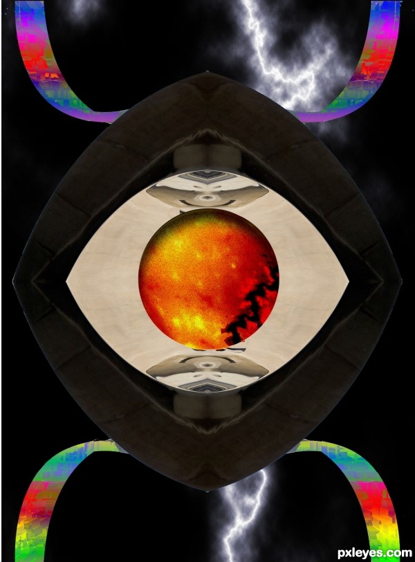
The rainbow colors look a bit too rough and blocky compared to the rest of the image. Perhaps a wee bit of surface blur to smooth them...
Thx MossyB , i'll try do my best next time , thx a lot
Howdie stranger!
If you want to rate this picture or participate in this contest, just:
LOGIN HERE or REGISTER FOR FREE
Color & grayscale together doesn't work. Try colorizing the source image.
cmyk46 is right, colorize the whole image for better effect
I disagree. I love the grayscale and color look. It gives the image a very dreamlike quality, as if the bride's presence is colorizing everything around her (think of the opening to the Gerard Butler version of "Phantom of the Opera" . Only critique I see is that the top of the stained glass window doesn't quite match up with the source image. A little skewing/angling should fix it up easily, though. Great work, author!
I agree with CMYK about colorize and also what about fixing up the church also.
Dreamlike quality my ass. It's discordant, and color matching the church would harmonize the entry.
I tried to merge the color as the hope of the dream being realized, rather than with black and white as the dream going, but thanks for the advice!
Matching the pews to the church might be another way to go, rather than colorizing the church.
a sudden thought... maybe make pieces of the wall-church flying off... like dream broken up...

just a tot
thanks to all !
You know I came along kind of late to look at this picture but in my opinion you have done a nice job on it. The colors and or lack of them??? look fine to me.
I think the desat adds to the 'story' of the title - maybe could have done some desat on the front pews and bottom of the stained glass, but overall, a very creative idea and good chop.
Thank you, Pérola !
Howdie stranger!
If you want to rate this picture or participate in this contest, just:
LOGIN HERE or REGISTER FOR FREE