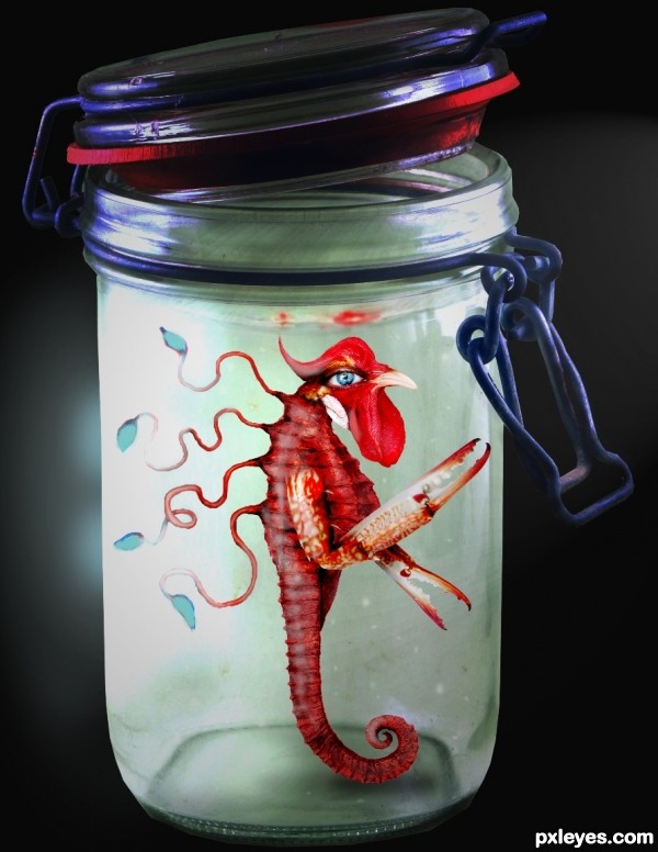
created this for the new species contest, but was not able to finish it on time. (5 years and 3168 days ago)

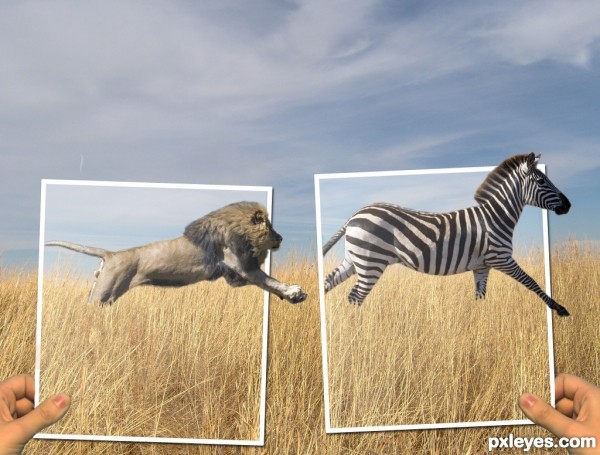
I wanted to do a picture with a lion and at first I wanted the zebra to be a person instead. But I couldn't find a good stock image of a person running away so the zebra is going to get eaten. (5 years and 3170 days ago)
This is a pretty good piece. I really like it. I do have a couple of suggestions though and will wait to vote. First, do a little research of the size of a lion relative to a zebra. Your picture seems like the lion is a bit large. If both are in the original then I will just accept that I know very little about lions and zebras  Second, putting one of the frames in front of the lion might add a little more dimension. Finally, the exposure on the hands doesn't really match. Not sure how to fix it, just seems not quite right. Just some food for thought.
thanks for your suggestions. Instead of making the lion smaller I made the zebra a bit bigger. I moved both animals to the left and put the frames in front of their tails to make it seem more like they are in the pictures. And lightened up the hands to make them a bit more pale because the whole picture kind of just has a pale look to it. 
i like the concept. maybe darken the background a bit, to draw attention to the photograph frames?
also, there are some sort of mask on top of the animals, is a little distracting.
I lowered the brightness of the background and it does help the foreground pop out a bit, thanks. and the mask that is over the photographs is suppose to be some gloss how pictures have, but I lowered the opacity of it over the animals. 
Very cool image author...one of the best ideas for OOB image...u should fix some minor details such making edges of animals bit softer and maybe with smudge tool u could work on hairs and fur....also, this is OOB image but don't forget shadows...GL
Howdie stranger!
If you want to rate this picture or participate in this contest, just:
LOGIN HERE or REGISTER FOR FREE

(5 years and 3170 days ago)
this freaks me out
yaaa really give me the creaps :P but in a nice way........ :P
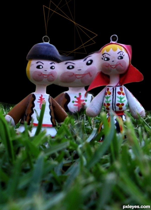
remove the hooks on their heads... may I know what is the purpose of the lines?
the third person should be "ghostly" = fade out more 
We say here '' triangle'' for the 3 lovers situations.
Howdie stranger!
If you want to rate this picture or participate in this contest, just:
LOGIN HERE or REGISTER FOR FREE

OLD PAPER thanks to SHLOMASTER
ANTIQUE WORLD MAP thanks to THESWEDISH
COMPASS thanks to GERBERA
SUNDIAL thanks to NASTYSENSTY
VINTAGE SEAL 1 thanks to HISKS
WAVY RIBBON 1 thanks to WEMEDGE
CLASSIFIED thanks to PLUSVERDE
(5 years and 3171 days ago)

Howdie stranger!
If you want to rate this picture or participate in this contest, just:
LOGIN HERE or REGISTER FOR FREE

Matthew 17:20
And He said to them, “Because of the littleness of your faith; for truly I say to you, if you have faith the size of a mustard seed, you will say to this mountain, ‘Move from here to there,’ and it will move; and nothing will be impossible to you.
Note: Entry edited. Pre-manipulated space picture already removed. (5 years and 3171 days ago)
lol......nice
Nice one, Author!
Really LOVE this!
Lots of fun! HEHEHEHE
great... like it!

Great work author, GL!
realy nice work
very nice 
nice..sbs would be nice too!
Nice concept there author. In the words of my kids " That really rocks the rocks".
very nice work! i like it
Congrats!!
Congrats..... good work!
Congrats, very nice work 
very good work! congrats!
Congrats, well deserved 
Congratulations,one of my favs ! 
To all who have provided fraction of their precious time just to view, to comment, to vote and to fav my entry; and for all the congrats...THANK YOU GUYS! 
yup well deserved congrats 
Congratulations, my friend, Bernie!
I love especially the Matthew you written there!
I really like images like this one, great work, congrats for your deserved place!
Thank you my friends Hayato and langstrum...It's a heartwarming reading comments and receiving fav from you guys. You're one of my idols.
Howdie stranger!
If you want to rate this picture or participate in this contest, just:
LOGIN HERE or REGISTER FOR FREE
very hard work here author.. good luck
Very good! Wonderful
suggest make the lower body more curvy (like seahorse)
thank you!
Cool mix!! the eye caught my eye
...good job!!
Howdie stranger!
If you want to rate this picture or participate in this contest, just:
LOGIN HERE or REGISTER FOR FREE