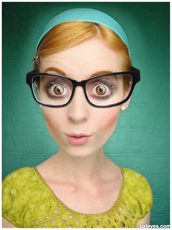
glasses and glossy effect from privet stock see SBS (5 years and 3187 days ago)
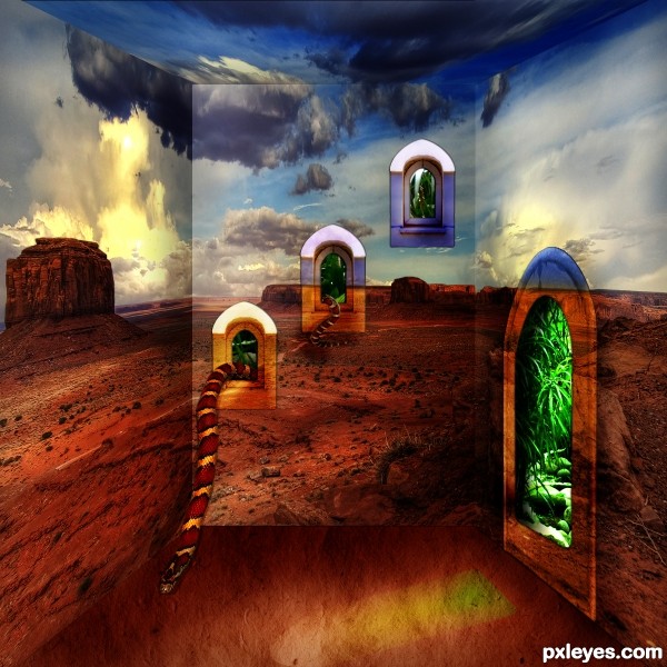
(5 years and 3188 days ago)
The floor looks a bit wonky, but the snake through the windows is awesome!
Try to work on the flor, because it is very disturbing, however the drost effect is interesting 
Thanks for your comments. Following your tips I replaced the floor with a new texture.
Howdie stranger!
If you want to rate this picture or participate in this contest, just:
LOGIN HERE or REGISTER FOR FREE
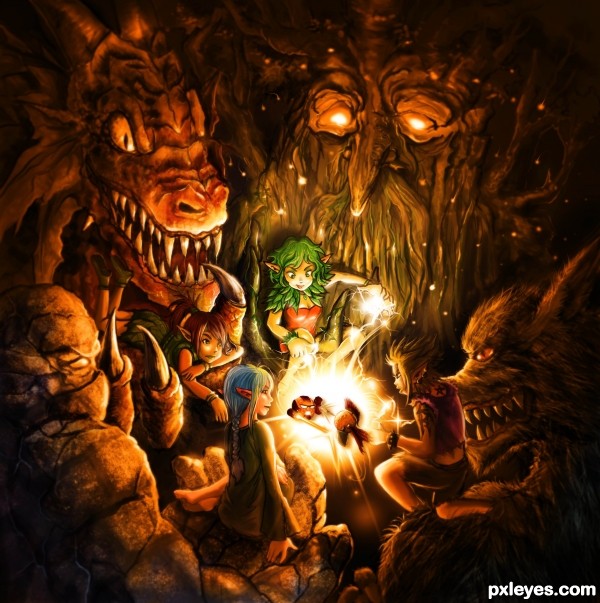
First idea that came to my twisted mind was an orange with magic circle around it. Then, I began to draw another things beside that initial ideas, so the final images grew outside my early imagination...
Fantasy Theme always brings imaginative things comes into play. So there will be no questioning about the results that far from my earlier idea nor fit to any ordinary rules.
Take a look at my drawing, folks. Although I put aside the Orcs, Unicorns, Pegasus, Hobbits... But I tend to bring the Elf, Golem, Dragon, Treant & Werewolf INCLUDING The Sparta & The Iron Man in this design, so it still looks like a fantasy with an oranges as a main object.
---
Note to viewer & Mods: See the details AFTER vote me. You'll find my signature hidden on the picture. So I WON'T AGAINST THE RULES OF ANONYMITY, okay? You've been warned.
Check SBS, nothing fancy there, just drawing, adjusting, detailing, fooling around with tools of Photoshop.
Done entirely with Photoshop CS5 with Wacom Intuos4 & Cintiq. Approximately done after 30 hours in 3 days, 10 hours per day.
Hope you'll like it & fave it.
For anyone that care to read; this fairies are divided into 4 elements of colors like Window 7: Red, Green, Blue & Yellow.
Red: The Dragon Rider, who rides the mighty Red Dragon & guard the sky.
Green: The Treant Protector, who befriend with the forest guardians & protect the land from evil entities.
Blue: The Ancestor Priest, who raises the Golems from the depth of the ocean to her side & became the sentinel.
Yellow: The Beast Master, who has a companion of selected were-beast & hunt the devils from the ancient times.
---
Thanks for viewing & reviewing my Orange Fantasy Painting with comments & constructive criticism.
◕ ‿‿ ◕
---C.S. Lewis, "It All Began with a Picture." (5 years and 3188 days ago)
Thank you, mircea. It's been a while since I illustrate something as detailed as this. It's quite interesting for me to print this illustration in a large format (let's say 60 cm square) later & hang it up to the wall. Although it will definitely reveal the secrets & illusions from this illustration. It is not insanely detailed in the larger pixels format for sure. Lol. 
This is definitely my favorite illustration so far!! great job author 
I envy your patience and effort on this work, and it should get very high score. Details, brush patterns, composition, and colors are awesome. Maybe there are many artworks out there with greater amount of details but considering this is the new entry for a weekly contest, not much people can do the same as you did. However, still there is a 'however' (please forgive me if I'm too strict on giving that critique), each layer of character is quite flat to me, you can work more on shadows and highlight to give more depth to your work, to reach the perfection. Still, elite work!
wonderful piece of art! Raw illustration as its best. However agree with langstrum, the only weakness is the flatten look of the image, it just makes it look more cartoonish, but that's just our opinion that we think a lil' depth would make it even better, maybe this is just the way you intended...
BTW signature is not that hidden... i seriously suggest to remove it for contest purposes, since precisely viewing the details is an important matter to vote...
Thanks for the comments & critiques, esp for langstrum.
Hey, man. Where did you point about the quite flat figure? Is the characters (fairies) or the guardians? There are already so many works on shadows & highlights upon every characters in this work, man. Might be not perfect, but consider this is done because of another jobs coming to me & however... I'll make another depth if I had such a time.
Ofc, I'll boost up my painting speed to another contest for sure. Once again, thanks for reviewing my work so far, everyone. Good luck on your entries too to the contestants.
@ Mike. Uh-Oh! I'll do it right now... completely 'hidden' after this update. Thanks for reviewing that~!
EDIT: NO SIGNATURE visible freely now. 
Okay, since you asked I'll give a scale to judge whether you need more depth or not. Focusing on the faces of the fairies, they're very close to the light source, right? comparing the highlight on their face and the midtones, they're dramatically different, so your light source is strong in the center but becomes weaker considerably as the distance increases. Therefore, the shadow and highlight on the dragon and the tree should be more dramatic also. The green and yellow fairies seem to be on the same plane and the two fighters are on top of them., etc.
I understand your situation, that's totally similar to me. You don't need to do that for the contest because you can win it easily and get high score. My critique is for the case if you want to improve and even commercialize your work. Thank you for your effort, if you didn't do that, we can't have this kind of work in Pxleyes ^^
very good work, i like it a lot ,only one small thing,you left the line in the upper left corner of the horns, GL 
Great suggestion, langstrum. I'll take that POV from you. Bear with me since I've been working this whole key lighting illustration just a week lately (inspired by Dimitri a.k.a Karaflazz from pxleyes photography contest). No serious lighting matters at the hand like this for the illustrations I've made around concept arts just with the two lights, but you've made my eyes quite open for the depth of colors.
I'm sure you know about manga, the origins of them; they're not bother with the lightings & depth of colors too much. They're seem so flat for instance. But FYI, I try to leave that manga area & follow the realistic approach like my friend, Stanley Lau from IFS. It's kinda like your art, langstrum. A hybrid of manga & realistic called manga realist.
Thanks for your opinions on my work, friend.
@ vexycon: whoa... you notice that? 
EDIT: Re-submit the entry.
Just want to say that your entry is one of the best DD I have seen this week. I think you have the talent and the creativity to do works and illustrations like this particular. I have seen your work and I am happy that you posted it here. I think by using Photoshop CS5, Wacom Intuos 4 and Cintiq, gives you the advantage of create a good Illustration, but remember that there are members who do not have all the fancy stuff you use for your work, and are limited to use just a Photoshop program, not even a CS 3! You are a professional, and yes, we like to see work like this. Hope to see some of your tutorials, if you post one. Good luck!
I do not know what is with me and these lines, but there is another on wolf ear  sorry but this picture has to be perfect ,I really like your work, I wish you all the best
oh....you're rocking pxleyes.com....! just another super elite work....!


 :bow2
:bow2 b)
b)
George, your comments most impressed me & also flattered me as well. I'm not that professionally & fancy guy with the kind of fancy stuffs, it's thanks to God for His blessings, talents that He gave to me & I just 'borrow' all my belongings in this world. About CS5, it's from my company, I didn't buy it by myself. Cintiq & Intos4 bought by myself (helped from my parents) years ago to help me speed up my commercial projects. I'm still young & need to improve myself after all.
Since I found Pxleyes accidentally month ago, I would like to share my techniques of illustrations & concept arts here after. Yet a master, but still enough for everyone to pick one or two techniques. Hope I'll finish & establish my first tutorial in no time. Thanks for cheering me up, George.
@Vexycon: MAN... your eyes so pixelated~! Really awesome details captured, thanks, I've already removed the gutter black shadows on my textured brushes.
@dekwid: thanks, man. Not an elite work, just try to share my works around here... since, I don't really dig the manipulation things with people & objects... EXCEPT matte-paintings for environments. 
Beautiful composition, but I agree, the characters appear somewhat flat. The center appears to be taking place in a room with the background consisting of painted large creatures watching. This is particularly because of the shadow behind the green figure.
The creature in the lower RH corner (werewolf?) looks out of place, and almost an afterthought, with the glowing edge of the figure in front of his mouth aligning too much with the profile of his face. The glow itself is out of place and inconsistent with the image lighting.
This is a very entertaining image, none the less.
Thank you, MossyB. Your comment always had an interesting POV. "Painting large creatures watching because of the shadow" I notice that after reading your comment & really... really... really looking at my own image. Wow. Point taken.
Yes, it is a dumb werewolf (lol). About the inconsistent glows & shadows, please forgive & bare with me. I've tried to make it as fast as possible without the worry about the precise or perfect outcome, I tried not to render the glow to much at an early stage, but with the adjustments layers turned on; the glow (because of Vibrance FX) burst out leave some of the mid tones desaturated. Maybe I'll correct this later after take some rest, however thanks to your DEEP comments (as always).
Author: Thanks for your feedback on my comment above. By calling you a "professional" I ment to tell you that you have made the effort to follow the suggestions for corrections, or adjustments to your work. You will see that some entries, do not even make corrections, or follow an advise to bette their work. This is a place to learn, it is true, that by looking at work like yours, will open a huge avenue for those who want to learn. Details are important in an entry, shadows, light, perspective, appareance, color harmony....etc, you have shown us that with patience and taking the time to correct your entries, we can learn from you, as well as from other exceptional Artists here in Pxleyes.
You have to have a commitment to create something nice and appealing to others, as I told you, you have the talent and the artistic creativity in your hands and mind. Forget about what I said about you having an advantage over others, by using fancy stuff, to create Art. It is you, who creates this, and your talent is endless. Thanks again for allowing us to be witnessing something beautiful....... !
Dear George; I really thanks to your kind words, I'd love to see the others points of views & try to understand their criticism about my art & I'd love constructive criticism here at Pxleyes as well. It's just a problem with the time spend if I had no change anything at all, but I'll try to fix or correct my entry if there's a break time to me (taking my lunch break or even while I'm relaxing at the office minutes before going home. Lol.)
George, you do have the talents & everyone got their artistic talents as well, it is my job & also commitment to illustrate something that basically from imaginations of a child (back day, while I'm working on the Studio Ghibli), but nowadays, I move to game art departments to produce concept arts; it's always a world of children if I may say so.
I'll be here for sharing my illustrations, passions & emotions. Sometimes, if I might not be here, it's simply because I have my own life to fight for; "my life for the horde..." 
WOW I am amazed! Wonderful work author!
Thank you, lordymail. I'm glad that you like it.
exceptional
Welcome to Pxleyes. Glad you found us!!!! What a future you have!! This is a fantastic entry!! GL
Really, thank you very much for everyone's support on this entry. Though it's still lacks of perfection of shadows, values & depth renderings. I hope, I'll improve my illustration works more realistically next time.
By meantime, I'm very sorry, I couldn't change the depth values of it, MossyB, Mike & Langstrum. But I did a minor changes of darkened, highlighted & removed some unwanted lines thanks to Vexycon with so little time for me back then.
I hope this so called illustration fit the orange theme. Good luck & best wishes to everyone~!
This is so beautiful! A real fantasy! My instant favorite!
Orange... Fantassy and lot of fantassy.... lol... you did the fantastic work, Congrats in advance......  (INSTANT FAV) keep entering....
Great 
Magnificent! An instant fav here!
I only found Pxleyes a few says ago and use Photoshop mainly for photo editing,but drawings like yours give me a boost to spend more time on digital art.I have to learn a lot of course,but picking up bits and pieces from the 'masters' along the road will certainly help me in the right direction.
The Duel Of Oranges comes close to perfection in my humble opinion,it's stunning !
Author, you have incredible talent! This is fantastic work. 
Hello everyone... I'm honored that you like my entry. Though it is more like a plain digital painting rather then the skilled photo-manipulation. To be honest, I just want to share my free-time stuffs like this, not trying to compete nor show off. I really couldn't make an adjustments to some of the suggestions. But still, I would like to thank you very much indeed to those who support me, vote me & offer an opinions to me.
@Duhby63; I believe there are NO masters out there or even here in Pxleyes. We're a couple, a community of learning people together. So as for me, I'm still want to learn, adapt, share & could even get something insight from everyone. I am trying to survive.
So, I would like to give my supports to everyone here in Pxleyes; my best damn entries. Sharing is caring, isn't it? 
FANTASTIC!!
AMAZING! You make me want to run out and buy a pen-pad....even though I can't draw quite as exceptionally as you!
I seen this coming! CONGRATS!
a well placed 1st.. congrats... 
Congratulations...brilliant work
Congrats ... there was little doubt about it!
Congratulation to everyone as well. Though it's quite not perfect with the renderings of my painting because of the tight schedules, still... I LEARN SO MUCH from you, guys. This community is great. Meantime, I'll share my tutorials. It's not how to do this, but how to speed up your creations with custom brushes & such. So there will be no doubt about how could I achieve this complex illustrations in a single week with another illustrations of mine.
Hope this will answer or even prove some of you which try to ask about it.
Thanks in advance, have a nice day!
Congrats, awesome work 
Congrats on your super fantastic victory... and of course congrats on becoming the top entry of 2011., keep them coming and waiting for ur tutorial.... 
thats a lot of work! wow! congrats!
Congratulations,the hard work has paid off !
Congratulations!! Looking forward to your future entries!!.
What can I tell you....... oh, well...... Congrats!!! waiting to see more....
WOW. Awesome work. Congrats
Howdie stranger!
If you want to rate this picture or participate in this contest, just:
LOGIN HERE or REGISTER FOR FREE
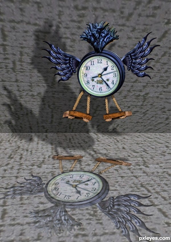
only the source and PS (5 years and 3189 days ago)
1) the shadow seems to be from the 'reflection of the clock', instead from the top flying clock.
2) the bottom surface doesn;t seems suitable for casting a reflection
but again... your title states"breaking the rules of time"..... ignore my above comments 

Howdie stranger!
If you want to rate this picture or participate in this contest, just:
LOGIN HERE or REGISTER FOR FREE
(5 years and 3190 days ago)
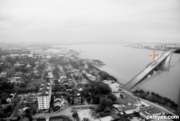
instead of the "guy" crossing the bridge, suggest substitute with ships/boats below it.
take care of the blending of the bridge and background image, so that they look as one.
perspectively speaking, the right side of the bridge should be smaller, since it is the furthest part.
it looks like an old postcard.... nice 
The wooden mannequin ruins the illusion of this piece. He just looks out of place, proportionally and color-wise. I agree, either ships beneath, or a bunch of tiny cars would fit better.
Try to manipulate the point where the bridge touch the land so the vehicles who pass can continue their journey in the road :p. There needs a path becuase it seems that you have not access to the city.
I agree for the wooden mannequin, looks like e giant who has swallowed the colors of the city, and because of him you are loosing the idea of an old postcard.
Good luck.
yep, the wooden figure doesn't fit, try to blend the bridge in to the picture and you should cork a bit on the reflections. in high resolution you can see the reflection details that it doesn't fit.
All the best 
Larger than life concept there.
Howdie stranger!
If you want to rate this picture or participate in this contest, just:
LOGIN HERE or REGISTER FOR FREE
nice work
thanks
Just wonderful ... she is a real "character" ... fantastic work!
The face expression is stunning
congrats
Congratulations
Congrats!!!
thanks all
Fantastic! I love it's simplicity - a quirky improvement on the original source.
Howdie stranger!
If you want to rate this picture or participate in this contest, just:
LOGIN HERE or REGISTER FOR FREE