(5 years and 3279 days ago)
(5 years and 3279 days ago)
Howdie stranger!
If you want to rate this picture or participate in this contest, just:
LOGIN HERE or REGISTER FOR FREE
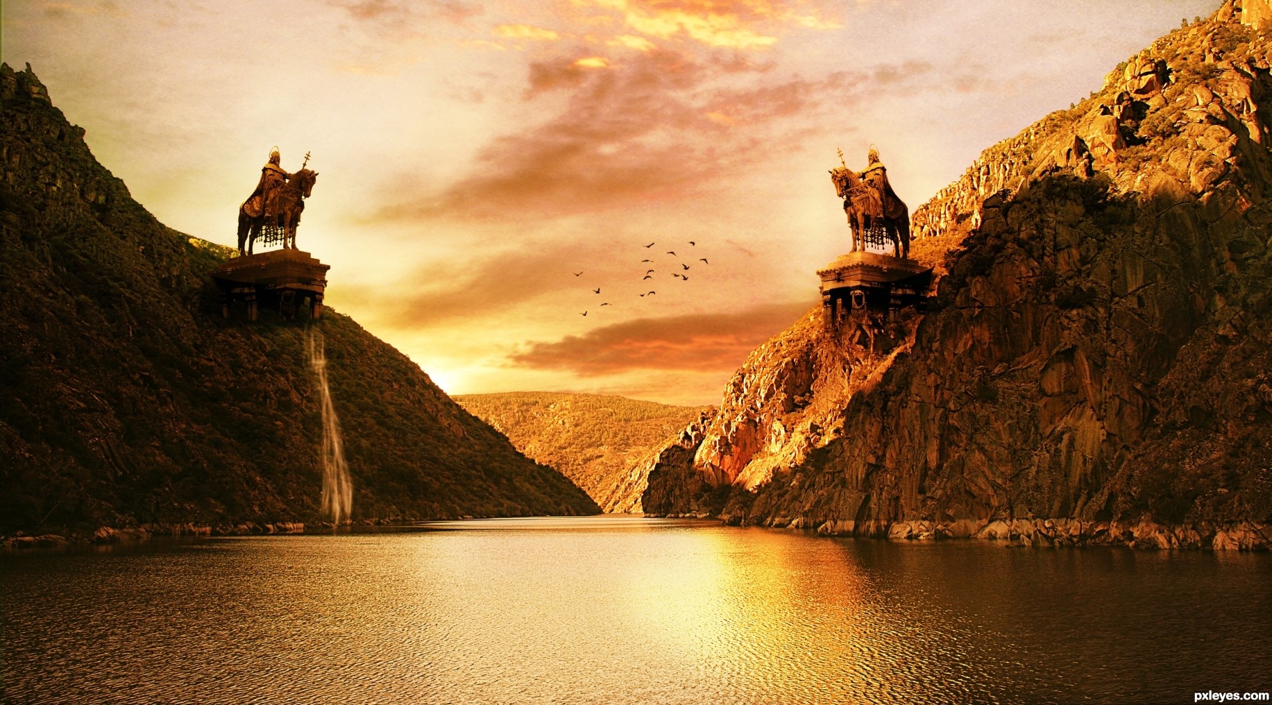
Here is my entry for the contest, thanks to - serje ,saavem, freshleaf and curzie.
(5 years and 3280 days ago)
Beautiful!
the boat is distracting....
title should be "the duel"... more appropriate?
anyway, with the boat out of the picture, I will love it more 
Interesting. More yellow than orange to my eye, however. The twin monumental St. Stephen sculptures make the small, unexpectedly unstaffed boat (surprisingly white in the very yellow light BTW) boat seem out of place. Actually, the boat seems oversized for the setting. With all the intense background light, the light on the front side of the statues seems odd.
Thank you everyone, I will update my entry and I will remove the boat for sure!
if no time, suggest just crop off the boat, the image will still look good
Lovely
Thank you everyone for support and suggestions.
@aheman and DanLundberg - Boat removed from the image.
Entry name updated as per suggestion by aheman.
@DanLundberg and everyone, I have updated the image let me know if you have any suggestions.
it's PERFECT now!
I guess the knight on the right (brighter one) will win
Hahaha... thank you my friend
Would love to have seen an SBS for this ... great image!
Thank you Arca for showing interest in my creation. I really want to post the SBS but because of busy schedule I don't think it will be possible, but I will try my best.
Howdie stranger!
If you want to rate this picture or participate in this contest, just:
LOGIN HERE or REGISTER FOR FREE
(5 years and 3280 days ago)
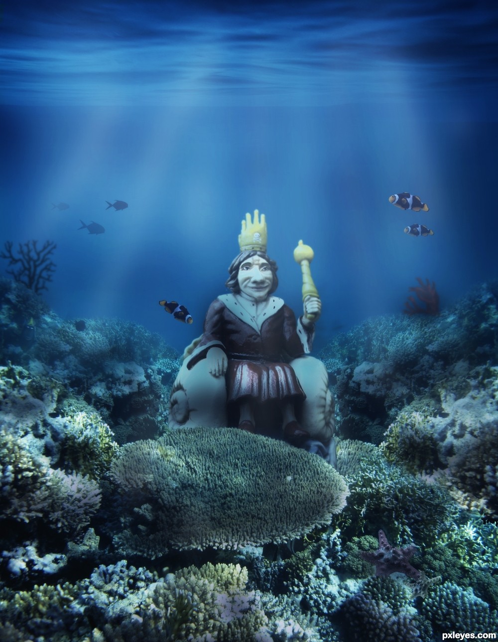
nice ocean colours and floor choice.
Well blended, GL!

Many thanks!!!
Howdie stranger!
If you want to rate this picture or participate in this contest, just:
LOGIN HERE or REGISTER FOR FREE
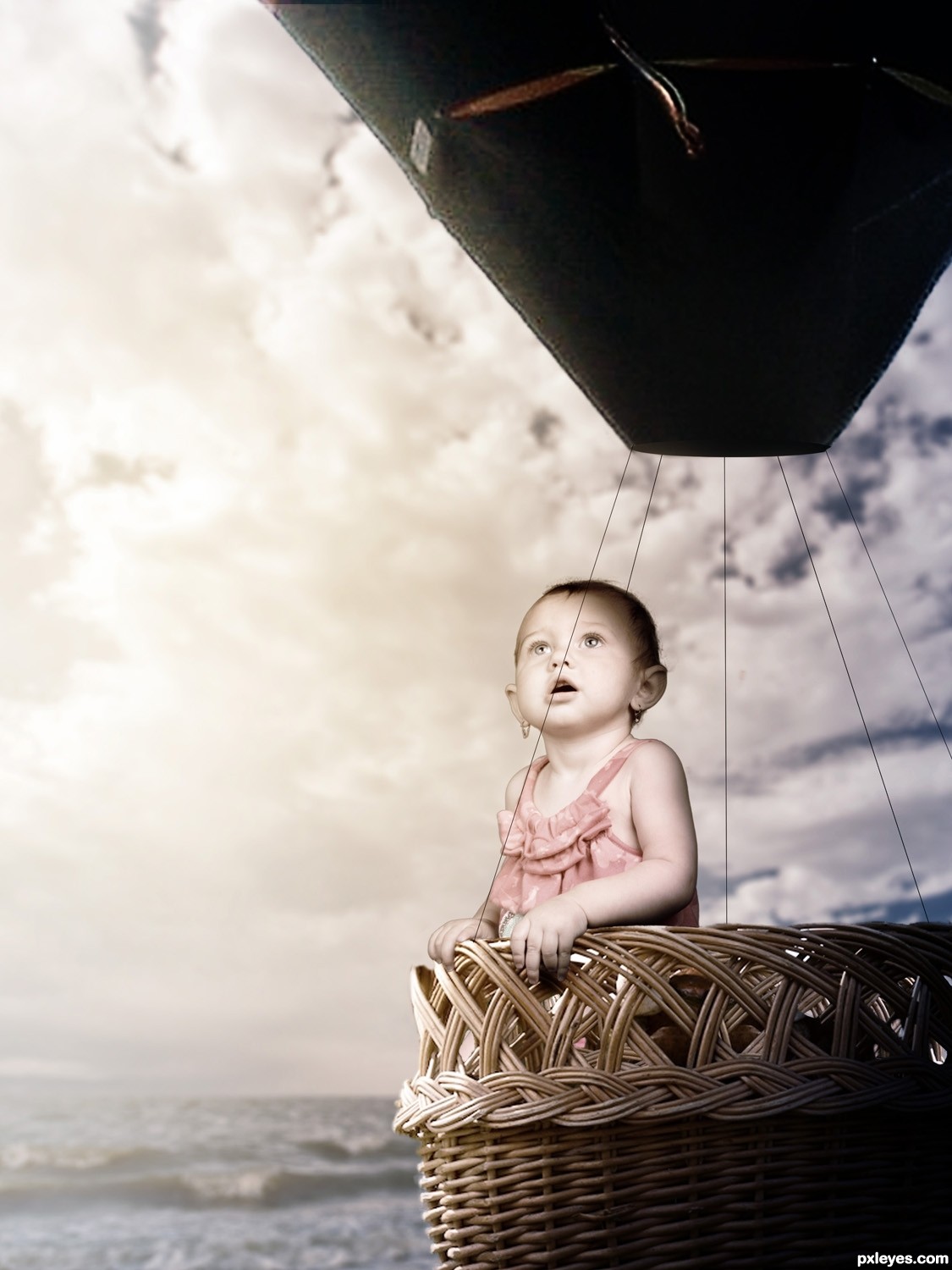
Thanks to NightFateStock (5 years and 3281 days ago)
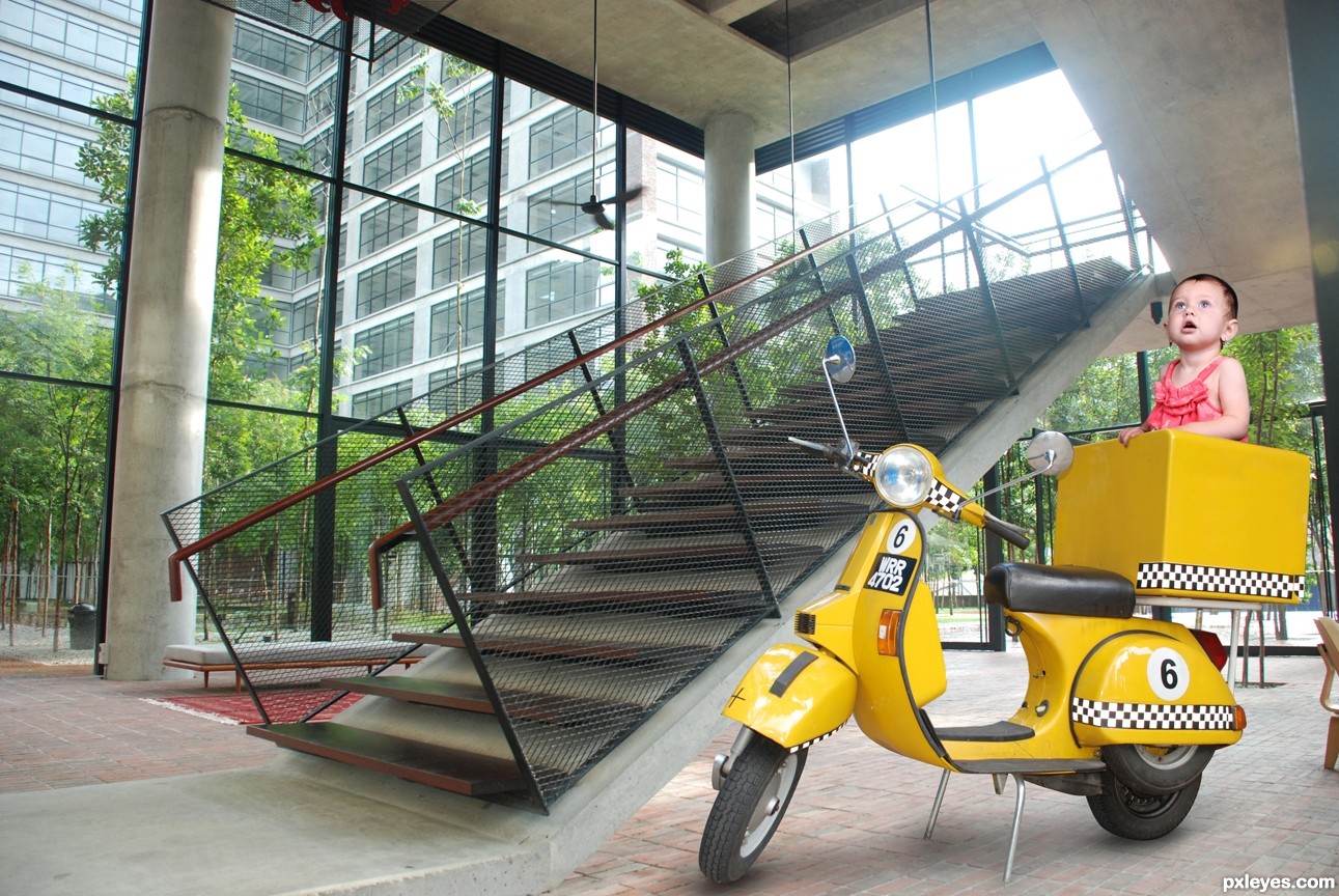
Ballon & basket are out of proportion. Too many white edges on child & balloon.
The white edges were done using the Glowing Edges filter set to screen, they were intentional. As for the proportion i'm very aware of it but it would've made for a boring image if they were.
Might have been easier to make a SBS explaining that, then...??
The lighting is too inconsistent and wonky, from the intentional glow edges, which just look like a bad extraction, to the totally black balloon, showing no light refraction/reflection from the strong light source of the sun.
The "shadows" from the totally black balloon lines also look very unrealistic, and not in a good fantasy way.
While an SBS would help the view recognize which poor chopping effects are deliberate, this is still an image that needs work, either to look more realistic, or more fantasy. At present, it just looks very novice, especially for a photoshop competition, IMHO.
Glowing edges overlay removed, black lines made thinner, more light added to the balloon and scaled down the child slightly. Thank you.
Maybe it's just me but the balloon feels a little low compared to the water... I can foresee an imminent and dramatic crash on the horizon...
Oh and on the subject of the balloon and basket being 'out of proportion' I think it probably looks better this way than if they were not scaled down to the baby. Now do feel free to ignore this if it becomes pretentious but a full size basket would give the idea that it was being seen by an adult and that the baby was out of place or intruding for comic effect. Whereas a smaller basket kind of gives the impression that it is being seen by the child, in its own world, and that the basket is specifically for it, not adults. I warned you it would become pretentious...
balloon color to change to match overall color scheme
strings not strong enough to hold balloon, change to ropes?
nice idea
Howdie stranger!
If you want to rate this picture or participate in this contest, just:
LOGIN HERE or REGISTER FOR FREE
Photography and photoshop contests
We are a community of people with
a passion for photography, graphics and art in general.
Every day new photoshop
and photography contests are posted to compete in. We also have one weekly drawing contest
and one weekly 3D contest!
Participation is 100% free!
Just
register and get
started!
Good luck!
© 2015 Pxleyes.com. All rights reserved.


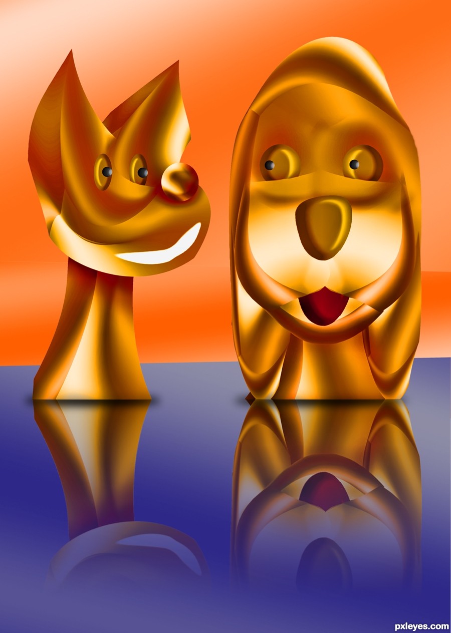
dun understand it ... this just made me smile and smile

need to improve the white mouth of the dog
Sweet and great SBS ... thanks for including one!!!
Howdie stranger!
If you want to rate this picture or participate in this contest, just:
LOGIN HERE or REGISTER FOR FREE