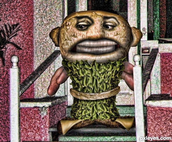
source and porch photo (5 years and 3274 days ago)
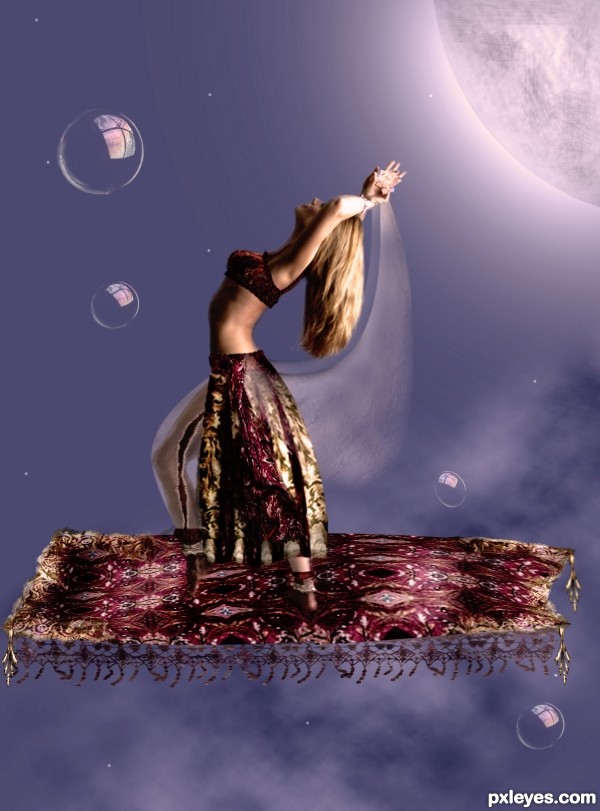
lady is the only outside source used. all other parts have been created from source only
THANKS TO MJRANUM FromD"arts for stock photo of lady.
UPDATED ENTRY:
BRUSHES FROM FALLN STOCK D"ART.. thanks (5 years and 3274 days ago)
The moon kinda plain... And there's a slight of straight lines on the right.
change title "among the stars"
feel that the moon should be on the left, as if the lady is doing a "moon-dance" to please the Gods. Make the moon whiter and a better glow (however due to the lighting on the lady, it may not be a good idea, on 2nd tots)
arch the carpet or curl it a little, will be more natural 
Pretty lady in the sky!
Howdie stranger!
If you want to rate this picture or participate in this contest, just:
LOGIN HERE or REGISTER FOR FREE
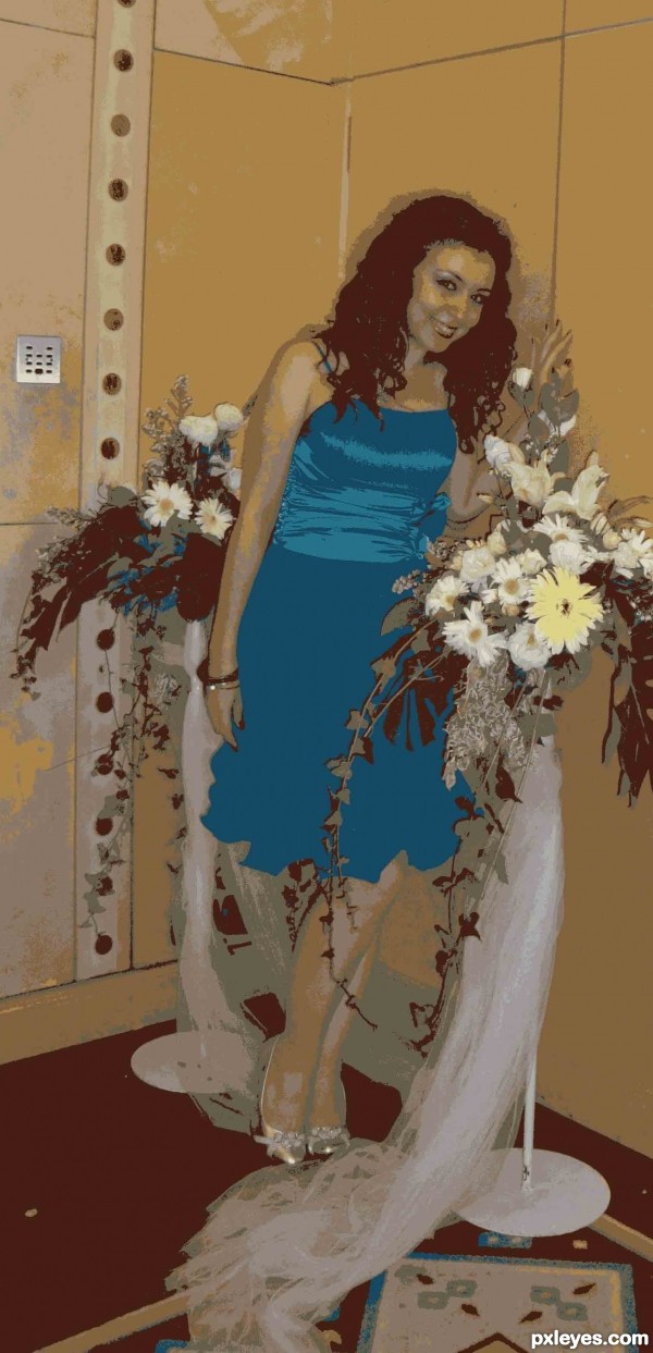
16 Colours used in this ..... (5 years and 3275 days ago)
For the dress color ... I changed it from the color palette later ... and I merged some colors ..
The contest is to "decrease the color depth anywhere from 2 to 16 colors (1-4 bit)." You're not supposed to additionally play with the image by then changing and merging colors. That is unfair to the other entries.
I changed and mergerd the colors from the (16 colors) color taplette .. I just selected what colors I need to stay and what colors I don't need ..and what colors are not supposed to be together ....
I hope this is legal ...and tnx 4 da advice....
you still changed the colors? You are supposed to only decrease the colors used.
Alright ... now I give up ...u r 2 now
I've returned the colors to their original situation .....
Hope u like it now ..
actually, I'm glad you did because I like this A LOT better!!!
Howdie stranger!
If you want to rate this picture or participate in this contest, just:
LOGIN HERE or REGISTER FOR FREE
(5 years and 3276 days ago)
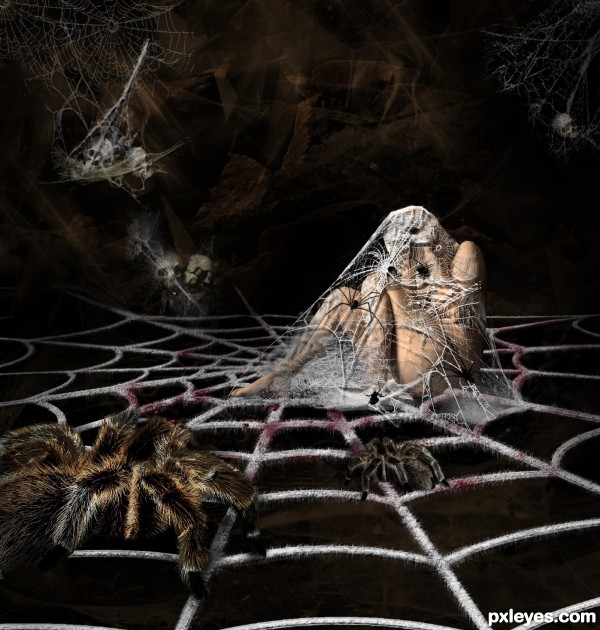
Very nice -- like the web and the work on the figure
Very effective, it gives me the creeps!!
very good job..
Withering! 
very nice work,GL!!
very cool 
Creepy, crawlie goodness ... great job!
Congrats Geex  very creepy
Congrats! great work!
Excellent work. Especially the web covering the model is the best of all. And the making of the base web was very instructive.
Good job.
Howdie stranger!
If you want to rate this picture or participate in this contest, just:
LOGIN HERE or REGISTER FOR FREE
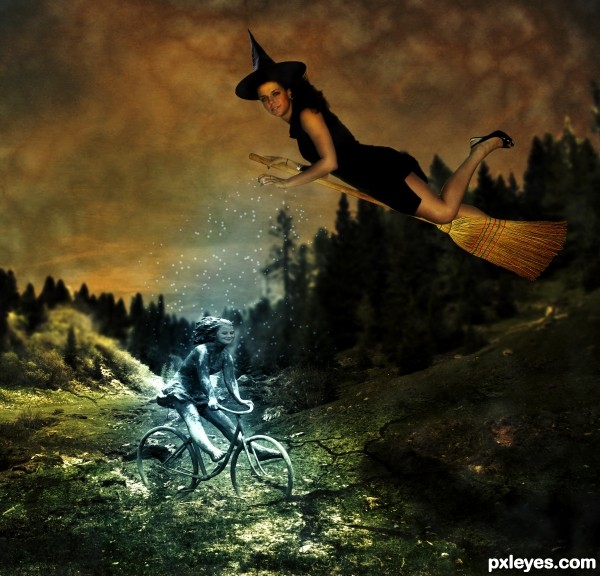
(5 years and 3276 days ago)
nice work -- maybe take a look at the fornt wheel seem to be blending into the earth rather than on top -- also the rear wheel is a bit off round -- touch up the masking and this will be better (IMHO)
You might want to reposition the broom so that it is supporting the witch. She looks too obviously in front of, rather than on top of it.
Thanks for yur comments! I have already fixed them, I think it's better now. Check it and tell me! Thank you again!
Looks better.
I really like what you did to the bicycle girl's face, but it's a bit too small for the rest of the body.
Nice work.
I'm sorry, but this is just hilarious. 

i love it!!! great idea!
Howdie stranger!
If you want to rate this picture or participate in this contest, just:
LOGIN HERE or REGISTER FOR FREE
I think I know this guy... hehe
I not sure I'd want to know him ... definitely weird
There's one in every neighborhood. Good use of parts, author!
Howdie stranger!
If you want to rate this picture or participate in this contest, just:
LOGIN HERE or REGISTER FOR FREE