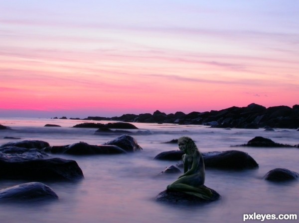
created using clone, brush, path, and two source images. (5 years and 3198 days ago)
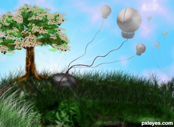
Everything from the original source. (5 years and 3199 days ago)
love this entry... the balloons are very well constructed and i like your rock, realistic ... This is artistic work...
Quite clever take on this. Love the part of the camel that you used throughout! 
Howdie stranger!
If you want to rate this picture or participate in this contest, just:
LOGIN HERE or REGISTER FOR FREE
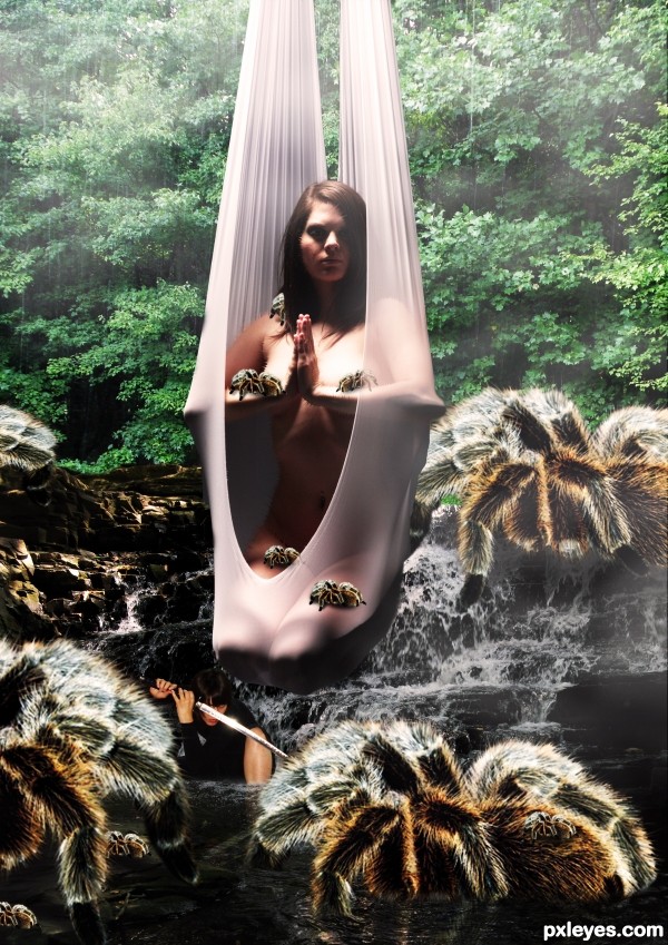
(5 years and 3199 days ago)
Very mysterious image!
Just one thing: you cut model's right elbow... 
ok thanks eri fix
the front spider on her lap is at a wrong angle as it is on the "web-net" and not flat on her lap.
somehow, i felt the ninja girl in black should be placed in the bushes, a more assasin-like fashion, juz a suggestion 
one has to wonder what she is hanging from when its clear she is well into the water where no trees are hanging.
The lighting on the hanging girl is coming straight down where as in the backgroung it looks like its coming from the left of screen.
The girl in the water would not be so bright and would also be smaller, she looks bigger that the rocks behind her in the waterfall, and I only say this because you can see the water base near her legs which is throwing off the size.
Howdie stranger!
If you want to rate this picture or participate in this contest, just:
LOGIN HERE or REGISTER FOR FREE
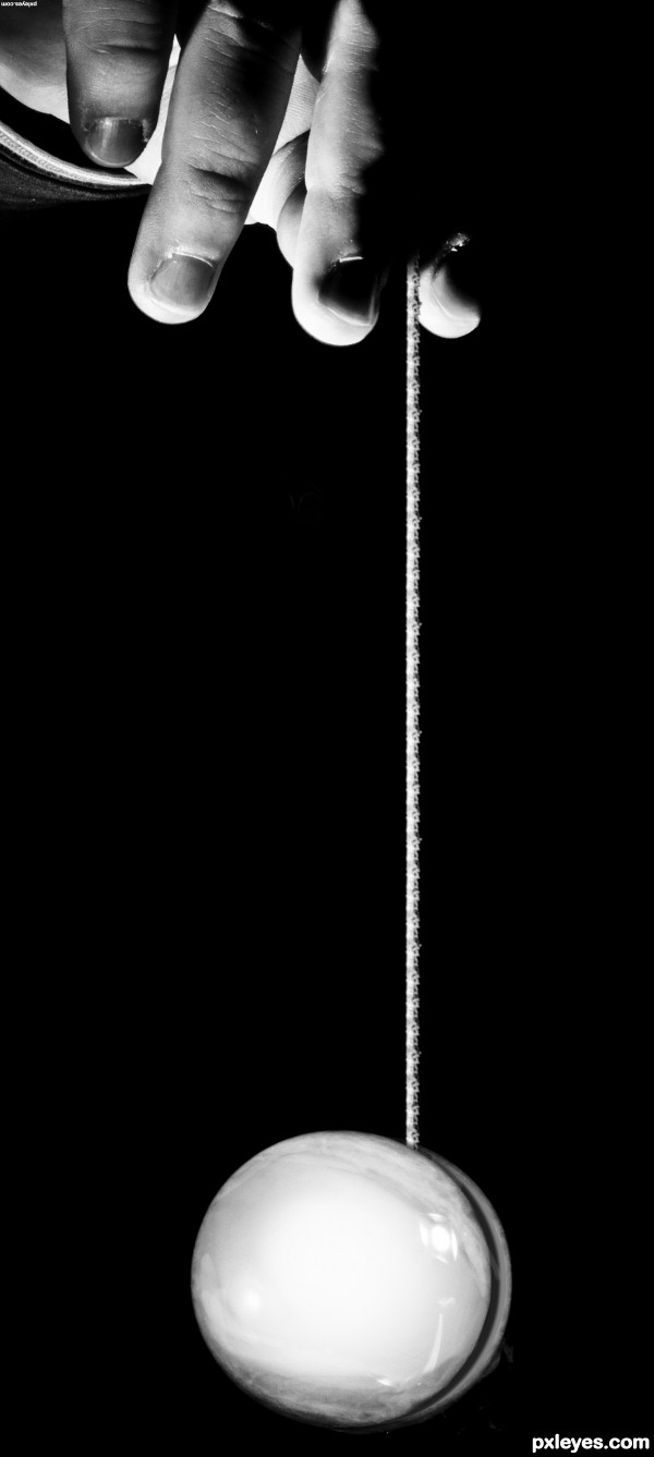
a quick simple entry with no external sources. Basically just copying and flipping pieces of the source. (5 years and 3200 days ago)
Clever ... simple ... and well done!
What Arca said. It always helps to look at sources upside down! A little of the smoke in a radial blur would be all that I'd suggest, otherwise great job. 
Congrats!
Howdie stranger!
If you want to rate this picture or participate in this contest, just:
LOGIN HERE or REGISTER FOR FREE
(5 years and 3202 days ago)
:o
Howdie stranger!
If you want to rate this picture or participate in this contest, just:
LOGIN HERE or REGISTER FOR FREE
It's so dark, it's very hard to tell what parts, or how much of the contest source you've used.
You may want to consider some judicious cropping, to make your use of the contest source more of the focal point in this image. Right now there is too much background, and too little contest source...
Also think about straightening out your horizon line. It's presently tilting down to the RH side...
The head looks too far forward on the neck. Decent idea but lack of a high res version hurts you.
Howdie stranger!
If you want to rate this picture or participate in this contest, just:
LOGIN HERE or REGISTER FOR FREE