Thanks to the following for stock-
Redheadstock D'art
MJ Ranum D'art
Mqtrf Pxleyes Member.
(5 years and 3204 days ago)
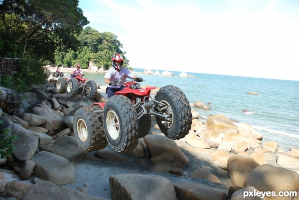
for the beach photo is own by me! thanks! (5 years and 3204 days ago)
The background lighting is inconsistent with the contest source.
Notice how the wheels of the vehicle are fully lit? Yet you have both versions riding over rocks that are in the shade. Just doesn't work, visually...
Consistency of lighting and shadows is hard, but is one of the most important things in almost any entry in these competitions. You can try lightening the rocks with the Dodge Tool, or find another beach background image to use that does not have such obvious shadows beneath the riders.
Howdie stranger!
If you want to rate this picture or participate in this contest, just:
LOGIN HERE or REGISTER FOR FREE
source (5 years and 3204 days ago)
Amazing, GL!
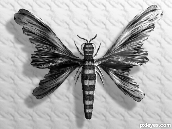
Imaginative and creative use of the source image. Nice final result. I like the that you retained the greyscale look overall too.
seems like the insect upside down
suggestions:
1) adjust the wings part near the body to cover some of the legs portion
2) angulate the legs, now too straight
3) too stark colors for the insect, should lighten alittle
4) touch-up the body, so that it do not have a "mirror" line at the center
5) rotate the insect alittle
6) add a little perspective look
7) fade the edges of the shadows to make it more natural (can use a big brush, lower the intensity to erase the shadow edges)

Thinking out of the box... That's real art... GL
Thinking out of the box... That's real art... GL
Congratulations 
congrats!!
Congrats. nice work!
Howdie stranger!
If you want to rate this picture or participate in this contest, just:
LOGIN HERE or REGISTER FOR FREE
(5 years and 3204 days ago)
Well done!
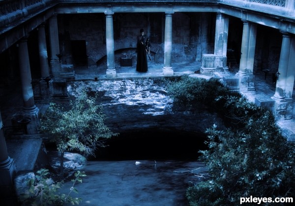
hehehe.. (I would get rid of the two white paper sheets behind the warrior.. just burn them or clone them out, or turn them into papyrus or something  .. they just don't fit the awesome mood you created.. but that could be me.. GREAT JOB!!
(they center him great, but they look to modern to me  )
)
(YES.. the paper is gone and the image is fantastic now.. GOOD LUCK)
Thanks Drivenslush, I have removed 2 white paper sheet from background.
great job... but the picture let me expect something in the pit.
suggest add a little hint of a creature in the pit to complete the whole story 
Thanks aheman for suggestion. He is expecting something. Suspense 

Howdie stranger!
If you want to rate this picture or participate in this contest, just:
LOGIN HERE or REGISTER FOR FREE
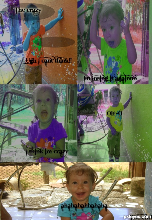
i used color balance
i resized the pictures so they fit one box
added glow to the title
also i cut my image so that they would fit the box.
there is no source this is my image. (5 years and 3204 days ago)
hi i did not really understand what you said..i did rite a step by step and im not sure what you said about the uncut or cut thing...
Maybe you should create some circles or rectangles to insert the text, it's a little hard to read sometimes, due tot he variance of light/dark of the backgrounds.
Author your entry is correct now. You should check your personal messages (PM's). Just go to the stats box on the right and click "unread messages".
Howdie stranger!
If you want to rate this picture or participate in this contest, just:
LOGIN HERE or REGISTER FOR FREE
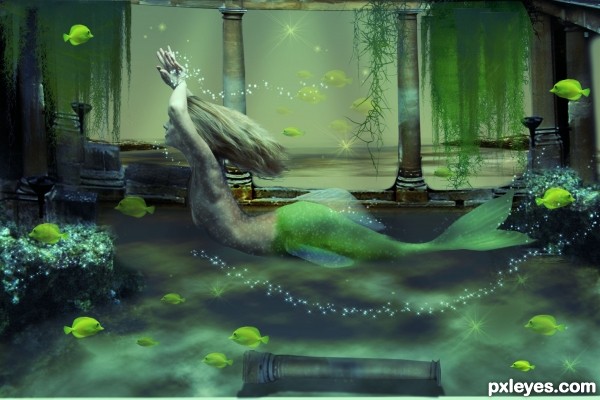
Her body looks too small and not proportional to the rest of it. Lovely concept and coloring.
suggestions:

1) underwater feel, should include glistening to the mermaid
2) make hair more "lighter" (now looks heavy, too thick) and free flowing
3) the dangling sea-plants should have different shades of green to create depth
4) trailing bubbles around arms and tail, to create sense of movement
5) lift up the abdomen of the mermaid to make her more shapely
6) add some fish near her, both infront and behind her
hope these suggestions are useful
thank you both for the great feedback... I took note of what you said and made changes.

I hope you like them
Congrats!!
Congrats
ooh.... its perfect now, go frame it up and CONGRATS!
Howdie stranger!
If you want to rate this picture or participate in this contest, just:
LOGIN HERE or REGISTER FOR FREE