Photoshop Pictures: The (page 187)


results 931 - 935 of 2863

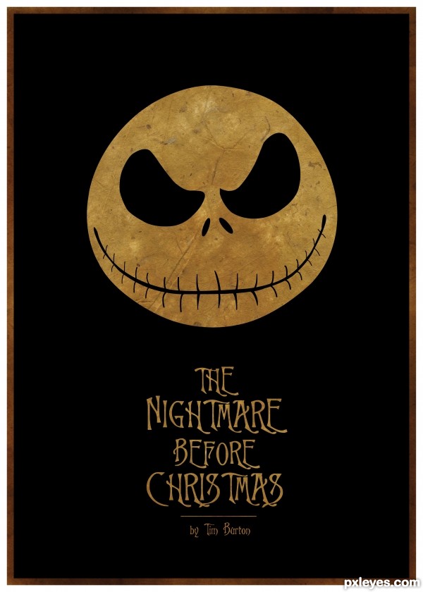
The Nightmare Before Christmas - created by Concrete


The Nightmare Before Christmas
Favs: 2SBS: 8Hi-resRank: 2/42Score: 65.7% (31)43125 views

Another Tim Burton movie poster by me...

One of my all time fav movies had to do it, wasn't sure it the white or texture looked best though.

Check my SBS to see the black and white version.

Used Illustrator only. (5 years and 3045 days ago)

avatar loopyluv
loopyluv says:

Love it!!!! ehehe

avatar CMYK46
CMYK46 says:

IMO the texture works better. GL author, nice job.

author says:

Yeah I thought the texture might give it more character/mood, glad you like

avatar Androla
Androla says:

wonderful!!!!

avatar Drivenslush

Excellent!!!!

avatar alyssadanielle

love this! and glad you went with the texture, it just pulls in the mood of the movie! fantastic! good luck author!

author says:

Thanks guys I hope this does well, will try submit another today still.

avatar nilknarfsoive

congrats!

avatar lordymail
lordymail says:

Congrats!

Howdie stranger!
If you want to rate this picture or participate in this contest, just:

LOGIN HERE or REGISTER FOR FREE


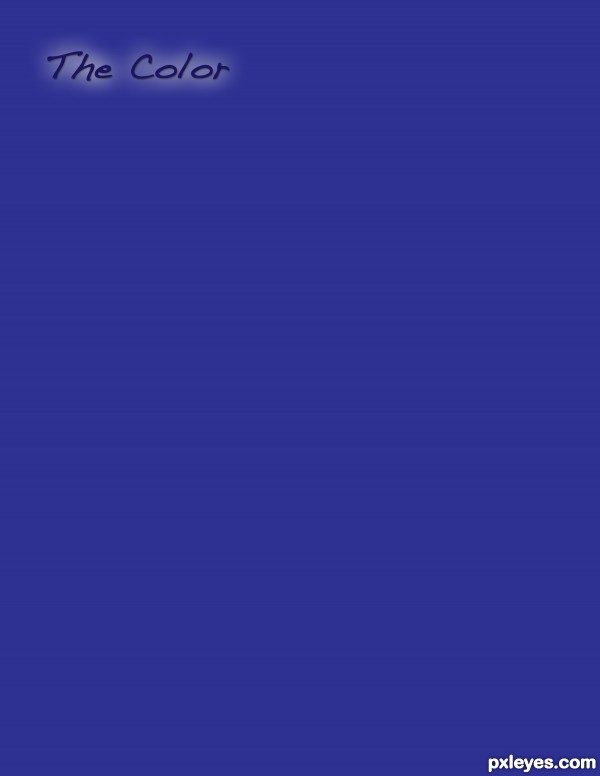
The Color Purple - created by lbadge320


The Color Purple
Favs: 0SBS: 2Hi-resRank: 38/42Score: 53.7% (0)6215 views

(5 years and 3046 days ago)

avatar MossyB
MossyB says:

This is a good monitor tester!
The hex code for purple is #4D198D or 3F0584
http://www.i-freeware-download.com/web-colors/hex-rgb-hsv-Royal-purple-cId-986.aspx
My monitor shows this color to be 2d3091...Too blue, with not enough magenta...
But that could just be my monitor. I've posted the hex codes in case it's not me.

avatar enblanco
enblanco says:

Oh, thank you I've just discovered I'm daltonic, anyway great minimalist poster, GL!

avatar CMYK46
CMYK46 says:

IMO a gradient would be better than a flat color.

avatar MossyB
MossyB says:

The movie isn't "the color gradient," tho...lolol!

author says:

Thanks! I appreciate your comments. I thought about the gradient too. But I was going for minimalism...this seemed to fit the definition better.

Howdie stranger!
If you want to rate this picture or participate in this contest, just:

LOGIN HERE or REGISTER FOR FREE


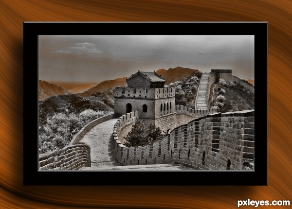
The Wall - created by Drivenslush


The Wall
Favs: 0SBS: 5Hi-resRank: 7/42Score: 57.9% (5)4569 views

basic cleaning, adding a tv type frame, stuff (5 years and 3046 days ago)

avatar greymval
greymval says:

Not bad, is this CS5 ?

author says:

White Rabbit (the version that only existed for a moment before CS5)

Howdie stranger!
If you want to rate this picture or participate in this contest, just:

LOGIN HERE or REGISTER FOR FREE


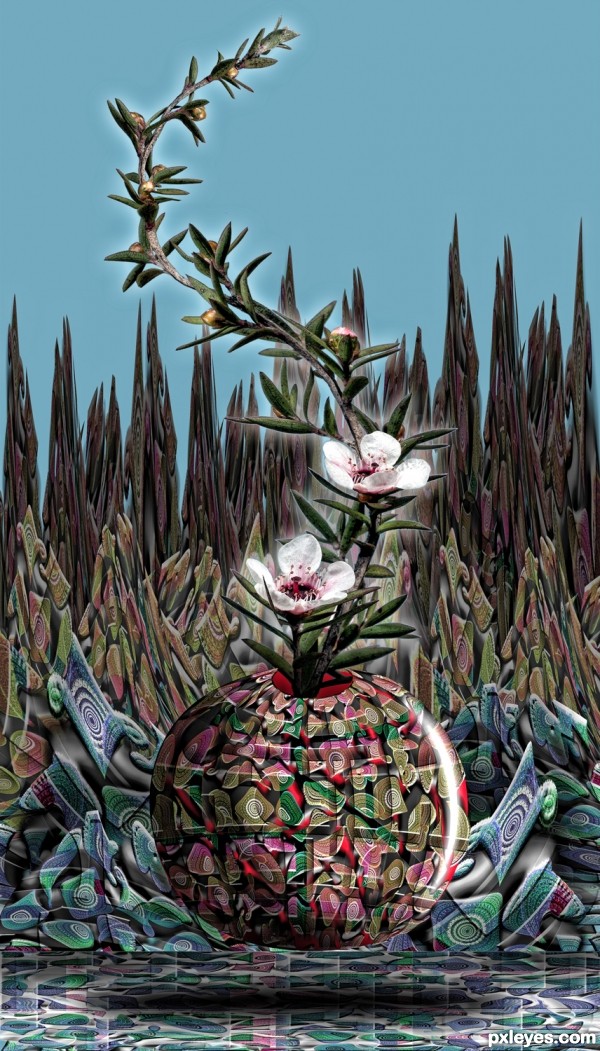
The Braceling - created by Drivenslush


The Braceling
Favs: 0SBS: 30Hi-resRank: 3/42Score: 59.6% (25)5897 views

Source and PS (5 years and 3047 days ago)

avatar pearlie
pearlie says:

This is amazing! It's got to be one of your most intricately made pieces to date. So many of the step images remind me of those old braided rugs. Cool work, author.

author says:

I was channeling artgirl... hehe

avatar lordymail
lordymail says:

Congrats!

avatar Luciana
Luciana says:

You are irremediably nuts!!! (in a very good way)

avatar Luciana
Luciana says:

You are irremediably nuts!!! (in a very good way)

Howdie stranger!
If you want to rate this picture or participate in this contest, just:

LOGIN HERE or REGISTER FOR FREE


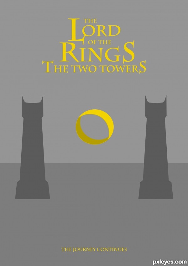
TLOTR - created by lordymail


TLOTR
Favs: 0SBS: 7Hi-resRank: 23/42Score: 58.7% (0)10245 views

No outside source used.
Hope you like it.
Feel free to comment.

Edited. (5 years and 3047 days ago)

avatar kekskruemel

this is one of the best really love this

avatar wazowski
wazowski says:

Nice use of colors. I might have put the horizon line ánd towers somewhat lower so you can give some more space to the name of the serie and somewhat more under the name of the movie. Imo a bit too much happens above now while under it's a bit too empty. Good luck!

author says:

thanks for the tip wazowski. I changed it like you said . Hope it's better, if not then please feel free to comment.

avatar MossyB
MossyB says:

Nice visual balance, good minimal yet effective communication of the concept. Nice work!

Howdie stranger!
If you want to rate this picture or participate in this contest, just:

LOGIN HERE or REGISTER FOR FREE