Photoshop Pictures: The (page 192)


results 956 - 960 of 2863

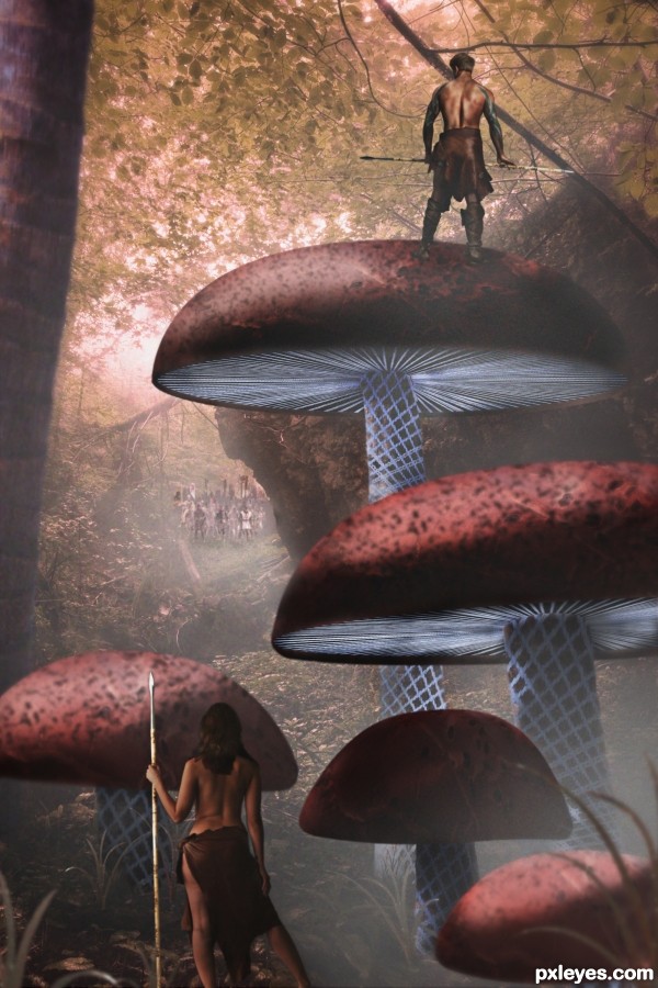
The Scouting Party - created by greymval


The Scouting Party
Favs: 2SBS: 6Hi-resRank: 7/14Score: 62.7% (0)20481 views

A team of scouts discovers the invading forces advancing through the forest.

I would like to mention & thank Marcus Ranum, for his quality stock. Mouse drawing the characters would have taken me another 2 days to finish the entry.
Please check the full resolution. (5 years and 3055 days ago)

6 Sources:

avatar nilknarfsoive

Wow... very nice...

avatar robvdn
robvdn says:

Very nice, I suggest you add some shadows though.

author says:

Lol, rob was right, thx. You see your entry differently the next day . I had no idea why i hated it
You can see the changes in SBS. Also thank you nilknarfsoive.

avatar nanaris
nanaris says:

I like this imaginary world, looks a little avatar!! very nice,,!!

avatar bcabilan
bcabilan says:

Yummy mushrooms...hehehehe... nice one!

author says:

Made me craving too! ha ha
Nanaris, at first I wanted to make it all blue and draw the humanoid aliens. But it was less energy / time consuming to make it earhlike by finding the right stock, than inventing alien landscape
Thank you for your comments.

avatar enblanco
enblanco says:

Excelent, GL!

avatar arca
arca says:

Fascinating creation and very interesting world you have envisioned. GL

avatar erathion
erathion says:

great work author and he is lucky guy....i would like any time to her watch my back...

avatar Rod13
Rod13 says:

Interesting Fantasy world there author. Best of Luck.

Howdie stranger!
If you want to rate this picture or participate in this contest, just:

LOGIN HERE or REGISTER FOR FREE


The Thriller - created by Rod13


The Thriller
Favs: 0SBS: 8Hi-resRank: 10/14Score: 49.3% (0)3877 views

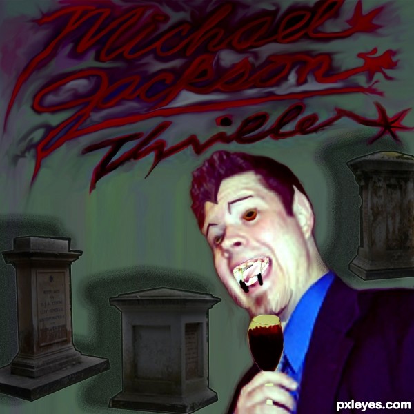
I have to say it, A teenage girls poster for her bedroom don't say THRILLER. Such was the case with the King of Pops Smash Hit Album from the 80's.
I was trying for something more of a grunge horror take on the cover,. Trying not to be anything like the Video. (5 years and 3055 days ago)

6 Sources:

No comments yet... Be the first!The, Thriller

Howdie stranger!
If you want to rate this picture or participate in this contest, just:

LOGIN HERE or REGISTER FOR FREE


One of the Lilim - created by Drivenslush


One of the Lilim
Favs: 2SBS: 10Hi-resRank: 4/14Score: 60.8% (20)10342 views

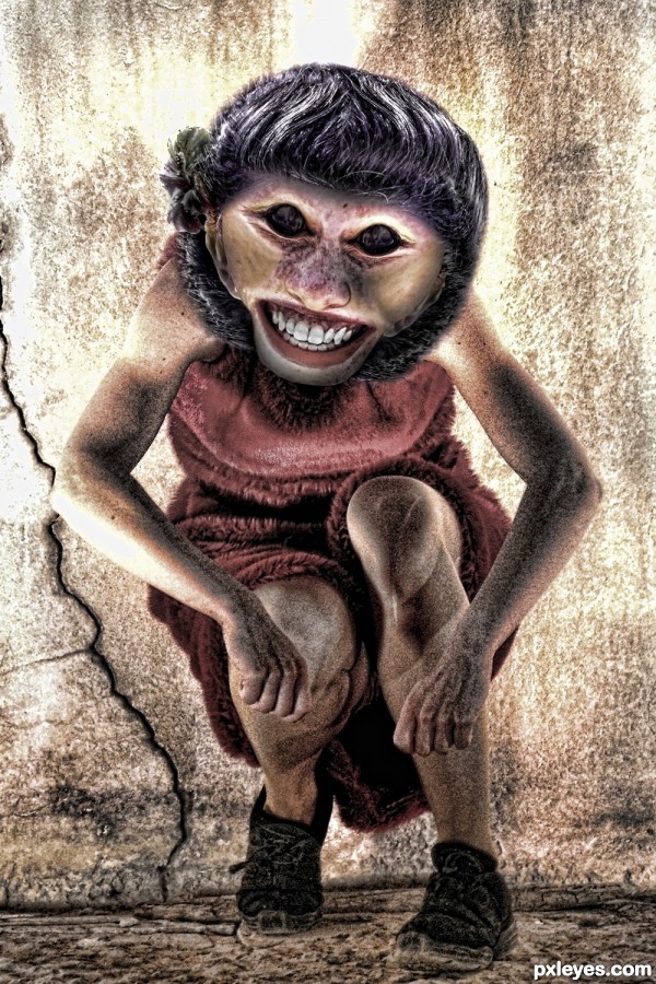
Daughter of Lilith (5 years and 3055 days ago)

1 Source:

avatar greymval
greymval says:

Lol, good scary chop.

avatar arca
arca says:

Great work here ... very clever and well put together!!!!

avatar erathion
erathion says:

Fantastic piece...IMHO top 3...well done

avatar CorneliaMladenova

Gorgeous, looks friendly

avatar ramesan
ramesan says:

very good work author ...GL!!

Howdie stranger!
If you want to rate this picture or participate in this contest, just:

LOGIN HERE or REGISTER FOR FREE


Delete - created by Nysoe


Delete
Favs: 0SBS: n/aHi-resRank: 14/14Score: 43.3% (0)5255 views


(5 years and 3056 days ago)

no avatar
nacho124 says:

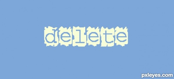
"send me money" hahahaha loved it!!!!!!
"PLEASE!" lol!!!!

Howdie stranger!
If you want to rate this picture or participate in this contest, just:

LOGIN HERE or REGISTER FOR FREE


The Park: Day Into Night - created by elemare


The Park: Day Into Night
Favs: 6SBS: 15Hi-resRank: 4/14Score: 67% (22)12958 views

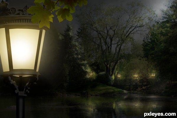
Primary source is my own photo (step 1)

Update: Front lantern was brightened. (Thanks, Androla!) (5 years and 3056 days ago)

2 Sources:

avatar dekwid
dekwid says:

what a peaceful nite.......!

avatar Androla
Androla says:

wonderful picture! the only suggestion is that you should make the front lantern brighter! much brighter! good luck!

author says:

Thank you both. I was afraid that would over-dominate the entire scene, Androla. But I will give it a try. Thank you so much!

avatar arca
arca says:

Beautiful work ... lovely source image and wonderful conversion to night. Your lighting is perfect!

avatar Androla
Androla says:

looks really much better!!!!!! awesome entry!!!

avatar DanLundberg

Lovely up through about Step 15, but the introduction of the foreground lamp with a vanishing point much lower than that of the background makes it look simply like a lamp in front of a painted backdrop.

author says:

OK, Dan, light lifted. Better? Thank you!

avatar DanLundberg

Yes, it is better (although I would eliminate the foreground lamp's underside glow and raise the underside's far edge).

The foreground lamp and leaves are a good way to add depth to the image. The brightness of the foreground lamp makes it the focus, however. I would move it to the left so only half of it at best is visible in the frame.

author says:

Thank you, Dan, I appreciate your advice. I moved the lamp off some, but think its lines and curves make it quite a beautiful piece by itself, worthy of discovery.

avatar erathion
erathion says:

beautiful scene author...very well done

avatar enblanco
enblanco says:

Great job, GL!

avatar ramesan
ramesan says:

Beautiful work...best of luck!!

avatar arca
arca says:

Congratulations on a lovely entry!

Howdie stranger!
If you want to rate this picture or participate in this contest, just:

LOGIN HERE or REGISTER FOR FREE