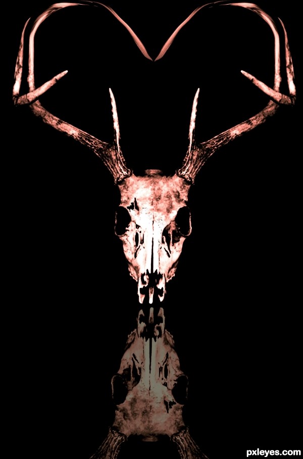
(5 years and 3207 days ago)
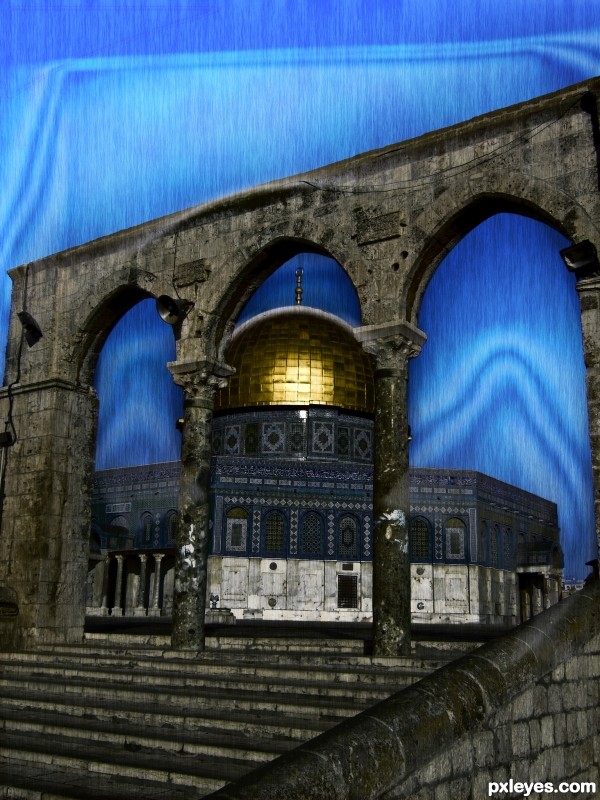
(5 years and 3208 days ago)
It doesn't look like rain, so much as a noise texture with a motion blur...Almost like a blue curtain.
Part of this is due to the background color (rain doesn't usually have such a blue environment), and the whitish shapes, in addition to the "too regular" noise.
Perhaps you could lightly erase parts of the "rain" at a reduced opacity with one of the "speckle" brush shapes to make the downpour look a bit more random.
Although the bevel and emboss (and the triangle) in the sky above the arches doesn't really make sense to me, I do like the design between the arches - it adds a touch of eeriness to the nicely desaturated temple and rain effect. 
Howdie stranger!
If you want to rate this picture or participate in this contest, just:
LOGIN HERE or REGISTER FOR FREE

I was inspired by designer & artist Per Arnoldi.
Arnoldi is very well known for his posters and book covers.
His style is simple and just playing with colors and thickness of the text, is a typical characteristic of his style. (5 years and 3208 days ago)
As a poster it looks pretty nice, but not sure how this would work as cover. The name The Eye will be also big on top of the image, so it would be double. Perhaps instead of THE EYE 3 you can write something else that's typical for Arnoldi? Also, would be nice if you could describe what you took from his work or style that made you create your design. 
Good luck!
In fact, Arnoldi is very well known for his posters and book covers, so no wonder if it looks like a poster. 
His style is simple and just playing with colors and thickness of the text, is a typical characteristic of his style. 
Of course, my picture is far from commensurate with his works, for I am not Per Arnoldi. For then I'd be stinking rich. 
I've now changed the text.
Thank You 
Nicely done!
Good luck!
Howdie stranger!
If you want to rate this picture or participate in this contest, just:
LOGIN HERE or REGISTER FOR FREE
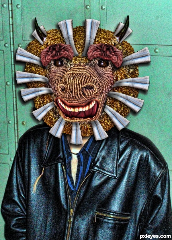
(5 years and 3208 days ago)
Total wildness, author! 
Howdie stranger!
If you want to rate this picture or participate in this contest, just:
LOGIN HERE or REGISTER FOR FREE
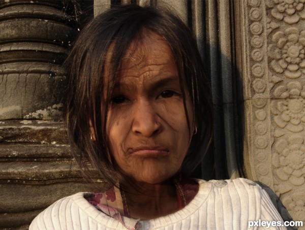
after a long time, i'm doing an entry again (:
Used the young girl as a base and overlayed parts of the old woman. I did a lot of warping and transforming to make the shape of the head look less childish. (5 years and 3209 days ago)
what a face!!!! VERY WELL DONE!!!!
It would be nice see the young face, GL!
Thank you very much (:
you can see the young face in the source.
Really nice job!
Very well done author! Best of luck!
thanks (:
Howdie stranger!
If you want to rate this picture or participate in this contest, just:
LOGIN HERE or REGISTER FOR FREE
Howdie stranger!
If you want to rate this picture or participate in this contest, just:
LOGIN HERE or REGISTER FOR FREE