(5 years and 3385 days ago)
(5 years and 3385 days ago)
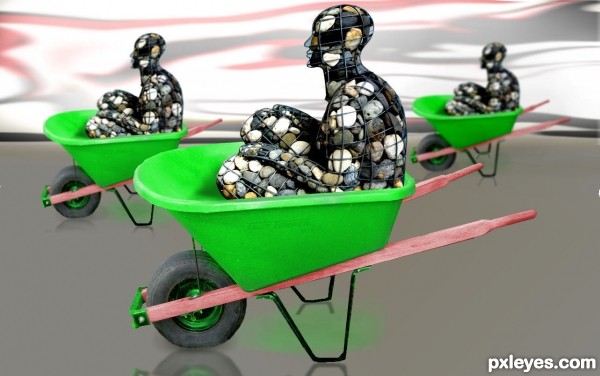
so simple yet so much fun.. wonderful image (this would be AWESOME in a Minimalist Restaurant (about six feet wide) hehehe
EDIT: and the thumbs down monster strikes again.. hehehe
cool work author...gl
Clever title. Nice job!
Nice one, where are the rolling to?
Funny. Nicely done, author. 
Howdie stranger!
If you want to rate this picture or participate in this contest, just:
LOGIN HERE or REGISTER FOR FREE
(5 years and 3385 days ago)
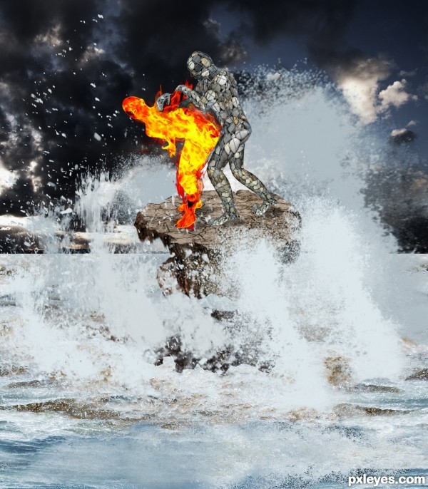
great imagination author...add more flames on the edges of the flaming guy...now look a bit to much cut-ed...best of luck
A bit chaotic...but I can totally appreciate the work you did on the stone man. Nice job!
they are fighting right ? 
good work 
Like gornats implied, that position is open to interpretation , people might ask if Stone is pawning or pounding Fire.
I wish i could help with a better stock source but all Ranum's wrestlers have the same issue.
In case you wanna change it, you could search for judo stock or try using this :
http://www.sxc.hu/photo/172104
yes but I think the title makes it clear guys, lol. Great imagination here, well done =- )
I had not noticed, but you are right, maybe I should change the title. the passion of the elements ha ha, thanks for your comments
Lol, I'm glad you have the sense of humour., author.
Howdie stranger!
If you want to rate this picture or participate in this contest, just:
LOGIN HERE or REGISTER FOR FREE
source and my photos (5 years and 3386 days ago)
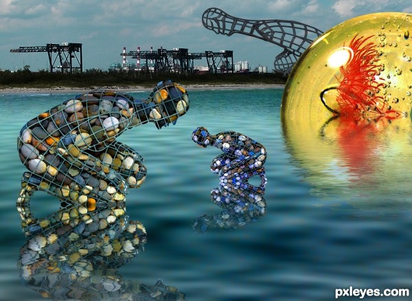
Amazing how there are mirror smooth reflections upon "choppy" water...Woo Hoo!
Haha, i love the humour here. Lovely vibrance and a very original use of source (as always!)
awe.. Ponti got attacked by the thumbs down monster... LOL.. really cracks me up LOL
super cool coloring and perfect water reflections...i have to learn how u always achieve perfect reflections...best of luck
For those wondering, I think you have to use displacement map for the reflection, distort -ripple might work too, but whenever i used displace on water it looked marvelous.
Then you could try edit - fade displace if you want less of that effect.
Maybe author can help more.
aaaand the pettiness continues, haven't even been back a week 
Howdie stranger!
If you want to rate this picture or participate in this contest, just:
LOGIN HERE or REGISTER FOR FREE
thanks to
~SoloPianoStock of
deviantart.com &
*suntanna-stock of
deviantart.com
&
MnMacarta of
pxleyes.com (5 years and 3386 days ago)
very very nice work author...gl
very serene feel , good work 
hey thanks for the support 
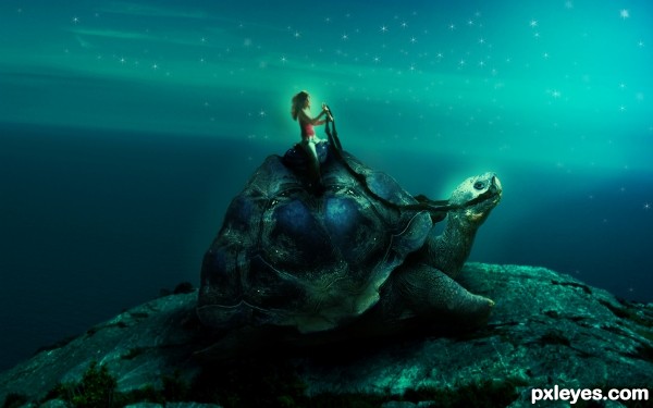
Dreamy and cool. I like the color too. May I suggest that you vary the star shines. Some could be more blurry than others...or some more intense in brightness than others etc. 
EDIT: In that case...
thanks a lot pixelkid for your comment and suggestion..about stars...but what was in my mind while i was doing this that some magical star like glowing particles are coming from an unknown source..which are definitely not stars...
Very cute work = )
Howdie stranger!
If you want to rate this picture or participate in this contest, just:
LOGIN HERE or REGISTER FOR FREE
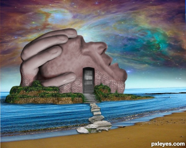
nice work you need to add shadows to blend imo
i agree with nisha. i like you concept, definitely, but just a few little things i might add... bringing some of the brick texture up onto the face to blend it in better...some shadows and stuff...and then, also, blur the horizon so it gives it more depth. also..and not to be picky, but just trying to help... i think the yellow of the stones going into the water is too bright. perhaps lower the saturation so it blends better with the image as a whole.
Thanks for the comments, I tried to fix must or you suggestions - the bricks on the face are still stumping me though...
You've done a lot of cool work here which would be easier to appreciate if you included an SBS. I'm not sure I agree with the relative simplicity of the foreground/midground against the complexity of the background. The perfectly horizontal panels in the door are at odds with the tilted horizon in the background.
I have to agree with most of whats been said, great concept but a little more work on the blending factors.... best of luck
Howdie stranger!
If you want to rate this picture or participate in this contest, just:
LOGIN HERE or REGISTER FOR FREE