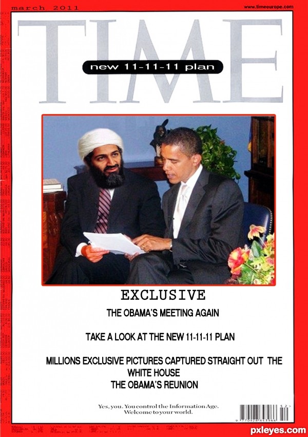
we have to be prepare for everything new picture shock the world (5 years and 3314 days ago)
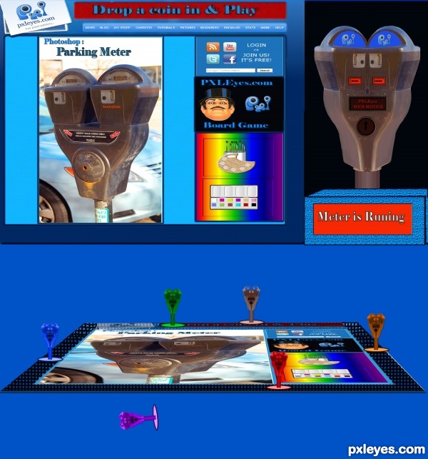
(5 years and 3315 days ago)
Angle of board and pieces do not match, could use a light source that lends shadows and dimension. Just MHO, I like the idea! GL author
Thanks sgc
Howdie stranger!
If you want to rate this picture or participate in this contest, just:
LOGIN HERE or REGISTER FOR FREE
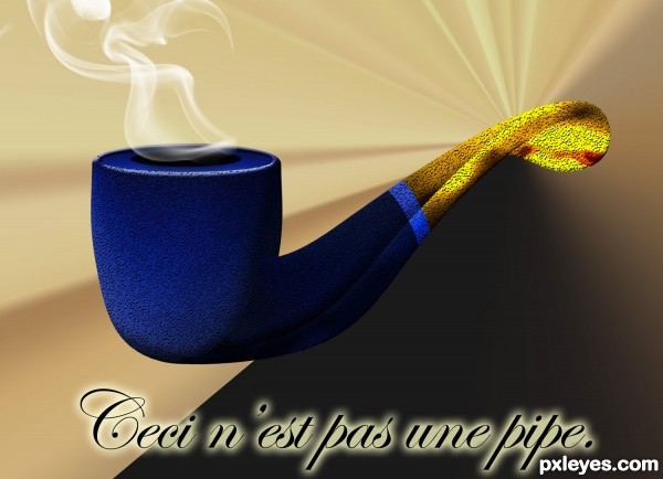
René Magritte
This is Not a Pipe
Drawn in PS (5 years and 3315 days ago)
Nice subject pick. One thing, is there written "Leci n'est pas une pipe"? Because it should be Ceci. In the painting it looks like a "L" (dunno why it's written like that), but it's a C. Good luck!
got it Waz, all fixed  thanks
The SBS simply amazes me! I don't understand how you do this! Fantastic job!
Pretty cool
Very nice work author and so cool final product...gl
Hi my friend! It's perfect homage, but I guess these textures from photoshop are very common, which do you think? just giving the image a lot, maybe if you worked a greater realism in colors and shadows, do not know! Best of luck man!
Nicely done, I especially like how you did the stem of the (not a) pipe, as well as the background contrast combined with focal point of the burst. 
Howdie stranger!
If you want to rate this picture or participate in this contest, just:
LOGIN HERE or REGISTER FOR FREE
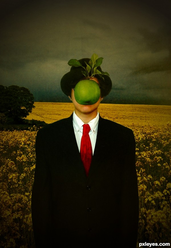
(5 years and 3315 days ago)
Makes me think of Pink Floyd for some reason. I like it 
Wow! This is very cool! Art I would actually hang in my home!
Very nice work, but SBS would be nice, and who is the artist you are coping?
Emik...did you check the source links? its Son Of Man by Rene Magritte.
and i didn't do an sbs because it seems pretty simple to me. i just used 3 sources and put them together. a little gradient overlay and then a texture source. I guess if i have to, i will make one, but it will be a very boring sbs. cut and paste, cut and paste, cut and paste. and then blend. *sigh*
JC Freak: thank you so very much  i adore pink floyd, so i'm quite happy it made you think of that.
And Rbsgrl  thank you as well.
  i was quite happy with the final results
I have to say only well done...this is hit in the contest target center...best of luck
I would like to see SBS : - )
okay okay. tonight i will put together an extensive sbs. :lol: proper cut and paste style.
Good concept, but why not also imitate the original background?
I believe in adding in my own sense of flair. I couldn't bring myself to completely copy someone elses work. At all.
But its early in the show. Perhaps something might still change. It took all I had not to change the green apple to a red one.
Great .... love his work and your interpretation.
hot cha cha cha..
and for those of you who requested the sbs, check it out.  its added now.
Thanks so much to everyone for the wonderful comments.  i appreciate them all.
and CMYK..i decided not to change the background after all. :P
Great job with this counterfeit. Beautiful result.
I like your interpretation a lot, including your background choices. Well done, author! 
Howdie stranger!
If you want to rate this picture or participate in this contest, just:
LOGIN HERE or REGISTER FOR FREE
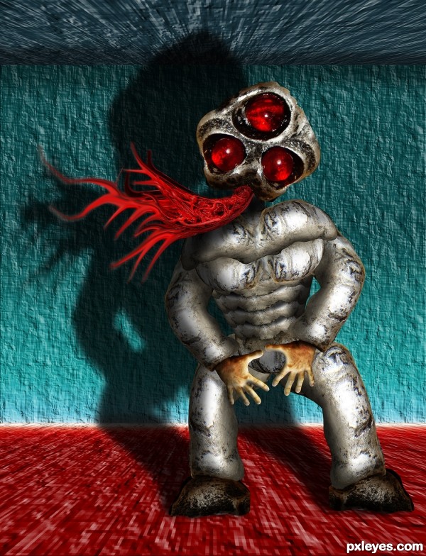
Made famous by Michael Jackson, but he usually used one hand :)
source and two of my pics (5 years and 3315 days ago)
cool
cool lookin image as usual!!!
U just ain't (taint) right. But I like this picture... 


nice job my friend
Great work! Made me laugh!
great image author...he look so crazyyyyyyyyy....GL
What fun ... 
Did Mick Jagger's lips pose for the chest area? 
Good Luck!!!
Howdie stranger!
If you want to rate this picture or participate in this contest, just:
LOGIN HERE or REGISTER FOR FREE
Bin Laden's head/face needs to be blurred a bit. Maybe a little noise and slight desaturation too. I like the idea although it's kinda scary. GL author.
thanks freack fixt a little
Oh my...very imaginative!! I like that you chose Time for your magazine!
Good idea, but Bin Laden's head is distorted, and I doubt we'd ever see him in a suit & tie! GL author.
the white house approve only suits , we have to stay diplomatic
cool work author...love the approach...small nit pick...skin color on his hand is way different of his face color...but maybe that is ok cause in terrorist camps his face is always exposed to the sun, but his hands are always in the pockets...
thanks erathion fix a little
looks like this was done in M$ paint. Text looks very plain, unbelievable, and the image is very grainy. Not to mention Osama is believed to be dead.
is this contest suppose to be real ?????????????????????????
Howdie stranger!
If you want to rate this picture or participate in this contest, just:
LOGIN HERE or REGISTER FOR FREE