source with my photo (5 years and 3438 days ago)
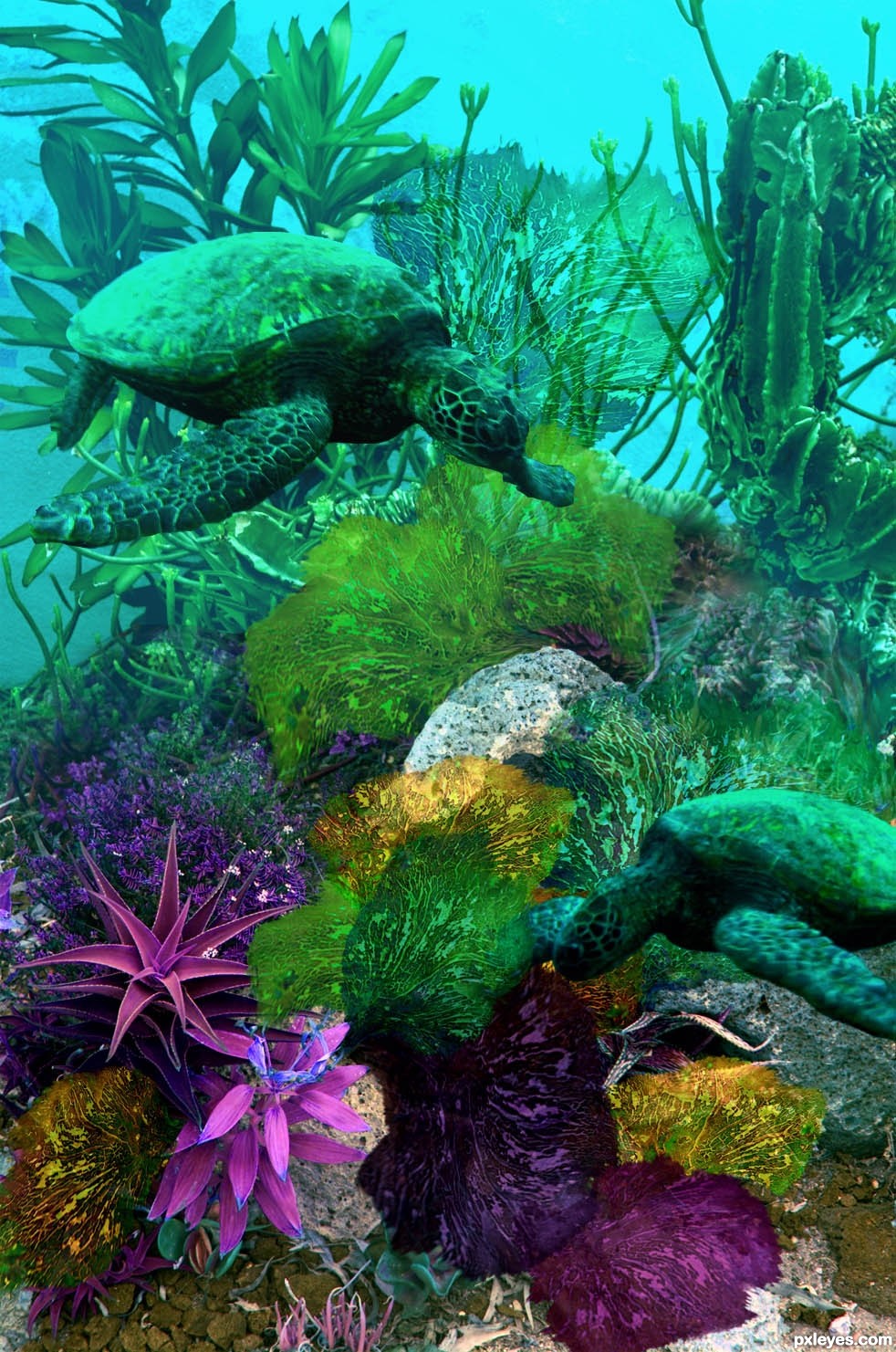
Thanks to Nemo's great uncle at flickr for the turtle source photos; to abraxas3D for the under the sea source used to place the sea fans made from the bracket fungus source; heirbornstud at morguefile.com for the vortex source used behind the background scene when I began. (5 years and 3439 days ago)
Nice work author! Just some little nitpicks, I think the front flipper of the lower turtle should be in front of the fan, and you can try and warp the fan's a bit more to give them some body, it seems a little flat. GL!
Love the colour and the turtle is great!
This is great stuff. Keep up the great work!!
luv this
Happy and free turtle, beautiful image 
Howdie stranger!
If you want to rate this picture or participate in this contest, just:
LOGIN HERE or REGISTER FOR FREE
my photo graph of an empty fountain as background (5 years and 3439 days ago)
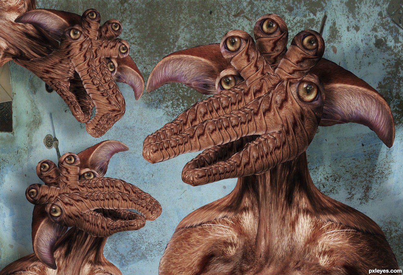
very crazy entry! great construction of the monster i knew it was u

Ohhh my,, I tried to give it a name. Not in my wildest imagination could I reach at one. Then I thought fav could be one... GL.. IMO author it would been better had this come earlier. Would had reaped votes.
One of my all time faves ... okay now I know who it is ... one of my all time faves of yours! Looks like JarJar Binks on acid (not sure if it is him or me on the stuff though) ... perfect!
It does look like that multi eyed creature from Star Wars, The ears would have to be much longer and floppy to be Jar Jar binks LOL Thank for the fav both Nisha and Arca (and thanks for your comment locale)
Ah yes ... but if I was hallucinating Jar Jar he might not have any ears!

Really ... they only looks a very little bit like him ... they truly are unique creatures ... just pulling your leg (or ear if you happen to have really long ones).
I agree. This is also one of my all time favorites bar none!
WTF???!!! That's what I said when I saw this.  GL!
GL!
Top work author...fantastic creatures...well done
Howdie stranger!
If you want to rate this picture or participate in this contest, just:
LOGIN HERE or REGISTER FOR FREE
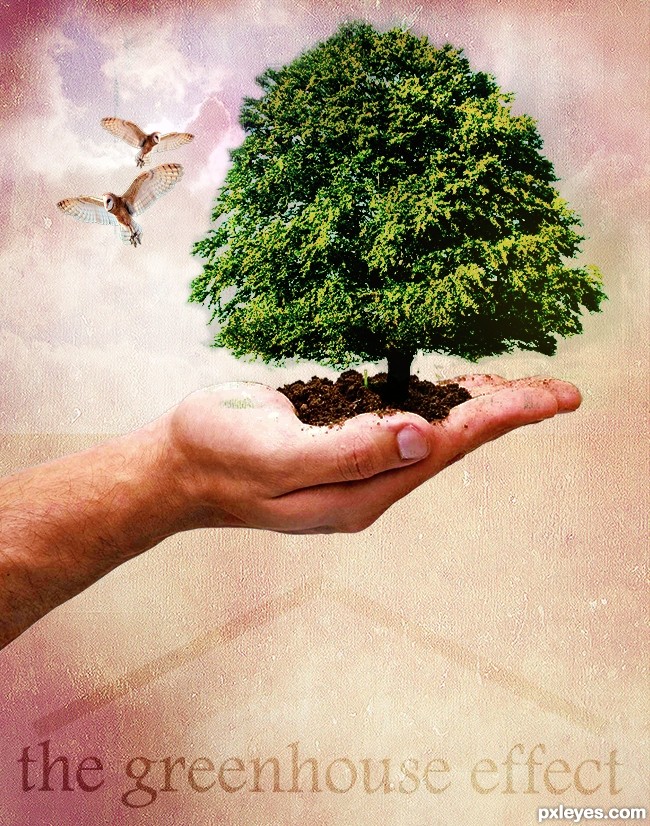
Used blending and masking to create the final image following the tutorial.Create a Nature Inspired Photo Manipulation in Photoshop from Psdtuts+ (5 years and 3440 days ago)
You almost need a third owl to balance the effect (and since you have the ability I would turn the owl to LOOK INTO the image and not off the page.. old newspaper layout rule LOL..).. the middle finger got slammed pretty hard in the masking process.. but it's only visible in the high res... Your overall design is quite nice... (watch the distort when enlarging the OWL.. hold down the shift key when resizing.. his head is a tad bit squished... Puppet Warp would be best but gentle liquify and/or warp can work as well... (when repeating the same image it's important to alter the images slighty so they don't look like perfect clones.. unless that is your goal then go for it...
Good Luck Author.. and welcome to PXLeyes
Thank you so much for your feed back......the best way to learn in my book......i will try to look at it again if time allows. Thanks for your welcome.......must say entering my first contest made me quite nervous :0 lol
Your color tones are a bit off, with your tree somewhat yellow and sickly looking, and the hand too pale. You can (if you wish) correct both of those with Image>Adjustments>Selective color, choosing yellow adjustments for the tree (increasing the cyan and decreasing the yellow) and the reds (slightly increasing the magenta and black) if you have the hand and tree on separate layers.
Your overall composition is somewhat compromised because you have the background lighter areas too large, resulting in a whitish "halo on the RH side of the sickly tree, and too much light above the hand on the LH side. This subtly pulls the focus outwards.
The owls are also now a bit too large and distracting within the overall image.
A very nice tutorial you found, the effects used can be applied to many other types of images.
Thank you MossyB for your feed back, have made a few adjustments along the lines suggested.
Ooooh! MUCH better!
Now you've improved upon the tutorial with the sky behind the owls, and the eye is drawn to the tree, and then moves around the image.
Nice work.
Looks good, not sure about the green bit on the palm.
Thank you MossyB I agree that it looks much better now with the changes, the feedback was so appreciated.
Welcome and nice finished image!
Nice work, the message is strong. Very effective use of texture
great work...gl
Howdie stranger!
If you want to rate this picture or participate in this contest, just:
LOGIN HERE or REGISTER FOR FREE
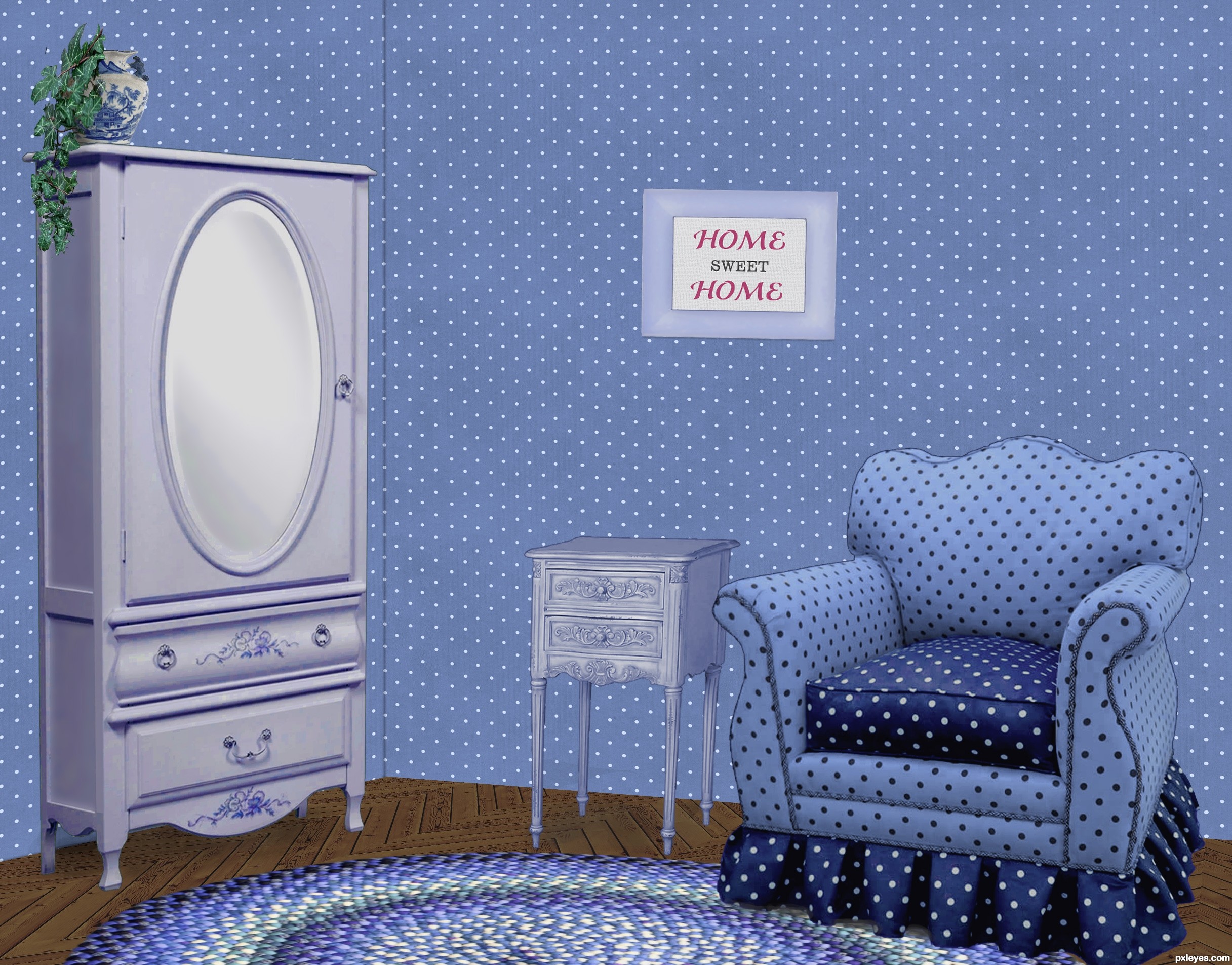
It was easier to put Granny in a home when we could decorate it the way she wanted... (5 years and 3440 days ago)
Nice work on the floor. Wall at left should be darker, as both planes would not receive the same light.
I wondered about that, since the light is striking the armoire from the right, I figured the wall behind it should be illuminated, though. If there was a corner by the armoire, it would be darker once you turn the corner, just as the LH side of the armoire is darker. The surface of the wall behind it is like the front, illuminated.
Thanks about the floor. It was fun making that part!
Agree with CMYK. It also would improve the image greatly if you tried to darken the inside areas of the cushions on the arms of the chair...it might help give some variance to the 'blue look' of the shot. Just a thought. Good job!
I agree, some variations in light around the walls would;ve been nice. It would eliminate the whole 'pasted in' feel.
The shadows the objects are casting look great and your floor pattern is crazy good!
Lovely blue room
Howdie stranger!
If you want to rate this picture or participate in this contest, just:
LOGIN HERE or REGISTER FOR FREE
Photography and photoshop contests
We are a community of people with
a passion for photography, graphics and art in general.
Every day new photoshop
and photography contests are posted to compete in. We also have one weekly drawing contest
and one weekly 3D contest!
Participation is 100% free!
Just
register and get
started!
Good luck!
© 2015 Pxleyes.com. All rights reserved.


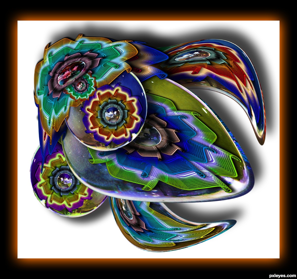
You are a genius my friend!!!!
shadows are too strong and wrong!
Great creative mess...gl
Faved!
Look like the beetles we get here in the summer ... and they don't play music Fun!
Fun!
Here we go again....warping, and coloring looks good. yes, it looks like a JU JU BEE. (Whatever it is) good luck author.
http://www.frugalnutandcandy.com/store/item.asp?ITEM_ID=353&DEPARTMENT_ID=70
THESE ARE JU JU BEES!!! hehehehe
Howdie stranger!
If you want to rate this picture or participate in this contest, just:
LOGIN HERE or REGISTER FOR FREE