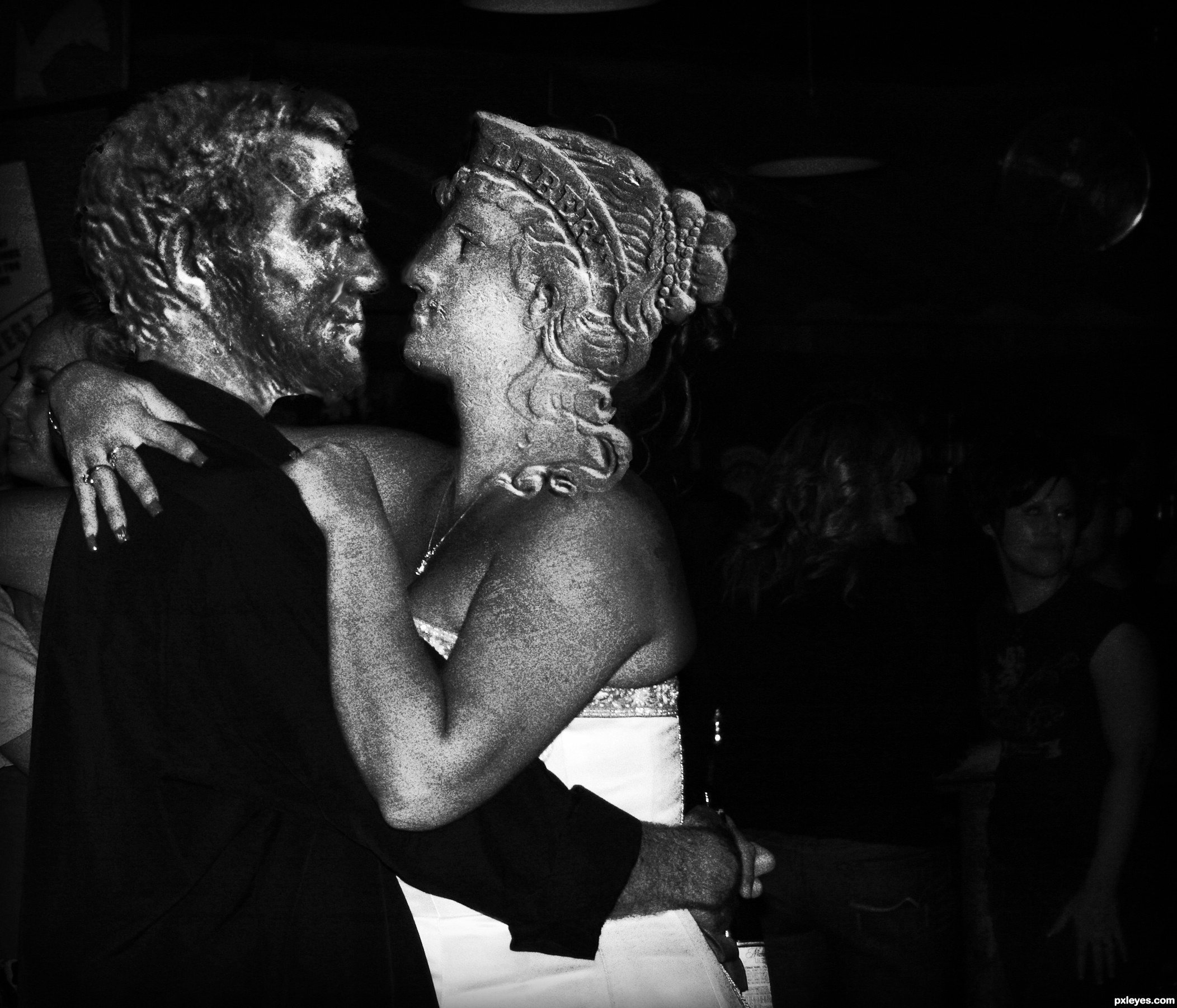
(5 years and 3333 days ago)

Sculpture, columns, background all made from the source. No outside sources used. Please see detailed SBS. (5 years and 3333 days ago)
Smart idea, it would have looked far better with more time invested by:
-arranging the composition so it would be a simmetrical perspective vs the assimmetrical statue.
-Insisting on highlights of the sculpture like the light was comming from above, vs a general light from the left.
- columns having a base.
- color pallete including complementaries : blue vs orange statue, or red vs green columns.
I'm sure you already know all these, that's why i wish you had more time.
I see you edited the color, nice 
Nice work.. Good luck..
nice work...gl
Howdie stranger!
If you want to rate this picture or participate in this contest, just:
LOGIN HERE or REGISTER FOR FREE
Credit:
chuqui, nickdesignz.deviantart.com (5 years and 3333 days ago)
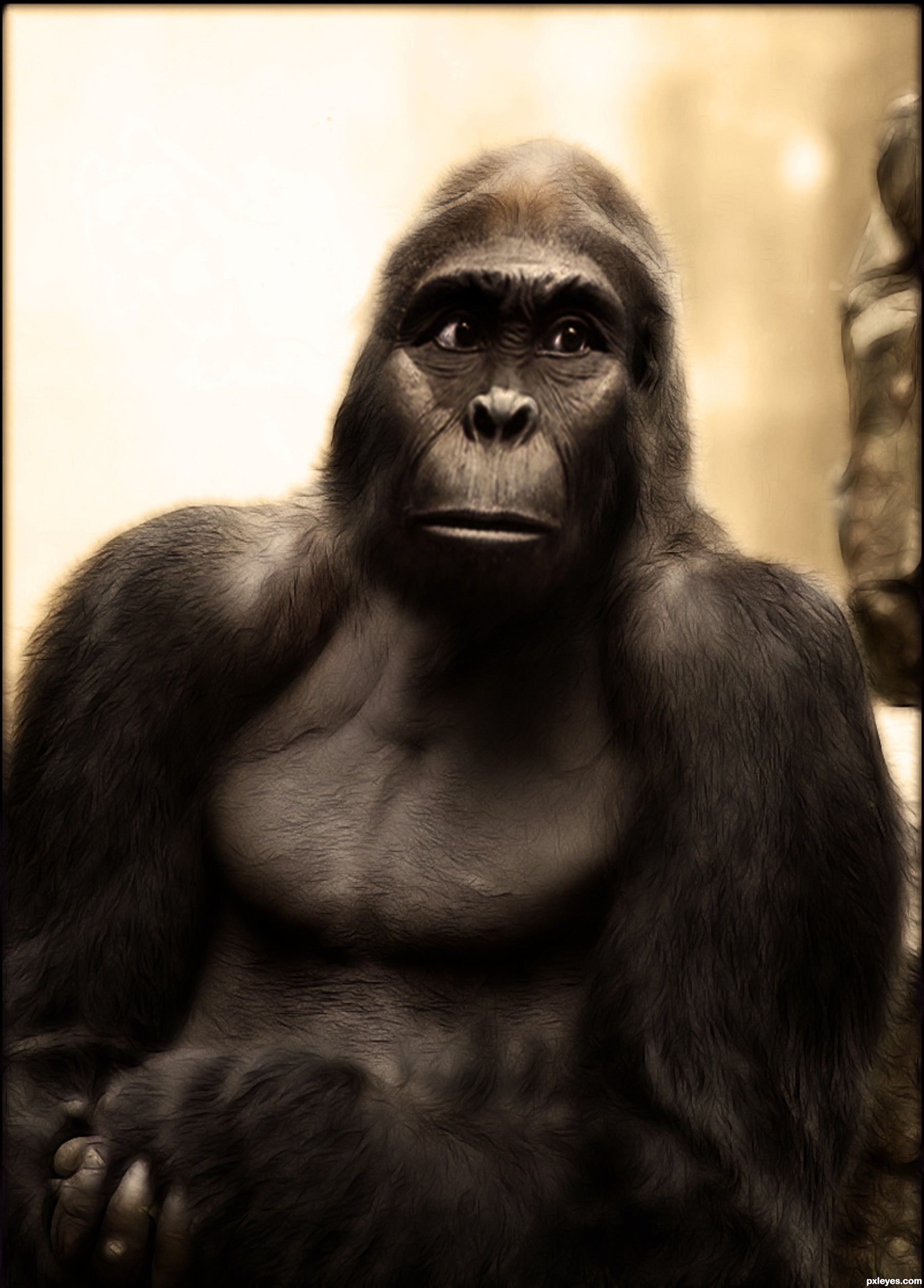
Expresion is beautiful...good luck author!
Good blending here, got only one suggestion, the face seems a bit flat like he is slammed in the face or something.. anyway mayby you coulg give him somewhat more volume  ?
?
GL
very nice work...gl author
Nice portrait 
Congrats!
thx all for your comm!!!
Howdie stranger!
If you want to rate this picture or participate in this contest, just:
LOGIN HERE or REGISTER FOR FREE
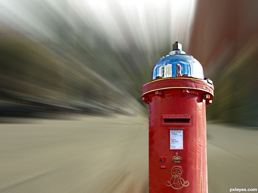
MASKING WITH OTHER POST BOX (5 years and 3334 days ago)
A background and a postman or somebody with a letter would give more sense to this design.
the idea is gud ....!!
to focus on particular object while moving in high velocity.
Howdie stranger!
If you want to rate this picture or participate in this contest, just:
LOGIN HERE or REGISTER FOR FREE
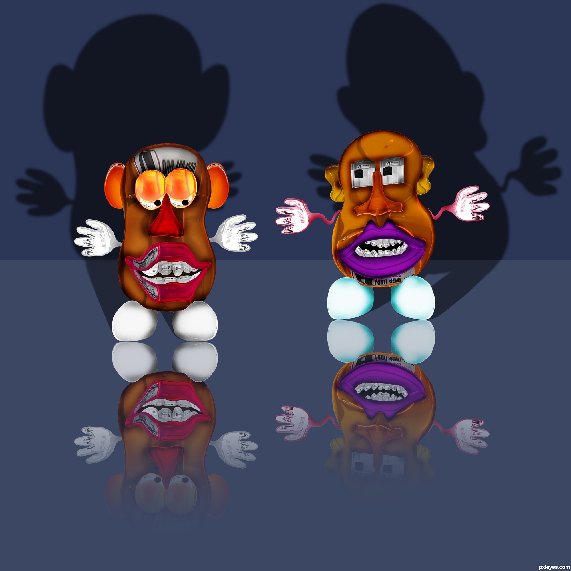
Only the source was used. (5 years and 3335 days ago)
Nice idea...gl,
Funny! Reminiscent of the work of a well known poseur. 
Great work author...they are...cool...are they dingleberries cousins.......just a joke...
nice
Good color combination. Nice shadow. A soft dark brush at wall joints or gradient mask will make the wall great and shadow greater. GL.
Locale, can you be more specific.
looks nice, but for all the work done, i think there could have been a better result. but what do i know
OK, Dragoncide. I'm open to suggestions. Saying that it could have been better doesn't really help me much. In fact, that's a comment relevant to most entries. A lot of entries could have done better.
Indeed very funny author. I like the expressions on their faces.
It amazes me what people can do with a source like this. good luck!
Howdie stranger!
If you want to rate this picture or participate in this contest, just:
LOGIN HERE or REGISTER FOR FREE
Photography and photoshop contests
We are a community of people with
a passion for photography, graphics and art in general.
Every day new photoshop
and photography contests are posted to compete in. We also have one weekly drawing contest
and one weekly 3D contest!
Participation is 100% free!
Just
register and get
started!
Good luck!
© 2015 Pxleyes.com. All rights reserved.


Good idea! Some color matching would really help.
Agrees with CMYK46... Maybe adjust the Hue a bit
Thanks for the suggestion... probably not what you were expecting eh?
Well, this is a cheap way of making it work, but color matching would have been far better, and shown off your PS skills as well.
It's all good CMYK46; I'm just here kill'in time and having fun! If I had to rely on my mad PS skillz, I'd no doubt be a starving artist!
haha well well indeed didn't expexted this solution... !
!
You mayby could adjust the man head a bit more
Gl
Howdie stranger!
If you want to rate this picture or participate in this contest, just:
LOGIN HERE or REGISTER FOR FREE