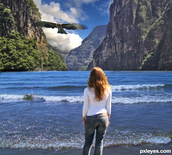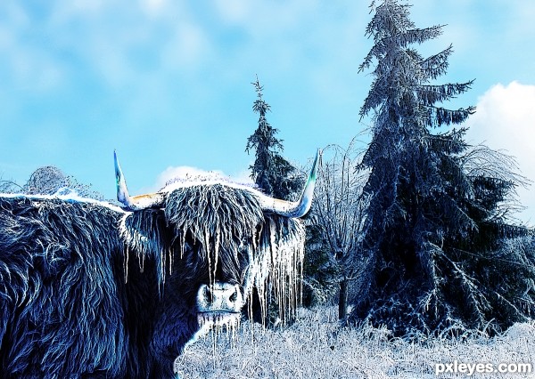
The "earth", "water" and "sky" sources are 3 separate images. Any traces of either element which may have been in the respective elements has been masked or cloned out. I hope this satisfies the contest guidelines. (5 years and 2670 days ago)

(5 years and 2671 days ago)
lovely 
Howdie stranger!
If you want to rate this picture or participate in this contest, just:
LOGIN HERE or REGISTER FOR FREE

(5 years and 2671 days ago)
Interesting idea! Best of lucks author!
nice work author 
Howdie stranger!
If you want to rate this picture or participate in this contest, just:
LOGIN HERE or REGISTER FOR FREE

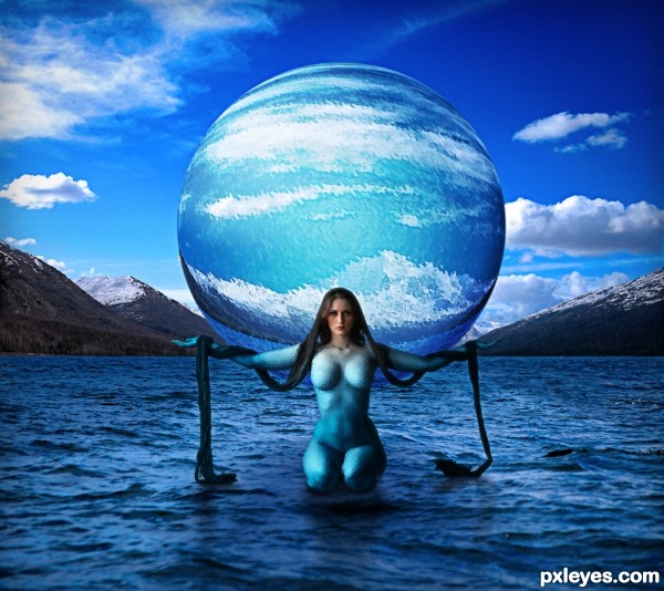
In Sumerian mythology, Nammu was the primeval sea that gave birth to An (heaven) and Ki (earth) and the first gods, representing the Apsu, the fresh water ocean that the Sumerians believed lay beneath the earth, the source of life-giving water and fertility. (5 years and 2672 days ago)
Good idea. Mountains need shadows, the figure could use more defined shadows, if not a reflection. Edges of the figure & globe could use some subtle blurring. I'm not sure about the texture on the model, but if you like it, that's your call. 
PS: Good find on the mythology theme.
Thanks for the compliments and the suggestions. I added some shadowing for the mountains and also slightly softened the edges of the sphere and model. I don't believe that you would find more defined shadows on such turbulent waters as these. It was a specific choice I made not to have them defined so they looked more natural. At least that's how I see it. The choice of texture was to make her look like she was made partly of water and also so it just wasn't a nude woman on water. Nammu was part of the sea and that's what I wanted to portray.
I still don't see shadows of the mountains on the water. The rest is better.
Hopefully they are a bit more defined now.
Excellent concept!
Thanks!
Howdie stranger!
If you want to rate this picture or participate in this contest, just:
LOGIN HERE or REGISTER FOR FREE

No external sources used. (5 years and 2672 days ago)
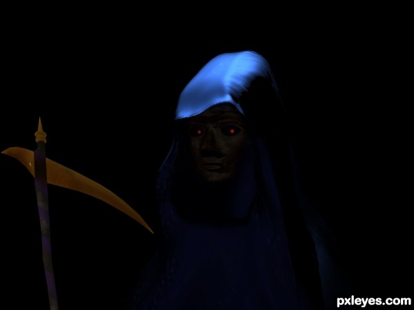
This is really too dark to see anything, even in high res. You also need to post sources and/or a step by step.
i like the shining moonlight on the hood, i think that that effect could add some detail to the rest
Way too dark considering you had a shiny golden source to work with.
Howdie stranger!
If you want to rate this picture or participate in this contest, just:
LOGIN HERE or REGISTER FOR FREE
Great sources and great blend, especially on the woman. Good luck!
Thanks musicj19!
nice work author
Nice blend
Thank you so much old PXL friend. Merry Christmas, good to see you again.

Howdie stranger!
If you want to rate this picture or participate in this contest, just:
LOGIN HERE or REGISTER FOR FREE