(5 years and 3366 days ago)
thanks to mqtrf and meihua-stock
for amazing stocks (5 years and 3366 days ago)
THAT'S A PRETTY DAMN NICE IMAGE YOU GOT THERE!  REALLY!
  AND THE SBS IS MORE LIKE A HIGHLY DETAILED TUTORIAL WOW TOP MARKS GL
Thanks
Hay friend,
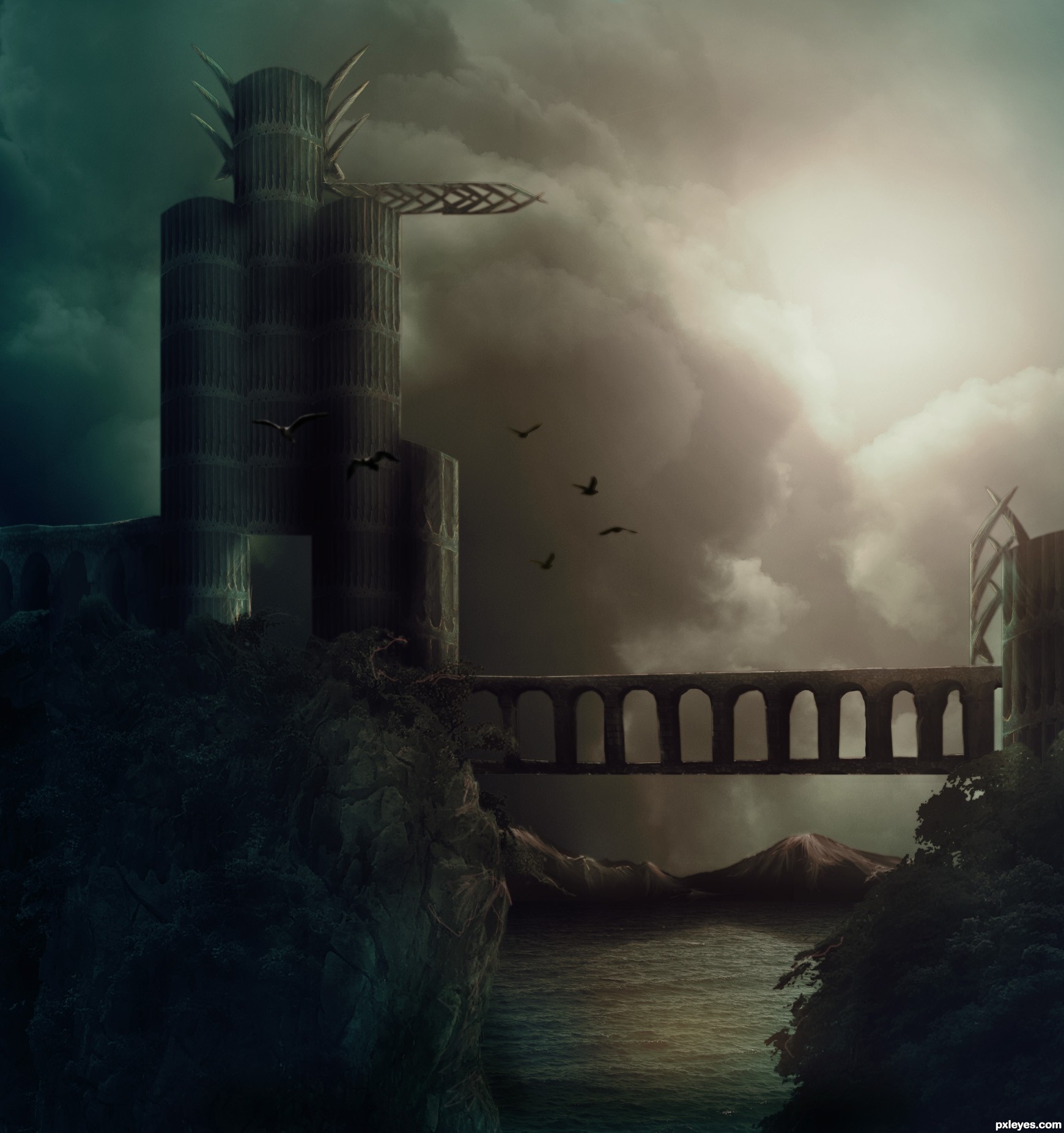
Add some birds to give some feel of life, just try it.
Best of luck!
@ AdhirAnimator thanks for the suggestion , going to try it later
Top notch work, author! Love the addition of the mountains that you painted. Only one thing, at the end did you add a vertical gradient? Great sbs, thanks, it's a keeper!
@ pearlie , yes
Clever, moody and beautiful. Wonderful work, Author.
Very nicely done, but the right side of the bridge structure isn't attached to anything.
(Just scale it over that way a bit, and your pic will be great!).
Thanks ponti55 and CMYK46, going to edit it soon
Hay its really awesome but yea I know I am expecting a lot.
Just suggestions:
1. Move birds near the light source right side at top and scale down little bit.
2. If you add yellow light at the entrance (left down side) it will look pretty cool.
Just try it.
Love overall image and yes my fav for sure!
Impressing work, so moody
Spooky tower, every monster would be so proud and happy to live in such abode
Amazing piece author...Instant fav from me...GL
Congrats ...... 
Congrats, excellent work
Congrats for the first place
Congrats!
Congrats...well deserved win...
Congrats!!
congrats
congrats
Congrats!
Congrats!!
Howdie stranger!
If you want to rate this picture or participate in this contest, just:
LOGIN HERE or REGISTER FOR FREE
This tutorial was inspirational:
http://night-fate.deviantart.com/art/manipulation-tutorial-7-89088380
Layer masking with curves, color balance, and levels layer adjustments applied. (5 years and 3367 days ago)
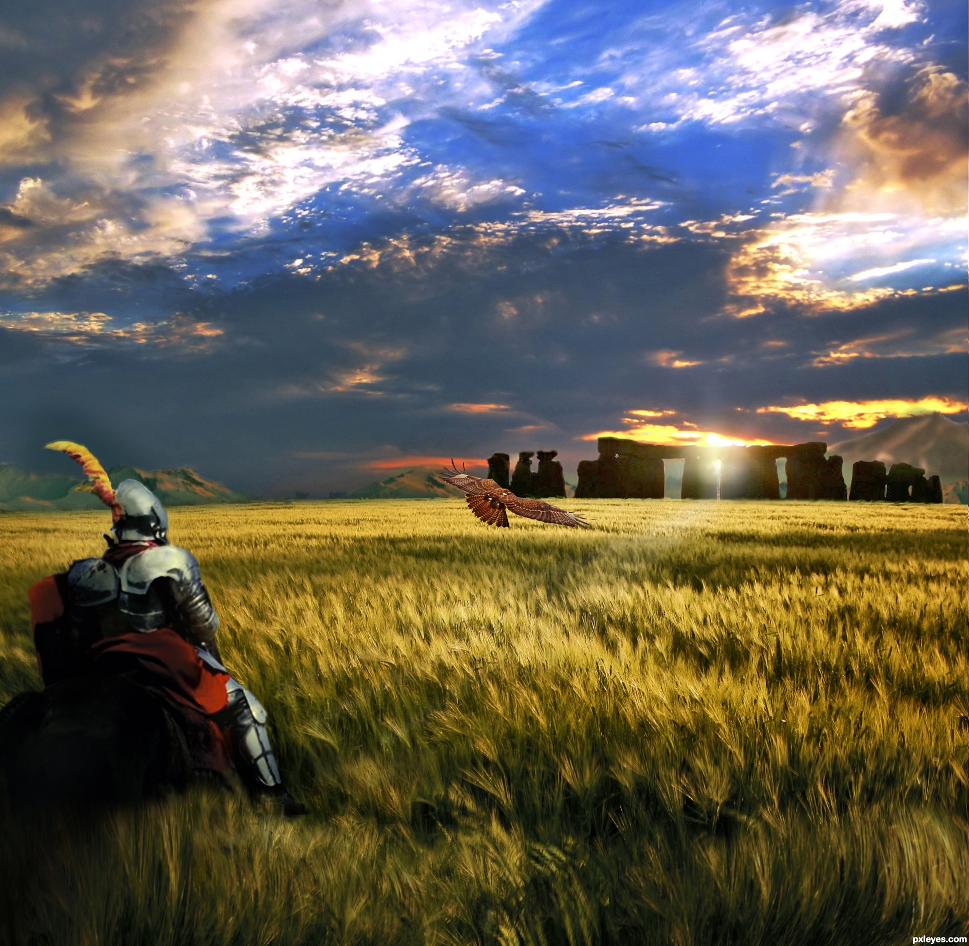
Interesting image. The bird is way too low to have any dramatic presence in the pic. It would have much more contrast & visual impact against the darker area of the sky.
Lots of elements nicely put together! The hawk  is a good contrast against the golden wheat and Stonehenge pillars. Very nice work, author.
With the sun setting behind Stonehenge, the knight should not be showing a bright reflection from the other side...Inconsistent lighting.
1. In the meadow.
I suggest you make the grass look like it's on top of the horsy- either add a mask to the horse or copy a piece of the tall gras and put it on top of the knight layer.
It would be more interesting if it looks like they already entered the meadow.
2. Darken their back.
The light on the knights armor comes from the back, but in your environnement the sun is setting in front of the characters. So, either try to remove the shining on armor and horse hips with clone stamp or add a new layer and paint over with black & blend after .
Wow dude! Now this looks cooler than in my imagination !
There are some mask probs left corner (better seen in hi-res), but you can fix them quickly.
Nice job!
very very nice effective work...great job author...GL
Howdie stranger!
If you want to rate this picture or participate in this contest, just:
LOGIN HERE or REGISTER FOR FREE
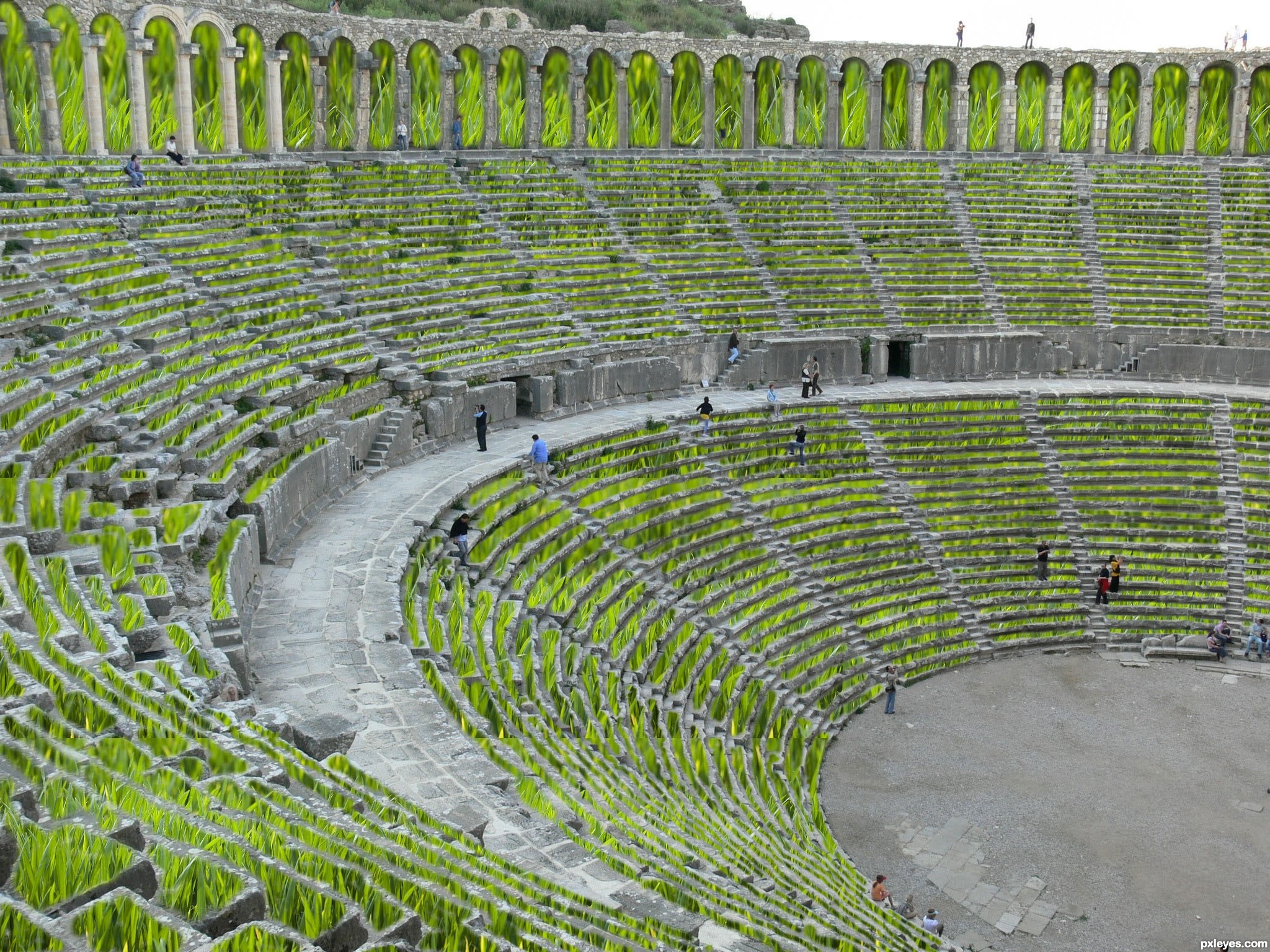
ITS FULL OF MASKING (5 years and 3367 days ago)
I can see that this would have taken you quite a long time to create with putting the individual sections of grass in, so I applaud your efforts.
Unfortunately this is extremely difficult to make look realistic. It works ok for the further sections where you cannot see the detail of the blades of grass, but the closer sections look really pasted on.
I think if you removed some of the closer sections and the parts behind the arches, you might have a nicer result. Some vines or plants to help give it an overgrown look might add something too.
The grass is out of scale compared to the people in the image, especially at the very top section. In the sections you've masked, some grass is in focus & some is blurry...also we can see abrupt cut lines in many places.
would look better i think if you removed the grass texture on the very top where the arches are, and if you lowered the saturation on the rest of the grass, and darkened it a bit. would make it look less fake.
What they all have said.
But it is a nice idea, and with some more execution it will be a great entry
its very hard to do but your great
its very hard to do but your great
Howdie stranger!
If you want to rate this picture or participate in this contest, just:
LOGIN HERE or REGISTER FOR FREE
(5 years and 3368 days ago)
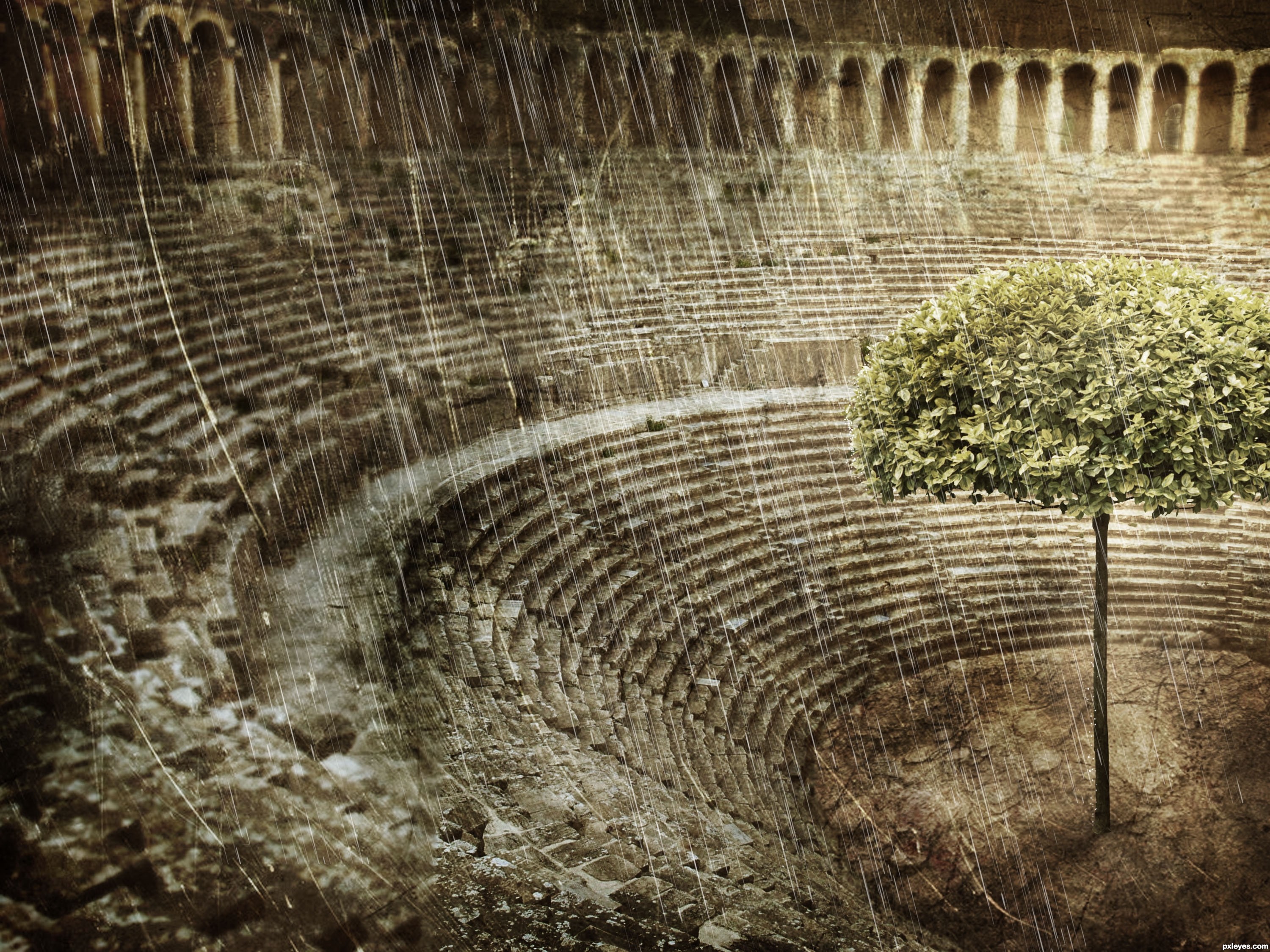
nice job on the rain... im kinda tired of all the noise and motion blur+screen type rain.. this looks alot better... is that how you did it? it really does look nice though...
Brushes + Motion Blur + Duplicate + Transform Tool
Very well done. Good texture and atmosphere
awesome work! love the color!
Great work author...best of luck
Well done, the texture is perfect it almost looks like rain = )
Howdie stranger!
If you want to rate this picture or participate in this contest, just:
LOGIN HERE or REGISTER FOR FREE
Photography and photoshop contests
We are a community of people with
a passion for photography, graphics and art in general.
Every day new photoshop
and photography contests are posted to compete in. We also have one weekly drawing contest
and one weekly 3D contest!
Participation is 100% free!
Just
register and get
started!
Good luck!
© 2015 Pxleyes.com. All rights reserved.


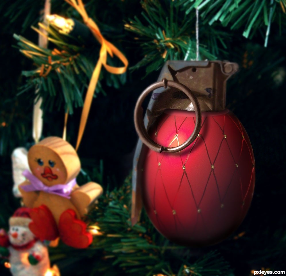
PULL IT PULL IT!!!!! hehehe
wow really like this humor
but IMO i'd make the pin just like the grenade thingy nice and shiney ( just my opinion)
GL author
You did a good job with the texture of the grenade
The light source is opposite the background, you should flip the grenade to make it consistent...
I LOVE IT!!! GL!
hahahahaha...great job author...top notch...well done
lol, extra points for making me laugh = )
Congrats
Congrats
Congrats...
Congrats!!
Thanks everyone!
Congrats
Howdie stranger!
If you want to rate this picture or participate in this contest, just:
LOGIN HERE or REGISTER FOR FREE