I think that i shall never see
a poem lovely as a Tree.
Poems were made by fools like me.
But only God can make a Tree.
J.Kilmer
(No external source used!) (5 years and 3503 days ago)
All photos besides the main source are taken by me. (5 years and 3503 days ago)
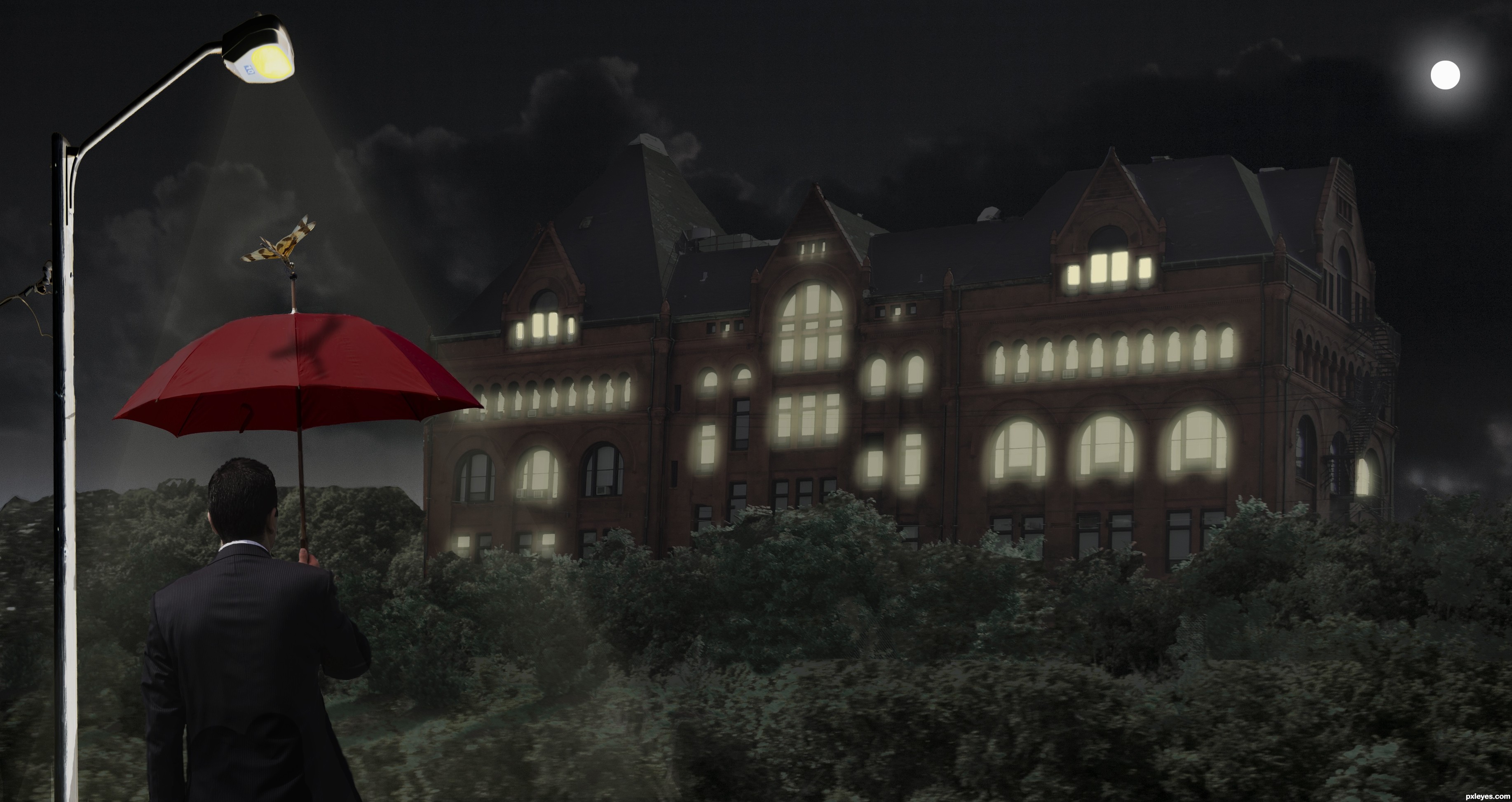
If you want to make it like night time you should select some windows and make it glow like the light is on in that room. There are some tutorials online about night time.
You could also introduce a lighting pole that would bring out the guy with the umbrella, so that we can see him in contrast with the rest of the image. Just have to be carefull where you place it.
Thanks graymval, I gave a shot. Any better?
IMO it's still too dark even in high res...I'm going to wait to vote and check back....Best of Luck
Well you got the idea author, but you could make those lights yellow, and placed randomly, not just on the top windows. Also add a glow to them , double click on layer = layer style, click outer glow, adjust setting in that pannel.
Same thing for the light pole + you might have to make a new layer on top and use a yellow brush to drag light lines from the lamp and then make them transparent, screen or overlay and blur.
I strongly suggest to search some tutorials out there, in case my explanations are not helpfull enough.
Added some more windows & glow. Also added a moon. Better I hope. : )
First of all author, you should be proud for giving yourself a prety hard mission for a beginner.
Although not perfect, i consider this an improvement and I hope the voters will appreciate your efforts & patience. Be sure I do.
The most critical adjustments that i consider you should do at this stage:
1.Make those edges clean! Light pole,umbrella man, left side forest & left side building need adjustments.
Check this tutorial here and use Pen tool to repair them :
http://www.youtube.com/watch?v=AGVsn-X2GxI
2. When you put the light at a window near the edge of the building you must put light on the side of the building as well, it's logical. Rooms on corners are usually square, and have windows on two sides so when the light is up it should be seen on both sides.
Keep it up, you're doing good.
Thanks graymval, you have been a great help. I will try to fix these items, it tuff work.
Gave it one more try, added a light beam on light pole, and cleaned it all up a bit. Hope you guys like this one better.
good work, but i think the glow is still too unrealistic
Just too dark in overall gamma. Cannot clearly make out the castle, while the foliage is a bit too light.
Howdie stranger!
If you want to rate this picture or participate in this contest, just:
LOGIN HERE or REGISTER FOR FREE
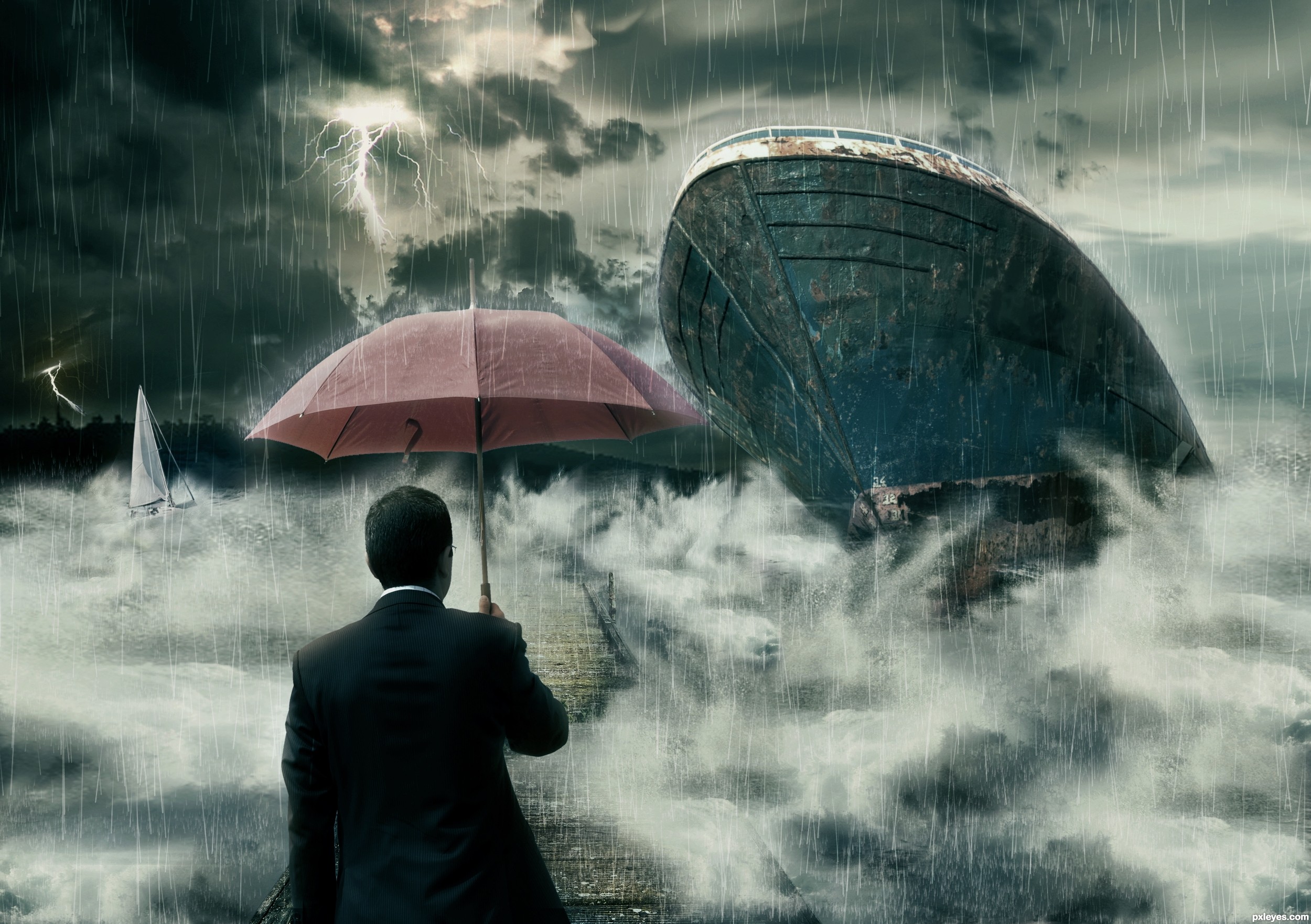
Basic techniques are used. Here I like to thanks MarcelTH for the wonderful sky pic and michaelaw for small boat. (5 years and 3503 days ago)
Great rain effects 
Really nice...
Best of luck my friend!
Thanks Adhir and Ponti... I'm so happy to receive a comment from a artist like yoU!
Two boats with identical damage? One would be enough, and improve the composition. The one at left is not necessary.
Well you're right. But I can't imagine the composition with only one damage. So I replace left one with different boat.
Very nice contrast, movement, and lighting. Well done.
Nice idea, well executed! GL! 
oOo scary! And that guy is crazy, why isn't he running for his life?!?!?! lol. Very creative idea, and nicely done!
Howdie stranger!
If you want to rate this picture or participate in this contest, just:
LOGIN HERE or REGISTER FOR FREE
Joits-http://www.flickr.com/photos/joits/
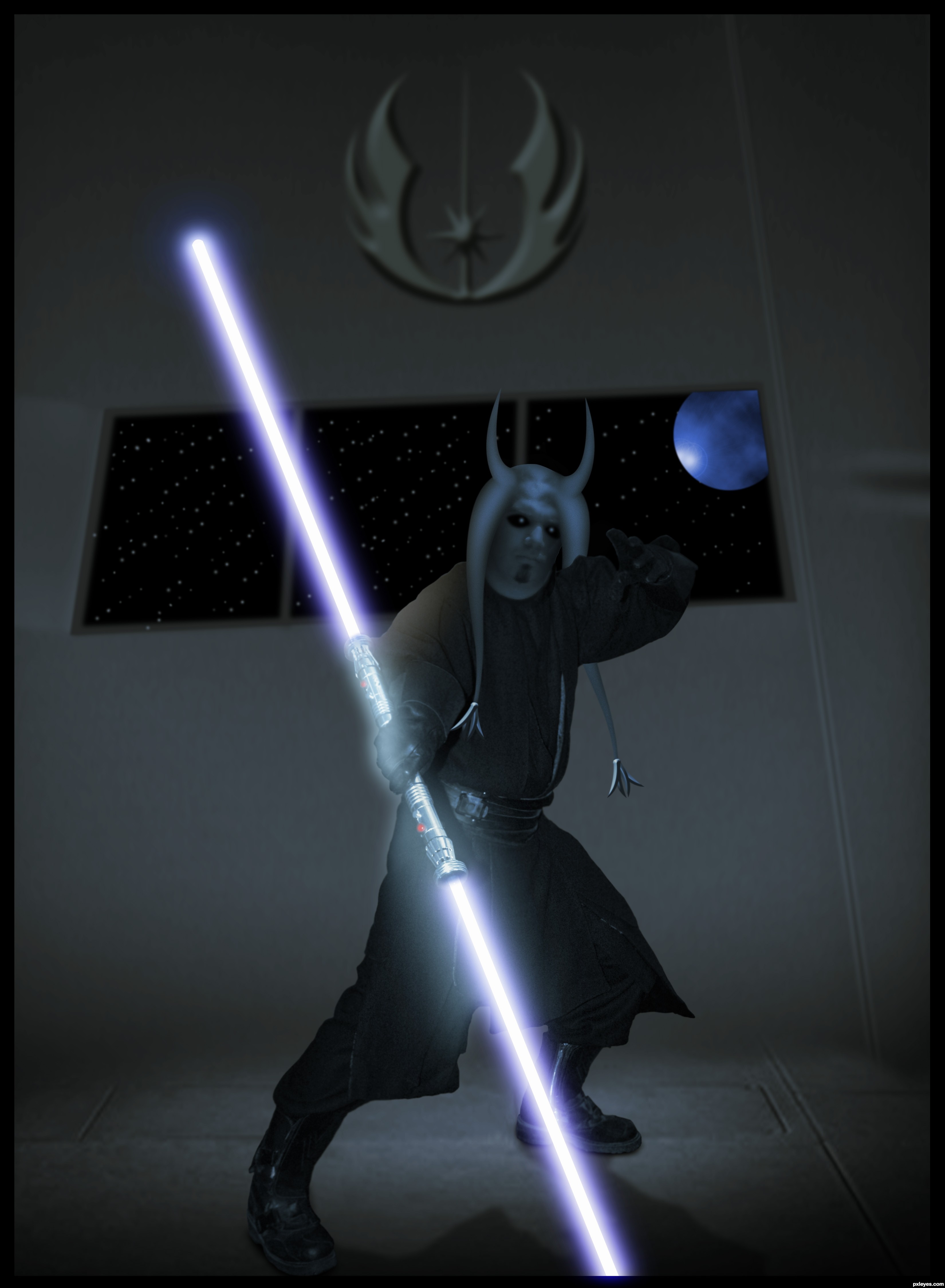
Thanks for the great photo of Darth Maul...:) (5 years and 3506 days ago)
cool work and nice sbs
I`d recognise that chin warmer anywhere lol......great entry man!
Very cool ...
nice work author especially with the background
Yeeee, nice pair of horns 
Howdie stranger!
If you want to rate this picture or participate in this contest, just:
LOGIN HERE or REGISTER FOR FREE
(5 years and 3506 days ago)
wonderful!
Thanks
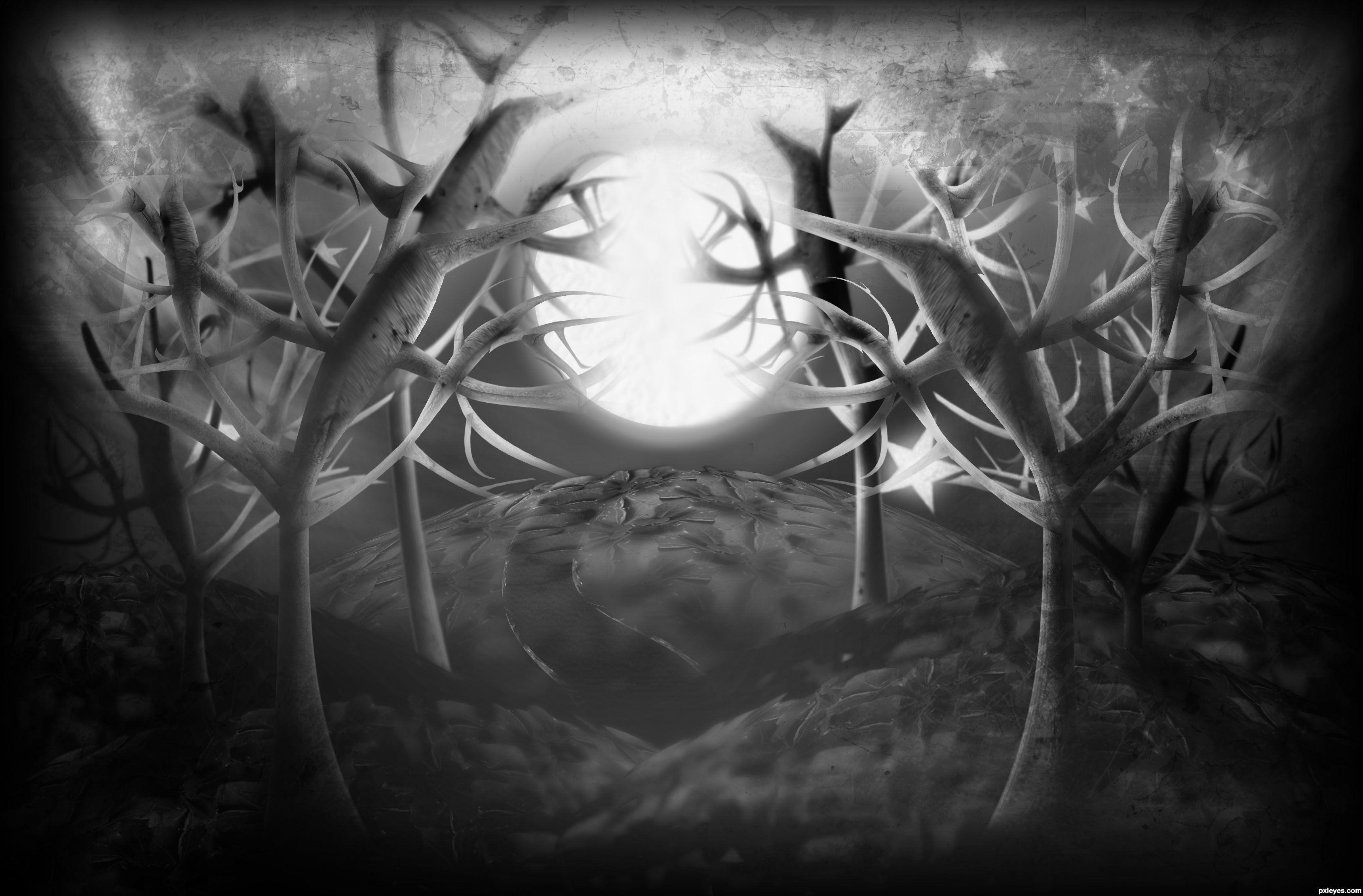
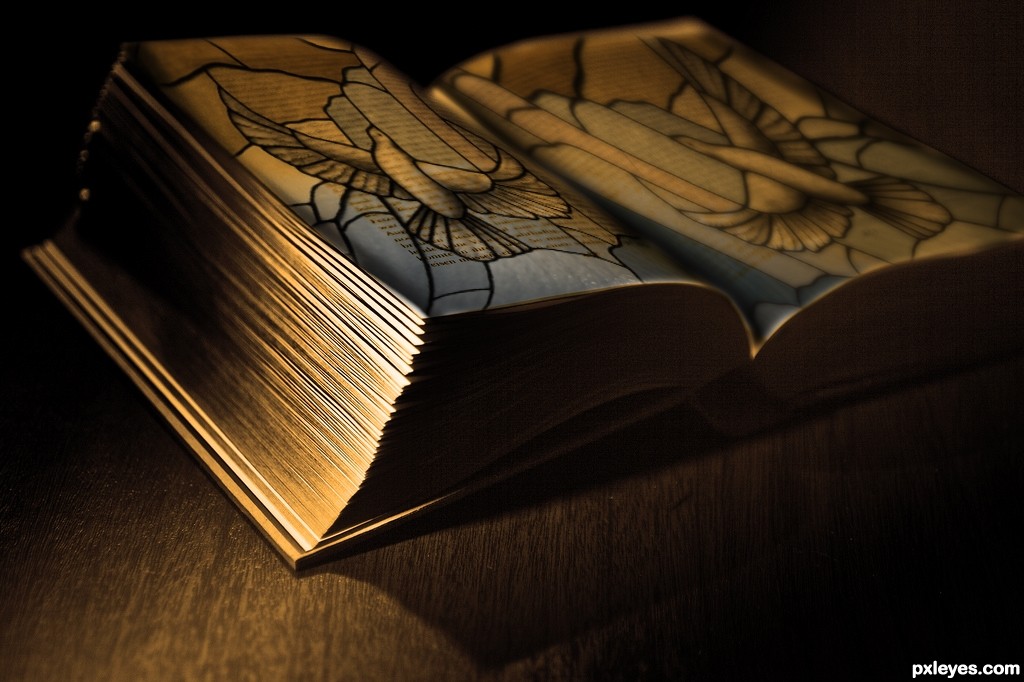
Moody and evocative. This is simplistic art at its best!
i like this one...
Fabulous job author...Mood is perfect...well done
this is very lovely! i love the medieval look to it!
nice idea and lovely work ......all the best to u..........
Its so simple but I love it!
Howdie stranger!
If you want to rate this picture or participate in this contest, just:
LOGIN HERE or REGISTER FOR FREE
Photography and photoshop contests
We are a community of people with
a passion for photography, graphics and art in general.
Every day new photoshop
and photography contests are posted to compete in. We also have one weekly drawing contest
and one weekly 3D contest!
Participation is 100% free!
Just
register and get
started!
Good luck!
© 2015 Pxleyes.com. All rights reserved.


Bad source link. Also an incomprehensible SBS and way CBR.
The guide wasn't intended to be a tutorial but only the proof that the work is made by me and not stolen from internet.
I can't imagine what CBR means....
CBR = chopped beyond recognition ....some of my works were called CBR,... it is just ok, nothing wrong with cbr because there is sbs to show how to make it,......
and this is good work, I like the feel conveyed in this pic....
I like it! It reminds me of the Nightmare before Christmas.
Too dull with no color. Agree with CMYK. It's so chopped beyond recognition, you could have used anything to make the image. Not a good use of the source image.
BUT... if you place that chair on top of the hill, in the bakcground, and just distort it a bit to blend your style, the source will be recognizable, and this would be a cool entry,imo. Don't forget to add it a (loong) shadow.
About colours.. you could do some blue highlights here and there, but it's your choice.
Great CBR author...love the concept, mood and final product...well done
Great imagination here
Some times, CBR entries are better than using the source image and just copying and pasting stuff around to make it look nice. Creativity counts, even distorted images from source images are nice to see. You did a good work, and I wish you good luck author.
Howdie stranger!
If you want to rate this picture or participate in this contest, just:
LOGIN HERE or REGISTER FOR FREE